Posts tagged Winner (58)

October 10, 2011

Stat of the Week Winner: October 1-7 2011

Thanks for all the nominations this week, especially all those from Tony Cooper! The winning nomination is: “Drowning deaths soar beyond 2010 total” – there are many such stories in the media where the usual type of variability one would expect to see with counts of events is seen as something unusual:

This is similar to my previous nomination in that it is making headlines out of statistical noise.

90 people have now drowned in New Zealand in 2011 and the drowning drowning toll is predicted to rise to 110 or more by the end of the year.

But an examination of the drowning deaths chart at http://www.watersafety.org.nz/research/ shows that 110 is pretty normal and that 2010 was an exceptional year in being below 100.

Looks like we have a new statistical term “soaring to the mean” to replace “reversion to the mean.”

October 3, 2011

Stat of the Week Winner: September 24-30 2011

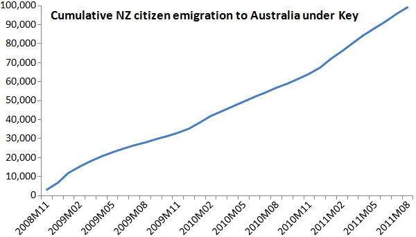
This week we’ve chosen Jeremy Greenbrook-Held’s nomination of this graph found on political blog The Standard:

Many have been criticising the graph, including David Farrar, those in the comments on The Standard and a blog post on Stuff, and here’s a summary of the main concerns:

  1. Using cumulative figures, making it appear as though the rate of emigration is increasing.
  2. Starting the graph at zero makes it appear as though no-one emigrated prior to John Key becoming Prime Minister.
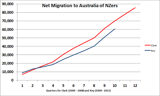
  3. The graph uses gross migration rather than net migration
  4. Not displaying historial emigration data for comparison

David Farrar created a graph which addresses points 3 and 4 above:

September 19, 2011

Stat of the Week Winner: September 10-16

No winner this week due to a lack of nominations – please add your suggestions for this week’s competition!

September 12, 2011

Stat of the Week Winner: September 3-9 2011

Congratulations to Eric Crampton for another great nomination and we have awarded it as our winner. It’s a fairly technical, well-researched Stat of the Week which is argued well.

September 5, 2011

Stat of the Week Winner: August 27-September 2 2011

Thank you for the three nominations for this week’s Stat of the Week competition.

Tony’s nomination of Spirit Level has been highly politicized and would require us to be ready to provide detailed rebuttals to the proponents of both sides of the argument. Life is too short!

We’d also like to hear the results of Ian Well’s complaint to the NZBCA of Growpro’s statistics and find out more details before commenting on them. (Ian, please advise us when the ruling comes out if there are comments on the statistics.)

Miranda Devlin’s nomination makes a good point that the obesity and overweight figures quoted are overall ones, rather than just for women (as the whole article is about them). However, in the sentence before these statistics are mentioned, the article does point out the obesity percentage for women.

In saying all this, we aren’t selecting a Stat of the Week this week but encourage you to discuss the nominations further if you wish.

August 29, 2011

Stat of the Week Winner: August 20-26 2011

Thank you Eric Crampton for another great nomination for this week’s Stat of the Week competition, but due to a lack of other entries we will not be awarding a winner this week.

Please add your nominations for the new competition, there are plenty of Stat of the Week candidates out there!

August 22, 2011

Stat of the Week Winner: August 13-19 2011

Thanks to all who added nominations for our second Stat of the Week competition.

This week we’ve chosen Tony Cooper’s nomination of NZ Herald’s article (reprinted from The Independent) on television’s “lethal” impact.

I (sadly) enjoy the way newspapers take a statistical correlation from scientific journals and turn them into cause-and-effect producing the “television kills” conclusion. A Nobel prize for the Herald, please.

Entertaining for statisticians but perhaps not for the lay public. Very disappointing for someone who watches TV after going for a run and now learns that the TV has undone the benefits of the run.

The nomination was also seconded by Eric Crampton:

Tons of places have been reporting on the “This hour of TV Watching costs you 22 minutes of life” study. But It’s nonsense. Here’s why.

The paper they’re referencing, out of Australia, just extrapolates to some life expectancy tables the results from Dunstan et al, available here: http://t.co/CZZxF36

What do Dunstan et al find? Controlling for some health-related covariates, there may be an increased risk of mortality with TV watching. But have a look at their confidence intervals. First off, their baseline risk is watching less than 2 hours of TV per week. So it’s complete nonsense to talk about an hour costing 22 minutes. Then, the RR for 2-4 hours of watching per day, after controlling for confounds, has a 95% confidence interval that always includes 1.0. To me, that means there’s no statistically significant relationship even if the point estimates on RR are >1.

They’re able to get CIs that don’t include 1.0 on all-source mortality for >4 hours daily watching, but boy do I worry about baseline characteristics of that group being far worse than for the lower watching groups. Yeah, they control for that, and controlling for it reduces the relative risk. But when you can substantially reduce the RR for the health confounds for which you CAN adjust, how much would you additionally reduce the RR for those unobservable health characteristics for which you cannot adjust?

The whole thing just seems sensationalistic. The most you could pull out of the study is that folks watching more than four hours of tv per day may have higher risk of all-source mortality, but that a lot of it may well be due to unobservable health differences between the kind of folks who watch 6 hours of TV per day and the kind of folks who don’t.

Congratulations Tony!

(PS: Bryan Clarke’s nomination about 2 degrees Celsius not being half of 4 degrees Celsius is something which irks various members of the department too but isn’t really statistics.)
August 15, 2011

Stat of the Week Winner: August 6-12 2011

Thanks to all who added nominations for our first Stat of the Week competition. The nominations were all fascinating for a variety of reasons and much could be written about each of them. We’ve chosen Eric Crampton’s nomination of John Pagani’s heated blog post on youth unemployment:

In the midst of extensive discussion of the rise in youth unemployment starting around Q4 2008, Pagani points to changes in apprenticeship funding as a policy shift that could have generated the change (arguing against changes in the youth minimum wage as having been the cause). He writes:
“If it wasn’t the removal of the youth minimum wage that caused youth unemployment to increase, then it would have to have been caused by something else that happened around the same time.

One other big change was the a sharp fall in young people getting skills for work.

In December 2008 there were 133,300 people in industry training. By the end of last year, there were 108,000. ”

You could be forgiven for assuming that about 25,000 kids had been kicked out of apprenticeships – it sure looks like he’s referring to youths. All the other discussion is on youth unemployment. But the number he’s citing is overall enrolment in training and apprenticeships. And the drop in youth enrolment in training – about 4,000 – is nowhere near large enough to provide a plausible alternative explanation.

Congratulations Eric!