October 26, 2015

Wealth inequality: not so simple

There’s a new edition of the Credit Suisse report on global wealth. It thinks New Zealand is the second richest nation in the world, and that the USA has 10% of the world’s poorest people.

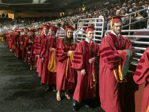
Here’s a picture of some of those world’s poorest people.

Keck-graduation-2015_0092

These are graduates from the Keck School of Medicine, at the University of Southern California, who owe an average of over US$200,000 in student loans.  By the Credit Suisse definition of wealth inequality they have less wealth than people living in poorly-maintained state housing in south Auckland. They have less wealth than immigrant agricultural workers in southern California. They have less wealth than subsistence farmers in Chad.

The computations are correct in a sense, but useless for two reasons. The first is that they don’t count the value of any non-salable assets (like a degree in medicine from USC, or permanent residency in the US).  The second is more subtle.  Wealth inequality is a concern over and above income inequality mostly because it’s bad for governance: small groups of people get too much power.  Assets minus debts isn’t a good indication of this power, because the cost and effectiveness of lobbying, influence, and bribery varies so much from country to country.
 

Stat of the Week Competition: October 24 – 30 2015

Each week, we would like to invite readers of Stats Chat to submit nominations for our Stat of the Week competition and be in with the chance to win an iTunes voucher.

Here’s how it works:

  • Anyone may add a comment on this post to nominate their Stat of the Week candidate before midday Friday October 30 2015.
  • Statistics can be bad, exemplary or fascinating.
  • The statistic must be in the NZ media during the period of October 24 – 30 2015 inclusive.
  • Quote the statistic, when and where it was published and tell us why it should be our Stat of the Week.

Next Monday at midday we’ll announce the winner of this week’s Stat of the Week competition, and start a new one.

(more…)

October 24, 2015

Bacon vs cigarettes

There has apparently been a leak from the International Agency for Research on Cancer about their forthcoming assessment of meat. It’s just in the UK papers so far, but I expect it will spread. Here’s an example, from the Telegraph

Bacon, ham and sausages ‘as big a cancer threat as smoking’, WHO to warn
The WHO is expected to publish a report listing processed meat as a cancer-causing substance with the highest of five possible rankings

Presumably what they mean is that IARC is going to classify processed meat as a Group 1 carcinogen. The story is playing on a common misunderstanding of the IARC hazard grades for carcinogenicity.

As I’ve written before, the IARC hazard grades aren’t about the magnitude of the threat. A Group 1 carcinogen is an agent whose ability to cause or promote cancer is well established. To quote the Preamble to the IARC Monographs

A cancer ‘hazard’ is an agent that is capable of causing cancer under some circumstances, while a cancer ‘risk’ is an estimate of the carcinogenic effects expected from exposure to a cancer hazard. The Monographs are an exercise in evaluating cancer hazards, despite the historical presence of the word ‘risks’ in the title. The distinction between hazard and risk is important, and the Monographs identify cancer hazards even when risks are very low at current exposure levels, because new uses or unforeseen exposures could engender risks that are significantly higher.

In the Monographs, an agent is termed ‘carcinogenic’ if it is capable of increasing the incidence of malignant neoplasms, reducing their latency, or increasing their severity or multiplicity.

The ‘five possible rankings‘ mentioned by the Telegraph could also do with some clarification. Effectively, there are three rankings, officially defined as “definite”, “probable”, and “possible”. There’s a “don’t know” ranking for things that haven’t been studied enough to make any assessment. Finally, there’s a largely-hypothetical “probably not” ranking, which has only ever been used once in nearly a thousand assessments.

If the leak is correct, processed meats will be joining alcohol, plutonium, sunlight, tobacco, birth-control pills, and Chinese-style salted fish in Group 1. These aren’t all an equal threat, but the IARC scientists believe all of them are able to cause cancer at the right dose.

Mostly Male Meetings: what are the odds?

A story in the Atlantic talks about an ongoing problem in science (and tech, and science fiction): the large number of conferences where nearly all the high-profile speaking slots go to men.  This isn’t news, even to their readers; there was a story in the Atlantic two and a half years ago on the same point. You don’t see this to quite the same extent in statistics, but at least part of that is because we don’t do as many conferences with a lot of high-profile speaking slots. We tend to let everyone speak.

When this is raised, one of the main negative response (of the ones people are prepared to put their names to), has been that this is chance. That’s what the piece in the Atlantic talks about.

Working with a “conservative” assumption that 24 percent of Ph.D.s in mathematics have been granted to women over the last 25 years, he finds that it’s statistically impossible that a speakers’ lineup including one woman and 19 men could be random.

The  probability of getting 0 or 1 women in a random sample of 20 people from a population with 24% women is 3%.  You could argue that the speakers are likely to be academics, and will tend to be more senior and increase the probability a bit, but the story’s figure of “less than 5%” is not an outlandish estimate — especially as mathematicians make a point of claiming they do their best work young.

On the other hand, 5% (or 3%) isn’t that small a number. It certainly isn’t “statistically impossible” as in the quote or “astronomically small” as in the story’s headline. Considering this conference in isolation the evidence of bias would be positive, but hardly overwhelming.

The statistical aspect of this problem is a bit like the statistical aspect of the Bechdel test for movies (two female characters; who talk to each other; not only about a man). You’d expect some movies to fail the Bechdel test. Some movies should fail the Bechdel test. What’s notable is that about half of all movies do.

You’d expect some conferences to have substantially fewer women than the population average for a field — the women in, say, mathematics will not be spread out evenly, so some topics will have more and some will have fewer in a way that messes up the probability calculation.  Also, some conferences will be more worried about other forms of under-representation — it’s more obvious for women because they are a relatively large fraction of the target population and because you can tell someone’s gender fairly reliably from a name and photo.

There wouldn’t be anything noteworthy about the occasional conference having substantially fewer women than expected. Even with perfect homogeneity across topics and no bias, about one conference in thirty would have a one-in-thirty under-representation of women. In that scenario you could argue there wasn’t any need to do anything about it.

That is so not where we are.

October 23, 2015

A little search goes a long way

The Herald has a story about cheese addiction, meant literally.

To understand why this is probably unreliable, try Wikipedia on the following terms or phrases from the story

Next, consider why Vegetarian Times is the primary source for a story purportedly about biochemistry.

October 22, 2015

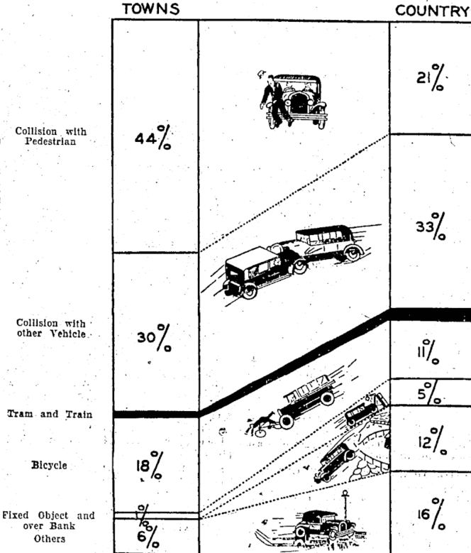
Early NZ data visualisation

From the National Library of New Zealand, via Jolisa Gracewood

natlib.govt

Types of motor-vehicle accidents in rural areas vary considerably from those ocourrlng In urban areas, as shown in tho above chart. Tho percentages are based on figures of the Transport Department in respect of accidents causing’ fatalltles during the twelve months, April I, 1932, to March 31, 1933.

The text goes on to say “The black section representing collisions with tram and train forms only I per cent, of the whole, through this type of accident appeals to the popular Imagination’ from its spectacular nature.”  Some things don’t change.

Second-hand bogus poll

Headline1 in 3 women watch porn – survey

Opening sentence: One in three young women regularly view porn, with many watching it on their smartphone, it has emerged.

It turns out this is “Some 31 per cent of participants in the survey by magazine Marie Claire.” If you Google, you can find the Marie Claire invitation to take the survey, with a link. There are also Facebook and YouTube versions of the invitation. It’s a self-selected internet survey; a bogus poll.

Considered in the context of its original purpose, this survey isn’t so bad. It’s part of a major project(possibly NSFW) by the magazine, and its contributing editor Amanda de Cadenet, to discuss women’s use of pornography.  The survey provided a way for them to involve readers, and a context for telling readers, however they responded, “there are lots of other women like you”.  From that point of view the quantitative unreliability and poorly-defined target population isn’t such a problem, though it would presumably be better to have the right numbers.

Disconnected from the magazine and presented as data-based news, the survey results have very little going for them.

The wine when it is red

Q: Are you going to have a glass of wine tonight?

A: You mean as a celebration?.

Q: No, because a glass of red wine has the same benefits as a gym session. The Herald story?

A: Yeah, nah.

Q: What part of “Red wine equal to a gym workout – study” don’t you understand?

A: How they got that from the research.

Q: Was this just correlations again?

A: No, it was a real experimental study.

Q: So I’m guessing you’re going to say “in mice”?

A: Effectively. It was in rats.

Q: They gave some rats red wine and made others do gym workouts?

A: No, there wasn’t any red wine.

Q: But the story… ah, I see. “A compound found in red wine”. They gave the rats this compound directly?

A: That’s right

Q: And the gym workouts?

A: Basically, yes. The rats did treadmill runs, though they don’t report that they had headphones on at the time.

Q: So the resveratrol group ended up fitter than the exercise group?

A: No, both groups got the workouts. The resveratrol plus exercise group ended up fitter than the group just getting exercise.

Q: So, really, it’s about a glass of red wine plus a gym workout, not instead of a gym workout? If it was people, not rats?

A: Well, not “a glass”.

Q: How many glasses?

A: The rats got 146mg resveratrol per kg of weight per day. One standard conversion rate is to divide by 7 to get mg/kg in humans: about 20. So for a 60kg person, that’s about 1200mg/day of resveratrol.

Q: How much is in a glass of wine?

A: It depends on the size, but at 5 glasses per bottle, maybe 0.3 mg

Q: So we might need bigger glasses, then.

A: At least you’ll get plenty of exercise lifting them.

October 21, 2015

Rugby World Cup Predictions for the Semi-finals

Team Ratings for the Semi-finals

The basic method is described on my Department home page.

Here are the team ratings prior to this week’s games, along with the ratings at the start of the Rugby World Cup.

Current Rating Rating at RWC Start Difference
New Zealand 28.42 29.01 -0.60
South Africa 22.84 22.73 0.10
Australia 20.85 20.36 0.50
England 16.43 18.51 -2.10
Ireland 15.97 17.48 -1.50
Wales 13.85 13.93 -0.10
Argentina 11.27 7.38 3.90
France 8.96 11.70 -2.70
Scotland 5.94 4.84 1.10
Fiji -2.19 -4.23 2.00
Samoa -4.15 -2.28 -1.90
Italy -6.37 -5.86 -0.50
Tonga -8.84 -6.31 -2.50
Japan -9.10 -11.18 2.10
USA -17.13 -15.97 -1.20
Georgia -17.74 -17.48 -0.30
Canada -17.89 -18.06 0.20
Romania -19.44 -21.20 1.80
Uruguay -31.67 -31.04 -0.60
Namibia -33.29 -35.62 2.30


Performance So Far

So far there have been 44 matches played, 37 of which were correctly predicted, a success rate of 84.1%.
Here are the predictions for last week’s games.

Game Date Score Prediction Correct
1 South Africa vs. Wales Oct 17 23 – 19 10.10 TRUE
2 New Zealand vs. France Oct 17 62 – 13 16.60 TRUE
3 Ireland vs. Argentina Oct 18 20 – 43 7.50 FALSE
4 Australia vs. Scotland Oct 18 35 – 34 16.50 TRUE


Predictions for the Semi-finals

Here are the predictions for the Semi-finals. The prediction is my estimated expected points difference with a positive margin being a win to the first-named team, and a negative margin a win to the second-named team.

Game Date Winner Prediction
1 South Africa vs. New Zealand Oct 24 New Zealand -5.60
2 Argentina vs. Australia Oct 25 Australia -9.60


ITM Cup Predictions for the ITM Cup Finals

Team Ratings for the ITM Cup Finals

The basic method is described on my Department home page.

Here are the team ratings prior to this week’s games, along with the ratings at the start of the season.

Current Rating Rating at Season Start Difference
Canterbury 13.66 10.90 2.80
Auckland 11.17 5.14 6.00
Tasman 9.23 12.86 -3.60
Taranaki 8.54 7.70 0.80
Wellington 4.00 -4.62 8.60
Counties Manukau 2.72 7.86 -5.10
Hawke’s Bay 1.77 -0.57 2.30
Otago 0.38 -4.84 5.20
Waikato -4.56 -6.96 2.40
Bay of Plenty -6.01 -9.77 3.80
Manawatu -6.69 -1.52 -5.20
North Harbour -8.60 -10.54 1.90
Southland -10.02 -6.01 -4.00
Northland -19.56 -3.64 -15.90


Performance So Far

So far there have been 74 matches played, 53 of which were correctly predicted, a success rate of 71.6%.
Here are the predictions for last week’s games.

Game Date Score Prediction Correct
1 Auckland vs. Tasman Oct 16 44 – 24 2.90 TRUE
2 Hawke’s Bay vs. Bay of Plenty Oct 17 33 – 26 12.80 TRUE
3 Canterbury vs. Taranaki Oct 17 46 – 20 5.40 TRUE
4 Wellington vs. Otago Oct 17 34 – 14 4.90 TRUE


Predictions for the ITM Cup Finals

Here are the predictions for the ITM Cup Finals. The prediction is my estimated expected points difference with a positive margin being a win to the home team, and a negative margin a win to the away team.

Game Date Winner Prediction
1 Hawke’s Bay vs. Wellington Oct 23 Hawke’s Bay 1.80
2 Canterbury vs. Auckland Oct 24 Canterbury 6.50