Not how barcharts work
From the @nzlabour twitterwallah, via Matt Nippert
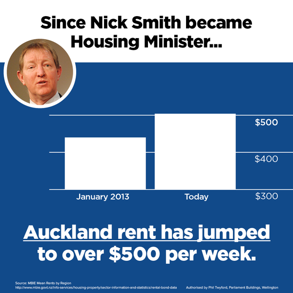
Barcharts start at zero. Other sorts of charts don’t need to, but barcharts do. A line chart cut off at $300 would be ok — though if you were going to do that, you might as well include a longer range of data.
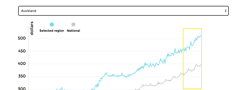
For example, here’s the top couple of inches of the detailed graph from Herald Insights, with the jump under Mr Smith’s administration highlighted in yellow.
Or you might compare to the increase in median household income for the Auckland region over that period, which was about 9%, and say that affordability of rental housing has decreased by maybe 5% over that time period. Or compare to the increase in minimum wage (7%). Or something.
Representing a time trend for which there’s weekly monthly data by a two-point decapitated bar chart suggests a low opinion of your audience. When Fox News does it, that’s fair enough, but from a New Zealand political party it’s unfortunate.
Recent comments