April 18, 2016

Being precise

regional1

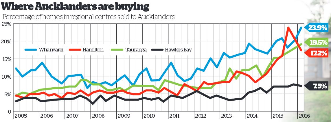
There are stories in the Herald about home buyers being forced out of Auckland by house prices, and about the proportion of homes in other regions being sold to Aucklanders.  As we all know, Auckland house prices are a serious problem and might be hard to fix even if there weren’t motivations for so many people to oppose any solution.  I still think it’s useful to be cautious about the relevance of the numbers.

We don’t learn from the story how CoreLogic works out which home buyers in other regions are JAFAs — we should, but we don’t. My understanding is that they match names in the LINZ title registry.  That means the 19.5% of Auckland buyers in Tauranga last quarter is made up of three groups

  1. Auckland home owners moving to Tauranga
  2. Auckland home owners buying investment property in Tauranga
  3. Homeowners in Tauranga who have the same name as a homeowner in Auckland.

Only the first group is really relevant to the affordability story.  In fact, it’s worse than that. Some of the first group will be moving to Tauranga just because it’s a nice place to live (or so I’m told).  Conversely, as the story says, a lot of the people who are relevant to the affordability problem won’t be included precisely because they couldn’t afford a home in Auckland.

For data from recent years the problem could have been reduced a lot by some calibration to ground truth: contact people living at a random sample of the properties and find out if they had moved from Auckland and why.  You might even be able to find out from renters if their landlord was from Auckland, though that would be less reliable if a property management company had been involved.  You could do the same thing with a sample of homes owned by people without Auckland-sounding names to get information in the other direction.  With calibration, the complete name-linkage data could be very powerful, but on its own it will be pretty approximate.


Stat of the Week Competition: April 16 – 22 2016

Each week, we would like to invite readers of Stats Chat to submit nominations for our Stat of the Week competition and be in with the chance to win an iTunes voucher.

Here’s how it works:

  • Anyone may add a comment on this post to nominate their Stat of the Week candidate before midday Friday April 22 2016.
  • Statistics can be bad, exemplary or fascinating.
  • The statistic must be in the NZ media during the period of April 16 – 22 2016 inclusive.
  • Quote the statistic, when and where it was published and tell us why it should be our Stat of the Week.

Next Monday at midday we’ll announce the winner of this week’s Stat of the Week competition, and start a new one.

(more…)

April 17, 2016

Briefly

  • “Statistical bullshit: how politicians poisoned statistics”, by Tim Harford in the Financial Times. An important piece to read, but it’s also worth bearing in mind Daniel Davies’s response on Twitter: “it wasn’t politicians that gave us the replicability crisis…”
  • Graphics: every attempted scoring shot Kobe Bryant made during his career.  Some features (like the three-point line) are obvious, more would probably be clear to basketball fans.  It still misses out a bit on the ‘compared to what?’ scale. How did Kobe’s shots compare to other players’, for example?
  • The dark side of comments. The Guardian analysed the 70 million comments on their website: results not surprising, but depressing.

Although the majority of our regular opinion writers are white men, we found that those who experienced the highest levels of abuse and dismissive trolling were not. The 10 regular writers who got the most abuse were eight women (four white and four non-white) and two black men. Two of the women and one of the men were gay. And of the eight women in the “top 10”, one was Muslim and one Jewish.

And the 10 regular writers who got the least abuse? All men

  • At Slate: maps of cholera: “at CDC headquarters today, five-and-a-half years into the epidemic, they are proudly displaying two historic maps that have everything to do with each other, but they are not telling you why” 
  • From 538: when people in the US file their taxes.
    casselman-taxday-v2

Evil within?

The headlineSex and violence ‘normal’ for boys who kill women in video games: study. That’s a pretty strong statement, and the claim quotes imply we’re going to find out who made it. We don’t.

The (much-weaker) take-home message:

The researchers’ conclusion: Sexist games may shrink boys’ empathy for female victims.

The detail:

The researchers then showed each student a photo of a bruised girl who, they said, had been beaten by a boy. They asked: On a scale of one to seven, how much sympathy do you have for her?

The male students who had just played Grand Theft Auto – and also related to the protagonist – felt least bad for her. with an empathy mean score of 3. Those who had played the other games, however, exhibited more compassion. And female students who played the same rounds of Grand Theft Auto had a mean empathy score of 5.3.

The important part is between the dashes: male students who related more to the protagonist in Grand Theft Auto had less empathy for a female victim.  There’s no evidence given that this was a result of playing Grand Theft Auto, since the researchers (obviously) didn’t ask about how people who didn’t play that game related to its protagonist.

What I wanted to know was how the empathy scores compared by which game the students played, separately by gender. The research paper didn’t report the analysis I wanted, but thanks to the wonders of Open Science, their data are available.

If you just compare which game the students were assigned to (and their gender), here are the means; the intervals are set up so there’s a statistically significant difference between two groups when their intervals don’t overlap.

gtamean

The difference between different games is too small to pick out reliably at this sample size, but is less than half a point on the scale — and while the ‘violent/sexist’ games might reduce empathy, there’s just as much evidence (ie, not very much) that the ‘violent’ ones increase it.

Here’s the complete data, because means can be misleading

gtaswarm

The data are consistent with a small overall impact of the game, or no real impact. They’re consistent with a moderately large impact on a subset of susceptible men, but equally consistent with some men just being horrible people.

If this is an issue you’ve considered in the past, this study shouldn’t be enough to alter your views much, and if it isn’t an issue you’ve considered in the past, it wouldn’t be the place to start.

Overcounting causes

There’s a long story in the Sunday Star-Times about a 2007 report on cannabis from the National Drug Intelligence Bureau (NDIB)

“Perhaps surprisingly,” Maxwell wrote, “cannabis related hospital admissions between 2001 and 2005 exceeded admissions for opiates, amphetamines and cocaine combined”, with about 2000 people a year ending up in hospital because of the drug.

The problem was with hospital diagnostic codes. Discharge summaries include both the primary cause of admission and a lot of other things to be noted. That’s a good thing — you want to know what all was wrong with a patient both for future clinical care and for research and quality control.  For example, if someone is in hospital for bleeding, you want to know they were on warfarin (which is why the bleeding happened), and perhaps why they were on warfarin. It’s not even always the case that the primary cause is the primary cause — if someone has Parkinson’s Disease and is admitted with pneumonia as a complication, which one should be listed? This is a difficult and complex field, and is even slightly less boring than it sounds.

As a result, if you just count up all the discharge summaries where ‘cannabis dependence’ was somewhere on the laundry list of codes, you’re going to get a lot of people who smoke pot but are in hospital for some completely different reason.  And since there’s a lot of cannabis consumption out there, you will get a lot of these false positives.

There are some other things to note about this report, though. The National Drug Foundation says (on Twitter) that they made the same point when it first came out. They also claim


that the Ministry of Health argued against its being published.

Perhaps now the multiple-counting problem has been publicised in the context of hospital admissions the same mistake will be made less often for road crashes, where multiple factors from foreign drivers to speed to alcohol to drugs are repeatedly counted up as ‘the’ cause of any crash where they are present.

April 13, 2016

Super 18 Predictions for Round 8

Team Ratings for Round 8

The basic method is described on my Department home page.

Here are the team ratings prior to this week’s games, along with the ratings at the start of the season.

Current Rating Rating at Season Start Difference
Crusaders 8.12 9.84 -1.70
Chiefs 6.51 2.68 3.80
Highlanders 6.25 6.80 -0.50
Hurricanes 5.62 7.26 -1.60
Brumbies 3.47 3.15 0.30
Waratahs 2.30 4.88 -2.60
Stormers 2.02 -0.62 2.60
Lions 0.42 -1.80 2.20
Bulls -0.72 -0.74 0.00
Sharks -1.06 -1.64 0.60
Blues -4.16 -5.51 1.30
Rebels -5.31 -6.33 1.00
Jaguares -8.67 -10.00 1.30
Reds -9.17 -9.81 0.60
Cheetahs -9.21 -9.27 0.10
Force -9.31 -8.43 -0.90
Sunwolves -12.98 -10.00 -3.00
Kings -17.37 -13.66 -3.70


Performance So Far

So far there have been 55 matches played, 36 of which were correctly predicted, a success rate of 65.5%.
Here are the predictions for last week’s games.

Game Date Score Prediction Correct
1 Chiefs vs. Blues Apr 08 29 – 23 15.30 TRUE
2 Force vs. Crusaders Apr 08 19 – 20 -15.10 TRUE
3 Stormers vs. Sunwolves Apr 08 46 – 19 17.90 TRUE
4 Hurricanes vs. Jaguares Apr 09 40 – 22 18.30 TRUE
5 Reds vs. Highlanders Apr 09 28 – 27 -13.10 FALSE
6 Sharks vs. Lions Apr 09 9 – 24 4.30 FALSE
7 Kings vs. Bulls Apr 09 6 – 38 -10.60 TRUE


Predictions for Round 8

Here are the predictions for Round 8. The prediction is my estimated expected points difference with a positive margin being a win to the home team, and a negative margin a win to the away team.

Game Date Winner Prediction
1 Crusaders vs. Jaguares Apr 15 Crusaders 20.80
2 Rebels vs. Hurricanes Apr 15 Hurricanes -6.90
3 Cheetahs vs. Sunwolves Apr 15 Cheetahs 7.80
4 Blues vs. Sharks Apr 16 Blues 0.90
5 Waratahs vs. Brumbies Apr 16 Waratahs 2.30
6 Bulls vs. Reds Apr 16 Bulls 12.40
7 Lions vs. Stormers Apr 16 Lions 1.90


NRL Predictions for Round 7

Team Ratings for Round 7

The basic method is described on my Department home page.

Here are the team ratings prior to this week’s games, along with the ratings at the start of the season.

Current Rating Rating at Season Start Difference
Cowboys 11.97 10.29 1.70
Broncos 9.31 9.81 -0.50
Roosters 3.73 11.20 -7.50
Bulldogs 2.93 1.50 1.40
Storm 2.10 4.41 -2.30
Sharks 1.20 -1.06 2.30
Rabbitohs 1.06 -1.20 2.30
Eels 0.10 -4.62 4.70
Sea Eagles 0.08 0.36 -0.30
Panthers -1.29 -3.06 1.80
Raiders -1.73 -0.55 -1.20
Dragons -3.51 -0.10 -3.40
Titans -4.93 -8.39 3.50
Wests Tigers -5.25 -4.06 -1.20
Warriors -5.74 -7.47 1.70
Knights -8.36 -5.41 -2.90


Performance So Far

So far there have been 48 matches played, 25 of which were correctly predicted, a success rate of 52.1%.
Here are the predictions for last week’s games.

Game Date Score Prediction Correct
1 Broncos vs. Dragons Apr 07 26 – 0 14.10 TRUE
2 Rabbitohs vs. Roosters Apr 08 10 – 17 1.60 FALSE
3 Eels vs. Raiders Apr 09 36 – 6 0.90 TRUE
4 Warriors vs. Sea Eagles Apr 09 18 – 34 0.50 FALSE
5 Panthers vs. Cowboys Apr 09 18 – 23 -11.20 TRUE
6 Sharks vs. Titans Apr 10 25 – 20 9.90 TRUE
7 Knights vs. Wests Tigers Apr 10 18 – 16 -0.50 FALSE
8 Storm vs. Bulldogs Apr 11 12 – 18 3.50 FALSE


Predictions for Round 7

Here are the predictions for Round 7. The prediction is my estimated expected points difference with a positive margin being a win to the home team, and a negative margin a win to the away team.

Game Date Winner Prediction
1 Sea Eagles vs. Eels Apr 14 Sea Eagles 3.00
2 Cowboys vs. Rabbitohs Apr 15 Cowboys 13.90
3 Titans vs. Dragons Apr 16 Titans 1.60
4 Bulldogs vs. Warriors Apr 16 Bulldogs 12.70
5 Broncos vs. Knights Apr 16 Broncos 20.70
6 Raiders vs. Sharks Apr 17 Raiders 0.10
7 Wests Tigers vs. Storm Apr 17 Storm -4.40
8 Roosters vs. Panthers Apr 18 Roosters 8.00


April 11, 2016

Missing data

Sometimes…often…practically always… when you get a data set there are missing values. You need to decide what to do with them. There’s a mathematical result that basically says there’s no reliable strategy, but different approaches may still be less completely useless in different settings.

One tempting but usually bad approach is to replace them with the average — it’s especially bad with geographical data.  We’ve seen fivethirtyeight.com get this badly wrong with kidnappings in Nigeria, we’ve seen maps of vaccine-preventable illness at epidemic proportions in the west Australian desert, we’ve seen Kansas misidentified as the porn centre of the United States.

The data problem that attributed porn to Kansas has more serious consequences. There’s a farm not far from Wichita that, according to the major database providing this information, has 600 million IP addresses.  Now think of the reasons why someone might need to look up the physical location of an internet address. Kashmir Hill, at Fusion, looks at the consequences, and at how a better “don’t know” address is being chosen.

Stat of the Week Competition: April 9 – 15 2016

Each week, we would like to invite readers of Stats Chat to submit nominations for our Stat of the Week competition and be in with the chance to win an iTunes voucher.

Here’s how it works:

  • Anyone may add a comment on this post to nominate their Stat of the Week candidate before midday Friday April 15 2016.
  • Statistics can be bad, exemplary or fascinating.
  • The statistic must be in the NZ media during the period of April 9 – 15 2016 inclusive.
  • Quote the statistic, when and where it was published and tell us why it should be our Stat of the Week.

Next Monday at midday we’ll announce the winner of this week’s Stat of the Week competition, and start a new one.

(more…)

April 9, 2016

Movie stars broken down by age and sex

The folks at Polygraph have a lovely set of interactive graphics of number of speaking lines in 2000 movie screenplays, with IMDB look-ups of actor age and gender.  If you haven’t been living in a cave on Mars, the basic conclusion won’t be surprising, but the extent of the differences might. Frozen, for example, gave more than half the lines to male characters.

They’ve also made a lot of data available on Github for other people to use. Here’s a graph combining the age and gender data in a different way than they did: total number of speaking lines by age and gender

hollywood

Men and women have similar number of speaking lines up to about age 30, but after that there’s a huge separation and much less opportunity for female actors.  We can all think of exceptions: Judi “M” Dench, Maggie “Minerva” Smith, Joanna “Absolutely no relation” Lumley, but they are exceptions.