December 5, 2016

Do snake people hate our freedom?

We had a Stat of the Week nomination for this graph from Stuff showing attitudes to democracy changing for people born more recently:

stuff-essential

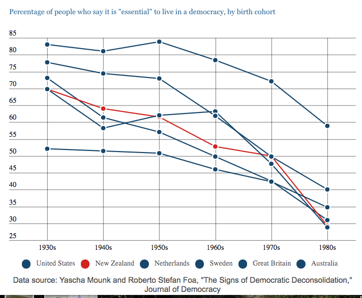
The complaint was that the non-NZ lines were indistinguishable. They do get pop-up descriptions on mouse-over, but the coloured circles in the legend are certainly not doing much work.

This is the original graph, from the New York Times:

nyt-essential

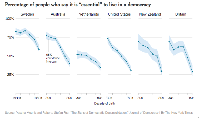
The Times verison is more elegant and clearer, and also provides uncertainty intervals around the lines. On the other hand, the higher-than-wide panels are going to make any decrease look more dramatic.

There are two more important problems with the graph. The first is that it uses only the highest category, “Essential”, on a ten-point scale.  A decrease in the proportion of people using the top rating could be due to the whole distribution moving down, but it could also just be a trend in people’s tendency to use the extreme values on a scale.

Here’s a related graph using other data, tweeted by (Prof) Pippa Norris

mean

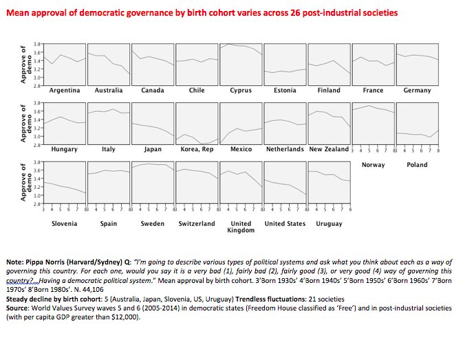
The trend looks weaker when using means on a four-point scale. It’s also less universal than the New York Times graph suggests.

There’s another problem, though.  The source for the first graph: Yascha Mounk and Roberto Stefan Foa, “The Signs of Democratic Deconsolidation,” Journal of Democracy. The paper doesn’t exist yet at the journal’s website (or anywhere else that I’ve been able to find).  According to Dr Mounk’s CV, it’s coming out in the first edition next year.

Part of the point of peer-reviewed publications is that they include the details that don’t make it into a media story. This is, potentially, significant research on an important topic. If we’re going to have a full-on panic about millennials and the end of democracy, we could at least wait a couple of months for the research to be published.


Stat of the Week Competition: December 3 – 9 2016

Each week, we would like to invite readers of Stats Chat to submit nominations for our Stat of the Week competition and be in with the chance to win an iTunes voucher.

Here’s how it works:

  • Anyone may add a comment on this post to nominate their Stat of the Week candidate before midday Friday December 9 2016.
  • Statistics can be bad, exemplary or fascinating.
  • The statistic must be in the NZ media during the period of December 3 – 9 2016 inclusive.
  • Quote the statistic, when and where it was published and tell us why it should be our Stat of the Week.

Next Monday at midday we’ll announce the winner of this week’s Stat of the Week competition, and start a new one.

(more…)

December 2, 2016

Polling accuracy

It’s worth remembering sometimes that the Daily Mail is far from the worst UK paper statistically, and that US election polling and reporting could be a lot worse.

There was a by-election today in the electorate of Richmond Park. The Liberal Democrats won, with 49.7% of the vote to ex-Conservative Zac Goldsmith’s 45.2%.

Last month On Monday, the Evening Standard published a poll showing Goldsmith was leading 56% to 29%.

On Tuesday, the Standard reported as controversial a claim that the Liberal Democrats were “within three to four points” of Mr Goldsmith, with a Conservative source saying  “These are the usual claims from the LibDem national by-election machine – that’s not what we are finding on the doorstep.”

Crash statistics

From the Herald

crash
Obviously there isn’t research giving ‘the exact time you will crash your car’.  What you might hope for is the time at which you (more precisely, the average NZ driver) are at highest risk.  We don’t even get that.

The comparisons are for totals, and as the story admits, more crashes happen in peak times because more people are driving.  It’s worse than that, though. The story says

…22,000 collisions occur annually in the afternoon peak up to 6pm. This then drops to just 2000 crashes a year at 11pm and a mere 800 at 1am.

The 22,000 is over 3-hour periods and I think the 2000 and 800 are for single-hour periods — I can’t tell for sure, because there’s no link to the original source, and I can’t find it on the IAG website.

Perhaps more relevantly for the New Zealand Herald, you have to read down to paragraph 11, which begins “Across most states…” to get the first solid indication that this story is about another country.

It’s from news.com.au, which explains why the handling of numbers isn’t up to local standards.

Briefly

  • Beautiful pictures of food popularity over season and year, based on Google Trends data (via @kamal_hothi)
  • Despite the Sydney Morning Herald, Sydney high-school kids did not synthesise Daraprim. They synthesised pyrimethamine, and the difference is what matters. First, there’s the manufacturing quality control criteria that they don’t come close to meeting. More importantly, though, there’s the whole regulatory failure that let Shkreli overprice his brand of the drug in the US. In New Zealand, for comparison, Pharmac buys pyrimethamine for less than a dollar a pill, and in Australia it’s about the same (maybe cheaper).
  • Figure.NZ has a ‘festive data calendar’ with one NZ fact each day
  • In the past few months, global mean temperatures have decreased. Or even “plummeted”
    cynwlefucaas1gx
    That’s because it’s winter in the northern hemisphere, and the northern hemisphere has more land than the southern hemisphere, and land temperatures vary more with season than ocean temperatures. It happens every year, and no-one would take this year’s fall as special evidence against climate change. Except, apparently, the US House of Representatives Committee on Science, Space, and Technology (or at least their Twitter account)
December 1, 2016

Praedictio mortis conturbat me

Q: Did you see scientists have found a way to predict immediate death?

A: What? Lack of pulse?

Q: Very droll. No, it says interleukin-6. What is that?

A: It’s a messenger protein that some white blood cells use to stimulate other white blood cells to do stuff. If there’s a lot of it around, there’s probably inflammation, which is probably bad.

Q: And it’s new?

A: No.

Q: The story says it’s new.

A: Yes. Yes, it does.

Q: So what’s new?

A: Interleukin 6 and another marker of inflammation called C-reactive protein used to be thought of as the best things to measure if you cared about inflammation. Some researchers came up with another, called α1-acid glycoprotein, and said it was better. This research is arguing that, no, α1-acid glycoprotein isn’t better.

Q: Why isn’t α1-acid glycoprotein mentioned in the story?

A: It is: the Herald’s just having font problems and calling it Î±1-acid glycoprotein.

Q: Are they right? Is interleukin 6 really better than α1-acid glycoprotein?

A: We can’t really tell just from this one study, any more than we could really tell α1-acid glycoprotein was better from the study that liked it.

Q: How accurate is the prediction?

A: Well, suppose you were given the name of  a 55-year old and had to guess whether they’d die in the next five years. What would you guess?

Q: Umm. No?

A: Very good. In this study, over 98% of the people didn’t die in the first five years of followup, so you’d be about 98% accurate knowing nothing.

Q: And knowing their interleukin 6 levels?

A: About 98% accurate.

Q: So it’s useless?

A: No, not at all. Comparing people at the top and bottom of the middle 50% of the distribution for interleukin-6 was like comparing smokers to non-smokers for short-term death rate. It’s just that will you/won’t you die in five years is not the right question for reasonably healthy middle-aged people.

Q: So it could be important for insurance, then?

A: In principle, if you wanted to undermine the usefulness of insurance.  It’s more useful for science — either understanding how inflammation has its effects, or trying to rule it out as an explanation of a correlation.


November 28, 2016

Stat of the Week Competition: November 26 – December 2 2016

Each week, we would like to invite readers of Stats Chat to submit nominations for our Stat of the Week competition and be in with the chance to win an iTunes voucher.

Here’s how it works:

  • Anyone may add a comment on this post to nominate their Stat of the Week candidate before midday Friday December 2 2016.
  • Statistics can be bad, exemplary or fascinating.
  • The statistic must be in the NZ media during the period of November 26 – December 2 2016 inclusive.
  • Quote the statistic, when and where it was published and tell us why it should be our Stat of the Week.

Next Monday at midday we’ll announce the winner of this week’s Stat of the Week competition, and start a new one.

(more…)

November 26, 2016

Garbage numbers from a high-level source

The World Economic Forum (the people who run the Davos meetings) are circulating this graph:cyjjcamusaaooga

According to the graph, New Zealand is at the bottom of the OECD, with 0% waste composted or recycled.  We’ve seen this graph before, with a different colour scheme. The figure for NZ is, of course, utterly bogus.

The only figure the OECD report had on New Zealand was for landfill waste, so obviously landfill waste was 100% of that figure, and other sources were 0%.   If that’s the data you have available, NZ should just be left out of the graph — and one might have hoped the World Economic Forum had enough basic cluefulness to do so.

A more interesting question is what the denominator should be. The definition the OECD was going for was all waste sent for disposal from homes and from small businesses that used the same disposal systems as homes. That’s a reasonable compromise, but it’s not ideal. For example, it excludes composting at home. It also counts reuse and reduced use of recyclable or compostable materials as bad rather than good.

But if we’re trying to approximate the OECD definition, roughly where should NZ be?  I can’t find figures for the whole country, but there’s some relevant –if outdated — information in Chapter 3 of the Waste Assessement for the Auckland Council Waste Management Plan. If you count just kerbside recycling pickup as a fraction of kerbside recycling+waste pickup, the diversion figure is 35%. That doesn’t count composting, and it’s from 2007-8, so it’s an underestimate. Based on this, NZ is probably between USA and Australia on the graph.

Where good news and bad news show up

In the middle of last year, the Herald had a story in the Health & Wellbeing section about solanezumab, a drug candidate for Alzheimer’s disease. The lead was

The first drug that slows down Alzheimer’s disease could be available within three years after trials showed it prevented mental decline by a third.

Even at the time, that was an unrealistically hopeful summary. The actual news was that solanezumab had just failed in a clinical trial, and its manufacturers, Eli Lilly, were going to try again, in milder disease cases, rather than giving up.

That didn’t work, either.  The story is in the Herald, but now in the Business section. The (UK) Telegraph, where the Herald’s good-news story came from, hasn’t yet mentioned the bad news.

If you read the health sections of the media you’d get the impression that cures for lots of diseases are just around the corner. You shouldn’t have to read the business news to find out that’s not true.

November 25, 2016

Thanksgiving

It’s well into Thanksgiving Day in the US now, and that’s a nice tradition to export. So, today, I’m thankful for geophysics.

In the Late Bronze Age, it made perfect sense that earthquakes were caused by God or gods getting upset. That, on a larger scale, is how people often behave, and whether we are made in God’s image or he in ours, you’d expect some similarities.  And when an earthquake destroys a city, well, whether you think God is more offended by homosexuality or homelessness, by not giving enough to the temple or not giving enough to the poor, there’s going to be something in any major city to piss him off.

Now we have maps like this one from GNS Science:
kaikoura-earthquake-faults-e1479265716143
and this one, which I made for a very early StatsChat post, showing all sufficiently-large earthquakes from 1973 to mid-2011.

moonmap1

Working from travellers’ tales in the Middle East it would be impossible to see the patterns, but technologies including GPS, helicopters, the internet, and a worldwide network of seismometers makes them much clearer. Earthquakes mostly happen along a small set of lines, and scientists can measure the strains in the rock around those lines that lead to the earth rupturing.  The global pattern, together with a vast network of other evidence, fits an explanation where whole continents are pushed around on the Earth by convection deep inside, bumping and grinding as they collide. It doesn’t fit an explanation based on human behaviour being different in different places — even though that might seem a less grandiose explanation before we got the data.

There’s a lot we don’t know about earthquakes, but we understand them well enough to make high-risk/low-risk predictions, to describe the patterns of aftershocks, to do tsunami warnings (on a good day), and to buy and sell earthquake insurance.  We don’t know exactly why one building is destroyed and another is spared, but there aren’t any mysteries about it: it’s the sort of thing we could work out given time and money.

Science isn’t a pure good; there are many things we can go with more knowledge of the world, and the blue circles on the world map above show some seismic events that are the result of human action. But even they have become less frequent.

And now that God has gotten out of the natural-disaster business, many people in this country don’t believe in him, and those that do still believe mostly (with sad exceptions) have a higher opinion of him than their ancestors did.