December 17, 2019

Briefly

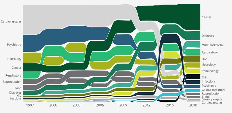
  • Bloomberg News writes about drug prices.  Their point is expensive cancer drugs, but their graph also shows how drugs for heart disease have become much, much less expensive as they go off patent (the light-grey area)
  • Census 2018 small-area data now available.  These go down to SA1, the smallest area unit for published results now.  About two-thirds of SA1s are a single meshblock, but some are multiple meshblocks to get the population size higher. Read the footnotes (always, but especially with the 2018 census)
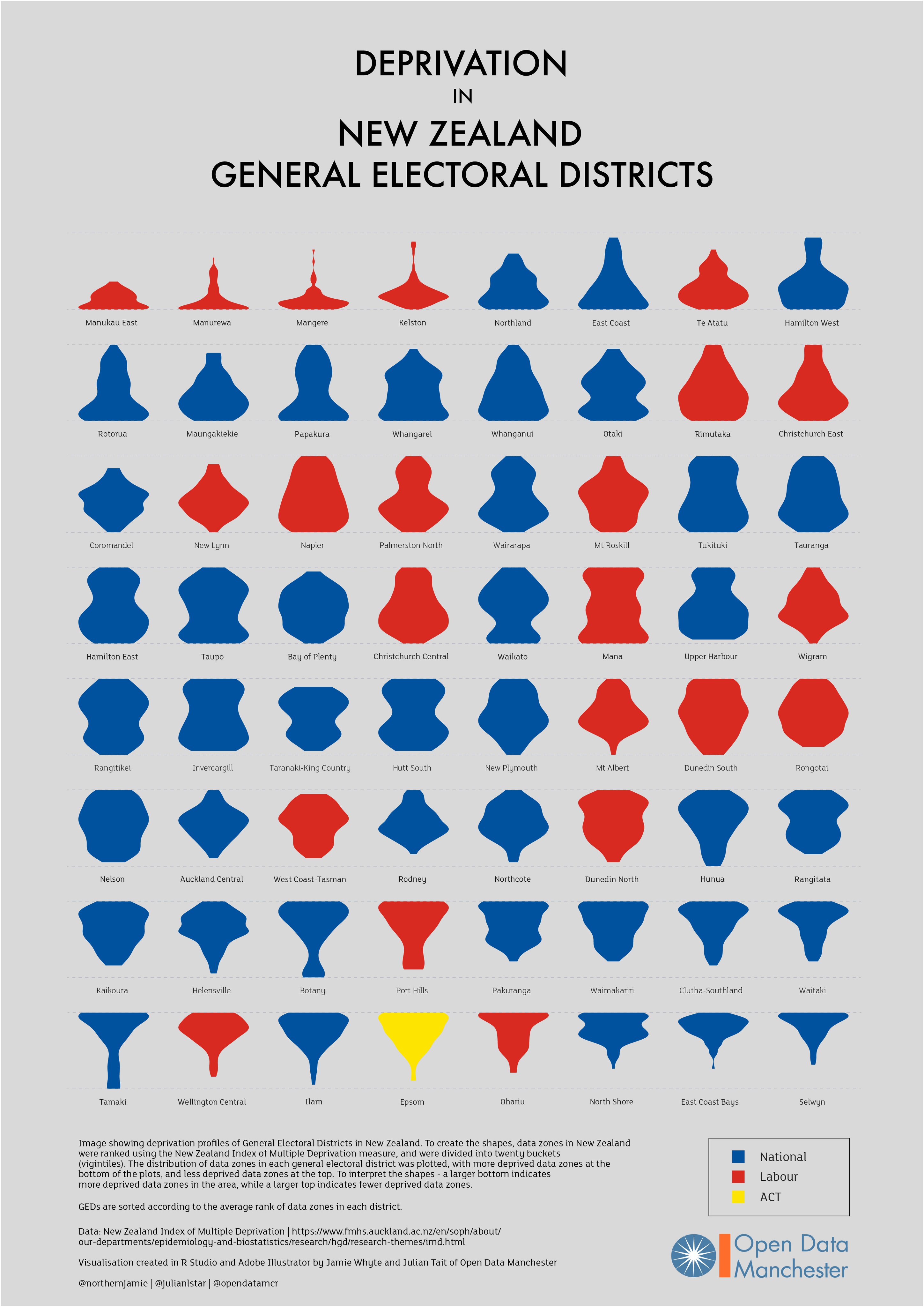
  • Jamie Whyte of Open Data Manchester has extended his inequality graphs to NZ (click to embiggen). Each blob shows a general electorate, and the width of the blob shows the proportion of people at various levels of the Index of Multiple Deprivation. So, for example, Manurewa is mostly high-deprivation, Selwyn (bottom right) is low. In the middle of the graphic, Hutt South and New Plymouth have opposite shapes: one has most people in the middle, the other has more people at the bottom and the top. There are two important caveats here compared to the UK version: this is based on everyone living in a general electorate regardless of which roll they are on, so it misses the Māori electoral roll and it misses the impact of List MPs.
  • Twitter thread from Peter Aldhous (of Buzzfeed), on DNA testing and media coverage over the past decade
  • NZ is still under-vaccinated for measles. At the moment there’s still a shortage of vaccine, but at some convenient point in the future you should make sure you’ve had your two shots.
  • Figure.NZ is seven years old — 44,000 graphs of NZ data
  • ‘Even if Kāinga Ora’s intentions were good, she was still concerned about “a creeping, increasing type of surveillance capacity being built … without mechanisms that allow communities to be really engaged in the process”‘.  Donna Cormack on the plans to put lots of sensors in state houses. There are obvious good uses of this sort of data, and bad uses, and the project would be better off with more information about how the data would be restricted to good uses (if that’s the plan).
December 12, 2019

Say something nice about a journalist

Alex Brae, who writes The Spinoff’s  daily news summary  (which you should sign up for), is having “Say something nice about a journalist” week.

As a site that mostly specialises in not saying nice things about journalists, we should probably do the same. Here’s a selection: I’ve probably forgotten some.

  • Kirsty Johnston has had a wide range of important stories this year, and is a good reason for subscribing to the Herald.
  • The Herald data journalism team: Chris Knox and Keith Ng (Keith also did some non-data-journalism in Hong Kong)
  • Jamie Morton, the Herald science reporter, has reported a lot of interesting and important science.
  • Farah Hancock has written some very good environmental and health stories for newsroom:  most recently, on the claims that a secret lab had found huge amounts of 1080 in some dead rats when Landcare didn’t, but also on pharmacies pushing homeopathic non-remedies, and on the measles outbreak
  • Eloise Gibson, also of newsroom, for her coverage of Sir Ray Avery and how some of his inventions are progressing and being evaluated, and for stories about radiata pine (big carbon sink) and about water-quality modelling
  • Joel MacManus had a very good piece at Stuff about algorithmic inputs to parole and sentencing
December 10, 2019

More misleading trends

There’s another badly-distorted bar chart being circulated, approved by Simon Bridges. It purports to show median rents in September 2017 and now.  I’m not actually going to reproduce the chart. Instead, look at this chart from interest.co.nz for the period covering the time since the 2011 election (the red line).

Over this time, rents have increased.  The trend is reasonably consistent, not far from 5.5%/year; it might be accelerating a bit.

The purple line shows the trend from September 2017 to now; you can see for yourself how it compares to the previous trend, and decide whether that’s good or bad, and who is to blame.  Presenting just the purple line, without the context, would clearly be a bit misleading.

The green line shows the trend from September 2017 to now more as the latest National Party bar chart depicts it: the bar corresponding to current rents is 39% longer than the bar corresponding to 2017 rents, which would be correct if the current median rent were $556.  Presenting the green line as the trend is more than a bit misleading.

(PS: I don’t want to get heavily into the political fact-checking business, but if the other parties are circulating graphs like these ones I’d be happy annoyed enough to write about them, too)

December 5, 2019

Graphical inflation

Multiple people have pointed me to this picture, authorised by Simon Bridges.

It’s designed to look like a barchart, but if it were a barchart the dimensions of the colored bits would have a closer quantitative relation to the numbers being displayed. I’m going to assume the numbers are correct, because that’s the sort of thing people are more careful about. The bars aren’t.

To start with, the red bar is wider than the blue bar, which is a well-known graphical exaggeration technique. But that’s not the real problem. The real problem is the heights.

On my laptop screen, I measured the red bar as 61% higher than the blue bar. But $2.23/L is only 16% higher than $1.91/L: that’s nearly a four-fold exaggeration of the difference

The dark red ‘Tax’ section of the red bar is 92% higher than the dark blue ‘Tax’ section of the blue bar, but $1.12 is only 29% higher than $0.87: more than a three-fold exaggeration.

If the heights were proportional to the numbers, as in a real barchart, it would look like this:

But wait, there’s more!  The blue bar is averaged over nine years of National government; the red bar is from last week.  That means the difference between the blue and red bars is partly inflation.  Over the time since September 2008, the RBNZ calculator says there has been 18% inflation.  We could say, as a rough approximation, that the data spread over nine years should get half the inflation applied.  Doing this would wipe out about half the difference between the blue and red bars, to give a comparison like this one:

There has been an increase in petrol prices due to tax increases under Labour. It’s not anywhere near as big as National’s graphic implies.

Curl up and dye

Q: Did you see that a harrowing study of 46,000 women shows hair dyes are heavily associated with cancer?

A: Harrowing?

Q: According to FastCompany.

A: That’s just the headline, though.

Q: “You know how you don’t see very old people with dyed hair? There may be a reason for that: Hair dye is heavily associated with cancer.”

A: That would be a heavy association.

Q: So is it true? There’s a link, even.

A: “We observed a 9% higher breast cancer risk for permanent dye use in all women but little to no associated risk for semipermanent or temporary dye use.”

Q: That’s… not as harrowing as I expected. Would that kill off a big fraction of hair-dye users?

A: Well, not very many men. For women the lifetime risk, which is the cumulative risk by the time you’re ‘very old’, is about 1 in 8. Increasing that by 9% would be about one extra breast cancer case per hundred hair-dye users.

Q:  So that’s not why very old people don’t use hair dye

A: There are probably other factors in play, yes.

Q: It’s just breast cancer, though. What about the effect on other cancers?

A: They didn’t look.  They mostly expected a risk on breast cancer, because of theories about ‘estrogen disruption’.

Q:  The story says the effects are bigger in Black women.

A: It looks like they probably are, though there’s a lot of uncertainty because Black women were only 10% of the study.

Q: Nothing about hair dye in men?

A: It was a study of sisters of people with breast cancer, so no men.

Q: Also too, no generalisability?

A: It’s not quite that bad, but, yes, it’s not clear how well this generalises. It could be that these women are more susceptible to hair dyes. Or not.

Q: What did previous research find?

A: It’s mixed. A big study in Black women in the 1990s didn’t find an association, but another current study did.

Q: So do we believe it?

A: We aren’t Black women who use hair dye. On several counts.

Q:

A: It certainly could be true, but the evidence isn’t overwhelming.


December 3, 2019

Pro14 Predictions for Round 8

Team Ratings for Round 8

The basic method is described on my Department home page.
Here are the team ratings prior to this week’s games, along with the ratings at the start of the season.

Current Rating Rating at Season Start Difference
Leinster 15.04 12.20 2.80
Munster 8.80 10.73 -1.90
Glasgow Warriors 7.35 9.66 -2.30
Ulster 3.02 1.89 1.10
Edinburgh 2.70 1.24 1.50
Connacht 2.60 2.68 -0.10
Scarlets 2.38 3.91 -1.50
Cheetahs 0.90 -3.38 4.30
Cardiff Blues 0.82 0.54 0.30
Ospreys -1.29 2.80 -4.10
Treviso -2.33 -1.33 -1.00
Dragons -10.07 -9.31 -0.80
Southern Kings -13.18 -14.70 1.50
Zebre -16.74 -16.93 0.20


Performance So Far

So far there have been 49 matches played, 38 of which were correctly predicted, a success rate of 77.6%.
Here are the predictions for last week’s games.

Game Date Score Prediction Correct
1 Munster vs. Edinburgh Nov 30 16 – 18 13.80 FALSE
2 Ulster vs. Scarlets Nov 30 29 – 5 5.80 TRUE
3 Treviso vs. Cardiff Blues Dec 01 28 – 31 4.70 FALSE
4 Connacht vs. Southern Kings Dec 01 24 – 12 23.30 TRUE
5 Dragons vs. Zebre Dec 01 12 – 39 15.70 FALSE
6 Ospreys vs. Cheetahs Dec 01 13 – 18 5.20 FALSE
7 Glasgow Warriors vs. Leinster Dec 01 10 – 23 -0.10 TRUE


Predictions for Round 8

Here are the predictions for Round 8. The prediction is my estimated expected points difference with a positive margin being a win to the home team, and a negative margin a win to the away team.

Game Date Winner Prediction
1 Leinster vs. Ulster Dec 21 Leinster 17.00
2 Zebre vs. Treviso Dec 22 Treviso -9.40
3 Connacht vs. Munster Dec 22 Munster -1.20
4 Dragons vs. Scarlets Dec 22 Scarlets -7.40
5 Glasgow Warriors vs. Edinburgh Dec 22 Glasgow Warriors 9.70
6 Ospreys vs. Cardiff Blues Dec 22 Ospreys 2.90


Rugby Premiership Predictions for Round 6

Team Ratings for Round 6

The basic method is described on my Department home page.
Here are the team ratings prior to this week’s games, along with the ratings at the start of the season.

Current Rating Rating at Season Start Difference
Saracens 9.03 9.34 -0.30
Exeter Chiefs 7.26 7.99 -0.70
Northampton Saints 2.63 0.25 2.40
Sale Sharks 1.04 0.17 0.90
Gloucester 0.76 0.58 0.20
Bath -0.23 1.10 -1.30
Bristol -0.81 -2.77 2.00
Harlequins -1.40 -0.81 -0.60
Worcester Warriors -1.88 -2.69 0.80
Wasps -2.15 0.31 -2.50
London Irish -3.83 -5.51 1.70
Leicester Tigers -4.19 -1.76 -2.40


Performance So Far

So far there have been 30 matches played, 23 of which were correctly predicted, a success rate of 76.7%.
Here are the predictions for last week’s games.

Game Date Score Prediction Correct
1 Bath vs. Saracens Nov 30 12 – 25 -3.70 TRUE
2 Exeter Chiefs vs. Wasps Dec 01 38 – 3 11.60 TRUE
3 Northampton Saints vs. Leicester Tigers Dec 01 36 – 13 9.90 TRUE
4 Worcester Warriors vs. Sale Sharks Dec 01 20 – 13 0.80 TRUE
5 Bristol vs. London Irish Dec 02 27 – 27 8.50 FALSE
6 Harlequins vs. Gloucester Dec 02 23 – 19 2.00 TRUE


Predictions for Round 6

Here are the predictions for Round 6. The prediction is my estimated expected points difference with a positive margin being a win to the home team, and a negative margin a win to the away team.

Game Date Winner Prediction
1 Gloucester vs. Worcester Warriors Dec 21 Gloucester 7.10
2 Leicester Tigers vs. Exeter Chiefs Dec 22 Exeter Chiefs -7.00
3 Sale Sharks vs. Northampton Saints Dec 22 Sale Sharks 2.90
4 Saracens vs. Bristol Dec 22 Saracens 14.30
5 Wasps vs. Harlequins Dec 22 Wasps 3.80
6 London Irish vs. Bath Dec 23 London Irish 0.90


November 21, 2019

What do statisticians do all day?

From the student dissertation talks this week

  • Toward Modeling of Disease Transmission Networks (E. coli in Germany)
  • Real Time Bus Headway Estimation in Auckland, New Zealand (the last bus was on time but your bus is late)
  • Survival Analysis of Guinea pigs with dental diseases (worse than you think)
  • Sample Path Behaviour of Accumulating Priority Queues
  • Comparison of the Bayesian and Simple Model for Estimations
  • Finding Periodic Climate Cycles in a Mud Core (we can’t see the sunspot cycle; we have a sad)
  • Optimal Sample Allocation for Estimating Regression Parameters (if it’s optimal for one purpose it won’t be for others)
  • Queue Mining — Online Delay Prediction
  • Enabling Text Analytics (simpler software)
  • Systematic Error Removal using Random Forests (in metabolomics)
  • Tracking of Dietary Patterns as Children Grow Up
  • Exploration of the Effects of a Text-MessageBased Diabetes Self-Management Support Programme (it works!)
  • A Study of Ticketing Prediction in the Events Industry (they didn’t give us the right data)
  • Anomaly Detection in Business Transactions UsingSupervised and— Unsupervised Methods (Fraud, we haz it)
  • Designing for a conceptual understanding of the Mean and Standard Deviation
  • Detecting Ecological Change along Environmental Gradients (for critters that live near the shore)
  • Identifying the Best Predictors for Power Demand Across Auckland
  • Automatic Identification of Patient Smoking Status based on Unstructured Clinical Notes (you’d think doctors would just say ‘smoker’. Sadly, no)
  • Visualization of Network Data (ooh, pretty)
  • Brownian Motions and Excursions
  • New methods for estimating population size based on close-kin genetics and extensions (Whales and inbreeding and population size)
  • An Examination of the Relationship between Student Engagement and Academic Achievement (it looks like lectures and tutorials are useful, but confounding)
November 19, 2019

Test for breast cancer?

Newshub (and a lot of the British press) reported a couple of weeks ago “New blood test could detect breast cancer five years before symptoms“.

There’s a problem. Well, more than one problem.

First, the accuracy of the test is terrible.  It missed the majority of cancers and falsely diagnoses about twenty percent of the normal samples as having cancer.  There’s no way anyone would use a test like that.

Second, the story says “They estimate that, with a fully-funded development programme, the test might become available in the clinic in about four-to-five years.” If they had a working test, that might be true. But they don’t. So it isn’t.

And finally, all the breast cancer samples were taken from people who had already been diagnosed, so the idea that you’ll get early diagnosis this way is, at best, hopeful.


Briefly

  • ‘For example, the tweet “I saw him yesterday” is scored as 6 per cent toxic, but it suddenly skyrockets to 95 per cent for the comment “I saw his ass yesterday”.‘  The Register, talking about a paper from the University of Washington
  • “Long-awaited cystic fibrosis drug could turn deadly disease into a manageable condition”. From the Washington Post. However, this drug will be priced at about NZ$485,000 for one year.  At that price, treating 500 people would cost about as much as Pharmac’s top six drugs, or as much as Pharmac currently spends on all cancer drugs. So let’s hope Pharmac can get a good deal.
  • Janelle Shane, optical physicist and AI humorist, has written a book about AI. The title is one of a set of machine-generated pickup lines. “You Look Like a Thing and I Love You”
  • “The goals of the advertising business model do not always correspond to providing quality search to users….we believe the issue of advertising causes enough mixed incentives that it is crucial to have a competitive search engine that is transparent and in the academic realm.” The interesting part of this quote is the source: Page L, Brin S (1998) “The Anatomy of a Large-Scale Hypertextual Web Search Engine” (via Slate Money)