Posts filed under Surveys (188)

April 2, 2014

Census meshblock files: all the datas

Statistics New Zealand has just released the meshblock-level data from last year’s Census, together with matching information for the previous two censuses (reworked to use the new meshblock boundaries).

Mashblock shows one thing that can be built with this sort of data, there are many others.

Get your meshblock files here

Drug use trends

There’s an interesting piece in Stuff about Massey’s Illegal Drug Monitoring System. I’d like to make two points about it.

First, the headline is that synthetic cannabis use is declining. That’s good, but it’s in a survey of frequent users of illegal drugs.  If you have the contacts and willingness to buy illegal drugs, it isn’t surprising that you’d prefer real cannabis to the synthetics — there seems to be pretty universal agreement that the synthetics are less pleasant and more dangerous.  This survey won’t pick up trends in more widespread casual use, or in use by teenagers, which are probably more important.

Second, the study describes the problems caused by much more toxic new substitutes for Ecstacy and LSD. This is one of the arguments for legalisation. On the other hand, they are also finding increased abuse of prescription oxycodone. This phenomenon, much more severe in the US, weakens the legalisation argument somewhat.  Many people (including me) used to believe, based on reasonable evidence, that a substantial fraction of the adverse health impact of opioid addiction was due to the low and unpredictably-varying purity of street drugs, and that pure, standardised drugs would reduce overdoses. As Keith Humphreys describes, this turns out not to be the case.


March 25, 2014

Political polling code

The Research Association New Zealand  has put out a new code of practice for political polling (PDF) and a guide to the key elements of the code (PDF)

The code includes principles for performing a survey, reporting the results, and publishing the results, eg:

Conduct: If the political questions are part of a longer omnibus poll, they should be asked early on.

Reporting: The report must disclose if the questions were part of an omnibus survey.

Publishing: The story should disclose if the questions were part of an omnibus survey.

There is also some mostly good advice for journalists

  1. If possible, get a copy of the full poll  report and do not rely on a media release.
  2. The story should include the name of the company which conducted the poll, and the client the poll was done for, and the dates it was done.
  3.  The story should include, or make available, the sample size, sampling method, population sampled, if the sample is weighted, the maximum margin of error and the level of undecided voters.
  4. If you think any questions may have impacted the answers to the principal voting behaviour question, mention this in the story.
  5. Avoid reporting breakdown results from very small samples as they are unreliable.
  6. Try to focus on statistically significant changes, which may not just be from the last poll, but over a number of polls.
  7. Avoid the phrase “This party is below the margin of error” as results for low polling parties have a smaller margin of error than for higher polling parties.
  8.  It can be useful to report on what the electoral results of a poll would be, in terms of likely parliamentary blocs, as the highest polling party will not necessarily be the Government.
  9. In your online story, include a link to the full poll results provided by the polling company, or state when and where the report and methodology will be made available.
  10. Only use the term “poll” for scientific polls done in accordance with market research industry approved guidelines, and use “survey” for self-selecting surveys such as text or website surveys.

Some statisticians will disagree with the phrasing of point 6 in terms of statistical significance, but would probably agree with the basic principle of not ‘chasing the noise’

I’m not entirely happy with point 10, since outside politics and market research, “survey” is the usual word for scientific polls, eg, the New Zealand Income Survey, the Household Economic Survey, the General Social Survey, the National Health and Nutrition Examination Survey, the British Household Panel Survey, etc, etc.

As StatsChat readers know, I like the term “bogus poll” for the useless website clicky surveys. Serious Media Organisations who think this phrase is too frivolous could solve the problem by not wasting space on stories about bogus polls.

On a scale of 1 to 10

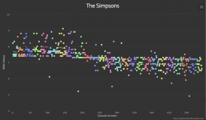
Via @neil_, an interactive graph of ratings for episodes of The Simpsons

simpsons


This comes from graphtv, which lets you do this for all sorts of shows (eg, Breaking Bad, which strikingly gets better ratings as the season progresses, then resets)

The reason the Simpsons graph has extra relevance to StatsChat is the distinctive horizontal line.  For the first ten seasons an episode basically couldn’t get rated below 7.5, after that it basically couldn’t rated above 7.5.   In the beginning there were ‘typical’ episodes and ‘good’ episodes; now there are ‘typical’ episodes and ‘bad’ episodes.

This could be a real change in quality, but it doesn’t match up neatly with the changes in personnel and style.  It could be a change in the people giving the ratings, or in the interpretation of the scale over time. How could we tell? One clue is that (based on checking just a handful of points) in the early years the high-rating episodes were rated by more people, and this difference has vanished or even reversed.

March 20, 2014

Beyond the margin of error

From Twitter, this morning (the graphs aren’t in the online story)

Now, the Herald-Digipoll is supposed to be a real survey, with samples that are more or less representative after weighting. There isn’t a margin of error reported, but the standard maximum margin of error would be  a little over 6%.

There are two aspects of the data that make it not look representative. Thr first is that only 31.3%, or 37% of those claiming to have voted, said they voted for Len Brown last time. He got 47.8% of the vote. That discrepancy is a bit larger than you’d expect just from bad luck; it’s the sort of thing you’d expect to see about 1 or 2 times in 1000 by chance.

More impressively, 85% of respondents claimed to have voted. Only 36% of those eligible in Auckland actually voted. The standard polling margin of error is ‘two sigma’, twice the standard deviation.  We’ve seen the physicists talk about ‘5 sigma’ or ‘7 sigma’ discrepancies as strong evidence for new phenomena, and the operations management people talk about ‘six sigma’ with the goal of essentially ruling out defects due to unmanaged variability.  When the population value is 36% and the observed value is 85%, that’s a 16 sigma discrepancy.

The text of the story says ‘Auckland voters’, not ‘Aucklanders’, so I checked to make sure it wasn’t just that 12.4% of the people voted in the election but didn’t vote for mayor. That explanation doesn’t seem to work either: only 2.5% of mayoral ballots were blank or informal. It doesn’t work if you assume the sample was people who voted in the last national election.  Digipoll are a respectable polling company, which is why I find it hard to believe there isn’t a simple explanation, but if so it isn’t in the Herald story. I’m a bit handicapped by the fact that the University of Texas internet system bizarrely decides to block the Digipoll website.

So, how could the poll be so badly wrong? It’s unlikely to just be due to bad sampling — you could do better with a random poll of half a dozen people. There’s got to be a fairly significant contribution from people whose recall of the 2013 election is not entirely accurate, or to put it more bluntly, some of the respondents were telling porkies.  Unfortunately, that makes it hard to tell if results for any of the other questions bear even the slightest relationship to the truth.


March 18, 2014

Three fifths of five eighths of not very much at all

The latest BNZ-REINZ Residential Market Survey is out, and the Herald has even embedded the full document in their online story, which is a very promising change.

According to the report 6.4% of homes sales in March are  to off-shore buyers, 25% of whom were Chinese. 25% of 6.4% is 1.6%.

If you look at real estate statistics (eg, here) for last month you find 6125 residential sales through agents across NZ. 25% of 6.4% of 6125 is 98. That’s not a very big number.  For context, in the most recent month available, about 1500 new dwellings were consented.

You also find, looking at the real estate statistics, that last month was February, not March.  The  BNZ-REINZ Residential Market Survey is not an actual measurement, the estimates are averages of round numbers based on the opinion of real-estate agents across the country.  Even if we assume the agents know which buyers are offshore investors as opposed to recent or near-future immigrants (they estimate 41% of the foreign buyers will move here), it’s pretty rough data. To make it worse, the question on this topic just changed, so trends are even harder to establish.

That’s probably why the report said in the front-page summary “one would struggle, statistically-speaking, to conclude there is a lift or decline in foreign buying of NZ houses.”

The Herald  boldly took up that struggle.

March 4, 2014

What you don’t know

The previous post was about the failure of the ‘deficiency model’ of communication, which can be caricatured as the idea that people who believe incorrect things just need knowledge pills.

Sometimes, though, information does help. A popular example is that providing information to university students about the actual frequency of binge drinking, drug use, etc, can reduce their perception that ‘everyone is doing it’ and reduce actual risky  behaviour.

So, it’s interesting to see these results from a US survey about same-sex marriage

Regular churchgoers (those who attend at least once or twice a month), particularly those who belong to religious groups that are supportive of same-sex marriage, are likely to over- estimate opposition for same-sex marriage in their churches by 20 percentage points or more.

  • „„About 6-in-10 (59%) white mainline Protestants believe their fellow congregants are mostly opposed to same-sex marriage. However, among white mainline Protestants who attend church regularly, only 36% oppose allowing gay and lesbian people to legally marry while a majority (57%) actually favor this policy.
  • Roughly three-quarters (73%) of Catholics believe that most of their fellow congregants are opposed to same-sex marriage. However, Catholics who regularly attend church are in fact divided on the issue (50% favor, 45% oppose).

For survey nerds, the sampling methodology and complete questionnaire are also linked from that web page.

February 16, 2014

Most young Americans think astronomy is science

And they’re right.

The problem is they don’t know the difference between the words “astronomy” and “astrology”. So we get survey results like this,

A study released by the National Science Foundation finds nearly half of all Americans feel astrology—the belief that there is a tie between astrological events and human experiences—is “very” or “sort of” scientific. Young adults are even more prone to believe, with 58% of 18- to 24-year-olds saying it is a science.

Richard N. Landers, a psychologist in Virginia, thought the name confusion might be responsible, and ran a survey using Amazon’s Mechanical Turk, where you pay people to do simple tasks.  He asked people to define astrology and then to say whether they thought it was scientific.

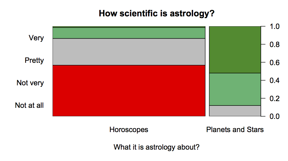
What he found, is shown in this graph based on his data

astro


People who think astrology is about horoscopes and predicting the future overwhelming don’t think it’s scientific — about 80% are in the ‘no’, and ‘hell, no’ categories. People who think astrology is about the solar system and stars  think it is pretty scientific or very scientific.

The data isn’t perfect — it’s from a much less representative sample than the NSF used — but there’s a very strong indication that confusion between “astronomy” and”astrology” could explain the otherwise depressing results of the NSF survey.


(via @juhasaarinen)

February 15, 2014

I only drink it for the pictures

Stuff has a story about differences in coffee preference between regions of NZ.

A customer survey published yesterday confirms the capital has the country’s biggest coffee snobs – almost three in four will choose an expensive brew over a less tasty one every time.

They don’t give enough information to work out how big the differences are, or how they compare to the uncertainty in the survey.

There’s slightly more information in the press release — still no uncertainty, but we are told that the figure is 72% for Wellington and 67% for the country as a whole. Not a terribly impressive difference, and almost certainly the survey isn’t large enough to be able to tell which region is really highest. Fortunately, it’s not a question where the true answer matters.

You have to go to the Canstar Blue site to find that the survey population isn’t Kiwis in general, or even coffee-drinkers, but people who have been to a chain coffee store at least once in the past six months.

Interestingly, although 17% to 33% of people (varying between regions) consider coffee alone to qualify as breakfast, only 10% to 14% say they drink coffee for the caffeine.

Yeah, right.

February 14, 2014

Interpreted with caution

There’s a new paper in The Lancet, summarising population-based surveys across the world that asked about non-partner sexual violence. The paper’s conclusion, from the abstract

Sexual violence against women is common worldwide, with endemic levels seen in some areas, although large variations between settings need to be interpreted with caution because of differences in data availability and levels of disclosure.

The story in Stuff has the headline Sexual assaults more than double world average, and starts

The rate of sexual assault in Australia and New Zealand is more than double the world average, according to a new report.

After several highly publicised rapes and murders of young women in India and South Africa, researchers from several countries  decided to review and estimate prevalence of sexual violence against women in 56 countries.

The results, published in the UK medical journal The Lancet, found that 7.2 per cent of women aged 15 years or older  reported being sexually assaulted by someone other than an intimate  partner at least once in their lives.

The study found that Australia and New Zealand has the third-highest rate, more than double the world average, with 16.4  per cent.

If you look at the raw numbers reported in the paper, they showed Australia/NZ at about ten times the rate of the Caribbean or southern Latin America or Eastern Europe, which is really not plausible. Statistical adjustment for differing types of survey reduced that margin, but as the researchers explicitly and carefully point out, a lot of the variation between regions could easily be due to variations in disclosure, and it suggests that rape is being underestimated in some areas.

As usual with extreme international comparisons, the headline is both probably wrong and missing the real point. The real point is that roughly one in six women in Australia & NZ report having experienced sexual violence.