Posts filed under Surveys (188)

October 12, 2014

Unofficially over arithmetic

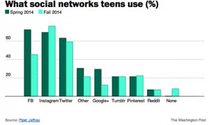
From the Herald (from the Washington Post), under the headline “Teens are officially over Facebook” (yes, officially)

Now, a pretty dramatic new report out from Piper Jaffray – an investment bank with a sizable research arm – rules that the kids are over Facebook once and for all, having fled Mark Zuckerberg’s parent-flooded shores for the more forgiving embraces of Twitter and Instagram.

This is based on a survey by Piper Jaffray, of 7200 people aged 13-19, (in the US, though the Herald doesn’t say that).

It looks as though US teens are leaving Facebook, but they sure aren’t flocking to Twitter, or, really, to Instagram. If you go to a story that gives the numbers, you see that reported Facebook use has fallen 27 percentage points. Instagram has risen only 7 percentage points, and Twitter has fallen by 4.
 fb1

So, where are they going? They aren’t giving up on social media entirely — although “None” category wasn’t asked the first time around, it’s only 8 percent in the second survey.  It’s possible that teens are cutting down on the number of social media networks they use, but it seems more likely that the question was badly designed. Even I can think of at least one major site that isn’t on the list, Snapchat, which globalwebindex thinks is used by 42% of US internet-connected 16-19 year olds.

Incidentally: those little blue letters that look like they should be a link? They aren’t on the Herald site either, and on the Washington Post site they link to a message that basically says “no, not for you.”
October 8, 2014

What are CEOs paid; what should they be paid?

From Harvard Business Review, reporting on recent research

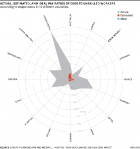
Using data from the International Social Survey Programme (ISSP) from December 2012, in which respondents were asked to both “estimate how much a chairman of a national company (CEO), a cabinet minister in a national government, and an unskilled factory worker actually earn” and how much each person should earn, the researchers calculated the median ratios for the full sample and for 40 countries separately.

The graph:

actualestimated


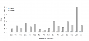
The radial graph exaggerates the differences, but they are already huge. Respondents dramatically underestimated what CEOs are actually paid, and still thought it was too much.  Here’s a barchart of the blue and grey data (the red data seems to only be available in the graph). Ordering by ideal pay ratio (rather than alphabetically) helps with the nearly-invisible blue bars: it’s interesting that Australia has the highest ideal ratio.

ceo

The findings are a contrast to foreign aid budgets, where the desired level of expenditure is less than the estimated level, but more than the actual level.  On the other hand, it’s less clear exactly what the implications are in the CEO case.


September 29, 2014

Stealth advertising survey

Stuff has a story that at first glance seems to be about baldness:

There are more men suffering hair loss in Auckland than anywhere in the country, with 42 per cent of those who live in the Super City thinning or completely bald.

In contrast, the hairiest region is Canterbury, where men are more rugged and sport glowing locks. Just 27 per cent of Canterbury men admit to suffering any hair loss.

We aren’t told the sample size or margin of error — if the survey was of 1000 people, you’d expect to get that sort of variation between the highest and lowest regions by chance.

I haven’t been able to find any more detailed results anywhere, but the important part of the story is actually in the next sentence

The headlining Colmar Brunton poll, commissioned by SRS Hair Clinic and released this week, surveyed men aged between 25 and 50.

That is, the point of this survey is to advertise a hair clinic (which sells a hair tonic that claims 100% Natural Ingredients and Zero Side Effects)


August 13, 2014

When are self-selected samples worth discussing?

From recent weeks, three examples of claims from self-selected samples:

In all three cases, you’d expect the pattern to generalise to some extent, but not quantitatively. The dating site in question specifically boasts about the non-representativeness of its members; the NZAS survey was sent to people who’d be likely to care, and there wasn’t much time to respond; scientists who had experienced or witnessed harassment would be more likely to respond and to pass the survey along to others.

I think two of these are worth presenting and discussing, and the other one isn’t, and that’s not just because two of them agree with my political prejudices.

The key question to ask when looking at this sort of probably non-representative sample, is whether the response you see would still be interesting if no-one outside the sample shared it. That is, the surveys tell us at a minimum

  • there exist 350 women in New Zealand who wouldn’t marry a man earning less than them, and are prepared to say so
  • there exist 200-odd scientists in NZ who think the National Science Challenges were badly chosen or conducted, and are prepared to say so
  • there exist 417 scientists who have experienced verbal sexual harassment, and 139 who have experienced unwanted physical contact from other research staff during fieldwork, and are prepared to say so.

I would argue that the first of these is completely uninteresting, but the second is contrary to the impressions being given by the government, and the third should worry scientists who participate in or organise fieldwork.


August 6, 2014

Income statistics

The Herald has a story headlined “Where to work if it’s money you’re after,” giving estimated median incomes across a range of job areas.  Sadly, if you read to the end, two of the sources are summaries of advertised salaries for advertised jobs on Seek and TradeMe.  That is, they are neither actual incomes, nor for the country as a whole.

Rather than just whinge about unrepresentative data, I looked at StatsNZ. They divide things up differently, so there was only one job group in the story that exactly matched one on NZ.Stat. People working in construction have a median weekly income of $840 and mean weekly income of $956 according to the NZ Income Survey. If most people in construction worked all year, without periods of unemployment, this would come to a median annual income of  $43,680 or a mean of $49,712.

The Herald thinks the median annual income in construction is $60,000-$78,000.


July 24, 2014

Infographic of the month

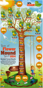
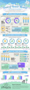
Alberto Cairo and wtfviz.net pointed me to the infographic on the left, a summary of a residents’ survey from the town of Flower Mound, Texas (near Dallas/Fort Worth airport). The highlight of the infographic is the 3-D piecharts nesting in the tree, ready to hatch out into full-fledged misinformation.

At least, they look like 3-D pie charts at first glance.  When you look more closely, the data are three-year trends in approval ratings for a variety of topics, so pie charts would be even more inappropriate than usual as a display method.  When you look even more closely, you see that that’s ok, because the 3-D ellipses are all just divided into three equal wedges — the data aren’t involved at all.

flower_mound 2014 Citizen Survey Infographic_201407151504422733

The infographic on the right comes from the town government.  It’s much better, especially by the standards of infographics.

If you follow the link, you can read the full survey results, and see that the web page giving survey highlights actually describes how the survey was done — and it was done well.  They sent questionnaires to a random sample of households, got a 35% response rate (not bad, for this sort of thing) and reweighted it based on age, gender, and housing tenure (ie rent, own, etc) to make it more representative.  That’s a better description (and a better survey) than a lot of the ones reported in the NZ media.


[update: probably original, higher resolution version, via Dave Bremer.]

June 25, 2014

Not even wrong

The Readers’ Digest “Most Trusted” lists are out again. Sigh.

Before we get to the actual complaint in Stat-of-the-Week recommendation, we should acknowledge that there’s no way the “most trusted” list could make sense.

Firstly, ‘trusted’ requires more detail. What is it that we’re trusting these people with? Of course, it wouldn’t help making the question more specific, since people will still answer on some vague ‘niceness’ scale anyway: we saw this problem with a Herald poll at the beginning of the year, which asked opinions about five notable people and found the only one notable for his commitment to animal safety had the lowest rating for “who would you trust to feed your cat?”. Secondly, there’s no useful way to get an accurate rating of dozens of people (or other items) in an opinion poll. People’s brains overload. Thirdly, even if you could get a rating from each respondent, the overall ranking will be sensitive to how you combine the individual ratings.

So how does Readers’ Digest do it? They say (shouting in the original)

READER’S DIGEST COMMISSIONED CATALYST CONSULTANCY & RESEARCH TO POLL A REPRESENTATIVE SAMPLE OF NEW ZEALANDERS ABOUT TRUSTED PEOPLE AND PROFESSIONS. A TOTAL OF 603 ADULTS RANKED 100 WELL-KNOWN PEOPLE AND 50 JOB TYPES ON A SCALE OF ONE TO TEN IN MARCH 2014.

That is, the list is determined in advance, and the polling just addresses the ordering on the list. There is some vague sense in which Willie Apiata is the most trusted person,  or at least the most highly-regarded person, or at least the most highly-regarded famous person, in New Zealand but there really isn’t any useful sense in which Hone Harawira is the least trusted person in New Zealand. There are many people in NZ who you’d expect to be less trusted than Mr Harawira; they didn’t get put on the list, and the survey respondents weren’t asked about them.

It’s not surprising that stories keep coming out about this list, and I suppose it’s not surprising that people try to interpret being on the bottom of the list. Perhaps more surprising, no-one has yet complained that there are actually 101 well-known people, not 100, on the list.

June 9, 2014

Chasing factoids

The Herald says

Almost four in 10 young UK adults describe themselves as digital addicts, according to research published by Foresters, the financial services company.

The story does quote an independent expert who is relatively unimpressed with the definition of ‘digital addict’, but it doesn’t answer the question ‘what sort of research?”

Via Google, I found a press release of a digital addiction survey promoted by Foresters. It’s not clear if the current story is based on a new press release from this survey or a new version of the survey, but the methodology is presumably similar.

So, what is the methodology?

Over 1,100 people across the UK responded to an online survey in November 2013 , conducted by Wriglesworth Research

There’s also a related press release from Wriglesworth, but without any more methodological detail. If I Google for “wriglesworth survey”, this is what comes up

wriglesworth

That is, the company is at least in the habit of conducting self-selected online polls, advertised on web forums and Twitter.

I tried, but I couldn’t find any evidence that the numbers in this online survey were worth the paper they aren’t written on.

May 16, 2014

Smarter than the average bear

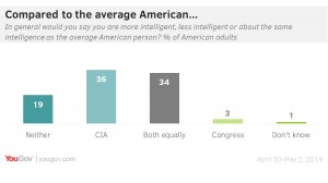
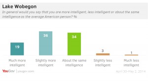
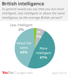
Online polling company YouGov asked people in the US and Britain about how their intelligence compared to other people.

For the US, the results were

usintel


They pulled that graph only seconds after I found it, and replaced it with the more plausible

intelligence2

The British appear to be slightly more reluctant that the Americans to say they’re smarter than average, though it would be unwise to assume they are less likely to believe it.


selfassess1-2

April 14, 2014

What do we learn from the Global Drug Use Survey?

drug


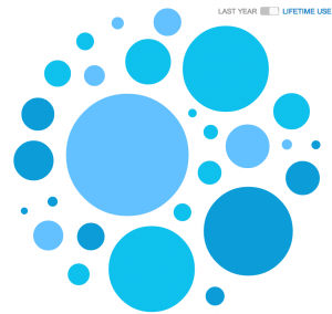
That’s the online summary at Stuff.  When you point at one of the bubbles it jumps out at you and tells you what drug it is. The bubbles make it relatively hard to compare non-adjacent numbers, especially as you can only see the name of one at a time. It’s not even that easy to compare adjacent bubbles, eg, the two at the lower right, which differ by more than two percentage points.

More importantly, this is the least useful data from the survey.  Because it’s a voluntary, self-selected online sample, we’d expect the crude proportions to be biased, probably with more drug use in the sample than the population. To the extent that we can tell, this seems to have happened: the proportion of past-year smokers is 33.5% compared to the Census estimate of 15% active smokers.  It’s logically possible for both of these to be correct, but I don’t really believe it.  The reports of cannabis use are much higher than the (admittedly out of date) NZ Alcohol and Drug Use Survey.  For this sort of data, the forthcoming drug-use section of the NZ Health Survey is likely to be more representative.

Where the Global Drug Use Survey will be valuable is in detail about things like side-effects, attempts to quit, strategies people use for harm reduction. That sort of information isn’t captured by the NZ Health Survey, and presumably it is still being processed and analysed.  Some of the relative information might be useful, too: for example, synthetic cannabis is much less popular than the real thing, with past-year use nearly five times lower.