Posts filed under Surveys (188)

February 7, 2016

Zombie bogus surveys

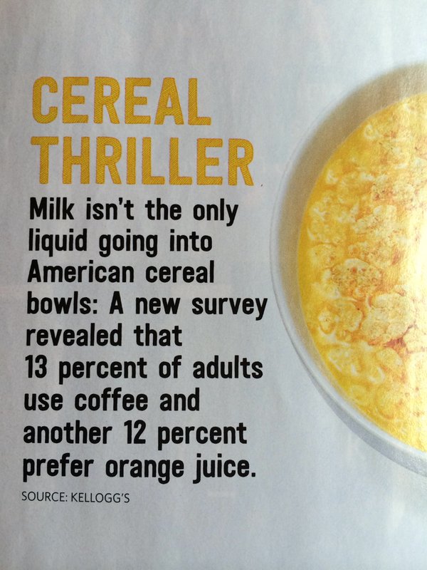
From Food Network magazine, via Twitter, via Julie Blommaert

Caj-ZOKUEAAr9vm

There’s no more detail than “Kellogg’s” as the source, and the Kellogg’s website is very sensibly not admitting to anything.

Some more Google finds two stories from September last year — getting the factoid into a real paper magazine, because of the publication time lag, gives it another chance to roam the earth looking for brains.

Even though it has to be the same survey, the story from Vice says “a full one-fifth of Americans are using orange juice in their cereal instead of milk,” though Bustle says “More than 10 percent of Americans admitted to using orange juice or coffee”.   It’s not just that the numbers are inconsistent, the phrasing in one case suggests “do you usually?” as the question, the other “have you ever?” It matters, or at least it would if anything about this mattered.

We’re also not told whether these are really supposed to be proportions of “Americans” or of “Americans who eat cereal”, or “Americans who eat cereal for breakfast”, or whatever.

Usefully, the Vice story does give a bit more detail about the survey

Two thousand US consumers and college students from all over the country participated in the study, with about 30 percent male subjects and 70 percent female. The participants were of all ages, with half being college students and the rest varied (14 percent between the ages of 25 and 34 years old, 16 percent between 35 and 44 years old, about a quarter between 45 and 54 years old, and the rest scattered in older or younger age groups). 

They don’t say how the participants were recruited or surveyed, but there’s enough information there to make it clear the data would be meaningless even if we knew what the questions were and what percentages the survey actually found.
January 15, 2016

When you don’t find any

The Icelandic Ethical Humanist Association commissioned a survey on religion. For people who don’t want to read the survey report (in PDF, in Icelandic), there’s a story at Iceland Magazine. The main point is in the headline: 0.0% of Icelanders 25 years or younger believe God created the world, new poll reveals.

That’s a pretty strong claim, so what did the survey actually do? Well, here you do need to read the survey report (or at least feed snippets of it to Google Translate). Of the people they sampled, 109 were in the lowest age category, which is ‘younger than 25’.  None of the 109  reported believing “God created the world” vs “The world was created in the Big Bang”.

Now, that’s not a completely clean pair of alternatives, since a fair number of people — the Pope, for example — say they believe both, but it’s still informative to some extent. So what can we say about sampling uncertainty?

A handy trick for situations like this one is the ‘rule of 3’.  If you ask N people and none of them is a creationist, a 95% confidence upper bound for the population proportion is 3/N. So, “fewer than 3% of Icelanders under 25 believe God created the world”

Who got the numbers, how, and why?

The Dominion Post has what I’m told is a front page story about school costs, with some numbers:

For children starting state school this year, the total cost, including fees, extracurricular activities, other necessities, transport and computers, by the time they finish year 13 in 2028 is estimated at $35,064 by education-focused savings trust Australian Scholarship Group.

That increases to $95,918 for a child at a state-integrated school, and $279,807 for private school.

Given that the figures involve extrapolation of both real cost increases and inflation thirteen years into the future, I’m not convinced that a whole-education total is all that useful. I would have thought estimates for a single year would be more easily interpreted.  However, that’s not the main issue.

ASG do this routinely. They don’t have the 2016 numbers on their website yet, but they do have last year’s version. Important things to note about the numbers, from that link:

ASG conducted an online education costs survey among its members during October 2013. The surveys covered primary and secondary school. In all, ASG received more than 1000 survey responses.

So, it’s a non-random, unweighted survey, probably with a low response rate, among people signed up for an education-savings programme. You’d expect it to overestimate, but it’s not clear how much. Also

Figures have been rounded and represent the upper ranges that parents can reasonably expect to pay

‘Rounded’ is good, even though they don’t actually show much sign of having been rounded. ‘Represent the upper ranges’ is a bit more worrying when there’s no indication of how this was done — and when the Dom Post didn’t include this caveat in their story.


November 22, 2015

Helpful context

From the Herald

A study by sleep experts at Sealy UK found that those who kip on the right-hand side of the mattress are far more pessimistic than those who doze on the left.


Neil Robinson, Sealy’s top snooze analyst, said: “The research certainly highlights an interesting trend ” could it be possible that the left side of bed is the ‘right’ side?


November 16, 2015

Measuring gender

So, since we’re having a Transgender Week of Awareness at the moment, it seems like a good time to look at how statisticians ask people about gender, and why it’s harder than it looks.

By ‘harder than it looks’ I don’t just mean that it isn’t a binary question; we’re past that stage, I hope.  Also, this isn’t about biological sex — in genetics I do sometimes care how many X chromosomes someone has, but most questionnaires don’t need to know. It’s harder than it looks because there isn’t just one question.

The basic Male/Female binary question can be extended in (at least) two directions.  The first is to add categories to represent other ways people identify their gender beyond just male/female, which can be fluid over time, or can have more than two categories. Here a write-in option is useful since you almost certainly don’t know all the distinctions people care about across different cultures. In a specialised questionnaire you might even want to separate out questions about fluid/constant identity from non-binary/diversity, but for routine use that might be more than you need.

A second direction is to ask about transgender status, which is relevant for discrimination and (or thus) for some physical and mental health risks.  (Here you might want also want to find out about people who, say, identify as female but present as male.) We have very little idea how many people are transgender — it makes data on sexual orientation look really precise — and that’s a problem for service provision and in many other areas.

Life would get simpler for survey collectors if you combined these into a single question, or if you had a Male/Female/It’s Complicated question with follow-up questions for the third group. On the other hand, it’s pretty clear why trans people don’t like that approach. These really are different questions. For people whose answer to the first question is something like “it depends” or a culturally specific third option, the combination may not be too bad. The problem comes when answer to the second type of question might be “Trans (and yes I sometimes get comments behind my back at work but most people are fine)”, but the answer to the first “Female (and just as female as people with ovaries and a birth certificate, ok)”.

Earlier this year Stats New Zealand ran a discussion and  had a go at a better gender question, and it is definitely better than the old one, especially when it allows for multiple answers and for a write-in answer. They also have a ‘synonym list’ to help people work with free-text answers, although that’s going to be limited if all it does is map back to binary or three-way groups. What they didn’t do was to ask for different types of information separately. [edit: ie, they won’t let you unambiguously say ‘female’ in an identity question then ‘trans’ in a different question]

It’s true that for a lot of purposes you don’t need all this information. But then, for a lot of purposes you don’t actually need to know anything about gender.

(via Writehanded and Jennifer Katherine Shields)

November 9, 2015

Inelegant variation

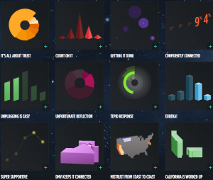
These graphs are from the (US) National Cable & Telecommunications Association (the cable guys)

cableguy

Apart from the first graph, they are based on five-point agree-disagree scales, and show the many ways you can make pie and bar charts more interesting, especially if you don’t care much about the data. I think my favourites are the bendy green barchart-orbiting-a-black-hole and the green rectangles, where the bars disagree with the printed numbers.

Since it’s a bogus poll, using the results basically to generate artwork is probably the right approach.

November 6, 2015

Failure to read small print

smallprint

This story/ad/column hybrid thing on the Herald site is making a good point, that people don’t read the detailed terms and conditions of things. Of course, reading the terms and conditions of things before you agree is often infeasible — I have read the Auckland Transport HOP card T&Cs, but I don’t reread them to make sure they haven’t changed every time I agree to them by getting on a bus, and it’s not as if I have much choice, anyway.  When the small print is about large sums of money, reading it is probably more important.

The StatsChat-relevant aspect, though is the figure of $1000 per year for failing to read financial small print, which seemed strange. The quote:

Money Advice Service, a government-backed financial help centre in the UK, claims failure to read the small print is costing consumers an average of £428 (NZ$978) a year. It surveyed 2,000 consumers and found that only 84 per cent bothered to read the terms and conditions and, of those that did, only 17 per cent understood what they had read.

Here’s the press release (PDF) from Money Advice Service.  It surveyed 3000 people, and found that 84 per cent claimed they didn’t read the terms and conditions.

The survey asked people how much they believed misunderstanding financial terms in the last year had cost them. The average cost was £427.90.

So the figure is a bit fuzzier: it’s the average of what people reported believing they lost, which actually makes it more surprising. If you actually believed you, personally, were losing nearly a thousand dollars a year from not reading terms and conditions, wouldn’t you do something about it?

More importantly, it’s not failure to read the small print, it’s failure to understand it. The story claims only 17% of those who claimed to read the T&Cs thought they understood them — though I couldn’t find this number in the press release or on the Money Advice site, it is in the Mirror and, unsourced, in the Guardian.  The survey claims about a third misunderstood what ‘interest’  meant and of the 15% who had taken out a payday loan, more than half couldn’t explain what a ‘loan’ was, and one in five didn’t realise loans needed to be paid back.

As further evidence that either the survey is unreliable or that it isn’t a simple failure to read that’s the problem, there was very little variation between regions of the UK in how many people said they read the small print, but huge variation (£128-£1014in how much they said it cost them.

I’m not convinced we can trust this survey, but it’s not news that some people make unfortunate financial choices.  What would be useful is some idea of how often it’s really careless failure to read, how often it’s lack of basic education, how often it’s gotchas in the small print, and how often it’s taking out a loan you know is bad because the alternatives are worse.

November 1, 2015

Twitter polls and news feeds

aje

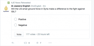
I don’t know why this feels worse that the bogus clicky polls on newspaper websites. Maybe it’s the thought of someone actually believing the sampling scheme says something useful. Maybe it’s being in Twitter, where following a news headline feed usually gets you news headlines. Maybe it’s that the polls are so bad: restricting a discussion of Middle East politics to two options with really short labels makes even the usual slogan-based dialogue look good in comparison.

In any case, I really hope this turns out to be a failed experiment, and that we can keep Twitter polls basically as jokes.


October 22, 2015

Second-hand bogus poll

Headline1 in 3 women watch porn – survey

Opening sentence: One in three young women regularly view porn, with many watching it on their smartphone, it has emerged.

It turns out this is “Some 31 per cent of participants in the survey by magazine Marie Claire.” If you Google, you can find the Marie Claire invitation to take the survey, with a link. There are also Facebook and YouTube versions of the invitation. It’s a self-selected internet survey; a bogus poll.

Considered in the context of its original purpose, this survey isn’t so bad. It’s part of a major project(possibly NSFW) by the magazine, and its contributing editor Amanda de Cadenet, to discuss women’s use of pornography.  The survey provided a way for them to involve readers, and a context for telling readers, however they responded, “there are lots of other women like you”.  From that point of view the quantitative unreliability and poorly-defined target population isn’t such a problem, though it would presumably be better to have the right numbers.

Disconnected from the magazine and presented as data-based news, the survey results have very little going for them.

October 19, 2015

Flag referendum stats

UMR have done a survey of preferences on the new flag candidates that can be used to predict the preferential-voting result.  According to their data, while Red Peak has improved a long way from basically no support in August, it has only improved enough to be a clear third to the two Lockwood ferns, which are basically tied for the lead both on first preferences and on full STV count.  On the other hand, none of the new candidates is currently anywhere near beating the current version.

The error in a poll like this is probably larger than in an election poll, because there’s no relevant past data to work with. Also, for the second round of the referendum, it’s possible that cutting the proposals down to a single alternative will affect opinion. And, who knows, maybe Red Peak will keep gaining popularity.