Posts filed under Surveys (188)

February 26, 2013

That’s not how polling works

I was struck by the Herald headline this morning “Gay marriage fans on top in objector’s poll”, which goes on to say

The Family First lobby group has published a poll which finally concedes what all other polls in the past year have shown – that more New Zealanders now support gay marriage than oppose it.

The poll of 1000 people by blogger David Farrar’s Curia Research has found 47 per cent think same-sex couples should be allowed to marry, against 43 per cent who think “civil unions are sufficient for same-sex couples”.

“Objector’s”, in the singular, would appear to refer to David Farrar, but as you would expect from the rest of his political beliefs, he’s firmly on the record as supporting marriage equality.  Assuming the apostrophe belongs after the “s”, meaning Family First, it still shouldn’t be relevant to the sampling that the poll was funded by them, though it might be surprising that they published the results (Curia also published the full results; I don’t know if they needed Family First’s permission to do so).

The level of support is still a bit lower than in some other polls. I’d guess that’s because of the phrasing of the question,

In 2004, Parliament legislated to allow same sex couples to register a civil union, amending over 150 pieces of legislation to give legal rights and recognition to same-sex couples. Do you think Parliament should change the definition of marriage to allow same-sex couples to marry, or do you think civil unions are sufficient for same sex couples?

compared to the Colmar Brunton question

Question: In New Zealand same-sex couples can enter into a Civil Union, but they are not able to get married. Do you think same-sex couples should be able to get married?
 

February 25, 2013

But that’s not the worst part

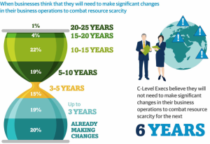
Andrew Gelman passes on this infographic from the Carbon Trust

hourglass


His correspondent points out that the colour scheme is awful, and that the hourglass metaphor would only make sense if the ‘pinch point’ in the hourglass was ‘now’, not 3-5 years in the future.

But that’s not the worst part: Andrew points out that the teeny orange area is actually highest rate per year over the whole time period, a fact that’s masked by the design.

But that’s not the worst part.  The data in the graph come from telephone interviews with some unspecified set of senior executives (CEO, CIO, CTO, COO, etc) selected in an unspecified way with an unspecified response rate, from companies of varying but unspecified size in varying but unspecified industries, so it isn’t really as if the numbers mean much anyway.

Where to cut?

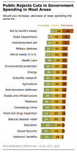
A US survey (see Wonkblog coverage) asked respondents about cutting government spending both overall, and in 19 specific areas.  Most people were in favour of overall cuts, but none of the 19 areas got a majority in favour of decreased funding (click to embiggen, as usual)

a good graph for a change


Even among self-identified Republicans, only two areas had majority support for cuts: unemployment benefits and foreign aid, which make up less than 3.5% of the federal budget.

The graph is pretty good, but some indication of the relative size of these areas (perhaps by the thickness of the bars) might improve it.

January 26, 2013

Selma and Stonewall

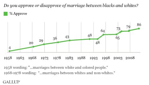
Today’s fascinating survey time series: for fifty-five years Gallup has been asking people in the US if they approve of interracial marriage. (via Paul Krugman, in the NY Times)

Gallup, via New York Times

On the one hand: Yay, progress! On the other hand, one in seven people still not only don’t approve but are prepared to admit this to a random caller on the phone.


January 12, 2013

Dream jobs and reality

The Herald story starts out

If you’re dreading returning to work on Monday, don’t despair – at least you’re not alone.

A new study has found only one in four Kiwis believes they are in their dream job, a percentage lower than in most major countries.

As usual, we can ask: who did the survey, how did they do it, and what are they selling?

The numbers come from LinkedIn, the well-known spam job-search company. They say

As part of its “Dream Jobs” study, LinkedIn surveyed more than 8,000 professionals globally to find out the most common childhood career aspirations and how many professionals currently have their dream job.

So, for a start, it’s not 25% of Kiwis, it’s restricted to ‘professionals’, however they were defined. That might well explain the high satisfaction reported in India and Indonesia, where getting into the ‘professional’ classification is harder and you’d expect more professionals to be happy with their jobs.

Other news sites have different versions of the information. For example, Mashable says that LinkedIn only sampled from their members, and that only 9% world-wide were in their dream jobs, with another 21% in a career that relates to their dream job, Huffington Post concurs, and this matches the LinkedIn press release.

The 8000 respondents were spread across at least 17 countries, and there’s no indication given of how many are from New Zealand.   More importantly, there’s no indication of how they were sampled. I can’t find any evidence that the survey was done in a way that makes the sample size matter.

January 6, 2013

Difference between one number

StatsChat goes on and on about the need to compare numbers: if you have two polls of the same question, you should probably compute either an average or a difference.

It could be seen as positive, then, that the Herald is reporting changes in attitudes to Aucklanders, with the headline “Poll finds rest of NZ warming to Jafas”

A recent Herald on Sunday-commissioned poll found around 45 per cent believed Aucklanders held themselves in higher regard than other New Zealanders. 

Unfortunately, if you just have one poll, as the Herald does, taking differences becomes more difficult.  They have to fall back on an opinion (from a tourism manager at Ateed)

“If you had conducted a poll like that 15-20 years ago the numbers would have been a lot higher.

“Attitudes towards Auckland are changing and more people from outside Auckland are choosing to live here.”

Sounds plausible, and I assume he knows what he’s talking about, but it would have worked just as well without the poll.

Also, if you’re going to ask people about attitudes towards Aucklanders, who make up about 1/3 of the population, it really matters whether Aucklanders are included in the sample or not. At least, it would if the poll results mattered for the story. The Herald doesn’t say.

January 2, 2013

Nation’s favorite plant

At this time of year you see a lot of predictions, but it’s hard to remember them long enough to track how well they do.

A nice exception came in the ChCh Press  story about the NZ Plant Conservation Network annual poll for NZ’s favorite plant.

New Zealand may be renowned for its distinctive flora and fauna, but it seems Kiwis prefer endangered herbs and wildflowers over pohutukawa and kowhai.

While earlier polls revealed Kiwi-favourites the pohutukawa and cabbage tree as New Zealanders’ plant of choice, in recent years lesser known species such as tree nettle, Cook’s scurvy grass and willowherb have climbed the ranks.

The results are now out, as the Herald reports, and the top three are kauri, pohutukawa, and puriri.  Northern and southern rata and one of the cabbage tree species are also in the top ten, so familiar, common, distinctive trees did well this year.

Predicting results of small self-selected polls is very hard, because the results can be very sensitive to voting by enthusiasts or enemies of one of the candidates. That’s why the results aren’t very useful for telling you what people think, though they can make for good publicity.


December 31, 2012

Briefly

  • Merriam-Webster gives their most-searched words of 2012.  At the top, “capitalism” and “socialism”, especially during the US election and the health insurance debates.  As Fred Clark points out, this means a depressingly large number of Americans were constructing political arguments of the form “According to the Merriam-Webster dictionary, X is defined as …” 
  • FakeAPStyleBook on Twitter advises journalists: “When quoting from a news release, pick the most nonsensical sentences to let people know what it’s like to have to read those things.” 
  • Almost 75% of Kiwis oppose testing ‘legal highs’ on animals.  It would be interesting to know the figure among those who think these drugs should be legal and regulated.  If you think they should be comprehensively banned or, at the other extreme, just left alone, then presumably you would be against requiring animal tests.
  • In the same Herald survey, 29% were against animal testing for any purpose whatsoever.  That’s a slightly higher level of opposition to modern medicine than I would have expected.
  • Stuff had a good story about celebrity bad science, from the UK charity Sense About Science
December 20, 2012

Glad tidings of great joy

The Herald has a story on the happiest countries in the world.  This is a sensible thing to measure, but it’s hard to know if you have got it right, or whether the differences between countries just reflect differences in responding to survey questions. At least it was from a real survey.

Another recent survey result was the US companies with the happiest employees.  Pfizer was on top of the list.  Pfizer is perhaps more notable recently for its layoffs, with the last round just this week, so the survey has been greeted with a certain bemusement in some parts of the internet.  The provenance of these data is a bit dubious:


To reveal the top happiest companies, CareerBliss analyzes thousands of independent employee-submitted reviews. 

Post a quick company review to nominate your company for next year!

and, yes, this means it’s just a self-selected bogus poll.

December 17, 2012

Unscientific polls of scientists

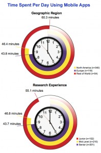
The graph below is an overly-creative variation on barplots, which I think confirms the principle “if you want to write the data values on the graph, it’s probably a bad graph”.

Good thing it wasn't two hours

The data are supposed to be “time per day spent using mobile apps”.  Presumably it’s mean time per day, though I can’t tell whether the mean is restricted to people who spend non-zero time.  The graphs come from a “study” conducted by the “Science Advisory Board®”.  The “Science Advisory Board®” is an online survey panel for market research, where biomedical scientists are the market.  Or as they put it

The Board is an independent, worldwide panel of life science and medical professionals that convenes electronically to voice their opinions on a wide range of topics.

Here “convenes electronically” means “gets sent survey links by email”, and since I’m not a “member”, in my case this means spam about a survey on lab equipment.

The “Science Advisory Board®” homepage includes various things aimed at making their study samples feel like a community. There’s also widget that cycles through their past few days of Twitter feed at a rate of about one every five seconds, and, rather surprisingly for a company that wants to give the impression of solid opinion research, a clicky bogus poll™.