Posts filed under Surveys (188)

April 26, 2013

That TV3 poll on racism? Bogus!

The Herald today ran this story claiming that people think New Zealand is a racist country, based on the results of a survey run  for TV3’s new show The Vote. Viewers voted through Facebook, Twitter, The Vote website or by text.

I haven’t watched The Vote, but I would like to know whether its journalist presenters, presumably fans of accuracy, point out that such self-selecting  polls are unscientific – the polite term for bogus. The best thing you can say is that such polls allow viewers to  feel involved.

But that’s not a good thing if claims made as a  result of these polls lead to way off-beam impressions being planted in the public consciousness; that’s often the way urban myths are born and prejudice stoked.

I’m not saying that racism doesn’t exist in New Zealand, but polls like this  offer no insight into the issue or, worse, distort the truth.

It’s disappointing to see the Herald, which still, presumably, places a premium on accuracy, has swallowed The Vote press release whole, without  pointing out its shortcomings or doing its homework to see what reliable surveys exist. TV3 must be very pleased with the free publicity, though.
April 23, 2013

When ‘self-selected’ isn’t bogus

Two opportunities for public comment that will expire soon, and where StatsChat readers might have something to say

  • Stats New Zealand wants to hear from people who use Census data.  They have a questionnaire on how you use the data, and how this might be affected if they change the Census in various ways. It’s open until Friday May 3
  • Public submissions on the new ‘legal highs’ bill close on Wednesday May 1.  The bill is here. You can make a submission here.  The Drug Foundation have a description and recommendations here

This sort of public comment is qualitative, rather than quantitative.  Neither the Select Committee nor Stats New Zealand is likely to count up the number of submissions taking a particular view and use this as a population estimate, because that would be silly.  What they should be aiming for is a qualitatively exhaustive sample, one that includes all the arguments for or against the bill, or all the different ways people use Census data.

April 17, 2013

Open data on the West Island

If you want to get Australian census summary data, you can download it from the Australian Bureau of Statistics, or buy a DVD for A$250.

An article in iTNews explains why someone might pay rather than downloading

“You have to click to download each pack individually, and they’ve set the site up deliberately to make it difficult to use a browser plugin to download everything that is contained on the released DVD image,” Bowland told iTNews.

That’s not hyperbole: Grahame Bowland quotes JavaScript code comments that actually say they are trying to make automatic downloading difficult.

Or, the data release is now available using bittorrent, thanks to Bowland, who bought the DVD (this is perfectly legit: the data are Creative Commons licenced).

(via @keith_ng)

April 16, 2013

Bogus poll news again

Stuff has a story “Dishonest Kiwi Travellers”, based on a survey press release from Hotels.com.  The survey asked people if they had stolen things from hotels and used the responses to rank countries by honesty, with the travellers who denied taking things being rated more honest than the ones who admitted it (rather than the other way around).

Fortunately it doesn’t really matter how honest the responses were, since if you follow a few links you can find a press release for the Canadian part of the survey, which admits

In a recent survey hotels.com® asked its Canadian email subscribers , including those in Quebec, about what they look for in hotel accommodations, and you might be surprised at what they had to say.

Or in other words, it’s a bogus poll.

April 4, 2013

Infographic meh.

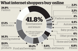
The Herald has produced this Stat of the Week nomination

BuyOnlineApr13


The obvious problem is that the percentages add up to about 170%, not 100%. That’s why the bar labelled “41.8%” is only about 1/4 of the circle.These are not mutually exclusive categories, and in fact someone who is in one of these categories is actually more likely to be in others.

The most interesting results from the underlying data would be about which purchases go together. Is there an more-or-less consistent ordering of things so that someone who buys food and beverages online will also buy reading materials and electronics online, or is it more complicated?  That’s probably the sort of information that Roy Morgan Research would like to sell you, with the overall proportions as a teaser — selling detailed survey reports is their business.

On the other hand, while the ribbon adding up to a full circle is irrelevant because there isn’t a meaningful total, it’s hard to get very worked up about it.  A table, or a ‘forest plot’ of points and margin of error would be a bit more informative — it’s not clear what the margin of error in the smaller categories is like.

I’m slightly more worried about the fact that reading isn’t counted as leisure, somewhat more worried that it’s news that more people use the internet now than ten years ago, and much more worried that the graph says it refers to 4977 people but the text of the story says 12000 people.

March 22, 2013

Briefly

  • A post at Scientific American about covering clinical trials, for journalists and readers.  It’s a summary from the Association of Health Care Journalists annual conference. Starts out “My message: Ask the hard questions.”
  • Asking the hard questions is also useful in covering surveys.  Stuff reports “Kiwi leaders amongst the world’s riskiest”,
  • New Zealand leaders are among the most likely in the world to ignore data and fail to seek a range of opinions when making decisions

    with no provenance except that this was based on a 600,000 person survey of managers and professionals by SHL.  Before trying to track down any more detail, just think: how could this have worked? How would you get reliable information to support those conclusions from each of 600,000 people? 

  • You may have heard about the famous Hawthorne experiment, where raising light levels in a factory improved output, as did lowering them, as did anything else experimental. The original data have been found and this turns out not to be the case.
March 16, 2013

Where survey stories come from

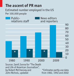
The ‘flack:hack’ ratio, the ratio of PR professionals to journalists, has been steadily increasing over time.  This graph, from the Economist, shows that the ratio in the US has  now reached 9:1.

20110521_wbc750


As Felix Salmon says

for every professional journalist, there are nine people, some of them extremely well paid, trying to persuade that journalist to publish something about a certain company. That wouldn’t be the case if those articles weren’t worth serious money to the companies in question.

This explains a lot of ‘survey’ stories.  A no-frills 1000-person survey is not only cheaper than a half-page news-section ad in the Herald, if it gets a story it’s a lot more effective.  A story will be syndicated to the regional papers, it will be on the online site for ever, and we’re much more likely to read and trust it.

March 15, 2013

Policing the pollsters … your input sought

This is from Kiwiblog:

A group of New Zealand’s leading political pollsters, in consultation with other interested parties, have developed draft NZ Political Polling Guidelines.

The purpose is to ensure that Association of Market Research Organisations and Market Research Society of New Zealand members conducting political polls, and media organisations publishing poll results, adhere to the highest “NZ appropriate” standards. The guidelines are draft and comments, questions and recommendations back to the working group are welcome.

This code seeks to document best practice guidelines for the conducting and reporting of political polls in New Zealand. It is proposed that the guidelines, once approved and accepted, will be binding on companies that are members of  AMRO and on researchers that are members of MRSNZ.

March 14, 2013

Who is buying our real estate?

Interesting data in Stuff today:

The latest BNZ and Real Estate Institute residential market survey found 9 per cent of house sales were to people offshore. 

Of those offshore buyers, 18 per cent were from Britain, 15 per cent from China and 14 per cent from Australia.

and many of the offshore buyers were immigrating, not just investing.  In fact,

just 1.2 per cent of house sales in Auckland were to Chinese buyers not intending to move here.

The only thing the story is missing is some mention of how people got the false impression that high house prices were the fault of Chinese investors.

Could it have been something they read, perhaps?

March 7, 2013

Briefly

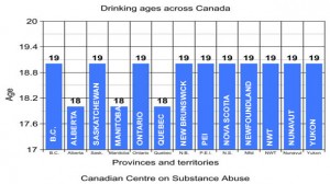
  • From the frozen north: the most pointless bar graph I’ve seen in a long time.

 li-drinking-graph

  • A website with interviews in data science and analytics, currently featuring UoA graduate Hadley Wickham, in his role as Chief Scientist of RStudio


  • From the Herald, a successful HRC-funded randomised trial of an NZ-invented inhaler for asthma.  They don’t link to the paper and editorial (which are not in ‘the prestigious Lancet medical journal’, but in the perfectly respectable Lancet Respiratory Medicine journal)


  • The US Census Bureau has released data on commute times, collected in the American Community Survey.  The Census Bureau has an infographic (sigh),  but since the data are available, other people can do better, in this case the New York public radio station WNYC (via)