Posts filed under Surveys (188)

June 27, 2013

How much does NZ pay?

The Herald has a story about NZ average wage figures published by the job-search website Seek.

Seek’s latest salary report, released today, showed the average salary for jobs advertised on their website, grew to $72,731 per annum – a 1.3 per cent increase on wages since January.

The problem is that this is an average for a set of ads. It’s  not an average for NZ workers as a whole, but it’s not even an average for people who apply for Seek jobs, or even people who get Seek jobs.

The Herald sensibly reports the average hourly wage that StatsNZ computes.

Figures from Statistics NZ show as of March this year, the average hourly wage was $27.48 or $57,158.40 per year.  

Another useful figure is the median weekly income from wage or salary for those receiving some wage or salary, allowing for part-time and overtime work, which the NZ Income Survey estimates (for June 2012) as $806, giving a yearly figure of $42000.

June 11, 2013

CensusAtSchool on Nine to Noon this morning

This morning sometime after 11am, I’ll be talking on Radio New Zealand’s Nine to Noon programme about one of the Department’s projects, CensusAtSchool. I’ll post a link to the interview recording once it’s online.

CensusAtSchool runs biennial surveys online to get data of interest to Year 5-13 students by asking them questions about themselves. This data then feeds into the teaching and learning about statistics. The surveys produce data about kids, from kids, for kids – to enrich their learning about how to collect, explore and analyse data.

The project also goes much further and provides support to teachers across all dimensions of teaching statistics in schools in New Zealand.

For more, see the CensusAtSchool website.

Update:

June 4, 2013

Survey respondents are lying, not ignorant

At least, that’s the conclusion of a new paper from the National Bureau of Economic Research.

It’s a common observation that some survey responses, if taken seriously, imply many partisans are dumber than a sack of hammers.  My favorite example is the 32% of respondents who said the Gulf of Mexico oil well explosion made them more likely to support off-shore oil drilling.

As Dylan Matthews writes in the Washington Post, though, the research suggests people do know better. Ordinarily they give the approved politically-correct answer for their party

In the control group, the authors find what Bartels, Nyhan and Reifler found: There are big partisan gaps in the accuracy of responses. …. For example, Republicans were likelier than Democrats to correctly state that U.S. casualties in Iraq fell from 2007 to 2008, and Democrats were likelier than Republicans to correctly state that unemployment and inflation rose under Bush’s presidency.

But in an experimental group where correct answers increased your chance of winning a prize, the accuracy improved markedly:

Take unemployment: Without any money involved, Democrats’ estimates of the change in unemployment under Bush were about 0.9 points higher than Republicans’ estimates. But when correct answers were rewarded, that gap shrank to 0.4 points. When correct answers and “don’t knows” were rewarded, it shrank to 0.2 points.

This is probably good news for journalism and for democracy.  It’s not such good news for statisticians.

May 29, 2013

Best place to live

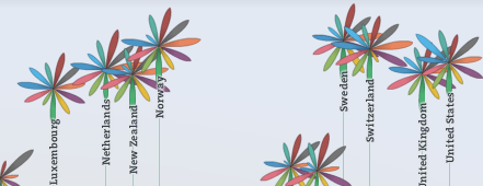
The Herald has a big spread on the OECD Better Life Index today — the graphics don’t show up in the online version, so I didn’t notice initially.

As long-time readers will remember from two years ago, the best thing about the OECD data is that their website lets you see what rankings result from giving different importance to different parts of their survey.  For example, New Zealand does well overall, but does relatively poorly on income, so its ranking is quite sensitive to how important you think income is.

This year’s interactive website is here (the Herald, sadly, doesn’t link). Go play.

daisies

May 25, 2013

Error and margin of error

The British consumer magazine Which? ran a mystery-shopper investigation of UK pharmacies recently.  One of the topics they covered was homeopathic products, and in 13 of the 20 pharmacies where they asked about homeopathic remedies they got advice that violated the Royal Pharmaceutical Society guidelines for pharmacists.  An information sheet from the society says that pharmacists should

when asked, assist patients in making informed decisions about homoeopathic products by providing the necessary and relevant  information, particularly the lack of clinical evidence to support the efficacy of homoeopathic products. They must also ensure that patients do not stop taking their prescribed medication if they take a homoeopathic product. Importantly, pharmacists will be in a position to discuss healthcare options and be able to identify any more serious underlying medical conditions and, if required, refer the patient to another healthcare professional.

(the most current guidelines are not available to non-members, but similar advice is quoted by Which?).

One of the responses to these findings has been that the survey is too small to draw any conclusions, but as Ben Goldacre points out, if the sample is representative, a sample size of 20 is enough to be worried


With sample sizes this small, different ways of calculating the uncertainty give visibly different results (I get 41%-85% in R), but the practical implications are the same.  If we can trust the sampling, at least 40% of pharmacists are providing advice that’s contrary to their professional guidelines and, since the mystery-shopper scenario was a patient who’d had a persistent cough for a month, advice that could actually be dangerous.

It would be interesting to know what the situation is like in NZ, especially as homeopathic products are specifically exempted  from the new rules that will require evidence to support health claims.
May 20, 2013

Sometimes a list should just be a list

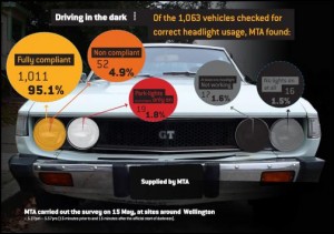
From the Motor Trade Association (via Scoop), an infographic that really would be better as a table or list rather than what appears to be a set of four pie charts.

headlights

Adding to the problems, the survey of 1063 vehicles was for a single half-hour period on one day, and 50% of the half-hour period was before the start of official darkness (though they say visibility was low enough to make headlights necessary).

May 17, 2013

Science survey

From the Wellcome Trust Monitor, a survey examining knowledge and attitudes related to biomedical science in the UK

The survey found a high level of interest in medical research among the public – more than seven in ten adults (75 per cent) and nearly six out of ten of young people (58 per cent). Despite this, understanding of how research is conducted is not deep – and levels of understanding have fallen since 2009. While most adults (67 per cent) and half of all young people (50 per cent) recognise the concept of a controlled experiment in science, most cannot articulate why this process is effective.

Two-thirds of the adults that were questioned trusted medical practitioners and university scientists to give them accurate information about medical research. This fell to just over one in ten (12 per cent) for government departments and ministers. Journalists scored lowest on trustworthiness — only 8 per cent of adults trusted them to give accurate information about medical research, although this was an improvement on the 2009 figure of 4 per cent.


May 15, 2013

You can’t trust those folks

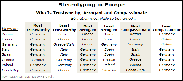
Pew Research have released a report on public opinion in Europe. There’s lots of important stuff in there about austerity, the Euro, unemployment, inequality, and so on.  There’s also this entertaining table:

2013-EU-12


As Robert Burns didn’t quite write: O wad some Pew’R the giftie gie us, To see oursels as ithers see us!

May 14, 2013

Survey-manufactured news

A familiar topic on StatsChat is the use of surveys (of widely varying quality) purely to create a press release, in the hope of getting some free product placement from overworked journalists.  The UK blog Ministry of Truth has a detailed look at a company that seems to specialise in this form of marketing

If you didn’t see it on the BBC, then you may well have caught up with the story via the Daily Mail, the Daily Mirror or the Yorkshire Evening Post. In a sense, it doesn’t really matter where you saw the story because they were all churned from the same press release, which had been put out by a  Gloucester-based PR agency called 10 Yetis, and they all, to varying degrees of cut and paste, uncritially reported at least some of the contents of the press release.

It is also, as you may also have already guessed, a complete and utter load of bullshit from start to finish, and that’s really what this particular article is all about.


May 13, 2013

Your guess is as good as ours

There’s currently discussion in NZ about whether to change the 5-yearly census.  North America is providing some examples of what not to do.

Canada decided a while back that they were going to chop most of the questions off the census and put them in a new survey.  The new survey is still sent to everyone, but is voluntary — the worst of both worlds, since a much smaller survey would allow for more effort per respondent in follow-up. Frances Woolley compares the race/ethnicity data from the 2006 Census and the new survey: the survey is dramatically overcounting minorities.

In the USA, a Republican congressman has proposed a bill that would stop the Department of Commerce and the Census Bureau from collecting basically anything other than the census.  That would wipe out the American Community Survey, the detailed 1%/year sample that provides a wide range of regional data. It would also wipe out the Current Population Survey, used to estimate the unemployment rate.  Fortunately for the US economy, there’s no chance of this bill becoming law: the business community hates it, and Senate will never pass it.  It’s still worrying that there’s a public-opinion advantage in pretending you want to abolish the government’s economic data collection.