Posts filed under Surveys (188)

September 9, 2013

—-ing good survey

From the Broadcasting Standards Authority, via @ColeyTangerina

Scope

  • Quantitative research to provide a monitor of the acceptability of the use of swear words, blasphemies and other expletives in broadcasting over time

Methodology

  • Administered national survey with 1,500 randomly selected individuals aged 18 years and over, stratified by region, age group, gender and ethnicity
  • Online methodology survey was the same approach as used in 2010. This is differentiated from the 1999 and 2005 surveys which made use of a face-to-face interview technique.

It’s pretty clear that the report is going to be unsuitable for some workplaces (that’s kind of the point) but the findings are interesting.  The ranking of unacceptability is not what I would have expected (I’m biased having lived in the US).

Of the 31 words they surveyed, in the context of a movie screening after 8:30pm with a criminal swearing at a police officer, the 27th is one that has been used on this blog (“bullshit”), with 20% unacceptability rating.  The worst-ranked word had  70% unacceptability.  Personally, I don’t think any of the words is unacceptable in that context, but there are several whose use would lower my opinion of the speaker.

They also looked at other scenarios, and the general conclusion seemed to be that it was worse not as bad for actors than for ‘real people’ to swear.
September 1, 2013

Bogus expat salary headlines

A couple of years ago, the Herald won Stat of the Week with a story headlined “Goodbye NZ, hello $100,000“. They have fallen for this year’s version of the same survey again, with a story headlined $100,000 easy for our expats” claiming that more than half of Kiwi expats make over $100000. It should be pretty obvious that this story can’t actually be true, especially given their recurring stories about problems Kiwis face in Australia.

The story comes from a survey by Kea, ‘New Zealand’s Global Network’, of about 30000 of its members, ie, a self-selected, non-representative group making up about 3-5% of Kiwi expats.  Basically, Kea have successfully gotten the paper to report as news their ability to contact and market to a large, high-income set of expats.


Update: For example, at the 2006 Census, average income for Kiwis aged 25-44 working in Australia was just under AU$50,000 (Table 15), about 25% higher than in NZ for the same jobs. It will have gone up a bit since then, but not doubled.

August 20, 2013

US language maps

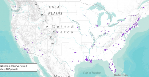
The US Census Bureau has put together an interactive map of languages other than English spoken in the US — you can look at all speakers of the language, or just those who are not fluent in English, for a range of languages.

Here’s the map for (preferentially) French speakers, showing concentrations in Maine (near French Canada) and Louisiana (Cajun) that I’d expect, groups in the major cities, and a cluster I don’t understand in northwestern Georgia

frenchmap

August 11, 2013

Chilean census problems

A neat bit of snark from the New York Times

“I humbly apologize to Chileans for those mistakes,” Mr. Piñera said in a statement Thursday. “When I was informed of these errors, I felt as upset and outraged as millions of Chileans throughout the country.”

It is not clear, however, how many millions of Chileans there are.

Last year, the Chilean census went from a one-day event run by volunteers to a much more ambitious operation taking months, but missing a lot more people — the census review commission (PDF, Spanish)estimates that more than 9% were missed. Worse, based on the projections from other data, the proportion of people missed seems to have varied by age and gender (and so presumably by other factors as well).  The review commission recommended using the data as little as possible, and trying to run a new census in 2015 for a subset of the information. For the next full census, in 2022, they recommended using adminstrative records, online forms, and other approaches to reduce the need to visit every household in person.

The commission also had fairly strong recommendations about the national statistical office

se estima indispensable que el INE fortalezca sus competencias, recursos, atribuciones y niveles de autonomía para que se convierta en una oficina de estadísticas de excelencia, propia del nivel de desarrollo que ha logrado el país. también se requiere que sea una institución abierta al escrutinio público, disponible para la participación de otras instancias públicas y privadas en las actividades que les competan, y que las estadísticas producidas se transformen en bienes públicos (las bases de datos y documentación asociada estén disponibles a todo público sin cargos financieros y en forma expedita, bajo los resguardos de confidencialidad necesarios).

or in English, that they improve their skills, resources, and competencies; become more transparent and independent; and make results publicly available for free in a useful format.

This is probably worse than the Canadian census debacle, though at least this one wasn’t deliberate. 

(via Luis Apiolaza)

August 7, 2013

Bogus poll on bogus shark documentary

Every year, the Discovery Channel has “Shark Week”, which is apparently their top-rated week of the year.  This year they led off with a programme about the extinct shark C. megalodon, which made the great white shark look like a guppy.

Unfortunately, they did a “Does Megalodon still exist?” programme.  The answer is, definitively, “No”, and to get any other answer you’d have to make up some evidence. That didn’t put them off.  Read Christie Wilcox (scientist) and Wil Wheaton (celebrity nerd) for more.

The excuse for putting this on StatsChat is below

bogusshark


I suppose it’s appropriate that they use a bogus poll to try to prove they fooled most of the people who trust them for science communication.

August 2, 2013

The methods behind the statistics do matter

From the US 6th Circuit Court of Appeals (PDF), in a lawsuit alleging false advertising by a US law school, based on a low-quality survey of graduates

For example, the Employment Report for 2010 states that the “average starting salary for all graduates” was $54,796. On its face, the phrase “all graduates” means just that: all Cooley graduates—not just the ones who responded to the survey—made, on average, $54,796. One could assume that, because there were 934 graduates, the average starting salary for all 934 graduates was $54,796. The title of the document containing this statement is “Employment Report and Salary Survey.”  Therefore, it cannot be that the average starting salary of all 2010 graduates was $54,796, because the document, entitled “Employment Report and Salary Survey” (emphasis added) was not based on the responses of all of the Cooley graduates in 2010; rather, the document states that the number of 2010 graduates was 934, but the number of graduates with employment status known was 780. So, the “[a]verage starting salary for all graduates” would instead mean the average starting salary of graduates who responded to the survey and chose to include their salary information—not the average salary of all Cooley graduates in any given year.

We agree with the district court that this statistic is “objectively untrue,” but that the graduates’ reliance upon it was “also unreasonable,”  which dooms their fraudulent misrepresentation claim.

It’s not just statisticians who think you need to pay attention to where the numbers come from.

(via)

July 30, 2013

3d bar graphs: just say no.

Or perhaps “OMG NO!!!”

article-3178

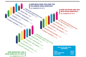
This example (click to embiggen) comes from The Critic, the magazine of Otago University Students Association and has been nominated for Stat of the Week.  It accompanies a reasonable story about satisfaction with services provided by OUSA.   There are some good points: for example, the colour coding means that you can easily tell which bars in the three graphs refer to the same OUSA service.  What you can’t easily do is compare services for levels of satisfaction. For example, in the right-hand set of bars, is the magenta bar taller than, shorter than, or the same as the  dark blue bar? Are you sure? How about the light blue and green bars? Also, if the questions were on a 1 to 5 scale, the bars should start at one, not at zero.

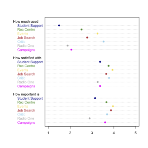
Here’s a version that’s less pretty but actually lets you compare the numeric values. I kept the same colour-coding, although more sedate colours would have been easier to read

ousa-survey


July 24, 2013

Briefly

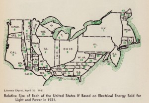
  • Some 1920-30s cartograms (distorted maps) of the USA, at Making Maps. Here’s the one based on electricity use
    brinton_gp_cartograms_1921
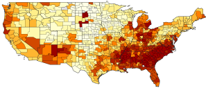
  • Another map: the USA has low income mobility (ie, children of the poor stay poor), but there is quite a lot of variation over the country. This is the version of the map from the original researchers, click for the shiny interactive New York Times version
    e_rank_b_hybrid_continental
  • A good story about a new randomized trial of a melanoma vaccine, based on NZ research.  The story even says that the trial is measuring specific components of immune response, not (yet) actual disease.  As should always be the case, the trial is registered and there’s more detail at the registry.
  • A post about wild extrapolation in estimating the value of marine reserves to (UK) anglers:
    Or you could look at the Celtic Deep rMPA, a site located some 70km offshore, where they estimate between 145,000 and 263,000 angling visits per year. That’s 400-720 visits a day, which translates to approx 40-70 typical sea angling boats, each full to the gunwales every single day of the year.
July 23, 2013

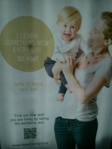
I learn something new every day

Today, for example, I found out what these ads in bus stops were for

wellbeing

Sovereign, the insurance company, has a survey of ‘wellbeing’, and wants you to participate.

The survey that produced the numbers in the ad is reasonably real research — it’s based on a random sample from an online survey panel — but

Would you like to be included in the next Sovereign Wellbeing Index results? If so take the full survey here.

together with the links on the ads suggests that they are going to augment the real survey with a bogus poll.

The survey results are interesting. They find that NZ has lower reported wellbeing than most other countries.  It’s not clear why this should be the case (and it disagrees with some other surveys), but one cynical suggestion is that a certain subset of Kiwis may have unintended reactions to questions like

I actively contribute to the happiness and wellbeing of others


Research provenance (just link, already)

The Herald has a story about high rates of depression in young Australian men, which gives very little information about what the data was like and where it came from.  Often that’s a sign that the people who came up with the numbers would really prefer you not know how they did it.

In this case, though, the research is from a well-designed  survey with computer-based interviewing of people chosen by dialling random telephone numbers, and there’s a detailed description of the research program and a glossy but carefully-written and informative report (PDF) available.