Posts filed under Surveys (188)

April 23, 2018

Bogus poll headlines

From StuffOne in six Kiwi drivers use their phone at traffic lights, poll finds

This is a bogus poll from Neighbourly, the local bulletin board/discussion site owned by Stuff‘s publisher.  It’s based on “more than 3900” self-selected members of the site, without any attempt to make the figures representative. And that’s before you get to the issue of how honest people are being about their law breaking.

There’s almost no limit to how wrong bogus polls can be. Thanks to anchoring bias, there’s a good chance you’re better informed if you don’t see the results than if you do.

For a while, the NZ media had stopped writing stories and headlines based on bogus polls, but it’s been starting up again.


February 13, 2018

Opinions about immigrants

Ipsos MORI do a nice set of surveys about public misperceptions: ask a sample of people for their estimate of a number and compare it to the actual value.

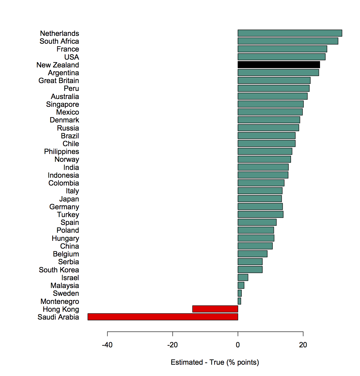
The newest set includes a question about the proportion of the prison population than are immigrants. Here’s (a redrawing of) their graph, with NZ in all black.

People think more than a quarter of NZ prisoners are immigrants; it’s actually less than 2%. I actually prefer this as a ratio

The ratio would be better on a logarithmic scale, but I don’t feel like doing that today since it doesn’t affect the main point of this pointpost.

A couple of years ago, though, the question was about what proportion of the overall population were immigrants. That time people also overestimated a lot.  We can ask how much of the overestimation for the prison question can be explained by people just thinking there are more immigrants than there really are.

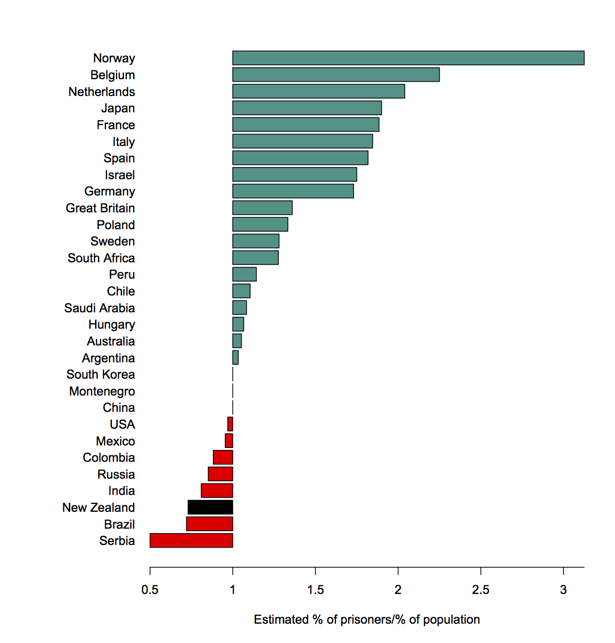
Here’s the ratio of the estimated proportion of immigrants among the prison population and the total population

The bar for New Zealand is to the left; New Zealand recognises that immigrants are less likely to be in prison than people born here. Well, the surveys taken two years apart are consistent with us recognising that, at least.

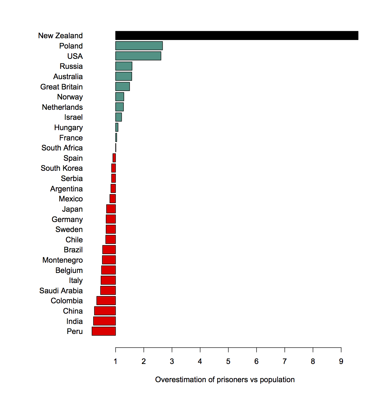
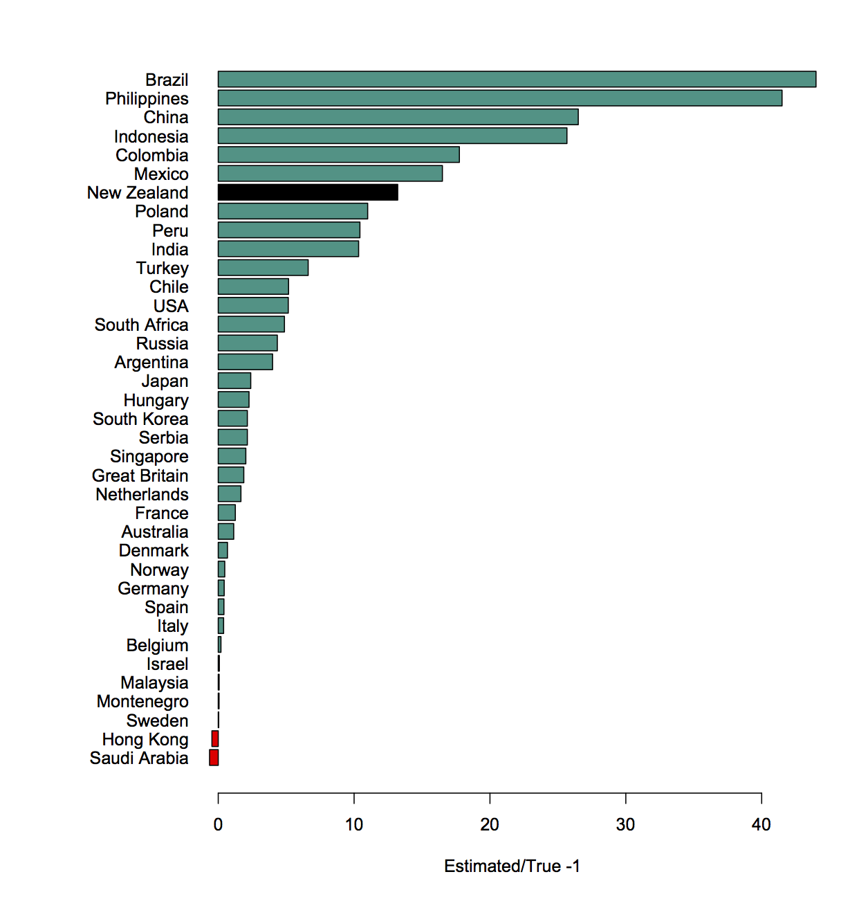
That’s just a ratio of two estimates. We can also compare to the reality. If we divide this ratio by the true ratio we find out how much more likely people think an individual immigrant is to end up in prison compared to how likely they really are.

It seems strange that NZ is suddenly at the top. What’s going on?

New Zealand has a lot of immigrants, and we only overestimate the actual number by about a half (we said 37%; it was 25% in 2017). But we overestimate the proportion among prisoners by a lot. That is, we get this year’s survey question badly wrong, but without even the excuse of being seriously deluded about how many immigrants there are.

December 27, 2017

Poll of the year

Now, in a sense this doesn’t matter. Since it’s a bogus clicky poll on a Donald Trump campaign site, it’s not there for data collection.

But that’s still an impressive piece of not trying to look as though you care.

(via @alittlestats)

November 15, 2017

Bogus poll headlines justified

The Australian postal survey on marriage equality was a terrible idea.

It was a terrible idea because that sort of thing shouldn’t be a simple majority decision.

It was a terrible idea because it wasn’t even a vote, just a survey.

It was a terrible idea because it wasn’t even a good survey, just a bogus poll.

As I repeatedly say, bogus polls don’t tell you anything much about people who didn’t vote, and so they aren’t useful unless the number voting one particular way is a notable proportion of the whole eligible population. In the end, it was.

A hair under 50% of eligible voters said ‘Yes’, just over 30% said ‘No’, and about 20% didn’t respond.

And, in what was not at all a pre-specified hypothesis, Tony Abbott’s electoral division of Warringah had an 84% participation rate and 75% ‘Yes’, giving 63% of all eligible voters indicating ‘yes’.


PS: Yay!

September 27, 2017

Stat Soc of Australia on Marriage Survey

The Statistical Society of Australia has put out a press release on the Australian Marriage Law Postal Survey.  Their concern, in summary, is that if this is supposed to be a survey rather than a vote, the Government has required a pretty crap survey and this isn’t good.

The SSA is concerned that, as a result, the correct interpretation of the Survey results will be missed or ignored by some community groups, who may interpret the resulting proportion for or against same-sex marriage as representative of the opinion of all Australians. This may subsequently, and erroneously, damage the reputation of the ABS and the statistical community as a whole, when it is realised that the Survey results can not be understood in these terms.

and

The SSA is not aware of any official statistics based purely on unadjusted respondent data alone. The ABS routinely adjusts population numbers derived from the census to allow for under and over enumeration issues via its post-enumeration survey. However, under the Government direction, there is there no scope to adjust for demographic biases or collect any information that might enable the ABS to even indicate what these biases might be.

If the aim was to understand the views of all Australians, an opinion survey would be more appropriate. High quality professionally-designed opinion surveys are routinely carried out by market research companies, the ABS, and other institutions. Surveys can be an efficient and powerful tool for canvassing a population, making use of statistical techniques to ensure that the results are proportioned according to the demographics of the population. With a proper survey design and analysis, public opinion can be reliably estimated to a specified accuracy. They can also be implemented at a fraction of the cost of the present Postal Survey. The ABS has a world-class reputation and expertise in this area.

(They’re not actually saying this is the most important deficiency of the process, just that it’s the most statistical one)

September 20, 2017

Takes two to tango

Right from the start of StatsChat we’ve looked at stories about how men or women have more sexual partners. There’s another one in the Herald as a Stat of the Week nomination.

To start off, there’s the basic adding-up constraint: among exclusively heterosexual people, or restricted to opposite-sex partners, the two averages are necessarily identical over the whole population.

This survey (the original version of the story is here) doesn’t say that it just asked about opposite-sex partners, so the difference could be true.  On average, gay men have more sexual partners and lesbians have fewer sexual partners, so you’d expect a slightly higher average for all men than for all women.  Using binary classifications for trans and non-binary people will also stop the numbers matching exactly.

But there are bigger problems. First, 30% of women and 40% of men admit this is something they lie about. And while the rest claim they’ve never lied about it, well, they would, wouldn’t they?

And the survey doesn’t look all that representative.  The “Methodology” heading is almost entirely unhelpful — it’s supposed to say how you found the people, not just

We surveyed 2,180 respondents on questions relating to sexual history. 1,263 respondents identified as male with 917 respondents identifying as female. Of these respondents, 1,058 were from the United States and another 1,122 were located within Europe. Countries represented by fewer than 10 respondents and states represented by fewer than five respondents were omitted from results.

However, the sample is clearly not representative by gender or location, and the fact that they dropped some states and countries afterwards suggests they weren’t doing anything to get a representative sample.

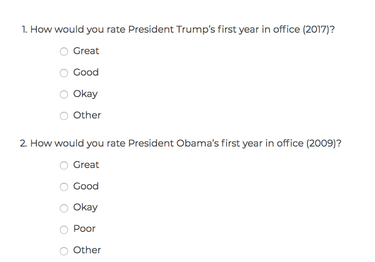
The Herald has a bogus clicky poll on the subject. Here’s what it looks like on my desktop
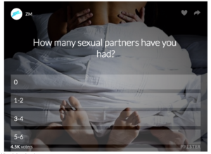
sex

On my phone it gets a couple more options visible, but not all of them. It’s probably less reliable than the survey in the story, but not by a whole lot.

This sort of story can be useful in making people more willing to talk about their sexual histories, but the actual numbers don’t mean a lot.
June 19, 2017

What’s brown and sticky?

Q: What’s brown and sticky?

A: A stick!

Q: What do you call a cow on a trampoline?

A: A milk shake!

Q: Where does chocolate milk come from?

A: Brown cows!

There’s a popular news story around claiming that 7% of Americans think chocolate milk comes from brown cows.

It’s not true.

That is, it’s probably not true that 7% of Americans think chocolate milk comes from brown cows.  If you try to trace the primary source, lots of stories point to Food & Wine, who point to the Innovation Center for U.S. Dairy, who point to Today.com, who point back to Food & Wine. Critically, none of the sources give the actual questions.  Was the question “Where does chocolate milk come from?” Was it “Lots of people say chocolate milk comes from brown cows, do you agree or disagree?” Was it “Does chocolate milk come from: (a) brown cows, (b) mutant sheep, (c) ordinary milk mixed with cocoa and sugar?” Was there a “Not sure” option?

This was clearly a question asked to get a marketing opportunity for carefully-selected facts about milk.  If the Innovation Center for US Dairy was interested in the factual question of what people believe about chocolate milk, they’d be providing more information about the survey and how they tried to distinguish actual believers from people who were just joking.

The Washington Post story does go into the more general issue of ignorance about food and agriculture: there’s apparently a lot of it about, especially among kids.  To some extent, though, this is what should happen. Via the NY Times

According to Agriculture Department estimates going back to 1910, however, the farm population peaked in 1916 at 32.5 million, or 32 percent of the population of 101.6 million.

It’s now down to 2%. Kids don’t pick up, say,  how cheese is made, from their day-to-day lives, and it’s not a top educational priority for schools.

The chocolate milk story, though, is bullshit: it looks like it’s being spread by people who don’t actually care whether the number is 7%.  And survey bullshit can be very sticky: a decade from now, we’ll probably find people citing this story as if it was evidence of something (other than contemporary news standards).

May 26, 2017

Big fat lies?

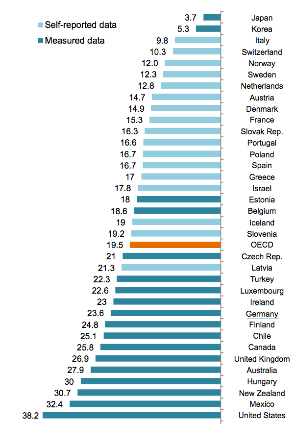
This is a graph from the OECD, of obesity prevalence:
oecd

The basic numbers aren’t novel. What’s interesting (as @cjsnowdon pointed out on Twitter) is the colour separation. The countries using self-reported height and weight data report lower rates of obesity than those using actual measurements.  It wouldn’t be surprising that people’s self-reported weight, over the telephone, tends to be a bit lower than what you’d actually measure if they were standing in front of you; this is a familiar problem with survey data, and usually we have no real way to tell how big the bias is.

In this example there’s something we can do.  The United States data come from the National Health And Nutrition Examination Surveys (NHANES), which involve physical and medical exams of about 5,000 people per year. The US also runs the Behavioral Risk Factor Surveillance System (BRFSS), which is a telephone interview of half a million people each year. BRFSS is designed to get reliable estimates for states or even individual counties, but we can still look at the aggregate data.

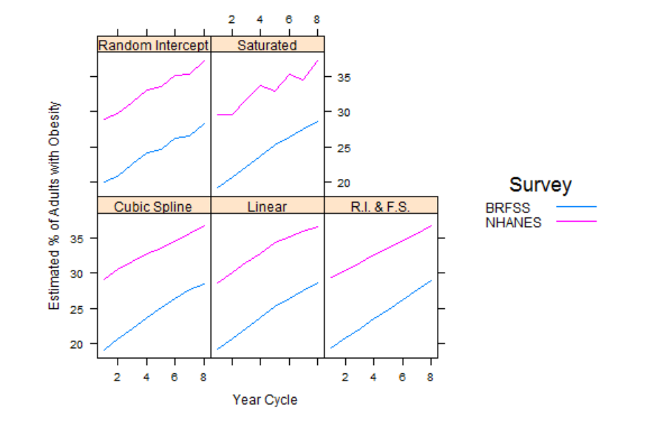
Doing the comparisons would take a bit of effort, except that one of my students, Daniel Choe, has already done it. He was looking at ways to combine the two surveys to get more accurate data than you’d get from either one separately.  One of his graphs shows a comparison of the obesity rate over a 16-year period using five different statistical models. The top right one, labelled ‘Saturated’, is the raw data.
combined

In the US in that year the prevalence of obesity based on self-reported height and weight was under 30%.  The prevalence based on measured height and weight was about 36% — there’s a bias of about 8 percentage points. That’s nowhere near enough to explain the difference between, say, the US and France, but it is enough that it could distort the rankings noticeably.

As you’d expect, the bias isn’t constant: for example, other research has found the relationship between higher education and lower obesity to be weaker when using real measurements than when using telephone data.  This sort of thing is one reason doctors and medical researchers are interested in cellphone apps and gadgets such as Fitbit — to get accurate answers even from the other end of a telephone or internet connection.

April 3, 2017

How big is that?

From Stuff and the Science Media Centre

Dr Sean Weaver’s start-up business has saved over 7000 hectares of native rainforest in Southland and the Pacific

So, how much is that? I wasn’t sure, either.  Here’s an official StatsChat Bogus Poll to see how good your spatial numeracy is;

The recently ex-kids are ok

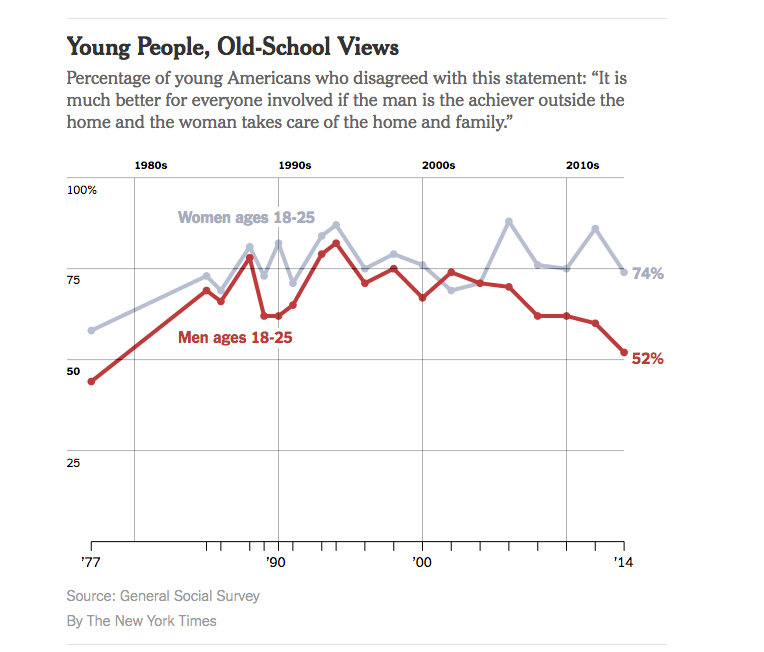
The New York Times had a story last week with the headline “Do Millennial Men Want Stay-at-Home Wives?”, and this depressing graphnyt

But, the graph doesn’t have any uncertainty indications, and while the General Social Survey is well-designed, that’s a pretty small age group (and also, an idiosyncratic definition of ‘millennial’)

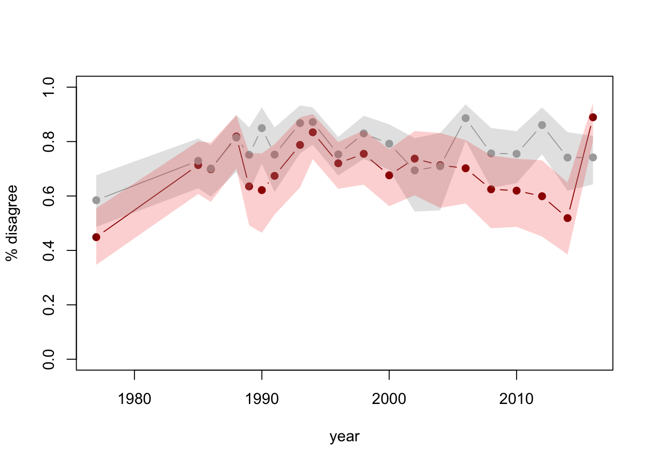
So, I looked up the data and drew a graph with confidence intervals (full code here)

foo

See the last point? The 2016 data have recently been released. Adding a year of data and uncertainty indications makes it clear there’s less support for the conclusion that it looked.

Other people did similar things: Emily Beam has a long post  including some context

The Pepin and Cotter piece, in fact, presents two additional figures in direct contrast with the garbage millennial theory – in Monitoring the Future, millennial men’s support for women in the public sphere has plateaued, not fallen; and attitudes about women working have continued to improve, not worsen. Their conclusion is, therefore, that they find some evidence of a move away from gender equality – a nuance that’s since been lost in the discussion of their work.

and Kieran Healy tweeted


As a rule if you see survey data (especially on a small subset of the population) without any uncertainty displayed, be suspicious.

Also, it’s impressive how easy these sorts of analysis are with modern technology. They used to require serious computing, expensive software, and potentially some work to access the data.  I did mine in an airport: commodity laptop, free WiFi, free software, user-friendly open-data archive.   One reason that basic statistics training has become much more useful in the past few decades is that so many of the other barriers to DIY analysis have been removed.