Posts filed under Social Media (95)

January 9, 2014

Infographic of the week

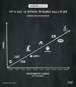
Via @keith_ng, this masterpiece showing that more searches for help lead to more language. Or something.

badlang

It’s not, sadly, unusual to see numbers being used just for ordering, but in this case the numbers don’t even agree with the vertical ordering.  And several of them aren’t, actually, languages. And the headline is just bogus.

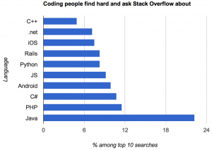
This version, by Kevin Marks (@kevinmarks), at least is accurate and readable.

oklang

but it’s hard to tell how much of Java’s dominance is due to it being popular versus being confusing.

Adam Bard has data on the most popular languages on the huge open-source software repository GitHub. This isn’t quite the right denominator, since Stack Overflow users aren’t quite the same population as GitHub users, but it’s something.  Assigning iOS, Android, and Rails, to Objective-C, Java, and Ruby respectively, and scaling by GitHub popularity, we find that C# has the most StackOverflow queries per GitHub commit; Objective-C and Java have about two-thirds as many.  In the end, though, this data isn’t going to tell you much about either high-demand programming skills or the relative friendliness of different programming languages.


November 25, 2013

–ing Twitter map

Showing what can be done straightforwardly with online data, the site Fbomb.co (possibly NSFW) is a live map of tweets containing what the Broadcasting Standards Authority tells us is the 8th most unacceptable word for NZ.  Surprisingly, it was written by a Canadian.

fbomb


November 19, 2013

Briefly

  • Animated visualisation of motor vehicle accident rates over the year in Australia. Unfortunately it’s based on just one year of data, which isn’t really enough. And if you’re going the effort of the animation, it would have been nice to use it to illustrate uncertainty/variability in the data
  • Randomised trials outside medicine: the combined results of ten trials of restorative justice conferences. Reoffending over the next two years was reduced, and the victims were happier with the handling of the case. (via @hildabast)
  • How much do @nytimes tweets affect pageviews for their stories?
October 18, 2013

Is the King (of beers) no longer the king?

Anecdotally, many of the New Zealanders I talk to think that a) all American beer is appallingly bad, and that b) this is all that Americans drink. In fact, the US has been leading the micro- and craft- brewing revolution for some years now, and a new survey shows that American beer drinking tastes are changing. Budweiser, the so-called King of Beers, a product of US brewing giant Anheuser Busch, appears to have been deposed by Colorado based Blue Moon Brewing Company. I am sure someone will tell me that far more Budweiser/Millers/Coors is produced than beer from Blue Moon, but hey maybe American’s are just using it to pre-cook bratwursts before grilling like I used to do.

I was a little concerned that this study might be self-selected, or industry motivated, but the information provided gives some reassurance: “Data on behalf Blowfish for Hangovers by a third party, private research firm based on a study of 5,249 Americans who drink alcohol and are over the age of 21. Margin of error for this study is 1.35% at a 95% confidence interval. Additional data on alcoholic beverage sales collected directly by the Alcoholic Epidemiolic Data System (AEDS) from States or provided by beverage industry sources.”

October 7, 2013

Caricatures in language space

There’s an interesting (and open-access) paper in the journal PLoS One that I would have expected to attract more media attention both for its results and for its visualisations.

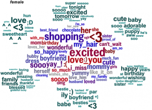
The researchers looked at words that distinguished people by age and gender (or, to be precise, what they had told Facebook were their age and gender). Here’s the female half of the graphic showing male/female distinguishing words (the full image, here, ‘contains language’)

facebook-gender


The clump in the middle are the words that are the most effective evidence that the writer is female. That doesn’t mean these words are especially frequent in women’s Facebook posts, just that they are much less frequent in men’s posts. The green clumps are the most-distinguishing topics, as identified statistically, with the words that define those topics.

Analyses like this are bound to come up with results that look like a caricature, since they are obtained in much the same way that a caricature is drawn, by finding and highlighting the most extreme and distinctive aspects.

September 19, 2013

It depends who you ask

The NZ Herald 

Privacy concerns are leading to “virtual identity suicide” with large numbers of Facebook users deleting their accounts, according to new scientific research.

A study investigating the phenomenon identified privacy as the biggest reason people are turning against the social network giant.

The new scientific research (not linked, journal not named)

The primary source for our convenience sample of Facebook quitters was the Website of the online initiative Quit Facebook Day. On this Website, Facebook users had the possibility to announce their intention to delete their account on May 31, 2010, which was declared as the Quit Facebook Day.

And what was the point of Quit Facebook Day?

In our view, Facebook doesn’t do a good job in either department. Facebook gives you choices about how to manage your data, but they aren’t fair choices, and while the onus is on the individual to manage these choices, Facebook makes it damn difficult for the average user to understand or manage this. We also don’t think Facebook has much respect for you or your data, especially in the context of the future.

So, how surprising is it that Quit Facebook Day quitters are more concerned about privacy than people who keep using Facebook?

July 25, 2013

Royal baby coronation lifetables

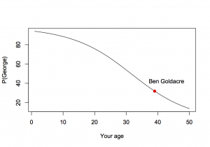
Ben Goldacre asked on Twitter

As he suggests, we’re going to have to make some oversimplifications.  Both Prince William (who comes from a wealthy, long-lived family) and Ben Goldacre (who is a skinny, hyperactive medical doctor) are likely to live longer than the typical UK male, and we will ignore this.  We will also ignore the possibilities that Baby George dies before his father, or that William dies before his father or grandmother, and the possibility that there won’t be a throne for King George.

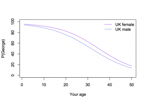
Now we need to get life tables for UK males, which give the current risk of death at each age.  For each year into the future, we multiply the chance of Prince William dying in that year by the chance that Dr Goldacre is still alive, and add these up, to get a little over 30%

ukmale


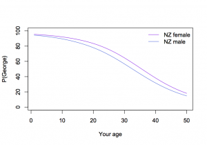
We can do the same thing for UK females and (with NZ life tables) for NZ males and females

ukboth


nzboth

July 5, 2013

Email metadata

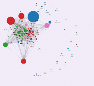
Some folks at the MIT Media Lab have put together a simple web app that takes your Gmail headers and builds a social network.

Once you log in, Immersion will use only the From, To, Cc and Timestamp fields of the emails in the account you are signing in with. It will not access the subject or the body content of any of your emails.

Here’s mine, from my University of Washington email (with the names blurred, not that communicating with me is all that incriminating)

immersion


Obviously my email headers reveal who I email, and, unsurprisingly, the little outlying clusters are small groups or individuals involved in specific projects.  More interesting is how the main clump breaks down:  the blue and pink circles are statisticians, the red are epidemiology and genomics people that I have worked with in person in Seattle, and the green are epidemiology and genomics people that I work with only via email.

June 27, 2013

Guide to reporting clinical trials

From the World Conference of Science Journalists, via @roobina (Ruth Francis), ten tweets on reporting clinical trials

  1. Was this #trial registered before it began? If not then check for rigged design, or hidden negative results on similar trials.
  2. Is primary outcome reported in paper the same as primary outcome spec in protocol? If no report maybe deeply flawed.
  3. Look for other trials by co or group, or on treatment, on registries to see if it represents cherry picked finding
  4. ALWAYS mention who funded the trial. Do any of ethics committee people have some interest with the funding company
  5. Will country where work is done benefit? Will drug be available at lower cost? Is disorder or disease a problem there
  6. How many patients were on the trial, and how many were in each arm?
  7. What was being compared (drug vs placebo? Drug vs standard care? Drug with no control arm?
  8. Be precise about people/patient who benefited – advanced disease, a particular form of a disease?
  9. Report natural frequencies: “13 people per 10000 experienced x”, rather than “1.3% of people experienced x”
  10. NO relative risks. Paint findings clearly: improved survival by 3%: BAD. Ppl lived 2 months longer on average: GOOD

Who says you can’t say anything useful in 140 characters?

June 13, 2013

What you can learn by mining metadata

Kieran Healy uses data from the time of the American Revolution to show how membership of organisations can be turned into social network information

Rest assured that we only collected metadata on these people, and no actual conversations were recorded or meetings transcribed. All I know is whether someone was a member of an organization or not. Surely this is but a small encroachment on the freedom of the Crown’s subjects. I have been asked, on the basis of this poor information, to present some names for our field agents in the Colonies to work with. It seems an unlikely task.

If you want to follow along yourself, there is a secret repository containing the data and the appropriate commands for your portable analytical engine.


You may well already have seen this, but I’ve been travelling.