Posts filed under Social Media (96)

January 2, 2015

Maybe not a representative sample

The Dominion Post asked motorists why they thought the road toll had climbed, and what should be done about it.

roadtoll

Interestingly, three of the five(middle-aged, white, male ,Wellington area) motorists attributed it to random variation. That’s actually possible: the evidence for a real change in risk nationally is pretty modest (and the Wellington region toll is down on last year).

(via @anderschri5 on Twitter)

Meaningless bignums

From the science journal Nature, who should know better than to quote big-sounding numbers without context.

B6R7QaNCIAI2Qsx

That’s roughly the same number of person-hours as the world spent watching the China Central Television news program Xīnwén Liánbō: estimated at 135 million people for half an hour a day.  Or about 1/3 as much time as spent watching YouTube.


December 29, 2014

Set to a possibly recognisable tune

The Risk Song: One hundred and eight hazards in 80 seconds

(via David Spiegelhalter)

December 14, 2014

Statistics about the media: Lorde edition

From @andrewbprice on Twitter: number of articles in the NZ Herald each day about the musician Lorde

lorde

The scampi industry, which brings in similar export earnings (via Matt Nippert), doesn’t get anything like the coverage (and fair enough).

More surprisingly, Lorde seems to get more coverage than the mother of our next head of state but two.  It may seem that the royal couple is always in the paper, but actually whole weeks can sometimes go past without a Will & Kate story.

December 12, 2014

Diversity maps

From Aaron Schiff, household income diversity at the census area level, for Auckland

AKL-income-diversity-better

The diversity measure is based on how well the distribution of income groups in the census area unit matches the distribution across the entire Auckland region, so in a sense it’s more a representativeness measure —  an area unit with only very high and very low incomes would have low diversity in this sense (but there aren’t really any). The red areas are low diversity and include the wealthy suburbs on the Waitemātā harbour and the Gulf, and the poor suburbs of south Auckland. This is an example of something that can’t be a dot map: diversity is intrinsically a property of an area, not an individual


From Luis Apiolaza, ethnic diversity in schools across the country

luis-school-diversity


This screenshot shows an area in south Auckland, and it illustrates that ‘diversity’ really means ‘diversity’, it’s not just a code word for non-white. The low-diversity schools (white circles) in the lower half of the shot include Westmount School (99% Pākehā), but also Te Kura Māori o Ngā Tapuwae (99% Māori), and St Mary MacKillop Catholic School (90% Pasifika).  The high-diversity schools in the top half of the shot don’t have a majority of students from any ethnic group.

December 7, 2014

Bot or Not?

Turing had the Imitation Game, Phillip K. Dick had the Voight-Kampff Test, and spammers gave us the CAPTCHA.  The Truthy project at Indiana University has BotOrNot, which is supposed to distinguish real people on Twitter from automated accounts, ‘bots’, using analysis of their language, their social networks, and their retweeting behaviour. BotOrNot seems to sort of work, but not as well as you might expect.

@NZquake, a very obvious bot that tweets earthquake information from GeoNet, is rated at an 18% chance of being a bot.  Siouxsie Wiles, for whom there is pretty strong evidence of existence as a real person, has a 29% chance of being a bot.  I’ve got a 37% chance, the same as @fly_papers, which is a bot that tweets the titles of research papers about fruit flies, and slightly higher than @statschat, the bot that tweets StatsChat post links,  or @redscarebot, which replies to tweets that include ‘communist’ or ‘socialist’. Other people at a similar probability include Winston Peters, Metiria Turei, and Nicola Gaston (President of the NZ Association of Scientists).

PicPedant, the twitter account of the tireless Paulo Ordoveza, who debunks fake photos and provides origins for uncredited ones, rates at 44% bot probability, but obviously isn’t.  Ben Atkinson, a Canadian economist and StatsChat reader, has a 51% probability, and our only Prime Minister (or his twitterwallah), @johnkeypm, has a 60% probability.


November 26, 2014

What doesn’t get into the papers

I complain a lot about the publicity-based surveys of varying quality that make it into the NZ media, but there’s a lot more that gets filtered out.

A journalist (who I’m not sure if I should name) sent me an example from Mitre 10

The research surveyed more than 1,500 New Zealanders on their connection to the quarter-acre dream and asked their opinions on the size of back yards and what they were doing to make the most of them.

An overwhelming 84 per cent of respondents agreed that they liked the idea of the traditional Kiwi quarter-acre paradise – a large plot of land with a standalone house on it, with plenty of room outdoors, and almost all said they would rather live on the traditional quarter-acre section than in high-density housing with reduced outdoor living spaces.

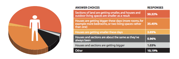
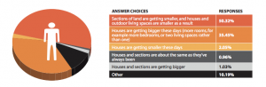
Over half of respondents felt that their outdoor living space is smaller now than what they had growing up (53%). Fifty percent of respondents attributed this to sections of land getting smaller, while 35 per cent believe houses are getting bigger, so there’s less room on a section for an outdoor living space.

The press release is a well-crafted example, with supporting evidence from QV that house sizes are increasing and quotes from a Massey University researcher — not about the survey, but about the general topic.

The survey, on the other hand, was fairly bogus. It was online, and most of the respondents got there through the Mitre 10 Facebook page.  You’d expect (and the Mitre 10 CEO has said) that the Facebook page attracts Mitre 10 customers, not necessarily a representative sample.  The report confirms this, with 88% of respondents being born in NZ, compared to about 75% of the population as a whole.

To make matters worse, here’s the reported data for the paragraphs quoted above. “Houses are bigger” and “sections are smaller” were alternative responses to the same question. You couldn’t answer that both were true — the correct answer, and the position that the report itself is pushing.

Untitled


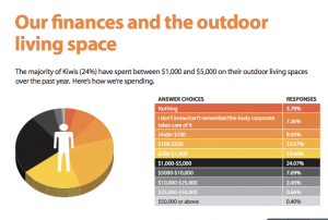
One more finding I can’t resist quoting: “The majority of Kiwis (24%) have spent between $1,000 and $5,000 on their outdoor living spaces over the past year. “

Untitled 2

November 16, 2014

John Oliver on the lottery

When statisticians get quoted on the lottery it’s pretty boring, even if we can stop ourselves mentioning the Optional Stopping Theorem.

This week, though, John Oliver took on the US state lotteries: “..,more than Americans spent on movie tickets, music, porn, the NFL, Major League Baseball, and video games combined. “

(you might also look at David Fisher’s Herald stories on the lottery)

July 23, 2014

The self-surveillance world

See anyone you know? (click to embiggen)

cats


This is a screenshot from I know where your cat lives, a project at Florida State University that is intended to illustrate the amount of detailed information available from location-tagged online photographs, without being too creepy — just creepy enough.

(via Robert Kosara and Keith Ng)

July 1, 2014

Facebook recap

The discussion over the Facebook experiment seems to involve a lot of people being honestly surprised that other people feel differently.

One interesting correlation based on my Twitter feed is that scientists involved in human subjects research were disturbed by the research and those not involved in human subjects research were not. This suggests our indoctrination in research ethics has some impact, but doesn’t answer the question of who is right.

Some links that cover most of the issues