Posts filed under Silly (68)

November 11, 2012

Psychic water bills

I’ve just received a water bill which, among other information, estimates my average daily water use for November.  That’s a pretty good trick for something that must have been mailed in the first few days of the month. They mean October, I assume.

Apart from their off-by-one labelling of months, Watercare are interesting because of their ‘estimated’ water usage.  They recently changed to sending monthly bills, but they still only try to read the meter ever second month, and in my case have failed to find it twice.  My first bill on moving in was for three months, and it was relatively high. I fixed the leaky seal in the toilet and expected the bills to go down.  The following month, the meter wasn’t read but my estimated daily water use went up about 7%.  The next month, again there was no meter reading, and the estimated daily use was another 10% higher. The next month the estimated daily use was down about 8%, again with no reading.

I can see why the estimated total usage would fluctuate based on the varying time between estimates, but it’s hard to see what basis Watercare had for estimating I was using more water in September (actually August) than in August (actually July) without any actual data.  I wouldn’t have expected the average Aucklander to use more water in winter, and a research report from Branz confirms my expectation.

This month, now they have found the meter, the estimated use has fallen about 85%, catching up on three months of overbilling.

October 16, 2012

Magical transformations of pumpkin

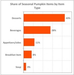
Today’s graph is almost entirely frivolous.  It’s pumpkin season in the US (Halloween and Thankgiving), and Felix Salmon (a past winner of the American Statistical Association’s award for excellence in statistical reporting) is writing about how pumpkin has diversified.

‘Pumpkin,’ in this context, usually means the combination of sugar, cinnamon, cloves, and nutmeg that makes pumpkin pie palatable.  The vegetable itself doesn’t really make an appearance.

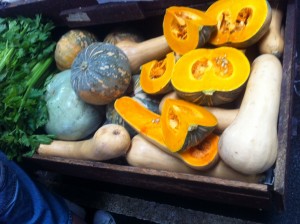
On the continuing issue of how survey responses are sensitive to exact wording, it’s also worth pointing out that the Americans have a much narrower view of which vegetables qualify as pumpkins — they have to be round and orange on the outside.   These, which I photographed last year in Melbourne, would not count as pumpkins in the US.

October 12, 2012

There’s nothing like a good joke.

Q:  Have you started eating more chocolate yet?
A: I assume this is about the New England Journal paper.

Q: Of course.  You could increase your chance of a Nobel Prize

A: There are several excellent reasons why I am not going to get a Nobel Prize, but in any case I don’t have to eat the chocolate: anyone in Australia or New Zealand would do just as well. You can have my share.

Q:  What do you mean?

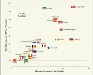
A: The article didn’t look at chocolate consumption by Nobel Prize winners, it looked at chocolate consumption in countries named in the official biographical information about Nobel Prize winners.  This typically includes where they were born and where they worked when they did the prize-winning research, and in some cases yet another country where they currently work.

Q: Does the article admit this?

A: In part.  The author admits that this is just per-capita data, not individual data.  Because he just got the Nobel Prize data from Wikipedia, rather than from the primary source, he doesn’t seem to have noticed that multiple countries per recipient are counted.

Q: Would the New England Journal of Medicine usually accept Wikipedia as a data source when the primary data are easily available?

A: No.

Q: What about the chocolate data?

A: The author doesn’t say whether the chocolate consumption measures weight as consumed (ie, including milk and sugar) or weight of actual chocolate content. That’s especially sloppy since he goes on and on about flavanols. Also, the Nobel Prize data is for 1901-2011 and the chocolate data is mostly just from 2010 or 2011: chocolate consumption in many countries has changed over the past century.

Q: Do you want to say something about correlation and causation now?

A: No, that’s what you say when you don’t know what causes spurious correlations.

Q: So what did cause this correlation?

A: There are at least two likely contributions.  The first is just that wealthy countries tend to have more chocolate consumption and more Nobel Prizes.  Chocolate and research are expensive.  The second is more interesting: it’s the same reason that storks per capita and birth rates are correlated.

Q: Storks bring chocolate as well as babies?

A: Not quite.  Birth rates and storks per capita tend to be correlated because they are both multiples of the reciprocal of population size.   Jerzy Neyman pointed this out in the prehistory of statistics, and Richard Kronmal brought it up again in 1993.  More recently, someone has done the computation with real data (p=0.008). Imperfect standardisation will induce correlation, and since Nobel Prizes almost certainly don’t depend linearly on population, the correction is bound to be imperfect.

Q: Why did the New England Journal publish this article?

A: It wasn’t published as a research article; it was in their ‘Occasional Notes’ series, which the journal describes as “accounts of personal experiences or descriptions of material from outside the usual areas of medical research and analysis.”

Q: Isn’t it good that stuffy medical journals do this sort of thing occasionally? There’s nothing like a good joke

A: Well, you might hope they would do it better, like the BMJ does.  This is nothing like a good joke.
 

September 27, 2012

How is the beer up (down) here?

UBS economists have produced a nice graph showing how many minutes does it take to earn a beer. There is one fatal flaw however – it doesn’t have New Zealand! I thought we had better remedy this (maybe I am just avoiding something). The graph takes the average price for 500mL of beer, and divides it by the median hourly wage. The dollar figures, I assume, are all converted to US dollars so that everything is on the same scale. Statistics New Zealand helpfully provides us with the average hourly wage for 2011 – NZD20.38, and pricepint.com uses the power of crowd-sourcing to give us the average price of a pint in New Zealand at GBP2.36. Converting both of these figures in to US dollars gives us USD16.8241 and USD3.82047 respectively at today’s rates from xe.net This means on average it takes 13.62 minutes to earn a pint in New Zealand. There are no figures on the plot, but we seem to sit somewhere between Australia and Argentina, our fellow Rugby Championship competitors, but a long way below South Africa.

September 19, 2012

Albacore goldmine

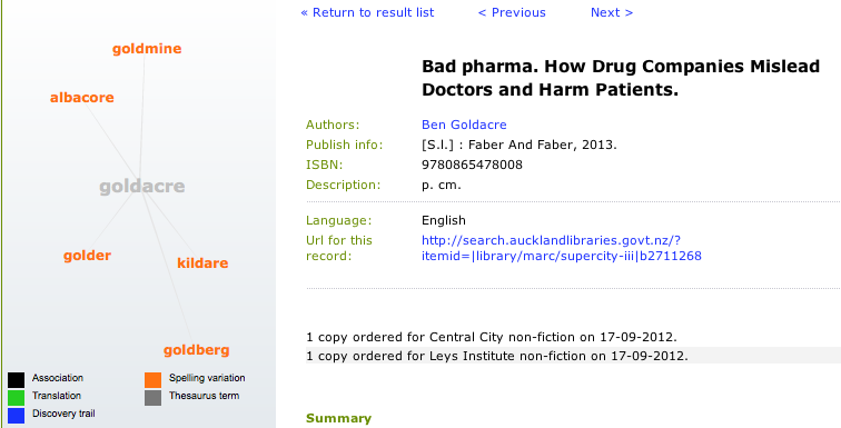
Ben Goldacre has a new book, “Bad Pharma”, coming out next week. I was checking to see if the Auckland city library had ordered it:

Indeed they have. Also, I found out that they have a graphical search tool for looking at connections between possible search terms. Just like Google’s Knowledge Graph, only not.  Clicking one of the orange words (eg, albacore or goldmine) takes you to another set of connections: albacore, hardcore, Vegemite, lockdown, toast, Screwtape,.. the possibilities for free association are endless).

September 7, 2012

Natural division of labour

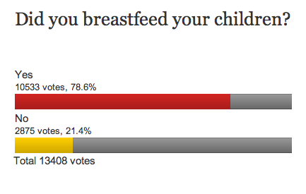
From one of the current clicky polls over on Stuff, some surprising results:

In a representative sample of NZ parents I would have thought the ‘Yes’ figure would have to be at most 50%.

The question is an example of where the passive voice can be an improvement: “Were your children breastfed?” 


August 20, 2012

Nostra maxima culpa

As Alan Keegan points out in his Stat of the Week nomination, the Stats Department Facebook page was sporting a graph whose only redeeming feature is that it doesn’t even pretend to convey information.

To decide what to do with the graph, we are hosting a bogus poll:


August 7, 2012

Even more alternative medal comparisons

As a former Australian, I need to point out that the natural denominator for comparisons between Aus and NZ should include sheep as well as people.

On this metric, Australia has one medal per 4.5 million population, and one gold medal per 50 million population. New Zealand has one medal per  4.4 million population, and one gold medal per 11.8 million population.

Looks like New Zealand is still ahead, even if you include sheep in the population.  On the other hand, Jamaica leaves us both in the dust.

August 2, 2012

It lives in the cloud

It’s probably a bad sign when Dilbert’s boss has heard of what you do: Big Data

July 4, 2012

Sincerest form of flattery

Thanks to the Google, while tracking down a specific phrase from a StatsChat post I found another site with a remarkably similar dialogue.  The main change is that the participants have been given names, implying a previously unreported interest in 21st century New Zealand accident statistics by the famous Russian probabilist Andrey Markov (who died in 1922).

[if the site goes offline, I have a screenshot]