Posts filed under Silly (68)

March 9, 2013

The HarleMCMC Shake

I’m sure that many of our readers are familiar with the latest internet trend, the Harlem Shake. Recently, a statistical version appeared that demonstrates some properties of popular Markov Chain Monte Carlo (MCMC) algorithms. MCMC methods are computer algorithms that are used to draw random samples from probability distributions that might have complicated shapes and live in multi-dimensional spaces.

MCMC was originally invented by physicists (justifying my existence in a statistics department) and is particularly useful for doing a kind of statistics called “Bayesian Inference” where probabilities are used to describe degrees of certainty and uncertainty, rather than frequencies of occurrence (insert plug for STATS331, taught by me, here).

Anyway, onto the HarleMCMC shake. It begins by showing the Metropolis-Hastings method, which is very useful and quite simple to do, but can (in some problems) be very slow, which corresponds to the subdued mood at the beginning of a Harlem Shake. As the song switches into the intense phase, the method is replaced by the “Hamiltonian MCMC” method which can be much more efficient. The motion is much more intense and efficient after that!

Here is the original video by PhD students Tamara Broderick (UC Berkeley) and David Duvenaud (U Cambridge):

http://www.youtube.com/watch?v=Vv3f0QNWvWQ

Naturally, this inspired those of us who work on our own MCMC algorithms to create response videos showing that Hamiltonian MCMC isn’t the only efficient method! Within one day, NYU PhD student Daniel Foreman-Mackey had his own version that uses his emcee sampler. I also had a go using my DNest sampler, but it has not been set to music yet.

So, next time you read or hear about a great new MCMC method, you should ask the authors how well it performs on the “Harlem Shake Distribution”. Oh and thanks to Auckland PhD student Jared Tobin for linking me to the original video!

February 19, 2013

Terminology

Most of the Stats department is currently moving from the leafy park-like north end of campus back to the glass and concrete Tower of Science. While we’re in transit, here’s a bogus poll on statistical terminology.

Distributions can be classified as to whether they produce more outliers or fewer outliers than a normal distribution. The terms are “platykurtic” (same Greek root as platypus, meaning “flat”) and “leptokurtic” (Greek root meaning “thin”)

Update: answer, and potentially discussion, in the comments

February 12, 2013

Conditional probabilities

Usually when someone confuses the probability of A given B and the probability of B given A they don’t really understand that these are different, and you have to point it out and explain it carefully. Richard David Prosser manages to be self-refuting,

And he added: “If you are a young male, aged between say about 19 and about 35, and you’re a Muslim, or you look like a Muslim, or you come from a Muslim country, then you are not welcome to travel on any of the West’s airlines…”

He accepted that most Muslims are not terrorists, but said it’s “equally undeniable” that “most terrorists are Muslims”.

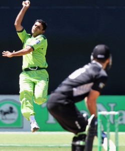
actually pointing out himself that p(terrorist|Muslim) and p(Muslim|terrorist) are not remotely similar.  In the same way, although most members of the Pakistan cricket team are Muslims, most Muslims are not members of the Pakistan cricket team.

That doesn’t handle the further pointless complication of ‘people who look like Muslims’, who, as far as I have been able to tell, are not over-represented among terrorists, but this site might be helpful for calibration.

January 26, 2013

Think of a number and multiply by 3120

The Herald has a story about a new app called TalkTo. Rather than you calling a business and waiting around for a possibly unhelpful response, you can text TalkTo and wait for them to call the business, ask your question and pass on the unhelpful response. Or, at least, you can if the business is in the USA or Canada — they currently wouldn’t handle Novapay or Qantas, the two examples in the story. The app obviously wouldn’t help for issues that require a dialogue, which includes essentially all the time I spend on hold.

Anyway, the statistics angle is that we apparently spend 43 days on hold during our lives.  As a basic numeracy challenge: is this more than you expect or less?

The number comes from 20 minutes per week for 60 years, so it doesn’t apply to any actually existing people — 60 years ago, we didn’t have the same level of on-hold, and 60 years in the future there’s at least some hope that a larger fraction of businesses will figure out how to make a useful web page (or whatever the next communication technology but seven turns out to be).

January 24, 2013

Enough with the Nobel correlations, already

Remember the correlation between current chocolate consumption and all-time Nobel Prizes?

Two British researchers now have done the same exercise for current milk consumption. Their letter, in the journal Practical Neurology suggests (I hope not seriously) that vitamin D might be responsible. They used Messerli’s data on Nobel Prizes, and don’t seem to have noticed any of the problems with it.

As you will remember, we showed length of country name (per capita) was rather more strongly correlated with Nobel Prizes (per capita) than chocolate consumption, and it also beats milk consumption. It’s also much more convincing as a causal relationship: the country names are much more constant over the time the Nobel Prize data were accumulated than milk or chocolate consumption, and since there’s no plausible mechanism for wealthy countries to have longer names than poor countries we avoid economic confounding.


January 21, 2013

Seasonal units of measurements

Stuff says (complete with cute photo)

The birth of a rare Nepalese red panda baby, weighing not much more than a tomato, has thrilled Auckland Zoo keepers.

Hmm.

pandasize

Especially given all the fuss last year about New Zealanders’ ignorance of vegetables, perhaps “weighing a bit less than an iPhone” would be more informative.


December 3, 2012

Stat of the Week Winner: November 24 – 30 2012

Congratulations to Eva Laurenson for her excellent nomination of the NZ Herald’s article entitled “Manukau ‘luckiest’ place for Lotto”:

What does ‘luckiest’ in this title mean? Well to the average person ( I asked a few) they interpreted that title as ” I would have a higher chance of winning Lotto if I bought my ticket from a Manukau store compared to another store from a different suburb in Auckland.” Is this really the case? I doubt it. The article ranks Manukau ‘luckiest’ because it is the suburb with the highest total paid out first division amount. However no where did they take into account the total sales of Lotto tickets in each suburb. I think if you took this into account you’d see that Manukau sells alot more tickets than some of these other suburbs in Auckland. So even though Manukau can boast 55 mil in first division prizes we have no idea whether that is 55 mil out of 100 mill worth of ticket sales or 55 mil out of 1 bill worth of ticket sales. Some of the other suburbs may have a lesser amount of first division payouts compared to Manuaku but could have a greater proportion of first division payouts compared to ticket sales. Hence if that was true, your chance of winning first division given that you bought your ticket in that other suburb would be greater than (the same probability measured for) Manukau. Therefore I think there isn’t sufficient information provided to make this claim.

What I think the article could say is ‘given I won first division, the chances that I bought my ticket in Manukau are ____ times the chance that I bought it somewhere else.’ Something to this effect could be derived from the information presented by the herald article and it makes a bit of sense. Is this what the article wrote though? Not at all. They summarised this finding into “Manukau is the luckiest Lotto suburb in Auckland.” Please! This screams misleading. As discussed above, there simply isn’t enough information to justify labelling Manukau the ‘luckiest’ suburb for Lotto. People have a clear idea of what it means to be lucky and that generally is that they have an increased chance of winning. This is not the conclusion you can draw from the information they provided and in this case I believe the herald got it wrong.

I also think, although probably not the authors intentions, labelling Manukau as the ‘luckiest’ suburb has the danger of enticing people to spend more on Lotto. This article published earlier in the year by the NZ herald noted that “Many South Auckland suburbs featured among those which gambled away the most money. Mangere Bridge, Flat Bush, Manukau and Manurewa were in the top dozen suburbs.”
Even though the article was talking about the pokies, Lotto is just another form of gambling. We shouldn’t be condemming one and sending a rosy message about another, especially to communities who are struggling as it is.

Overall I think this should be the Stat of the week because using ‘lucky’ was a nice little pun but in effect mislead people regarding their chances of winning first division depending on where they bought their ticket.

Secondly it seems wrong to label a suburb ‘luckiest’ and potentially encourage a community to spend more on Lotto there when it is known that it is a compartively poorer area than other Auckland suburbs and spends alot of money on gambling as it is.

Thomas expanded on this, saying:

This looks as if it’s claiming that tickets bought in Manukau have been more likely to win. If this was true, it would still be useless, because future lotto draws are independent of past ones.

It’s even more useless because there is no denominator: not tickets sold, not people in the suburb, not even number of Lotto outlets in the suburb.

What the statistic, and the accompanying infographic, really identifies is the suburbs that lose the most money on Lotto. That’s why Manukau and Otara are ‘lucky’ and Mt Eden and Remuera are ‘unlucky’, the sort of willfully perverse misrepresentation of the role of chance that you more usually see in right-wing US outlets.

November 24, 2012

Why real data is important in teaching

Proving that adding words to an algebra problem doesn’t automatically give it real-world context:

From Intriguing Mathematical Problems, Dover Publications, and Dan Meyer

Thanks, Textbooks adds: This brings up several more important questions:

  • Who has a “favorite” orange?
  •  How long have you had this orange that you’ve bonded with it so much?
  • Who has an equation to calculate the weight of an orange?
  • Is it your favorite because it happens to weigh nine pounds!?

(via)

[Other observations from Thanks, Textbooks  include:  I’m less concerned with the question, “What does the scale read?”  and more concerned with the question, “Why the hell are we lubricating a hamster?”]


November 17, 2012

Single molecule determines complex behavior

Alan Dove nails it

In a groundbreaking new study, scientists at Some University have discovered that a single molecule may drive people to perform that complex behavior we’ve all observed. Though other researchers consider the results of the small, poorly structured experiment misleading, a well-written press release ensures that their criticisms will be restricted to brief quotes buried near the bottoms of most news stories on the work, if they’re included at all…

…“Ten years from now, if you ask someone whose science education consists mainly of skimming news stories, I’m sure they’ll confirm that this single molecule causes this complex behavior,”

(via)

Isn’t technology –ing wonderful?

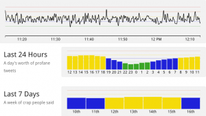
A new website WTFlevel.com (SFW, but makes siren noises) does real-time monitoring of the intensity of swearing on Twitter (only in English, unfortunately).

The record level so far was on US election day, where nearly 11% of tweets contained language unsuitable for those of a delicate constitution, most commonly in combination with the words “Romney” “Obama”, “election”, “stupid”, “white”, and “black”.