From Stuff
Bad luck is responsible for two-thirds of adult cancer while the remaining cases are due to environmental risk factors and inherited genes, researchers from the Johns Hopkins Kimmel Cancer Center found.
The idea is that some, perhaps many, cancers come from simple copying errors in DNA replication. Although DNA copying and editing is impressively accurate, there’s about one error for every three cell divisions, even when nothing is wrong. Since the DNA error rate is basically constant, but other risk factors will be different for different cancers, it should be possible to separate them out.
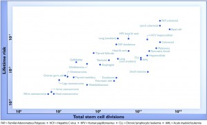
For a change, this actually is important research, but it has still been oversold, for two reasons. Here’s the graph from the paper showing the ‘2/3’ figure: the correlation in this graph is about 0.8, so the proportion of variation explained is the square of that, about two-thirds. (click to embiggen)

There are two things to notice about this graph. First, there are labels such as “Lung (smokers)” and “Lung (non-smokers)”, so it’s not as simple as ‘bad luck’. Some risk factors have been taken into account. It’s not obvious whether this makes the correlation higher or lower.
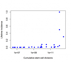
Second, the y-axis is on a log scale, so the straight line fit isn’t to cancer incidence and the proportion of variation explained isn’t a proportion of cancer risk. Using a log scale for incidence is absolutely right when showing the biological relationship, but you can’t read proportions of incidence explained off that graph. This is what the graph looks like when the y-axis is incidence, either with the x-axis still on a logarithmic scale

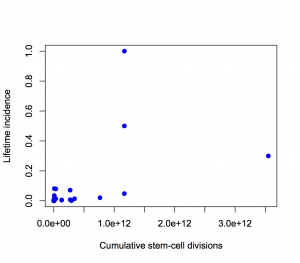
or with neither axis on a logarithmic scale

The proportion of variation explained is 18% and 28% respectively.
It’s ok to transform the x-axis as much as we like, so I looked at a square root transformation on the x-axis (based on the slope of the log-log graph). This gets the proportion of incidence explained up to about one third. Not two-thirds.
Using the log scale gives a lot more weight to the very rare cancers in the lower left corner, which turn out not to have important modifiable risk factors. Using an untransformed y-axis gives equal weight to all cancers, which is what you want from a medical or public health point of view.
Except, even that isn’t quite right. If you look at my two graphs it’s clear that the correlation will be driven by the top three points. Two of those are familial colorectal cancers, and the incidence quoted is the incidence in people with the relevant mutations; the third is basal cell carcinoma, which barely counts as cancer from a medical or public health viewpoint
If we leave out the familial cancers and basal cell carcinoma, the proportion explained drops to about 10%.
If we leave out put back basal cell carcinoma as well, something statistically interesting happens. The correlation shoots back up again, but only because it’s being driven by a single point. A more honest correlation estimate, predicting each point based on the other points and not based on itself, is much lower.
So, in summary: the “two-thirds of cancers explained” is Just Wrong. Doing a mathematically correct calculation gives about one third. Doing a calculation that’s actually relevant to cancer in the population gives even smaller values. (update) That’s not to say that DNA replication errors are unimportant — the paper makes it clear that they are important.
