Posts filed under Risk (222)

October 13, 2017

Road deaths up

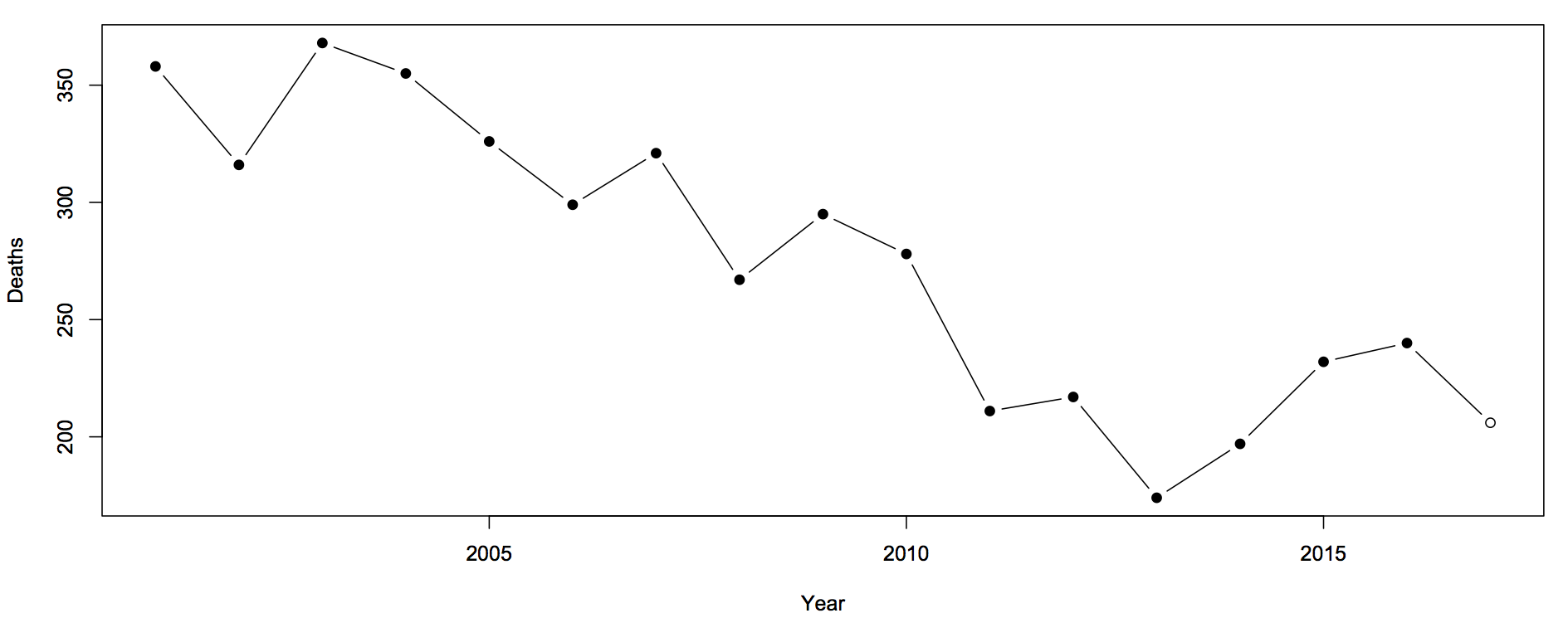
Sam Warburton (the economist, not the rugby player) has been writing about the recent increase in road deaths. Here are the counts (with partial 2017 data)

road-1

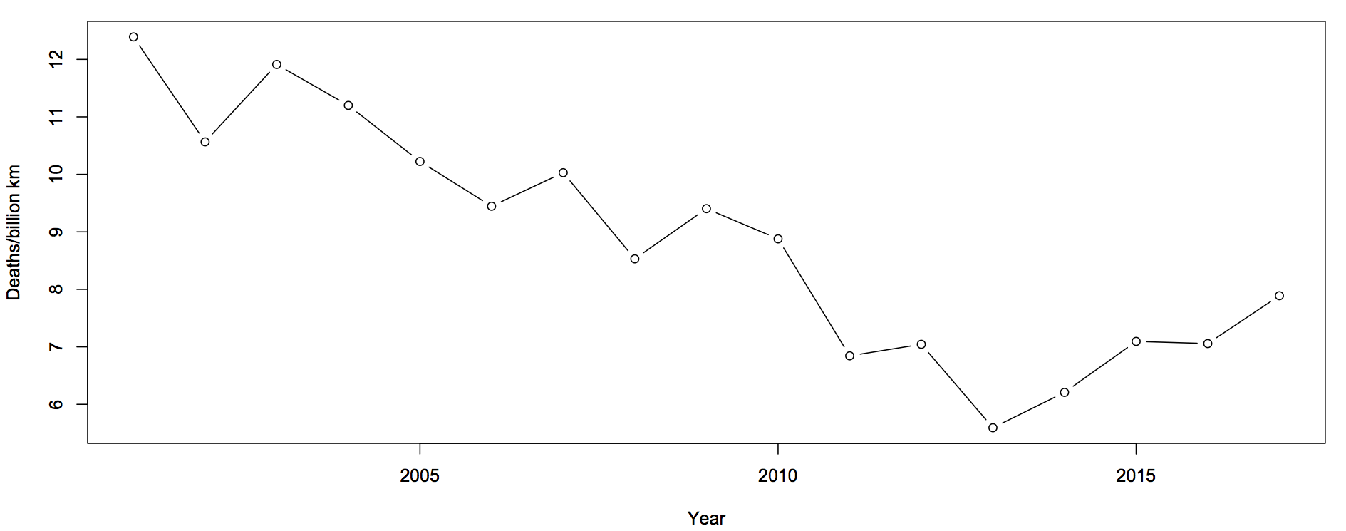
The first question you should ask is whether this is explained by population increases or by driving increases. That is, we want rates — deaths per unit of distance travelled

roads-2

There’s still an increase, but now the 2017 partial data are in line with the increase. The increase cannot be explained simply by more cars being on the roads.

The next question is about uncertainty.  Traditionally, news stories about the road toll were based on one month of data and random variation could explain it all. We still need a model for how much random variation to expect.  What I said before was

The simplest mathematical model for counts is the Poisson process.  If dying in a car crash is independent for any two people in NZ, and the chance is small for any person (but not necessarily the same for different people) then number of deaths over any specified time period will follow a Poisson distribution.    The model cannot be exactly right — multiple fatalities would be much rarer if it were — but it is a good approximation, and any more detailed model would lead to more random variation in the road toll than the Poisson process does.

In that case I was arguing that there wasn’t any real evidence of a change, so using an underestimate of the random variation made my case harder. In this case I’m arguing the change is larger than random variation, so I need to make sure I don’t underestimate random variation.

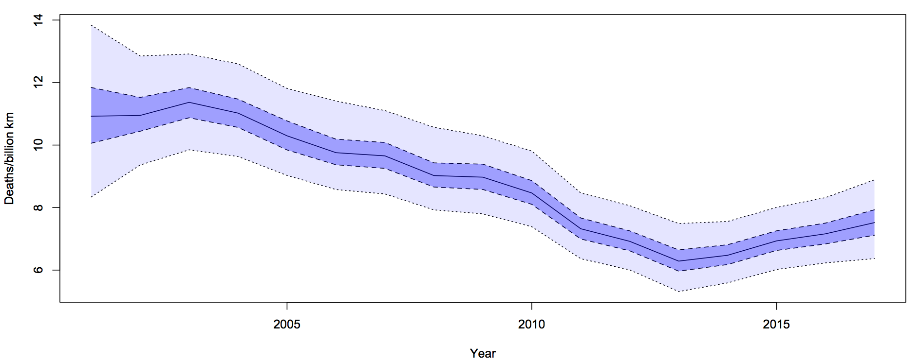
What I did was fit a Bayesian model with two extra random components.  The first was the trend over time. To avoid making assumptions about the shape of the trend I just assumed that the difference between adjacent years was relatively small and random. The second random component was a difference between the trend value for a year and the ‘true’ rate for that year. On top of all of that, there’s Poisson variation.  Since the size of the two additional random components is estimated from the data, they will capture all the variation.

roads-3

For each year, there is a 50% probability that the underlying rate is in the darker blue interval, and a 95% probability it’s in the light blue interval.  The trend is smoother than the data because the data has both the Poisson variation and the extra year-specific deviation. There’s more uncertainty in 2001 because we didn’t use pre-2001 data to tie it down at all, but that won’t affect the later half of the time period much.

It looks from the graph as though there was a minimum in 2013-14 and an increased rate since then.  One of the nice things about these Bayesian models is that you can easily and meaningfully ask for the probability that each year was the minimum. The probability is 54% for 2013 and 27% for 2014: there really was a minimum around then.

The probability that the rate is higher in 2017 than in 2013 is over 90%. This one isn’t just random variation, and it isn’t population increase.


Update: Peter Ellis, who has more experience with NZ official statistics and with Bayesian state-space time series models, gets qualitatively similar results
September 27, 2017

Stat Soc of Australia on Marriage Survey

The Statistical Society of Australia has put out a press release on the Australian Marriage Law Postal Survey.  Their concern, in summary, is that if this is supposed to be a survey rather than a vote, the Government has required a pretty crap survey and this isn’t good.

The SSA is concerned that, as a result, the correct interpretation of the Survey results will be missed or ignored by some community groups, who may interpret the resulting proportion for or against same-sex marriage as representative of the opinion of all Australians. This may subsequently, and erroneously, damage the reputation of the ABS and the statistical community as a whole, when it is realised that the Survey results can not be understood in these terms.

and

The SSA is not aware of any official statistics based purely on unadjusted respondent data alone. The ABS routinely adjusts population numbers derived from the census to allow for under and over enumeration issues via its post-enumeration survey. However, under the Government direction, there is there no scope to adjust for demographic biases or collect any information that might enable the ABS to even indicate what these biases might be.

If the aim was to understand the views of all Australians, an opinion survey would be more appropriate. High quality professionally-designed opinion surveys are routinely carried out by market research companies, the ABS, and other institutions. Surveys can be an efficient and powerful tool for canvassing a population, making use of statistical techniques to ensure that the results are proportioned according to the demographics of the population. With a proper survey design and analysis, public opinion can be reliably estimated to a specified accuracy. They can also be implemented at a fraction of the cost of the present Postal Survey. The ABS has a world-class reputation and expertise in this area.

(They’re not actually saying this is the most important deficiency of the process, just that it’s the most statistical one)

September 10, 2017

Should there be an app for that?

As you may have heard, researchers at Stanford have tried to train a neural network to predict sexual orientation from photos. Here’s the Guardian‘s story.

Artificial intelligence can accurately guess whether people are gay or straight based on photos of their faces, according to new research that suggests machines can have significantly better “gaydar” than humans.

There are a few questions this should raise.  Is it really better? Compared to whose gaydar? And WTF would think this was a good idea?

As one comment on the study says

Finally, the predictability of sexual orientation could have serious and even life-threatening implications to gay men and women and the society asa whole. In some cultures, gay men and women still suffer physical and psychological abuse at the hands of governments, neighbors, and even their own families.

No, I lied. That’s actually a quote from the research paper (here). The researchers say this sort of research is ethical and important because people don’t worry enough about their privacy. Which is a point of view.

So, you might wonder about the details.

The data came from a dating website, using self-identified gender for the photo combined with the gender they were interested in dating to work out sexual orientation. That’s going to be pretty accurate (at least if you don’t care how bisexual people are classified, which they don’t seem to). It’s also pretty obvious that the pictures weren’t put up for the purpose of AI research.

The Guardian story says

 a computer algorithm could correctly distinguish between gay and straight men 81% of the time, and 74% for women

which is true, but is a fairly misleading summary of accuracy.  Presented with a pair of faces, one of which was gay and one wasn’t, that’s how accurate the computer was.  In terms of overall error rate, you can do better that 81% or 74% just by assuming everyone is straight, and the increase in prediction accuracy in random people over the human judgment is pretty small.

More importantly, these are photos from dating profiles. You’d expect dating profile photos to give more hints about sexual orientation than, say, passport photos, or CCTV stills.  That’s what they’re for.  The researchers tried to get around this, but they were limited by the mysterious absence of large databases of non-dating photos classified by sexual orientation.

The other question you might have is about the less-accurate human ratings.  These were done using Amazon’s Mechanical Turk.  So, a typical Mechanical Turk worker, presented only with a single pair of still photos, does do a bit worse than a neural network.  That’s basically what you’d expect with the current levels of still image classification: algorithms can do better than people who aren’t particularly good and who don’t get any particular training.  But anyone who thinks that’s evidence of significantly better gaydar than humans in a meaningful sense must have pretty limited experience of social interaction cues. Or have some reason to want the accuracy of their predictions overstated.

The research paper concludes

The postprivacy world will be a much safer and hospitable place if inhabited by well-educated, tolerant people who are dedicated to equal rights.

That’s hard to argue with. It’s less clear that normalising the automated invasion of privacy and use of personal information without consent is the best way to achieve this goal.

August 16, 2017

Seatbelts save (some) lives

It’s pretty standard that headlines (and often politicians) overstate the likely effect of road safety precautions — eg, the claim that lowering the blood alcohol limit would prevent all deaths in which drivers were over the limit, which it obviously won’t.

This is from the Herald’s front page.

belt

On the left, the number 94 is the number of people who died in crashes while not wearing seatbelts. On the right (and in the story), the we find that this is about a third of all the deaths. It’s quite possible to wear a seatbelt and still die in a crash.

Looking for research, I found this summary from a UK organisation that does independent reviews on road safety issues. They say seatbelts in front seats prevent about 45% of fatal injuries in front seat passengers. For rear-seat passengers the data are less clear.

So, last year probably about 45 people died on our roads because they weren’t wearing seatbelts. That’s a big enough number to worry about: we don’t need to double it.

August 8, 2017

Breast cancer alcohol twitter

Twitter is not an ideal format for science communication, because of the 140-character limitations: it’s easy to inadvertently leave something out.  Here’s one I was referred to this morning (link, so you can see if it is retracted)

latta

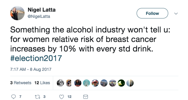
Usually I’d think it was a bit unfair to go after this sort of thing on StatsChat.  The reason I’m making an exception here is the hashtag: this is a political statement by a person of mana.

There’s one gross inaccuracy (which I missed on first reading) and one sub-optimal presentation of risk.  To start off, though, there’s nothing wrong with the underlying number: unlike many of its ilk it isn’t an extrapolation from high levels of drinking and it isn’t obviously confounded, because moderate drinkers are otherwise in better health than non-drinkers on average.  The underlying number is that for each standard drink per day, the rate of breast cancer increases by a factor of about 1.1.

The gross inaccuracy is the lack of a per day qualifier, making the statement inaccurate by a factor of several thousand.  An average of one standard drink per day is not a huge amount, but it’s probably more than the average for women in NZ (given the  2007/08 New Zealand Alcohol and Drug Use Survey finding that about half of women drank alcohol less than weekly).

Relative rates are what the research produces, but people tend to think in absolute risks, despite the explicit “relative risk” in the tweet.  The rate of breast cancer in middle age (what the data are about) is fairly low. The lifetime risk for a 45 year old woman (if you don’t die of anything else before age 90) is about 12%.  A 10% increase in that is 13.2%, not 22%. It would take about 7 drinks per day to roughly double your risk (1.17=1.94)  — and you’d have other problems as well as breast cancer risk.


April 14, 2017

Cyclone uncertainty

Cyclone Cook ended up a bit east of where it was expected, and so Auckland had very little damage.  That’s obviously a good thing for Auckland, but it would be even better if we’d had no actual cyclone and no forecast cyclone.  Whether the precautions Auckland took were necessary (at the time) or a waste  depends on how much uncertainty there was at the time, which is something we didn’t get a good idea of.

In the southeastern USA, where they get a lot of tropical storms, there’s more need for forecasters to communicate uncertainty and also more opportunity for the public to get to understand what the forecasters mean.  There’s scientific research into getting better forecasts, but also into explaining them better. Here’s a good article at Scientific American

Here’s an example (research page):

hurricane

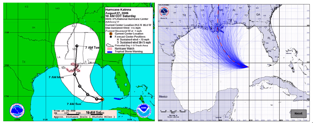
On the left is the ‘cone’ graphic currently used by the National Hurricane Center. The idea is that the current forecast puts the eye of the hurricane on the black line, but it could reasonably be anywhere in the cone. It’s like the little blue GPS uncertainty circles for maps on your phone — except that it also could give the impression of the storm growing in size.  On the right is a new proposal, where the blue lines show a random sample of possible hurricane tracks taking the uncertainty into account — but not giving any idea of the area of damage around each track.

There’s also uncertainty in the predicted rainfall.  NIWA gave us maps of the current best-guess predictions, but no idea of uncertainty.  The US National Weather Service has a new experimental idea: instead of giving maps of the best-guess amount, give maps of the lower and upper estimates, titled: “Expect at least this much” and “Potential for this much”.

In New Zealand, uncertainty in rainfall amount would be a good place to start, since it’s relevant a lot more often than cyclone tracks.

Update: I’m told that the Met Service do produce cyclone track forecasts with uncertainty, so we need to get better at using them.  It’s still likely more useful to experiment with rainfall uncertainty displays, since we get heavy rain a lot more often than cyclones. 

March 29, 2017

Technological progress in NZ polling

From a long story at stoppress.co.nz

For the first time ever, Newshub and Reid Research will conduct 25 percent of its polling via the internet. The remaining 75 percent of polling will continue to be collected via landline phone calls, with its sampling size of 1000 respondents and its margin of error of 3.1 percent remaining unchanged. The addition of internet polling—aided by Trace Research and its director Andrew Zhu—will aim to enhance access to 18-35-year-olds, as well as better reflect the declining use of landlines in New Zealand.

This is probably a good thing, not just because it’s getting harder to sample people. Relying on landlines leads people who don’t understand polling to assume that, say, the Greens will do much better in the election than in the polls because their voters are younger. And they don’t.

The downside of polling over the internet is it’s much harder to tell from outside if someone is doing a reasonable job of it. From the position of a Newshub viewer, it may be hard even to distinguish bogus online clicky polls from serious internet-based opinion research. So it’s important that Trace Research gets this right, and that Newshub is careful about describing different sorts of internet surveys.

As Patrick Gower says in the story

“The interpretation of data by the media is crucial. You can have this methodology that we’re using and have it be bang on and perfect, but I could be too loose with the way I analyse and present that data, and all that hard work can be undone by that. So in the end, it comes down to me and the other people who present it.”

It does. And it’s encouraging to see that stated explicitly.

November 26, 2016

Where good news and bad news show up

In the middle of last year, the Herald had a story in the Health & Wellbeing section about solanezumab, a drug candidate for Alzheimer’s disease. The lead was

The first drug that slows down Alzheimer’s disease could be available within three years after trials showed it prevented mental decline by a third.

Even at the time, that was an unrealistically hopeful summary. The actual news was that solanezumab had just failed in a clinical trial, and its manufacturers, Eli Lilly, were going to try again, in milder disease cases, rather than giving up.

That didn’t work, either.  The story is in the Herald, but now in the Business section. The (UK) Telegraph, where the Herald’s good-news story came from, hasn’t yet mentioned the bad news.

If you read the health sections of the media you’d get the impression that cures for lots of diseases are just around the corner. You shouldn’t have to read the business news to find out that’s not true.

November 4, 2016

Unpublished clinical trials

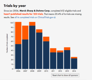
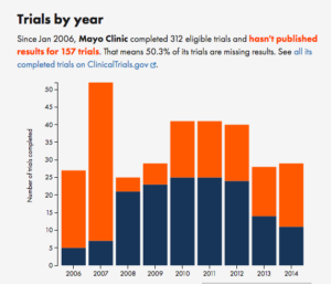
We’ve known since at least the 1980s that there’s a problem with clinical trial results not being published. Tracking the non-publication rate is time-consuming, though.  There’s a new website out that tries to automate the process, and a paper that claims it’s fairly accurate, at least for the subset of trials registered at ClinicalTrials.gov.  It picks up most medical journals and also picks up results published directly at ClinicalTrials.gov — an alternative pathway for boring results such as dose equivalence studies for generics.

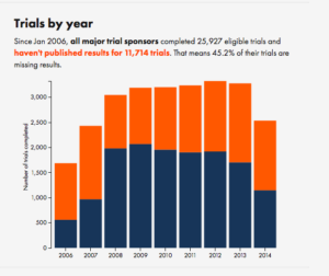
Here’s the overall summary for all trial organisers with more than 30 registered trials:

all

The overall results are pretty much what people have been claiming. The details might surprise you if you haven’t looked into the issue carefully. There’s a fairly pronounced difference between drug companies and academic institutions — the drug companies are better at publishing their trials.

For example, compare Merck to the Mayo Clinic
merck mayo

It’s not uniform, but the trend is pretty clear.


October 31, 2016

Give a dog a bone?

From the Herald (via Mark Hanna)

Warnings about feeding bones to pets are overblown – and outweighed by the beneficial effect on pets’ teeth, according to pet food experts Jimbo’s.

and

To back up their belief in the benefits of bones, Jimbo’s organised a three-month trial in 2015, studying the gums and teeth of eight dogs of various sizes.

Now, I’m not a vet. I don’t know what the existing evidence is on the benefits or harms of bones and raw food in pets’ diets. The story indicates that it’s controversial. So does Wikipedia, but I can’t tell whether this is ‘controversial’ as in the Phantom Time Hypothesis or ‘controversial’ as in risks of WiFi or ‘controversial’ as in the optimal balance of fats in the human diet. Since I don’t have a pet, this doesn’t worry me. On the other hand, I do care what the newspapers regard as reliable evidence, and Jimbo’s ‘Bone A Day’ Dental Trial is a good case to look at.

There are two questions at issue in the story: is feeding bones to dogs safe, and does it prevent gum disease and tooth damage? The small size of the trial limits what it can say about both questions, but especially about safety.  Imagine that a diet including bones resulted in serious injuries for one dog in twenty, once a year on average. That’s vastly more dangerous than anyone is actually claiming, but 90% of studies this small would still miss the risk entirely.  A study of eight dogs for three months will provide almost no information about safety.

For the second question, the small study size was aggravated by gum disease not being common enough.  Of the eight dogs they recruited, two scored ‘Grade 2’ on the dental grading, meaning “some gum inflammation, no gum recession“, and none scored worse than that.   Of the two dogs with ‘some gum inflammation’, one improved.  For the other six dogs, the study was effectively reduced to looking at tartar — and while that’s presumably related to gum and tooth disease, and can lead to it, it’s not the same thing.  You might well be willing to take some risk to prevent serious gum disease; you’d be less willing to take any risk to prevent tartar.  Of the four dogs with ‘Grade 1: mild tartar’, two improved.  A total of three dogs improving out of eight isn’t much to go on (unless you know that improvement is naturally very unusual, which they didn’t claim).

One important study-quality issue isn’t clear: the study description says the dental grading was based on photographs, which is good. What they don’t say is when the photograph evaluation was done.  If all the ‘before’ photos were graded before the study and all the ‘after’ photos were graded afterwards, there’s a lot of room for bias to creep in to the evaluation. For that reason, medical studies are often careful to mix up ‘before’ and ‘after’ or ‘treated’ and ‘control’ images and measure them all at once.  It’s possible that Jimbo’s did this, and that person doing the grading didn’t know which was ‘before’ and which was ‘after’ for a given dog. If before-after wasn’t masked this way, we can’t be very confident even that three dogs improved and none got worse.

And finally, we have to worry about publication bias. Maybe I’m just cynical, but it’s hard to believe this study would have made the Herald if the results had been unfavourable.

All in all, after reading this story you should still believe whatever you believed previously about dogfood. And you should be a bit disappointed in the Herald.