Posts filed under Risk (222)

January 14, 2014

The dangers of better measurement

An NPR News story on back pain and its treatment

One reason invasive treatments for back pain have been rising in recent years, Deyo says, is the ready availability of MRI scans. These detailed, color-coded pictures that can show a cross-section of the spine are a technological tour de force. But they can be dangerously misleading.

This MRI shows a mildly herniated disc. That's the sort of thing that looks abnormal on a scan but may not be causing pain and isn't helped by surgery.

This MRI shows a mildly herniated disc. That’s the sort of thing that looks abnormal on a scan but may not be causing pain and isn’t helped by surgery.

“Seeing is believing,” Deyo says. “And gosh! We can actually see degenerated discs, we can see bulging discs. We can see all kinds of things that are alarming.”

That is, they look alarming. But they’re most likely not the cause of the pain.

Health food research marketing

The Herald has a story about better ways to present nutritional information on foods

“Our study found that those who were presented with the walking label were most likely to make healthier consumption choices, regardless of their level of preventive health behaviour,” Ms Bouton said.

“Therefore, consumers who reported to be unhealthier were likely to modify their current negative behaviour and exercise, select a healthier alternative or avoid the unhealthy product entirely when told they would need to briskly walk for one hour and 41 minutes to burn off the product.

“The traffic light system was found to be effective in deterring consumers from unhealthy foods, while also encouraging them to consume healthy products.”

This sounds good. And this is a randomised experiment, which is an excellent feature.

However, it’s just an online survey of 591 people, about a hypothetical product, so what it actually found was that the labelling system was effective in deterring people from saying they would buy unhealthy foods, encouraging them to say they would consume healthy products and made them more likely to say they would exercise. That’s not quite so good. It’s a lot easier to get people to say they are going to eat better, exercise more, and lose weight that to get them to actually do it.

Another interesting feature is that this new research has appeared on the Herald website before. In October 2012 there was a story based on the first 220 survey responses

Not only were people more likely to exercise when they saw such labels, they also felt more guilty, Ms Bouton said.

“My findings showed that the exercise labelling was significantly more effective in both chocolate and healthier muesli bars in encouraging consumers to exercise after consumption.

“It increased the likelihood of having higher feelings of guilt after consumption and was more likely to stop [the participant] consuming the chocolate bar with the exercise labelling.”

The 2012 story still didn’t raise the issue of what people said versus actual behaviour, but it did get an independent opinion, who pointed out that calories aren’t the only purpose of food labelling.

More importantly, the stories and the two press releases are all the information I could find online about the research. There don’t seem to be any more details either published or in an online report. It’s good to have stories about scientific research, and this sort of experiment is an important step in thinking about food labelling, but the stories are presenting stronger conclusions that can really be supported by a single unpublished online survey.

January 7, 2014

How dangerous is the rest of the world?

Both Stuff and the Herald have stories today based on MFAT statistics on consular assistance provided for deaths and accidents overseas.  The basic message is that deaths overseas are increasing.

Both sites have interactive graphics: Stuff has a clicky map, and the Herald has barplots where you can select a country. A very nice feature of the Herald story is that they have more data, and a link to let you download it. They got the data under the Official Information Act, which is an impressive-sounding way of saying they asked MFAT for it (as Graeme Edgeler has pointed out, even ringing up some departmental office and asking what time they’re open is an Official Information Act request.)deaths

From the extended data it’s clear that consular assistance for deaths is up a lot over time. That’s a much bigger increase than the number of trips overseas, and the increase looks pretty similar if you exclude Australia, which is unrepresentative because so many Kiwis actually live there. I don’t have any real idea why this is happening, and apparently neither do the journalists.

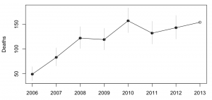
It’s interesting to look at how dangerous foreign travel is based on these data.  For Thailand, the story in Stuff quotes 115000 trips and 18 deaths in the 9 months to September 2013. That gives a mortality rate of 0.16 per 1000 trips. The annual mortality rate for New Zealand as a whole is 6.8 per 1000 people per year, but travellers tend to be younger and healthier than average. For twentysomethings, the annual mortality rate is about 0.6 per 1000 per year, so the average trip uses up at most 3 months worth of mortality risk — travelling to Thailand is dangerous, but not very dangerous.   Even then, we can’t be sure that it’s Thailand that is dangerous: other contributing explanations could be that people do riskier things while they are there, or that the sort of people who travel to Thailand are prone to taking more risks.  The figure for all countries is about half that for Thailand, though it’s less reliable because of the difficulty in knowing how to handle Australia.

The figures for deaths while travelling should be fairly reliable — I’d expect most deaths of travellers to require some consular assistance — but the figures for accidents are obviously less complete. That didn’t stop Stuff saying

But according to the figures, deaths far outnumber accidents and injuries for New Zealanders across the globe.

The phrase “according to the figures” is doing a lot of work in that sentence, if you want to be able to say it with a straight face.


Update: Luis Apiolaza tracked down data(XLS) on deaths of visitors to NZ. Mortality is about 0.05-0.07 per 1000 trips. Visitors are safer here than we are abroad.

January 6, 2014

In the deep midwinter

It’s cold in the United States at the moment. Very cold. Temperatures in places where lots of people live are down below -20C (before worrying about the wind chill).This isn’t just hypothermia weather, this is ‘exposed skin freezes in minutes’ weather, and hasn’t been seen on such a large scale for decades. So why isn’t this evidence against global warming?

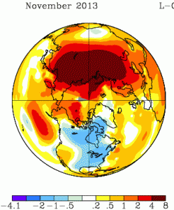
It will be a month or two before we have the global data, but the severe cold snaps in recent years have been due to cold air being in unusual places, rather than to the world being colder that week. For example, November 2013 was also cold in the North America, but it was warm in northern Russia; the cold had just moved (map from NASA).

nmaps


The cold spells in Europe in recent years have been matched by warm spells in Greenland and northeast Canada. You don’t hear about these as much, because hardly anyone lives there.  The ‘polar vortex‘ being described on the US news is an example of the same thing: cold air that usually stays near the pole has moved down to places where people live. That suggests the global temperature anomaly maps for December/January will show warmer-than-usual conditions in other parts of the far northern hemisphere.

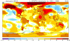
For contrast, look at the heat wave in Australia last January, when the Bureau of Meteorology had to find a new colour to depict really, really, really hot. This map is from the same NASA source (just a different projection)

nmaps-oz


Not only was all of Australia hot, the ocean south of Australia was warmer than typical. This wasn’t a case of cold air from the Southern Ocean failing to reach Australia, which causes heat waves in Melbourne several times a year. It doesn’t look like a case of just moving heat around.

No single weather event can provide any meaningful evidence for or against global warming. What’s important for honest scientific lobbying is whether this sort of event is likely to become more common as a result. The Australian heat waves definitely are. The situation is less clear for the US winter cold: the baseline temperatures will go up, which will mitigate future cold snaps, but there is some initial theoretical support for the idea that warming of the Arctic Ocean increases the likelihood that polar vortices will wander off into inhabited areas.


[note: you can also see in the Jan 2013 picture that the warm winter in the US was partly balanced by cold in Siberia that you didn’t hear so much about]

January 2, 2014

Toll, poll, and tolerance.

The Herald has a story that  has something for everyone.  On the front page of the website it’s labelled “Support for lower speed limit“, but when you click through it’s actually about the tighter tolerance (4km/h, rather than 10km/h) for infringement notices being used on the existing speed limits.

The story is about a real poll, which found about 2/3 support for the summer trial of tighter speed limits. Unfortunately, the poll seems to have had really badly designed questions. Either that, or the reporting is jumping to unsupportable conclusions:

The poll showed that two-thirds of respondents felt that the policy was fair because it was about safety. Just 29 per cent said that it was unfair and was about raising revenue.

That is, apparently the alternatives given for respondents combined both whether they approved of the policy and what they thought the reason was.  That’s a bad idea for two reasons. Firstly, it confuses the respondents, when it’s hard enough getting good information to begin with. Secondly, it pushes them towards an answer.   The story is decorated with a bogus clicky poll, which has a better set of questions, but, of course, largely meaningless results.

The story also quotes the Police Minister attributing a 25% lower death toll during  the Queen’s Birthday weekends to the tighter tolerance

“That means there is an average of 30 people alive today who can celebrate Christmas who might not otherwise have been,” Mrs Tolley said.

We’ve looked at this claim before. It doesn’t hold up. Firstly, there has been a consistently lower road toll, not just at holiday weekends.  And secondly, the Ministry of Transport says that driving too fast for the conditions is a only even one of the contributing factors in 29% of fatal crashes, so getting a 25% reduction in deaths just from tightening the tolerance seems beyond belief.  To be fair, the Minister only said the policy “contributed” to the reduction, so even one death prevented would technically count, but that’s not the impression being given.

What’s a bit depressing is that none of the media discussion I’ve seen of the summer campaign has asked what tolerance is actually needed, based on accuracy of speedometers and police speed measurements. And while stories mention that the summer campaign is a trial run to be continued if it is successful, no-one seems to have asked what the evaluation criteria will be and whether they make sense.

(suggested by Nick Iversen)

December 18, 2013

Survival analysis of chocolate in hospital

You may remember StatsChat’s criticism of data quality and analysis in paper about chocolate and Nobel Prizes from a leading medical journal.  Another leading medical journal, BMJ, traditionally has a Christmas issue with not entirely serious papers, typically based on good-quality silly research. One of the past highlights was the systematic review of randomised trials of parachute use.

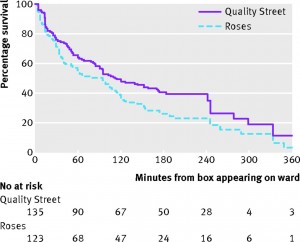
This year, there’s a survival analysis of chocolate in hospital wards. Survival analysis is the branch of statistics working with the time until an event happens.  Often the event is death, hence the name ‘survival’, but it could be something else bad, such as a heart attack, or something good, such as finding a job.  If you’re a chocolate, it’s being eaten.

survival


The data are a good fit to a constant hazard of consumption, with a rate of just under 1%/minute.  There isn’t any sign of strong heterogeneity — if some chocolates are preferred to others, the preference is either not strong enough or variable enough between people that no chocolates are safe.

Other papers in the Christmas issue include a semi-serious comparison of stem cell size and structure for mice and whales, and the finding that, in Dublin, people called Brady are more likely to have pacemaker treatment for bradycardia (presumably a multiple comparison issue)

December 2, 2013

Don’t be scared of WiFi

From TV One Breakfast this morning “WiFi detrimental to health, study suggests“. (I didn’t see this live; the Science Media Centre contacted me for comment)

The guest, Mr Kasper from Safe Wireless Technology NZ, said

Overseas research has shown that a person who uses a mobile phone for a year increases their chances of getting brain cancer by 70%, according to the SWTNZ.

The ‘overseas research’ appears to be this, a case-control study of acoustic neuroma in Scandinavia. The first thing to note is that “acoustic neuroma” isn’t the same thing as “brain cancer”. Acoustic neuroma is a rare, benign brain tumour (‘benign’ means it doesn’t spread metastatically), which is usually treatable, though often with long-term effects.  The researchers didn’t suggest that their results applied to other brain tumours; in fact, they assumed the opposite and used people with a different brain tumour, meningioma, as one set of controls for their comparisons.

The story  also says

“There’s so much research and there’s so much scientific evidence now that does more than just suggest that there is a real problem, and people are getting these problems,” Mr Kasper said.

The National Cancer Institute has a good summary of the scientific evidence, and they are not at all convinced. It certainly isn’t the case that there’s a strong association with brain cancer overall.

The new research appears to be better conducted than a lot of the past claims of associations between radio waves and health. It’s working against a strong burden of proof both from animal studies and from the fact that radio waves can’t damage DNA. I don’t think it manages that level of proof, but I think reasonable people could disagree. However, even if we assume that the association specifically with acoustic neuroma is real and causal, it doesn’t really support any concern over WiFi. Cellphones are pressed up against the ear, and so provide higher dose of radio-frequency energy to that ear. WiFi transmitters are typically not pressed up against the ear, and each doubling of the distance reduces the energy by a factor of four. And, since they don’t have to reach as far, WiFi signals are less powerful to begin with.

The story ends with

“We do want the Government to put some money into some independent research.”

I’m generally in favour of the Government putting money into research, but on this particular topic  there’s no real advantage to the research being done in New Zealand, and we have too small a population to contribute much. There are large international studies ongoing; we don’t need a small local one.

If you are worried about cellphones and acoustic neuroma, use headphones with your cellphone. If you are worried about WiFi and brain cancer, then relax.

 

November 29, 2013

Roundup retraction

I’ve written before about the Seralini research that involved feeding glyphosate and GM corn to rats. Now, Retraction Watch is reporting that the paper will be retracted.

This is a slightly unusual retraction: typically either the scientist has a horrible realisation that something went wrong (maybe their filters were affecting composition of their media) or the journal has a horrible realisation that something went wrong (maybe the images were Photoshopped or the patients didn’t actually exist).

The Seralini paper, though, is being retracted for being kinda pointless. The editors emphasise that they are not suggesting fraud, and write

A more in-depth look at the raw data revealed that no definitive conclusions can be reached with this small sample size regarding the role of either NK603 or glyphosate in regards to overall mortality or tumor incidence. Given the known high incidence of tumors in the Sprague-Dawley rat, normal variability cannot be excluded as the cause of the higher mortality and incidence observed in the treated groups.

Ultimately, the results presented (while not incorrect) are inconclusive, and therefore do not reach the threshold of publication for Food and Chemical Toxicology. 

They’re certainly right about that, but this is hardly a new finding. I’m not really happy about retraction of papers when it isn’t based on new information that wasn’t easily available at the time of review. Too many pointless and likely wrong papers are published, but this one is being retracted for being pointless, likely wrong, and controversial.


[Update: mass enthusiasm for the retraction is summarised by Peter Griffin]

November 27, 2013

Interpretive tips for understanding science

From David Spiegelhalter, William Sutherland, and Mark Burgman, twenty (mostly statistical) tips for interpreting scientific findings

To this end, we suggest 20 concepts that should be part of the education of civil servants, politicians, policy advisers and journalists — and anyone else who may have to interact with science or scientists. Politicians with a healthy scepticism of scientific advocates might simply prefer to arm themselves with this critical set of knowledge.

A few of the tips, without their detailed explication:

  • Differences and chance cause variation
  • No measurement is exact
  • Bigger is usually better for sample size
  • Controls are important
  • Beware the base-rate fallacy
  • Feelings influence risk perception
November 26, 2013

Should recreational genotyping be illegal?

The US Food and Drug Administration has sent a letter to 23andme, one of the companies that will genotype you and provide lots of information from the sample, telling them to stop. It’s a tricky situation.

This product is a device within the meaning of section 201(h) of the FD&C Act, 21 U.S.C. 321(h), because it is intended for use in the diagnosis of disease or other conditions or in the cure, mitigation, treatment, or prevention of disease, or is intended to affect the structure or function of the body. For example, your company’s website at www.23andme.com/health  (most recently viewed on November 6, 2013) markets the PGS for providing “health reports on 254 diseases and conditions,” including categories such as “carrier status,” “health risks,” and “drug response,” and specifically as a “first step in prevention” that enables users to “take steps toward mitigating serious diseases” such as diabetes, coronary heart disease, and breast cancer. Most of the intended uses for PGS listed on your website, a list that has grown over time, are medical device uses under section 201(h) of the FD&C Act. Most of these uses have not been classified and thus require premarket approval or de novo classification, as FDA has explained to you on numerous occasions.

On the one hand, I can’t see any valid social interest in stopping people from knowing their genotypes if they want to. On the other hand, the FDA has a point about marketing.

They raise two isssues.  The first is that 23andme make lots of (fairly weakly supported) claims about the usefulness of the results in disease prevention. The second is that some of the genotype information is actually clinically relevant and that they have not demonstrated sufficient accuracy in their results. The first issue is essentially a misleading advertising problem; the second is a quality assurance problem.

There are two things that can go wrong with the clinically useful results. The first is simple error: the genotype assay could give the wrong result, or you could be given results from someone else’s sample. This should be low probability, but it’s important to know how low — 1 in a 1000 would definitely be too high.

The second issue is interpretation. Suppose you have a lot of family members with breast cancer, and you suspect a BRCA1 mutation is responsible. You might be relieved if you test negative, and think your risk isn’t especially high, but that’s only a reliable conclusion if your family’s cancer risk was actually due to a BRCA1 mutation, not to some other genetic risk factor.


Update: I should probably note that 23andme could fix what I think are the actual problems, but this wouldn’t necessarily satisify the FDA.  The FDA aren’t currently being unreasonable oppressive Luddite statist bureaucrats, but they’re probably happy to be to if that’s the option on offer.