Posts filed under Research (206)

December 29, 2014

How headlines sometimes matter

From the New Yorker, an unusual source for StatsChat, an article about research on the impact of headlines.  I often complain that the headline and lead are much more extreme than the rest of the story, and this research looks into whether this is just naff or actually misleading.

In the case of the factual articles, a misleading headline hurt a reader’s ability to recall the article’s details. That is, the parts that were in line with the headline, such as a declining burglary rate, were easier to remember than the opposing, non-headlined trend. Inferences, however, remained sound: the misdirection was blatant enough that readers were aware of it and proceeded to correct their impressions accordingly. […]

In the case of opinion articles, however, a misleading headline, like the one suggesting that genetically modified foods are dangerous, impaired a reader’s ability to make accurate inferences. For instance, when asked to predict the future public-health costs of genetically modified foods, people who had read the misleading headline predicted a far greater cost than the evidence had warranted.
December 18, 2014

It’s beginning to look a lot like Christmas

In particular, we have the Christmas issue of the BMJ,  which is devoted to methodologically sound papers about silly things (examples including last year’s on virgin birth in the National Longitudinal Study of Youth, and the classic meta-analysis of randomised trials of parachute use)

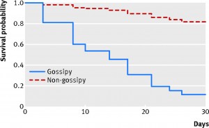
University of Auckland researchers have a paper this year looking at the survival rate of magazines in doctors’ waiting rooms

We defined a gossipy magazine as one that had five or more photographs of celebrities on the front cover and a most gossipy magazine as one that had up to 10 such images. The Economist and Time magazine were deemed to be non-gossipy. The rest of the magazines did not meet the gossipy threshold as they specialised in, for example, health, the outdoors, the home, and fashion. Practice staff placed 87 magazines in three piles in the waiting room and removed non-study magazines. To blind potential human vectors to the study, BA marked a unique number on the back cover of each magazine. Twice a week the principal investigator arrived at work 30 minutes early to record missing magazines.

And what did they find?

F1.large


December 11, 2014

Very like a whale

We see patterns everywhere, whether they are there or not. This gives us conspiracy theories, superstition, and homeopathy. It’s really hard to avoid drawing conclusions about patterns, even when you know they aren’t really there.

Some of the most dramatic examples are visual

HAMLET
Do you see yonder cloud that’s almost in shape of a camel?

LORD POLONIUS
By the mass, and ’tis like a camel, indeed.

HAMLET
Methinks it is like a weasel.

LORD POLONIUS
It is backed like a weasel.

HAMLET
Or like a whale?

LORD POLONIUS
Very like a whale.

Hamlet was probably trolling, but he got away with it because seeing shapes in the clouds is a common experience.

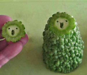
Just as we’re primed to see causal relationships whether they are there or not, we are also primed to recognise shapes whether they are there or not. The compulsion is perhaps strongest for faces, as in this bitter melon (karela) from Reddit

ByuOkJuIIAARd-z

and this badasss mop

BZs7gHTIcAAHAuC

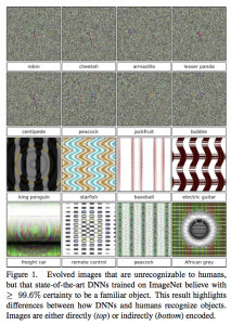
It turns out that computers can be taught similar illusions, according to new research from the University of Wyoming.  The researchers took software that had been trained to recognise certain images. They then started off with random video snow or other junk patterns and made repeated random changes, evolving images that the computer would recognise.

B4aMt24CcAAOeZv

These are, in a sense, computer optical illusions. We can’t see them, but they are very convincing to a particular set of artificial neural networks.

There are two points to this. The first is that when you see a really obvious pattern it isn’t necessarily there. The second is that even if computers are trained to classify a particular set of examples accurately, they needn’t do very well on completely different sets of examples.

In this case the computer was looking for robins and pandas, but it might also have been trained to look for credit card fraud or terrorists.


December 7, 2014

Bot or Not?

Turing had the Imitation Game, Phillip K. Dick had the Voight-Kampff Test, and spammers gave us the CAPTCHA.  The Truthy project at Indiana University has BotOrNot, which is supposed to distinguish real people on Twitter from automated accounts, ‘bots’, using analysis of their language, their social networks, and their retweeting behaviour. BotOrNot seems to sort of work, but not as well as you might expect.

@NZquake, a very obvious bot that tweets earthquake information from GeoNet, is rated at an 18% chance of being a bot.  Siouxsie Wiles, for whom there is pretty strong evidence of existence as a real person, has a 29% chance of being a bot.  I’ve got a 37% chance, the same as @fly_papers, which is a bot that tweets the titles of research papers about fruit flies, and slightly higher than @statschat, the bot that tweets StatsChat post links,  or @redscarebot, which replies to tweets that include ‘communist’ or ‘socialist’. Other people at a similar probability include Winston Peters, Metiria Turei, and Nicola Gaston (President of the NZ Association of Scientists).

PicPedant, the twitter account of the tireless Paulo Ordoveza, who debunks fake photos and provides origins for uncredited ones, rates at 44% bot probability, but obviously isn’t.  Ben Atkinson, a Canadian economist and StatsChat reader, has a 51% probability, and our only Prime Minister (or his twitterwallah), @johnkeypm, has a 60% probability.


December 1, 2014

Drug graphs

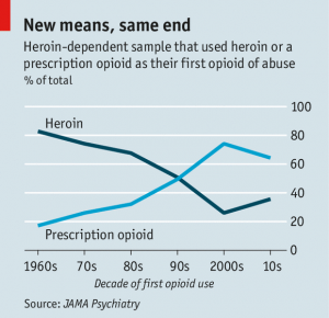
The Economist has a story on the changes in heroin abuse in the US (via @nzdrug).  It’s interesting to read, but I want to comment on the graphs.  The first one, and the one in the tweet, was this:

20141122_USC323

The source (if you use the clues in the story to search at JAMA Psychiatry) is here; the format of the graph is the same in the research paper.  I really don’t like this style with two lines for one proportion. At first glance it looks as though there’s information in the way one line mirrors the other, with the total staying approximately constant over time. Then you see that the total is exactly constant over time. It’s 100%.

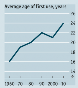
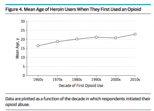
The other interesting graph is different in the research paper and the story. The data are the same, but the visual impression is different.

drug-nozero drug-zero

The graph on the left, from The Economist, has no zero. The graph on the right has a zero, making the change in mean age look a lot smaller.  In this case I think I’m with The Economist when it comes to the design, though I’d argue for a slightly wider and flatter graph. Barcharts must start at zero (defined appropriately for the data), but lines don’t have to, and an increase in mean age of first use from 16.5 to 22.9 is a pretty big change.

Where I’m not with The Economist is the numbers. The research paper, as I said, gives the numbers as 16.5 in the 1960s and 22.9 in the 2010s. The graph from the story is definitely too high at the maximum and probably too low at the minimum.


October 30, 2014

Cocoa puff

Both Stuff and the Herald have stories about the recent cocoa flavanols research (the Herald got theirs from the Independent).

Stuff’s story starts out

Remember to eat chocolate because it might just save your memory. This is the message of a new study, by Columbia University Medical Centre.


Sixteen paragraphs later, though, it turns out this isn’t the message

“The supplement used in this study was specially formulated from cocoa beans, so people shouldn’t take this as a sign to stock up on chocolate bars,” said Dr Simon Ridley, Head of Research at Alzheimer’s Research UK.


There’s a lot of variation in flavanol concentrations even in dark chocolate, but 900mg of flavanols would be somewhere between 150g and 1kg of dark chocolate per day.  Ordinary cocoa powder is also not going to provide 900mg at any reasonable consumption level.

The Herald story is much less over the top. They also quote in more detail the cautious expert comments and give less space to the positive ones. For example, that the study was very small and very short, and the improvement in memory was just in one measure of speed of very-short-term recall from a visual prompt, or that this measure was chosen because they expected it to be affected by cocoa rather than because of its relevance to everyday life. There was another memory test in the study, arguably a more relevant one, which was not expected to improve and didn’t.

Neither story mentions that the randomised trial also evaluated an exercise program that the researchers expected to be effective but wasn’t. Taking that into account, the statistical evidence for the effect of flavanols is not all that strong.

October 28, 2014

Absolute, relative, correlation, cause

The conclusions of a recent research paper

Delivery by [caesarean section] is associated with a modest increased odds of [autism], and possibly ADHD, when compared to vaginal delivery. Although the effect may be due to residual confounding, the current and accelerating rate of[caesarean section] implies that even a small increase in the odds of disorders, such as [autism] or ADHD, may have a large impact on the society as a whole. This warrants further investigation.

The Herald

Babies born through Caesarean section are more likely to develop autism, a new study says.

Academics warn the increasingly popular C-section deliveries heighten the risk of the disorder by 23 per cent.

There’s a fairly clear difference in language: the news story is fairly clearly implying that caesarean sections cause autism; the research paper is being scrupulously careful not to say that.

Using a relative risk is convenient in technical communication, but in non-technical communication makes the impact seem greater than it really is. The US Centers for Disease Control estimate a risk of 1 in 68 for autism spectrum disorder (there aren’t systematic NZ data).  If the correlation with C-section really is causal, we’re talking about roughly 14 kids with autism spectrum disorders per 1000 without a C-section and about 17 per 1000 with a C-section. The absolute risk increase, if it’s real, is about 3 cases per 1000 C-sections.

It’s also important to be clear that this correlation cannot explain much of the recent increases in autism. A relative risk of 1.23 means that if we went from no C-sections to 100% C-sections there would be a 23% increase in autism spectrum disorder. The observed increase is about five times that, and since  C-sections have only increased about 10 percentage points, not 100 percentage points, the observed increase in autism is about 50 times what this correlation could explain.

There are (I’m told by people who know the issues) good reasons to think there are too many C-sections.  This probably won’t be one of the most important ones.


October 18, 2014

When barcharts shouldn’t start at zero

Barcharts should almost always start at zero. Almost always.

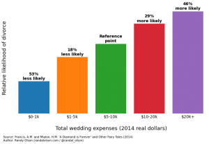
Randal Olson has a very popular post on predictors of divorce, based on research by two economists at Emory University. The post has a lot of barcharts like this one

marriage-stability-wedding-expenses

The estimates in the research report are hazard ratios for dissolution of marriage. A hazard ratio of zero means a factor appears completely protective — it’s not a natural reference point. The natural reference point for hazard ratios is 1: no difference between two groups, so that would be a more natural place to put the axis than at zero.

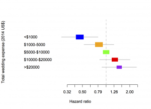
A bar chart is also not good for showing uncertainty. The green bar has no uncertainty, because the others are defined as comparisons to it, but the other bars do. The more usual way to show estimates like these from regression models is with a forest plot:

marriage

The area of each coloured box is proportional to the number of people in that group in the sample, and the line is a 95% confidence interval.  The horizontal scale is logarithmic, so that 0.5 and 2 are the same distance from 1 — otherwise the shape of the graph would depend on which box was taken as the comparison group.

Two more minor notes: first, the hazard ratio measures the relative rate of divorces over time, not the relative probability of divorce, so a hazard ratio of 1.46 doesn’t actually mean 1.46 times more likely to get divorced. Second, the category of people with total wedding expenses over $20,000 was only 11% of the sample — the sample is differently non-representative than the samples that lead to bogus estimates of $30,000 as the average cost of a wedding.

October 8, 2014

What are CEOs paid; what should they be paid?

From Harvard Business Review, reporting on recent research

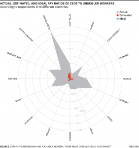
Using data from the International Social Survey Programme (ISSP) from December 2012, in which respondents were asked to both “estimate how much a chairman of a national company (CEO), a cabinet minister in a national government, and an unskilled factory worker actually earn” and how much each person should earn, the researchers calculated the median ratios for the full sample and for 40 countries separately.

The graph:

actualestimated


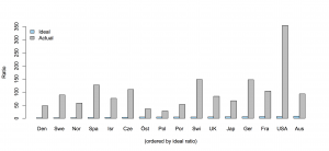
The radial graph exaggerates the differences, but they are already huge. Respondents dramatically underestimated what CEOs are actually paid, and still thought it was too much.  Here’s a barchart of the blue and grey data (the red data seems to only be available in the graph). Ordering by ideal pay ratio (rather than alphabetically) helps with the nearly-invisible blue bars: it’s interesting that Australia has the highest ideal ratio.

ceo

The findings are a contrast to foreign aid budgets, where the desired level of expenditure is less than the estimated level, but more than the actual level.  On the other hand, it’s less clear exactly what the implications are in the CEO case.


September 26, 2014

Screening is harder than that

From the Herald

Calcium in the blood could provide an early warning of certain cancers, especially in men, research has shown.

Even slightly raised blood levels of calcium in men was associated with an increased risk of cancer diagnosis within one year.

The discovery, reported in the British Journal of Cancer, raises the prospect of a simple blood test to aid the early detection of cancer in high risk patients.

In fact, from the abstract of the research paper, 3% of people had high blood levels of calcium, and among those,  11.5% of the men developed cancer within a year. That’s really not strong enough prediction to be useful for early detection of cancer. For every thousand men tested you would find three cancer cases, and 27 false positives. What the research paper actually says under “Implications for clinical practice” is

“This study should help GPs investigate hypercalcaemia appropriately.”

That is, if a GP happens to measure blood calcium for some reason and notices that it’s abnormally high, cancer is one explanation worth checking out.

The overstatement is from a Bristol University press release, with the lead

High levels of calcium in blood, a condition known as hypercalcaemia, can be used by GPs as an early indication of certain types of cancer, according to a study by researchers from the universities of Bristol and Exeter.

and later on an explanation of why they are pushing this angle

The research is part of the Discovery Programme which aims to transform the diagnosis of cancer and prevent hundreds of unnecessary deaths each year. In partnership with NHS trusts and six Universities, a group of the UK’s leading researchers into primary care cancer diagnostics are working together in a five year programme.

While the story isn’t the Herald’s fault, using a photo of a man drinking a glass of milk is. The story isn’t about dietary calcium being bad, it’s about changes in the internal regulation of calcium levels in the blood, a completely different issue. Milk has nothing to do with it.