Posts filed under Research (206)

October 9, 2013

Bell curves, bunnies, and dragons

Keith Ng points me to something that’s a bit more technical than we usually cover here on StatsChat, but it was in the New York Times, and it does have  redeeming levels of cutesiness: an animation of the central limit theorem using bunnies and dragons

The point made by the video is that the Normal distribution, or ‘bell curve’, is a good approximation to the distribution of averages even when it is a very poor approximation to the distribution of individual measurements.  Averaging knocks all the corners off a distribution, until what is left can be described just by its mean and spread.  (more…)

October 8, 2013

100% protection?

The Herald tells us

Sunscreen provides 100 per cent protection against all three types of skin cancer and also safeguards a so-called superhero gene, a new study has found.

That sounds dramatic, and you might wonder how this 100% protection was demonstrated.

The study involved conducting a series of skin biopsies on 57 people before and after UV exposure, with and without sunscreen.

There isn’t any link to the research or even the name of the journal, but the PubMed research database suggests that this might be it, which is confirms by the QUT press release. The researcher name matches, and so does the number of skin biopsies.  They measured various types of cellular change in bits of skin exposed to simulated solar UV light, at twice the dose needed to turn the skin red, and found that sunscreen reduced the changes to less than the margin of error.  This looks like good quality research, and it indicates that sunscreen definitely will give some protection from melanoma, but 100% must be going too far given the small sample and moderate UV dose.

I was a also bit surprised by the “so-called superhero gene”, since I’d never seen p53 described that way before. It’s n0t just me: Google hasn’t seen that nickname either, except on copies of this story.

October 7, 2013

Caricatures in language space

There’s an interesting (and open-access) paper in the journal PLoS One that I would have expected to attract more media attention both for its results and for its visualisations.

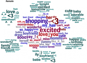
The researchers looked at words that distinguished people by age and gender (or, to be precise, what they had told Facebook were their age and gender). Here’s the female half of the graphic showing male/female distinguishing words (the full image, here, ‘contains language’)

facebook-gender


The clump in the middle are the words that are the most effective evidence that the writer is female. That doesn’t mean these words are especially frequent in women’s Facebook posts, just that they are much less frequent in men’s posts. The green clumps are the most-distinguishing topics, as identified statistically, with the words that define those topics.

Analyses like this are bound to come up with results that look like a caricature, since they are obtained in much the same way that a caricature is drawn, by finding and highlighting the most extreme and distinctive aspects.

October 3, 2013

People who bought this theory also liked…

An improved version of study that Stuff and StatsChat reported on more than a year ago has now appeared in print. The study found that people who have non-standard beliefs about the moon landings or Princess Diana’s death are also likely to have non-standard beliefs about climate change or health effects of tobacco. It improves on the previous research by using a reasonably representative online survey rather than a sample of visitors to climate debate blogs.

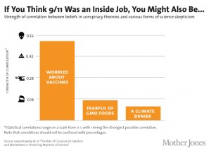
Mother Jones magazine in the US summarised some of the results in this graph of correlations

conspiracies6_2


That’s a horrible graph partly because, contrary to what the footnote says, correlations are not in fact restricted to be between 0 and 1, but between -1 and 1: and in fact the three correlations shown were negative in the research and have been turned around for more convenient display.

The title is misleading: only one of the six `conspiracist ideation’ questions was about 9/11, and it wasn’t a yes/no question, and it wasn’t really about it being an inside job (ie, performed by the government), but about the government allowing it to happen. In the same way, the other three variables aren’t simple yes/no questions, but scores based multiple questions, each on a 5-point scale.

A more-technical point is that correlations, while appropriate in the paper as part of their statistical model, aren’t really a good way to describe the strength of association.  It’s easier to understand the square of the correlation, which gives the proportion of variability in one variable explained by the other.  That is, the conspiracy-theory score explains about 25% of the variation in the vaccine score,  just over 1% of the variation in the GM Foods score, and just under 1% of the variation in the climate change score.

(via @zentree)

September 25, 2013

Briefly

  • Big Data and Due Process: fairly readable academic paper arguing for legal protections against harm done by automated classification (accurate or inaccurate)
  • The Herald quotes Maurice Williamson on a drug seizure operation

“The harm prevented from keeping these analogues away from communities has been calculated at $32 million,” Mr Williamson said.

Back in 2008, Russell Brown explained where these numbers come from. As you might expect, there is no reasonable sense in which they are estimates of harm prevented. They don’t measure what communities should care about.

  • Levels of statistical evidence are ending up in the US Supreme court. At issue is whether  a press release claiming that a treatment”Reduces Mortality by 70% in Patients with Mild to Moderate Disease” is fraud when the study wasn’t set up to look at mortality and when the reduction wasn’t statistically significant by usual standards.  Since a subsequent trial designed to look at mortality reductions convincingly failed to find them, the conclusion implied by the press release title is untrue, but the legal argument is whether, at the time, it was fraud.
  • From New Scientist: is ‘personalised’ medicine actually bad for public health?


September 15, 2013

Sometimes you don’t need to do the maths

On Friday, Stuff had a story about 10 pairs of twins in the same school in Wellington.

At this point I was going to break out the Stats New Zealand website and find out how many pairs of twins of school age there are in the country, and work how many schools you’d expect to have these sorts of numbers.  But when I went back to search for the story I found

  • A Herald story from last September, with 14 sets of twins in a Dunedin school
  • A Stuff story from last October, with 4 sets, in Timaru
  • A Stuff story from April, with 9 sets, in Manurewa
  • A Stuff story from June, with 3 sets in the same class, Palmerston Nth
  • A Stuff story from August, with 5 sets of twins and two of triplets, in Timaru

That’s just the past year, since the stories go on back in the past, and even stretch to other countries: a Stuff story from June was about 24 sets of twins in an Illinois school.

At some point it must be hard to keep pretending this is a surprise.


September 10, 2013

Marking predictions to market

A couple of weeks ago, I wrote about a Sydney Morning Herald story on new electorate-specific robopolls and their surprising predictions. Tim Colebatch at the SMH wrote

Uh-huh. Lonergan’s own national poll reports only a 2 per cent swing against Labor. Yet in the three seats it polled individually, it found an average swing of 10 per cent. That’s huge, far bigger than we have seen in any Federal election since 1943.

and I was similarly dubious.

We now have the facts: the national (two-party preferred) swing against Labour is just over 3%, and the swing in Kevin Rudd’s seat of Griffith, one of the three specifically polled and predicted to have a swing of 10.5%, was 5.42%. The other two seats mentioned in the story as polled by Lonergan were Forde (robopoll swing 8.5%, actual swing 2.5%) and Lindsay (robopoll swing 11%, voters 3.9%)

It looks as though the robopoll skeptics were right. Even though the national swing was larger than the poll predicted, the swings in the target electorates were much smaller.

August 23, 2013

Just making it easier to understand?

From the Journal of Nutritional Science

Young adult males (n 35) were supplemented with either half or two kiwifruit/d for 6 weeks. Profile of Mood States questionnaires were completed at baseline and following the intervention. No effect on overall mood was observed in the half a kiwifruit/d group; however, a 35 % (P = 0·06) trend towards a decrease in total mood disturbance and a 32 % (P = 0·063) trend towards a decrease in depression were observed in the two kiwifruit/d group. Subgroup analysis indicated that participants with higher baseline mood disturbance exhibited a significant 38 % (P = 0·029) decrease in total mood disturbance, as well as a 38 % (P = 0·048) decrease in fatigue, 31 % (P = 0·024) increase in vigour and a 34 % (P = 0·075) trend towards a decrease in depression, following supplementation with two kiwifruit/d. There was no effect of two kiwifruit/d on the mood scores of participants with lower baseline mood disturbance

From the Otago press release

Eating two kiwifruit a day can improve a person’s mood and give them extra energy, new research from the University of Otago, Christchurch (UOC) shows.

Over a six-week period, normally-healthy young men either ate two kiwifruit a day or half a kiwifruit daily as part of a research study into the potential mood-enhancing effects of the fruit.

Researchers found those eating two kiwifruit daily experienced significantly less fatigue and depression than the other group. They also felt they had more energy. These changes appeared to be related to the optimising of vitamin C intake with the two kiwifruit dose

From the Herald

Eating two kiwifruit a day can improve mood and energy levels, a new University of Otago study shows.

Those eating two kiwifruit were found to experience significantly less fatigue and depression than the others. They also felt they had more energy.

I’m not criticizing the research, which was a perfectly reasonable designed experiment, but if the findings are newsworthy, they are also worth presenting accurately.

August 9, 2013

Covering chocolate

Chocolate tastes nice but (sadly) is high in fat, so there’s a lot of potential appeal in news stories that say it’s really terribly healthy. Ideally these stories would come out just before Valentine’s Day, or Christmas, or perhaps Mothers’ Day, but any time of the year will do.

The Herald has a chocolate story, with the lead

Hot chocolate can help older people keep their brains healthy, research has shown.

The research compared blood flow in the brain, and performance on some cognitive function tests. The participants were assigned to drink cocoa with high or low levels of flavonols (aka flavonoids), the chemicals in chocolate that are thought to possibly have beneficial effects.  Based on the headline, you might expect that the researchers saw a difference between the two groups. Sadly, no:

Half the participants were given hot chocolate rich in antioxidant flavanol plant compounds while the other half received low-flavanol cocoa.

Flavanol content made no difference to the results, the researchers found.

That is, participants in both groups improved over the course of the study, regardless of what they drank.  Normally, this would be considered evidence against an effect of chocolate.

For comparison, there’s a more careful story at NPR news, and a less careful one at Forbes. We repeat the  StatsChat position on chocolate “Don’t eat it just for health reasons. If you don’t like it, save it for people who do.”
 

July 23, 2013

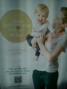
I learn something new every day

Today, for example, I found out what these ads in bus stops were for

wellbeing

Sovereign, the insurance company, has a survey of ‘wellbeing’, and wants you to participate.

The survey that produced the numbers in the ad is reasonably real research — it’s based on a random sample from an online survey panel — but

Would you like to be included in the next Sovereign Wellbeing Index results? If so take the full survey here.

together with the links on the ads suggests that they are going to augment the real survey with a bogus poll.

The survey results are interesting. They find that NZ has lower reported wellbeing than most other countries.  It’s not clear why this should be the case (and it disagrees with some other surveys), but one cynical suggestion is that a certain subset of Kiwis may have unintended reactions to questions like

I actively contribute to the happiness and wellbeing of others