Posts filed under Random variation (139)

July 26, 2013

Variation matters (royal baby life tables)

In yesterday’s coronation lifetables post, it turned out that a 39-yr old UK male had about a 32% chance of outliving a 31-yr old UK male.  That’s because there is quite a lot of variation around the mean life expectancy.

One might try estimating Ben Goldacre’s chance of seeing King George by working out Prince William’s life expectancy and then seeing how likely Ben is to be alive at that expected date.  The calculation ignores the uncertainty in Prince William’s lifespan, and it ends up with a serious underestimate of 20%.   If Ben Goldacre is still alive at baby George’s coronation, it is could well be because the coronation happens earlier than expected, and just using the mean life expectancy ignores this possibility.

The same issue arises in some of the tweets reacting to the StatsChat post, eg from James Shield “For me, about 70%, which seems high. My guess is I’ll be 86.”  The 70% probability is so high precisely because the event could happen before he is 86.


July 23, 2013

When prediction is useless

We have seen before on StatsChat that, worldwide, there’s no relationship between the position of the moon and the risk of earthquakes.  Suppose, for the sake of argument, that there was some relationship in New Zealand.  Imagine that in Wellington, 100% of big earthquakes happened in the 24-hour period centered on the moon’s closest approach to the earth. The real figure is more like 0%, since Sunday’s earthquake missed the window by a few hours (perigee was 8:28am Monday) and the 1855 Wairarapa quake and the 1848 Marlborough quake missed by days, but we’re running a thought experiment here.  Would this level of prediction be useful?

At one or two big quakes per century, even if they all happened on a predictable day of the lunar month, that’s a risk of between 0.075% and 0.15% per month. At one extreme, you couldn’t evacuate Wellington every month to get around the risk (and even if you did, it would probably cause more injuries each month than happened in Sunday’s quake).  At the other extreme, you could make sure you had a few days supply of water and food, and a plan for communicating with friends and relatives, but that’s a good idea even in the real world where earthquakes are unpredictable.  The only thing I could think of is that you wouldn’t schedule major single-day tourist events (World Cup games, royal visits) or the most delicate pieces of construction work for that day.

[If you want to look up lunar distances, there’s a convenient online calculator. Note that the times are in UTC, so the NZ standard time is 12 hours later than given]

July 13, 2013

Visualising the Bechdel test

The Bechdel Test classifies movies according to whether they have two female characters, who at some point talk to each other, about something other than a man.

It’s not that all movies should pass the test — for example, a movie with a tight first-person viewpoint is unlikely to pass the test if the viewpoint character is male, and no-one’s saying such movies should not exist.  The point of the test is that surprisingly few movies pass it.

At Ten Chocolate Sundaes there’s an interesting statistical analysis of movies over time and by genre, looking at the proportion that pass the test.  The proportion seems to have gone down over time, though it’s been pretty stable in recent years.

July 7, 2013

Who is on the (UK) front pages

From the inimitable Dan Davies, a post on how often you’d expect all the front-page photos in major UK newspapers to be of white people

So a while ago on Twitter, I saw this storify by @KateDaddie, talking about ethnic minority representation in the British media, in the context of this article by Joseph Harker in the British Journalism Review. As I am a notorious stats pedant and practically compulsive mansplainer, my initial reaction was to fire up the Pedantoscope and start nitpicking. On the face of it, it is not difficult to think up Devastating Critiques[1] of the idea of counting “#AllWhiteFrontPages” as an indicator of more or less anything. But if I’ve learned one thing from a working life dealing with numbers (and from reading all those Nassim Taleb and Anthony Stafford Beer books), it’s that the central limit theorem will not be denied, and that simple, robust metrics with a broad-brush correlation to the thing you’re trying to measure are usually better management tools than fragile customised metrics which look like they might in principle be better.

July 3, 2013

Compared to what?

From itnews

A mobility programme using Apple iPhones and iPads has changed the way New Zealand Police officers work, and the force is partly attributing a sharp drop in crime to the rollout of the devices.

According to figures published by NZ Police, using the devices within the Policing Excellence programme [PDF] has contributed to a 13 per cent reduction in crime for the year to May 31.

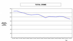
The Police press release is here, and you can see that they are the source of the claims. But if you look at the linked PDF, the 13% reduction is based on comparing (partly provisional) data for June 2012-May 2013 and June 2008-May 2009.  Crime has been decreasing steadily over this time: here’s the graph for 1995-2012 from NZ police (PDF, p16)

crime


The decrease from fiscal year 2008/9 to fiscal year 2011/12 (before the iPads) is from 1031.9 per 10,000 population to 891.9 per 10,000 population, or just over 14% — slightly larger than the decrease claimed when the iPad revolution is included.

It’s not surprising that the new mobility initiative isn’t showing up clearly in crime figures yet — the devices are still being rolled out. In fact the NZ Police report is talking about their whole modernisation initiative (started in August 2010) , though it’s still not possible to say how much of the 13% decrease is due to the changes, and the overall downward trend in crime would be sufficient to explain the entire decrease.


June 27, 2013

Making sense of uncertainty

Sense about Science (a British charity whose name, unusually, is actually accurate) have just launched a publication “Making Sense of Uncertainty”, following their previous guides for the public and journalists that cover screening, medical tests, chemical stories, statistics, and radiation.

Researchers in climate science, disease modelling, epidemiology, weather forecasting and natural hazard prediction say that we should be relieved when scientists describe the uncertainties in their work. It doesn’t necessarily mean that we cannot make decisions – we might well have ‘operational knowledge’ – but it does mean that there is greater confidence about what is known and unknown.
Launching a guide to Making Sense of Uncertainty at the World Conference of Science Journalists today, researchers working in some of the most significant, cutting edge fields say that if policy makers and the public are discouraged by the existence of uncertainty, we miss out on important discussions about the development of new drugs, taking action to mitigate the impact of natural hazards, how to respond to the changing climate and to pandemic threats.
Interrogated with the question ‘But are you certain?’, they say, they have ended up sounding defensive or as though their results are not meaningful. Instead we need to embrace uncertainty, especially when trying to understand more about complex systems, and ask about operational knowledge: ‘What do we need to know to make a decision? And do we know it?’ 

June 9, 2013

What the NSA can’t do by data mining

In the Herald, in late May, there was a commentary on the importance of freeing-up the GCSB to do more surveillance. Aaron Lim wrote

The recent bombings at the Boston Marathon are a vivid example of the fragmented nature of modern warfare, and changes to the GCSB legislation are a necessary safeguard against a similar incident in New Zealand.

 …

Ceding a measure of privacy to our intelligence agencies is a small price to pay for safe-guarding the country against a low-probability but high-impact domestic incident.

Unfortunately for him, it took only a couple of weeks for this to be proved wrong: in the US, vastly more information was being routinely collected, and it did nothing to prevent the Boston bombing.  Why not?  The NSA and FBI have huge resources and talented and dedicated staff, and have managed to hook into a vast array of internet sites. Why couldn’t they stop the Tsarnaevs, or the Undabomber, or other threats?

The statistical problem is that terrorism is very rare.  The IRD can catch tax evaders, because their accounts look like the accounts of many known tax evaders, and because even a moderate rate of detection will help deter evasion.  The banks can catch credit-card fraud, because the patterns of card use look like the patterns of card use in many known fraud cases, and because even a moderate rate of detection will help deter fraud.  Doctors can predict heart disease, because the patterns of risk factors and biochemical meausurements match those of many known heart attacks, and because even a moderate level of accuracy allows for useful gains in public health.

The NSA just doesn’t have that large a sample of terrorists to work with.  As the FBI pointed out after the Boston bombing, lots of people don’t like the United States, and there’s nothing illegal about that.  Very few of them end up attempting to kill lots of people, and it is so rare that there aren’t good patterns to match against.   It’s quite likely that the NSA can do some useful things with the information, but it clearly can’t stop `low-probability, high-impact domestic incidents’, because it doesn’t.  The GCSB is even more limited, because it’s unlikely to be able to convince major US internet firms to hand over data or the private keys needed to break https security.

Aaron Lim’s piece ended with the typical surveillance cliche

And if you have nothing to hide from the GCSB, then you have nothing to fear

Computer security expert Bruce Schneier has written about this one extensively, so I’ll just add that if you believe that, you can easily deduce Kristofferson’s Corollary

Freedom’s just another word for nothing left to lose.

June 7, 2013

Proper use of denominators

Mathew Dearnaley, in the Herald, has a story today about dangerous roads where he observes that the largest number of deaths is in the Auckland region, but immediately points out that what matters is the individual risk, estimated by fatalities per million km travelled.  We’ve been over this point quite a lot on StatsChat, so it’s great to see proper use of denominators in public.

When you divide by total distance travelled, to get a fair comparison, it  turns out that Gisborne has the most dangerous roads, followed by Taranaki, and that Auckland, like Wellington, is relatively safe.

Although Waikato roads claimed 66 lives – more than a fifth of a national toll of 308 deaths – the odds of being among the 10 people who died in crashes between the Wharerata Hills south of Gisborne and East Cape were almost twice as high as in the busier northern region.

One problem with the story is the issue of random variation.  According to NZTA, Hawkes Bay and Gisborne together had a total of 16 deaths last year, up from 8 the previous year.  There’s a lot of noise in these numbers, and even though the story sensibly looked at serious injuries as well, it’s hard to tell how much of the difference between regions is real and how much is chance.

It would be helpful to add up data over multiple years, though even then there is a problem, since we know that road deaths decreased noticeably in mid-2010, and this decrease may not have been uniform across regions.

May 9, 2013

Counting signatures

A comment on the previous post about the asset-sales petition asked how the counting was done: the press release says

Upon receiving the petition the Office of the Clerk undertook a counting and sampling process. Once the signatures had been counted, a sample of signatures was taken using a methodology provided by the Government Statistician.

It’s a good question and I’d already thought of writing about it, so the commenter is getting a temporary reprieve from banishment for not providing a full name.  I don’t know for certain, and the details don’t seem to have been published, which is a pity — they would be interesting and educationally useful, and there doesn’t seem to be any need for confidentiality.

While I can’t be certain, I think it’s very likely that the Government Statistician provided the estimation methodology from Statistics New Zealand Working Paper No 10-04, which reviews and extends earlier research on petition counting.

There are several issues that need to be considered

  • removing signatures that don’t come with the required information
  • estimating the number of eligible vs ineligible signatures
  • estimating the number of duplicates
  • estimating the margin of error in the estimate
  • deciding what level of uncertainty is acceptable

The signatures without the required information are removed completely; that’s not based on sampling.  Estimating eligible vs ineligible signatures is fairly easy by checking a sufficiently-large random sample — in fact, they use a systematic sample, taking names at regular intervals through the petition list, which tends to give more precise results and to be more auditable.  

Estimating unique signatures is  tricky, because if you halve your sample size, you expect to see 1/4 as many duplicates, 1/8 as many triplicates, and so on. The key part of the working paper shows how to scale up the the sample data on eligible, ineligible, and duplicate, triplicate, etc, signatures to get the unique unbiased estimator of the number of valid signatures and its variance.

Once the level of uncertainty is specified, the formulas tell you what sample size to verify and what to do with the results.  I don’t know how the sample size is chosen, but it wouldn’t take a very large sample to get the uncertainty down to a few thousand, which would be good enough.   In fact, since the methodology is public and the parties have access to the electoral roll in electronic form, it’s a bit surprising that the petition organisers didn’t run a quick check themselves before submitting it.


May 8, 2013

Does emergency hospital choice matter?

The Herald has a completely over-the-top presentation of what might be an important issue. The headline is “Hospital choice key to kids’ survival”, and the story starts off

Where ambulances take badly injured children first seems to affect their chances, paediatric surgeons say.

Starship children’s hospital surgeons have found that sending badly injured children to the wrong hospital may be contributing to a child death rate from injuries that is twice the rate of Australia’s.

The data:

Six (7 per cent) of the 88 children who went first to Middlemore died, but so did one (8 per cent) of the 12 who went directly to Starship.

That is, to the extent the data tell us anything, the evidence is against the headline.  Of course, the uncertainties are huge: a 95% confidence interval for the relative odds of dying after being sent to Middlemore goes from a 40-fold decrease to a 12-fold increase.  There’s basically no information in the survival data.

So, how much of the two-fold higher rate of death in NZ compared to Australia could reasonably be explained by suboptimal hospital choice? One of the surgeons involved in the study says

… overseas research showed that a good trauma protocol system could cut the death rate for injured adults by 20 to 30 per cent, but there was no good data for children.

That is, hardly any of the difference between NZ and Australia — especially as this specific hospital-choice issue only applies to one sector of one city in New Zealand, with less than 10% of the national population.

On the other hand, we see

The head of Starship’s emergency department, Dr Mike Shepherd, said the major factors contributing to New Zealand’s high fatal injury rate for children lay outside the hospital system in policies such as driver blood-alcohol limits, graduated driver licensing, and laws requiring children’s booster seats and swimming pool fences.

That sounds plausible, but if it’s the whole story you would expect high levels of non-fatal as well as fatal injuries. The overall rate of hospitalisations for injuries in children 0-14 years is almost identical in NZ (1395 per 100 000 per year, p29) and Australia (‘about’ 1500 per 100 000 per year, page v).