Posts filed under Random variation (139)

September 26, 2014

Screening is harder than that

From the Herald

Calcium in the blood could provide an early warning of certain cancers, especially in men, research has shown.

Even slightly raised blood levels of calcium in men was associated with an increased risk of cancer diagnosis within one year.

The discovery, reported in the British Journal of Cancer, raises the prospect of a simple blood test to aid the early detection of cancer in high risk patients.

In fact, from the abstract of the research paper, 3% of people had high blood levels of calcium, and among those,  11.5% of the men developed cancer within a year. That’s really not strong enough prediction to be useful for early detection of cancer. For every thousand men tested you would find three cancer cases, and 27 false positives. What the research paper actually says under “Implications for clinical practice” is

“This study should help GPs investigate hypercalcaemia appropriately.”

That is, if a GP happens to measure blood calcium for some reason and notices that it’s abnormally high, cancer is one explanation worth checking out.

The overstatement is from a Bristol University press release, with the lead

High levels of calcium in blood, a condition known as hypercalcaemia, can be used by GPs as an early indication of certain types of cancer, according to a study by researchers from the universities of Bristol and Exeter.

and later on an explanation of why they are pushing this angle

The research is part of the Discovery Programme which aims to transform the diagnosis of cancer and prevent hundreds of unnecessary deaths each year. In partnership with NHS trusts and six Universities, a group of the UK’s leading researchers into primary care cancer diagnostics are working together in a five year programme.

While the story isn’t the Herald’s fault, using a photo of a man drinking a glass of milk is. The story isn’t about dietary calcium being bad, it’s about changes in the internal regulation of calcium levels in the blood, a completely different issue. Milk has nothing to do with it.
September 19, 2014

Not how polling works

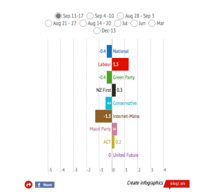
The Herald interactive for election results looks really impressive. The headline infographic for the latest poll, not so much. The graph is designed to display changes between two polls, for which the margin of error is 1.4 times higher than in a single poll: the margin of error for National goes beyond the edge of the graph.

election-diff


The lead for the story is worse

The Kim Dotcom-inspired event in Auckland’s Town Hall that was supposed to end John Key’s career gave the National Party an immediate bounce in support this week, according to polling for the last Herald DigiPoll survey.

Since both the Dotcom and Greenwald/Snowden Moments of Truth happened in the middle of polling, they’ve split the results into before/after Tuesday.  That is, rather than showing an average of polls, or even a single poll, or even a change from a single poll, they are headlining the change between the first and second halves of a single poll!

The observed “bounce” was 1.3%. The quoted margin of error at the bottom of the story is 3.5%, from a poll of 775 people. The actual margin of error for a change between the first and second halves of the poll is about 7%.

Only in the Internet Party’s wildest dreams could this split-half comparison have told us anything reliable. It would need the statistical equivalent of the CSI magic video-zoom enhance button to work.


August 16, 2014

Lotto and concrete implementation

There are lots of Lotto strategies based on trying to find patterns in numbers.

Lotto New Zealand televises its draws, and you can find some of them on YouTube.

If you have a strategy for numerological patterns in the Lotto draws, it might be a good idea to watch a few Lotto draws and ask yourself how the machine knows to follow your pattern.

If you’re just doing it for entertainment, go in good health.

July 30, 2014

If you can explain anything, it proves nothing

An excellent piece from sports site Grantland (via Brendan Nyhan), on finding explanations for random noise and regression to the mean.

As a demonstration, they took ten baseball batters and ten pitchers who had apparently improved over the season so far, and searched the internet for news that would allow them to find an explanation.  They got pretty good explanations for all twenty.  Looking at past seasons, this sort of short-term improvement almost always turns out be random noise, despite the convincing stories.

Having a good explanation for a trend feels like convincing evidence the trend is real. It feels that way to statisticians as well, but it isn’t true.

It’s traditional at this point to come up with evolutionary psychology explanations for why people are so good at over-interpreting trends, but I hope the circularity of that approach is obvious.

July 27, 2014

Air flight crash risk

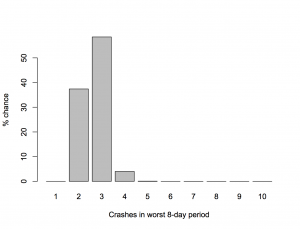
David Spiegelhalter, Professor of the Public Understanding of Risk at Cambridge University, has looked at the chance of getting three fatal plane crashes in the same 8-day period, based on the average rate of fatal crashes over the past ten years.  He finds that if you look at all 8-day periods in ten years, three crashes is actually the most likely way for the worst week to turn out.

He does this with maths. It’s easier to do it by computer simulation: arrange the 91 crashes randomly among the 3650 days and count up the worst week. When I do this 10,000 times (which takes seconds). I get

crashes


The recent crashes were separate tragedies with independent causes — two different types of accident and one deliberate shooting — they aren’t related like, say, the fires in the first Boeing Dreamliners were. There’s no reason for the recent events should make you more worried about flying.

July 24, 2014

Weak evidence but a good story

An example from Stuff, this time

Sah and her colleagues found that this internal clock also affects our ability to behave ethically at different times of day. To make a long research paper short, when we’re tired we tend to fudge things and cut corners.

Sah measured this by finding out the chronotypes of 140 people via a standard self-assessment questionnaire, and then asking them to complete a task in which they rolled dice to win raffle tickets – higher rolls, more tickets.

Participants were randomly assigned to either early morning or late evening sessions. Crucially, the participants self-reported their dice rolls.

You’d expect the dice rolls to average out to around 3.5. So the extent to which a group’s average exceeds this number is a measure of their collective result-fudging.

“Morning people tended to report higher die-roll numbers in the evening than the morning, but evening people tended to report higher numbers in the morning than the evening,” Sah and her co-authors wrote.

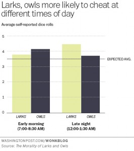
The research paper is here.  The Washington Post, where the story was taken from, has a graph of the results, and they match the story. Note that this is one of the very few cases where starting a bar chart at zero is a bad idea. It’s hard to roll zero on a standard die.

larks-owls-wapost


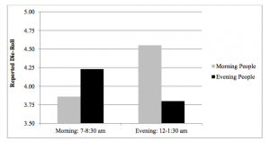
The research paper also has a graph of the results, which makes the effect look bigger, but in this case is defensible as 3.5 really is “zero” for the purposes of the effect they are studying

lark-owl


Unfortunately,neither graph has any indication of uncertainty. The evidence of an effect is not negligible, but it is fairly weak (p-value of 0.04 from 142 people). It’s easy to imagine someone might do an experiment like this and not publish it if they didn’t see the effect they expected, and it’s pretty certain that you wouldn’t be reading about the results if they didn’t see the effect they expected, so it makes sense to be a bit skeptical.

The story goes on to say

These findings have pretty big implications for the workplace. For one, they suggest that the one-size-fits-all 9-to-5 schedule is practically an invitation to ethical lapses.

Even assuming that the effect is real and that lying about a die roll in a psychological experiment translates into unethical behaviour in real life, the findings don’t say much about the ‘9-to-5’ schedule. For a start, none of the testing was conducted between 9am and 5pm.


July 2, 2014

What’s the actual margin of error?

The official maximum margin of error for an election poll with a simple random sample of 1000 people is 3.099%. Real life is more complicated.

In reality, not everyone is willing to talk to the nice researchers, so they either have to keep going until they get a representative-looking number of people in each group they are interested in, or take what they can get and reweight the data — if young people are under-represented, give each one more weight. Also, they can only get a simple random sample of telephones, so there are more complications in handling varying household sizes. And even once they have 1000 people, some of them will say “Dunno” or “The Conservatives? That’s the one with that nice Mr Key, isn’t it?”

After all this has shaken out it’s amazing the polls do as well as they do, and it would be unrealistic to hope that the pure mathematical elegance of the maximum margin of error held up exactly.  Survey statisticians use the term “design effect” to describe how inefficient a sampling method is compared to ideal simple random sampling. If you have a design effect of 2, your sample of 1000 people is as good as an ideal simple random sample of 500 people.

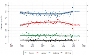
We’d like to know the design effect for individual election polls, but it’s hard. There isn’t any mathematical formula for design effects under quota sampling, and while there is a mathematical estimate for design effects after reweighting it isn’t actually all that accurate.  What we can do, thanks to Peter Green’s averaging code, is estimate the average design effect across multiple polls, by seeing how much the poll results really vary around the smooth trend. [Update: this is Wikipedia’s graph, but I used Peter’s code]

NZ_opinion_polls_2011-2014-majorparties

I did this for National because it’s easiest, and because their margin of error should be close to the maximum margin of error (since their vote is fairly close to 50%). The standard deviation of the residuals from the smooth trend curve is 2.1%, compared to 1.6% for a simple random sample of 1000 people. That would be a design effect of (2.1/1.6)2, or 1.8.  Based on the Fairfax/Ipsos numbers, about half of that could be due to dropping the undecided voters.

In principle, I could have overestimated the design effect this way because sharp changes in party preference would look like unusually large random errors. That’s not a big issue here: if you re-estimate using a standard deviation estimator that’s resistant to big errors (the median absolute deviation) you get a slightly larger design effect estimate.  There may be sharp changes, but there aren’t all that many of them, so they don’t have a big impact.

If the perfect mathematical maximum-margin-of-error is about 3.1%, the added real-world variability turns that into about 4.2%, which isn’t that bad. This doesn’t take bias into account — if something strange is happening with undecided voters, the impact could be a lot bigger than sampling error.


June 4, 2014

How much disagreement should there be?

The Herald

Thousands of school students are being awarded the wrong NCEA grades, a review of last year’s results has revealed.

Nearly one in four grades given by teachers for internally marked work were deemed incorrect after checking by New Zealand Qualifications Authority moderators.

That’s not actually true, because moderators don’t deem grades to be incorrect. That’s not what moderators are for.  What the report says (pp105-107 in case you want to scroll through it) is that in 24% of cases the moderator and the internal assessor disagreed on grade, and in 12% they disagreed on whether the standard had been achieved.

What we don’t know is how much disagreement is appropriate. The only way the moderator’s assessment could be considered error-free is if you define the ‘right answer’ to be ‘whatever the moderator says’, which is obviously not appropriate. There always will be some variation between moderators, and some variation between schools, and what we want to know is whether there is too much.

The report is a bit disappointing from that point of view.  At the very least, there should have been some duplicate moderation. That is, some pieces of work should have been sent to two different moderators, so we could have an idea of the between-moderator agreement rate. Then, if we were willing to assume that moderators collectively were infallible (though not individually), we could estimate how much less reliable the internal assessments were.

Even better would be to get some information on how much variation there is between schools in the disagreement: if there is very little variation, the schools may be doing about as well as is possible, but if there is a lot of variation between schools it would suggest some schools aren’t assessing very reliably.


May 28, 2014

‘Balanced’ Lotto reporting

From ChCh Press

Are you feeling lucky?

The number drawn most often in Saturday night’s Lotto is one.

The second is seven, the third is lucky 13, followed by 21, 38 and 12.

And if you are selecting a Powerball for Saturday’s draw, the record suggests two is a much better pick than seven.

The numbers are from Lotto Draw Frequency data provided by Lotto NZ for the 1406 Lottery family draws held to last Wednesday.

The Big Wednesday data shows the luckiest numbers are 30, 12, 20, 31, 28 and 16. And heads is drawn more often (232) than tails (216), based on 448 draws to last week.

In theory, selecting the numbers drawn most often would result in more prizes and avoiding the numbers drawn least would result in fewer losses. The record speaks for itself.

Of course this is utter bollocks. The record is entirely consistent with the draw being completely unpredictable, as you would also expect it to be if you’ve ever watched a Lotto draw on television and seen how they work.

This story is better than the ones we used to see, because it does go on and quote people who know what they are talking about, who point out that predicting this way isn’t going to work, and then goes on to say that many people must understand this because they do just take random picks.  On the other hand, that’s the sort of journalistic balance that gets caricatured as “Opinions differ on shape of Earth.”

In world historical terms it doesn’t really matter how these lottery stories are written, but they are missing a relatively a simple opportunity to demonstrate that a paper understands the difference between fact and fancy and thinks it matters.

May 23, 2014

Is Roy Morgan weird?

There seems to be a view that the Roy Morgan political opinion poll is more variable than the others, even to the extent that newspapers are willing to say so, eg, Stuff on May 7

The National Party has taken a big hit in the latest Roy Morgan poll, shedding 6 points to 42.5 per cent in the volatile survey.

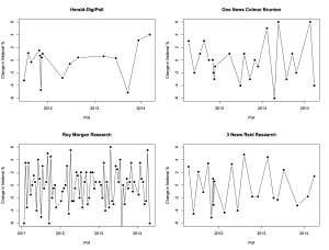
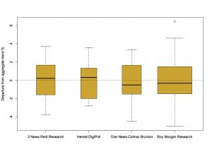
I was asked about this on Twitter this morning, so I went to get Peter Green’s data and aggregation model to see what it showed. In fact, there’s not much difference between the major polling companies in the variability of their estimates. Here, for example, are poll-to-poll changes in the support for National in successive polls for four companies

fourpollers


And here are their departures from the aggregated smooth trend

boxpollers


There really is not much to see here. So why do people feel that Roy Morgan comes out with strange results more often? Probably because Roy Morgan comes out with results more often.

For example, the proportion of poll-to-poll changes over 3 percentage points is 0.22 for One News/Colmar Brunton, 0.18 for Roy Morgan, and 0.23 for 3 News/Reid Research, all about the same, but the number of changes over 3 percentage points in this time frame is 5 for One News/Colmar Brunton, 14 for Roy Morgan, and 5 for 3 News/Reid Research.

There are more strange results from Roy Morgan than for the others, but it’s mostly for the same reason that there are more burglaries in Auckland than in the other New Zealand cities.