Posts filed under Random variation (139)

May 3, 2012

Road deaths down

A record low in road deaths last month has been accompanied by an unusually good Herald story.   Andy Knackstedt from the Transport Agency is quoted as saying

“It’s too early to say what may or may not be responsible for the lower deaths over the course of one month.

“But we do know that over the long term, people are driving at speeds that are more appropriate to the conditions, that they’re looking to buy themselves and their families safer vehicles, that the engineers who design the roads are certainly making a big effort to make roads and roadsides more forgiving so if a crash does take place it doesn’t necessarily cost someone their life.”

That’s a good summary.  Luck certainly plays a role in the month-to-month variation, and these tend to be over-interpreted,  but the recent trends in road deaths are real — much stronger than could result from random variation.   We don’t know how much the state of the economy makes a difference, or more-careful driving following the rule changes, or many other possible explanations.

[Update: when I wrote this, I didn’t realise it was the top front-page story in the print edition, which  is definitely going beyond the limits of the data]
March 30, 2012

Lotto silliness

As my good friend and colleague Thomas Lumley points out we have plenty of Lotto-based silliness to tide us over until the next stupid health related press release from a conference with no quality checks. Case-in-point is the article Powerball could be in the stars in Thursday’s NZ Herald (29 March, 2012, A5): (also nominated by Sammie Jia for Stat of the Week).

The article reports the frequency of zodiac signs from a survey of 104 first division Lotto winners, and gleefully touts Taurus as the luckiest star sign with 13% of the total. The article gives us a summary table:

Taurus 13%
Libra 11%
Capricorn 10%
Aquarius 9%
Virgo 9%
Pisces 9%
Leo 8%


Of course, all keen Statschat readers will note that this table does not add up to 100%, nor does it show all twelve zodiac signs, which is not very helpful. Buried in the text is the additional information that Aries and Cancer combined make up 4% of the total.

If we spread the remaining probability over Gemini, Sagittarius and Scorpio, and make the not entirely justified assumption that the distribution of zodiac signs is uniform (which is exactly what the NZ Herald has done), then we can perform a simple chi-squared test of uniformity. This yields a P-value of 0.22, which for most frequentists isn’t exactly compelling evidence.

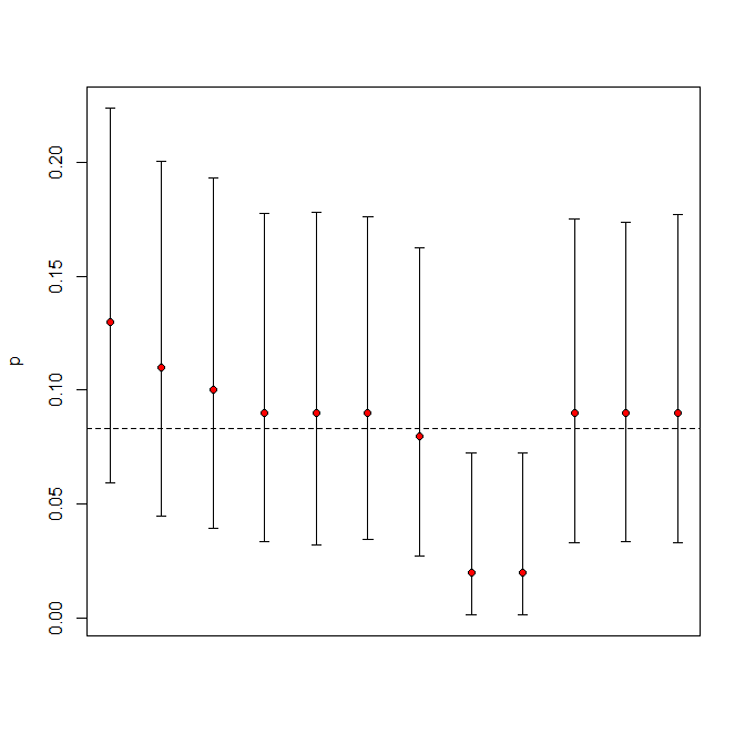
Being a Bayesian, I prefer to assume multinomial sampling with the prior on the probability of success being uniform. The figure below shows posterior credible intervals (based on 10,000 samples) for the true probability of success. The red dots are the observed values. The dashed line is the equal probability line (0.083 = 1/12).


All of the intervals overlap confirming our statistical intuition that all we are really observing is sampling variation. Yes, Ares and Cancer do fall below the line, but they are not significantly different from the other signs. You can, of course, not believe me – in which case Thomas has some tickets from last week’s draw going very cheap and your chance of winning is almost the same.

March 29, 2012

Very like a whale

The Herald has managed to top Stuff’s suggestion that Powerball is in Wairarapa with a story saying it’s “in the stars”.

Of course, they don’t mean the actual stars, they mean European-style astrological birth signs.  Allegedly (and it’s hardly the sort of claim that it’s worth verifying),  15% of winners over the past two years were born under Taurus.   Now, since there are 104 winners and 12 astrological signs, it’s arithmetically unavoidable that some signs will get more winners than others, but how many more would you expect in a typical two-year period?

The easiest way to approximate this is to ignore the fact that slightly more births occur in some months and just sample 104 winners equally from 12 groups.  Repeating this 10,000 times takes a few seconds, and we get a table showing the percentage chance that the most-sampled star sign will have at least 10, 11, 12, … winners.

10 11 12 13 14 15 16 17 18 19
1 100.00 99.70 94.50 76.30 50.50 28.40 14.40 6.30 2.80 1.20

Getting 15% in one group is not at all  surprising.

This still overestimates the surprise: if there hadn’t been an overall pattern, the story could have said that the chance of winning depends on your star sign and on the time of year, for example.    In fact, they did this as well: the second part of the story says that Taurus is lucky now, but that Capricorn will be lucky in a  few weeks.   Of course, the fact that the second part contradicts the first part isn’t mentioned anywhere, and no data are presented to gesture in the direction of evidence for the claim.

We’re very good at seeing patterns, even when they don’t exist, and statistics is one way of ameliorating this problem.

So what is the best time to buy a lottery ticket?  As Scott Adams shows, the day after the drawing — they are a lot cheaper then.

March 17, 2012

Faster-than-light neutrinos don’t replicate

This isn’t in the NZ media yet, but it will probably turn up soon.  A second CERN experiment, ICARUS,  has repeated the measurement of neutrino speed made by the famous OPERA experiment: the same neutrino source, the same distance, but different measurement equipment.   And the neutrinos arrived on-time, not 60ns early. Since the OPERA results violate relativity  and have other practical and theoretical problems , it’s not that hard to decide which set of numbers to believe.

As Prof. Matt Strassler says

This is the way it works in science all the time. A first experiment makes a claim that they see a striking and surprising effect. A second experiment tries to verify the effect and instead shows no sign of it. It’s commonplace. Research at the forefront of knowledge is much more difficult than people often realize, and mistakes and flukes happen on a regular basis. When something like this happens, physicists shrug and move on, unruffled and unsurprised.

 That’s why replication, reproducibility, and peer review are so important in science.  If your experiments are easy to run correctly and straightforward to interpret, you obviously aren’t working at the cutting edge.
February 12, 2012

Thresholds and tolerances

The post on road deaths sparked off a bit of discussion in comments about whether there should be a `tolerance’ for prosecution for speeding.  Part of this is a statistical issue that’s even more important when it comes to setting environmental standards, but speeding is a familiar place to start.

A speed limit of 100km/h seems like a simple concept, but there are actually three numbers involved: the speed the car is actually going, the car’s speedometer reading, and a doppler radar reading in a speed camera or radar gun.  If these numbers were all the same there would be no problem, but they aren’t.   Worse still, the motorist knows the second number, the police know the third number, and no-one knows the actual speed.

So, what basis should the police use to prosecute a driver:

  • the radar reading was above 100km/h, ignoring all the sources of uncertainty?
  • their true speed was definitely above 100km/h, accounting for uncertainty in the radar?
  • their true speed might have been above 100km/h, accounting for uncertainty in the radar?
  • we can be reasonably sure their speedometer registered above 100km/h, accounting for both uncertainties?
  • their true speed was definitely above 100km/h, accounting for uncertainty in the radar and it’s likely that their speedometer registered above 100km/h, accounting for both uncertainties?

(more…)

February 10, 2012

Not incoherent, just wrong.

NZ Herald yesterday

Since Queen’s Birthday weekend 2010, the tolerance has been lowered for speeding drivers to only 4km/h for public holidays, which police say has led to a drop in fatal crashes during these periods.A police spokesperson told the Dominion Post crashes during holiday periods had been cut by 46 per cent.

 Clive Matthew-Wilson, editor of the Dog and Lemon Guide, … accused the police of “massaging the statistics to suit their argument”. “When the road toll goes down over a holiday weekend, the police claim credit. When it rises by nearly 50 per cent, as it did last Christmas, they blame the drivers. They can’t have it both ways.”

In fact, it’s not at all impossible that the reduction in deaths was due to the lower speeding tolerance, and that the increase over last Christmas was due to unusually bad driving.  The police argument is not logically incoherent.  It is, however, somewhat implausible.  And not really consistent with the data.


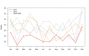
monthly road deaths since 2006If the reduction during holiday periods since the Queen’s Birthday 2010 was down to the lowered tolerance for speeding, you would expect the reduction to be confined to holiday periods, or at least to have been greater in holiday periods.  In fact, there was a large and consistent decrease in road deaths over the whole year. The new pattern didn’t start in June 2010: July, October, and November 2010 had death tolls well inside the historical range.

The real reason for the reduction is deaths is a bit of a mystery.  There isn’t a shortage of possible explanations, but it’s hard to find one that predicts this dramatic decrease, and only for last year.  If it’s police activities, why didn’t the police campaigns in previous years work?  If it’s the recession, why did it kick in so late, and why is it so much more dramatic than previous recessions or the current recession in other countries?  The Automobile Association would probably like to say it’s due to better driving, but that’s a tautology, not an explanation, unless they can say why driving has improved.

January 18, 2012

Oooh. Pretty.

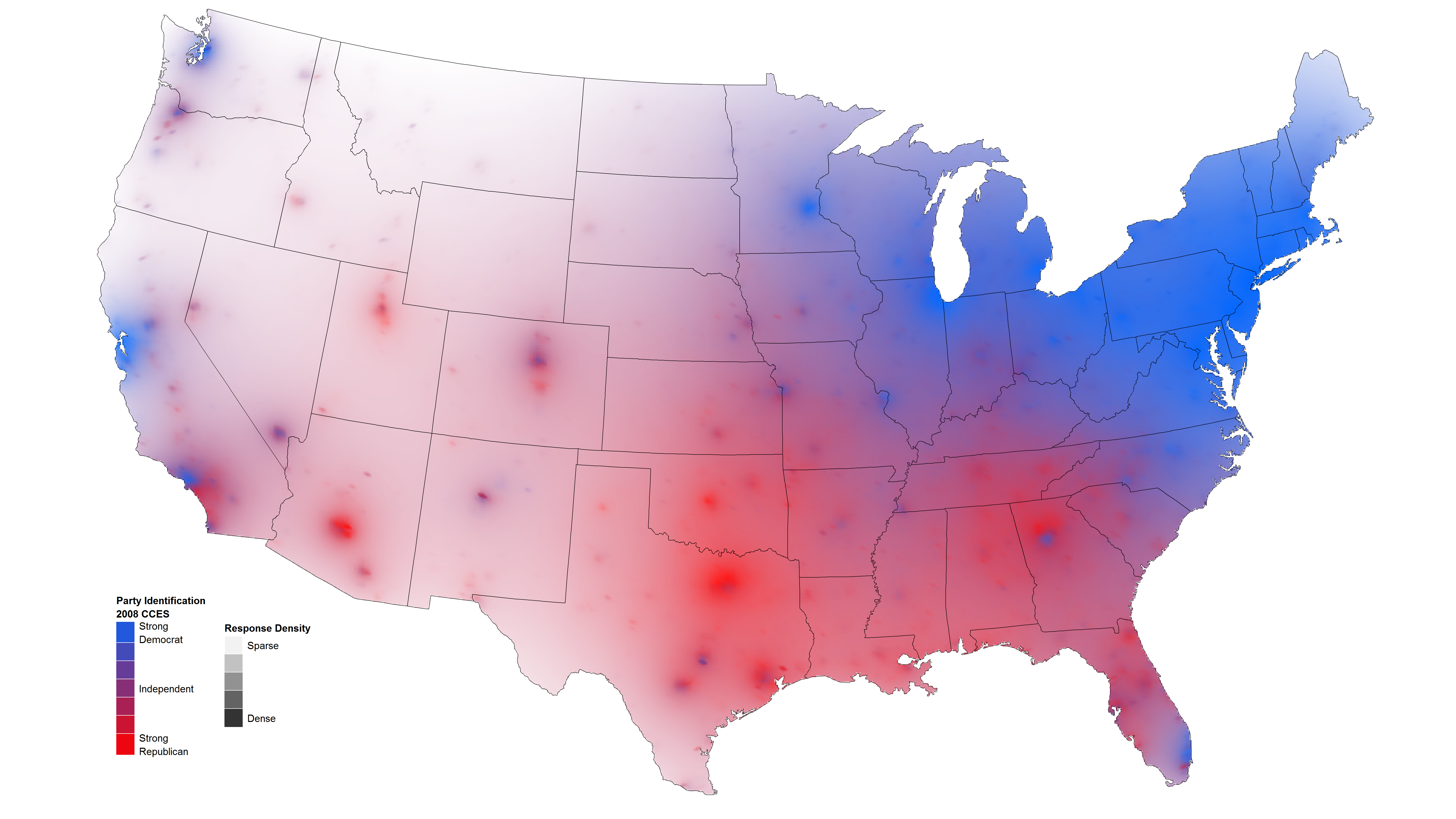
David Sparks has some nice maps of public opinion, using transparency to indicate the level of uncertainty.

Compare to my cruder county-level versions, based on plotting a sample of several thousand from the population

January 1, 2012

Deadliest jobs

Q: What proportion of fatal car crashes involve an alcohol-impaired driver

A: I can’t find the NZ figures, but according to the Centers for Disease Control and Prevention, in the US it’s about 1 in 3

Q: Since everyone involved is sober in 2/3 of crashes, does that mean it’s safer to drive drunk?

A: Why would you ask such a stupid question?

(more…)

October 30, 2011

Poisson variation strikes again

What’s the best strategy if you want to have a perfect record betting on the rugby?  Just bet once: that gives you a 50:50 chance.

After national statistics on colorectal cancer were released in Britain, the charity Beating Bowel Cancer pointed out that there was a three-fold variation across local government areas in the death rate.  They claimed that over 5,000 lives per year could be saved, presumably by adopting whatever practices were responsible for the lowest rates. Unfortunately, as UK blogger ‘plumbum’ noticed, the only distinctive factor about the lowest rates is shared by most of the highest rates: a small population, leading to large random variation.

funnel plot of UK colorectal cancer His article was picked up by a number of other blogs interested in medicine and statistics, and Cambridge University professor David Speigelhalter suggested a funnel plot as a way of displaying the information.

A funnel plot has rates on the vertical axis and population size (or some other measure of information) on the horizontal axis, with the ‘funnel’ lines showing what level of variation would be expected just by chance.

The funnel plot (click to embiggen) makes clear what the tables and press releases do not: almost all districts fall inside the funnel, and vary only as much as would be expected by chance. There is just one clear exception: Glasgow City has a substantially higher rate, not explainable by chance.

Distinguishing random variation from real differences is critical if you want to understand cancer and alleviate the suffering it causes to victims and their families.  Looking at the districts with the lowest death rates isn’t going to help, because there is nothing very special about them, but understanding what is different about Glasgow could be valuable both to the Glaswegians and to everyone else in Britain and even in the rest of the world.