Posts filed under Random variation (139)

July 20, 2012

Measurement error and rare events

Surveys are not perfect: some people misunderstand the question, some people recall incorrectly, some responses are written down incorrectly by the poller, and some people just lie.   These biases happen in both directions, but their impact is not symmetrical.

Suppose you had a survey that asked “Have you ever been abducted by aliens?”  We can be sure that false ‘Yes’ results will be more common than false ‘No’ results, so the survey will necessarily overestimate the true proportion. If you wrote down the wrong answer for 1% of people, you’d end up with an estimate that was 1% too high.

In principle, the same issue  could be a serious problem in estimating the support for minor parties: about 1% of people voted for ACT at the last election, and 99% didn’t.  Suppose you poll 10000 people and ask them if they voted for ACT, and suppose that 100 of them really were ACT voters. If your opinion poll gets the wrong answer, randomly, for 1% of people, you will get the wrong answer from 1 of the true ACT voters, and 99 of the true non-ACT voters, so you will report 100+99-1=198 ACT voters and 9900+1-99 = 9802 non-ACT voters.  You would overestimate the votes for ACT by a factor of two!  Keith Humphreys, who we have linked to before, postulates that this is why US polls indicating support for a third-party candidate tend to seriously overestimate their support.

I’m skeptical.  Here in NZ, where we really have minor parties, there is no systematic tendency to overestimate the support they receive.  ACT got 1% of the vote, and that was close to what the polls predicted. Similarly, the Maori Party, and the Greens received about the same number of votes in the last election as averages of the polls had predicted.  For NZ First, the election vote was actually higher than in the opinion polls.  Similarly, for the Dutch general election in 2010 there was pretty good agreement between the last polls and the election results.  Even in Australia, where there is effectively a two-party system in the lower house (but with preferential voting), the opinion poll figures for the Greens agreed pretty well with the actual vote

It’s true that measurement error tends to bias towards 50%, and this matters in some surveys, but I would have guessed the US phantom third party support is the result of bias, not error. That is, I suspect people tend to overstate their support for third-party candidates in advance of the election, and that in the actual election they vote strategically for whichever of the major parties they dislike least.   My hypothesis would imply not much bias in countries where minor-party votes matter, and more bias in countries with first-past-the-post voting.  Unfortunately there’s also a pure measurement error hypothesis that’s consistent with the data, which is that people are just more careful about measuring minor-party votes in countries where they matter.
July 18, 2012

Global Innovation Barchart

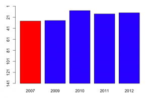
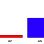
So.  The 2012 Global Innovation Index is out and NZ looks quite good.  Our only Prime Minister has a graph on his Facebook page that looks basically like this.


The graph shows that NZ was at rank 28 in 2007 and is now at rank 13.

A bar chart for two data points is a bit weird, though not nearly as bad as the Romney campaign’s efforts at Venn diagrams in the US.

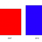
The scaling is also a bit strange.  The y-axis runs from 1 to 30, but there’s nothing special about rank 30 on this index. If we run the y-axis all the way down to 141 (Sudan), we get the second graph on the right, which shows that New Zealand, compared to countries across the world, has always been doing pretty well.


Now, there are some years missing on the plot, and the Global Innovation Index was reported for most of them.  Using the complete data, we get a graph like

So, in fact, NZ was doing even better on this index in 2010, and we get some idea of the year-to-year fluctuations.   Now, a barchart is an inefficient way to display data with just one short time series like this: a table would be better.

More important, though, what is this index measuring.  Mr Key’s Facebook page doesn’t say. Some of the commenters do say, but incorrectly (for example, one says that it’s based on current government policies).  In fact, the  exact things that go into the index change every year.  For example, the 2012 index includes Wikipedia edits and Youtube uploads,  in early years internet access and telephone access were included.  There are also changes in definitions: in early years, values were measured in US$, now they are in purchasing-power parity adjusted dollars.

Some of the items (such as internet and telephone access) are definitely good, others (such as number of researchers and research expenditure) are good all things being equal, and for others (eg, cost of redundancy dismissal in weeks of pay, liberalised foreign investment laws) it’s definitely a matter of opinion.Some of the items are under the immediate control of the government (eg public education expenditure per pupil, tariffs), some can be influenced directly by government (eg, gross R&D funding, quality of trade and transport infrastructure), and some are really hard for governments to improve  in the short term (rule of law, GMAT mean test score, high-tech exports, Gini index).

Since the content and weighting varies each year, it’s hard to make good comparisons. On the plus side, the weighting clearly isn’t rigged to make National look good — the people who come up with the index couldn’t care less about New Zealand — but the same irrelevance will also tend to make the results for New Zealand more variable.   Some of the items in the index will have been affected by the global financial crisis and the Eurozone problems. New Zealand will look relatively better on these items, for reasons that are not primarily the responsibility of the current governments even in those countries, let alone here.

I’d hoped to track down why New Zealand had moved up in the rankings, to see if it was on indicators that the current administration could reasonably take credit for, but the variability in definitions makes it very hard to compare.

Repopulating Canterbury?

Stuff has a story about twins in Canterbury, which is driven by two general human tendencies shared even by statisticians: thinking babies are cute, and overestimating the strangeness of coincidences.  We hear that

Canterbury mums have given birth to 21 sets of twins in the past six weeks.

and

 10 years ago the average would have been about six to eight sets a month.

Using the StatsNZ Infoshare tool (go to Population | Births -VSB | Single and multiple confinements by DHB) we find about 100 sets of multiple births per year in Canterbury DHB and a further dozen or so in South Canterbury DHB, without much change for the past ten years.  That means about nine or so multiple births per month on average.  If you use the average twin rate for all of NZ  (2.7%) and the number of births in the Canterbury region, you get a slightly lower 7.7 sets of twins per month on average.

If there are, on average, 9 multiple births per month, how long would you have to wait for a six-week period with 21?  Because the possible six-week periods overlap, it’s hard to do this calculation analytically, but we can simulate it: 9 per month is 108 per year, which is 108/52 per week.  We simulate a long string of one-week counts from a Poisson distribution with mean 108/52, and see how long we have to  wait between six-week totals of at least 21.  The average waiting time is about two years.  (you have to be a bit careful: the proportion of six-week intervals over 21 is a lot more than one in two years, because of the overlap between six-week intervals)

So, this is a once in two years coincidence if we just look at Canterbury.  It’s much more likely if twin stories from other regions might also end up as news — the probability is hard to estimate, because twins in Canterbury really are more newsworthy than in, say, Waikato.

July 17, 2012

Margin of error yet again

In my last post I more-or-less assumed that the design of the opinion polls was handed down on tablets of stone.  Of course, if you really need more accuracy for month-to-month differences, you can get it.   The Household Labour Force Survey gives us the official estimates of unemployment rate.  We need to be able to measure changes in unemployment that are much smaller than a few percentage points, so StatsNZ doesn’t just use independent random samples of 1000 people.

The HLFS sample contains about 15,000 private households and about 30,000 individuals each quarter. We sample households on a statistically representative basis from areas throughout New Zealand, and obtain information for each member of the household. The sample is stratified by geographic region, urban and rural areas, ethnic density, and socio-economic characteristics. 

Households stay in the survey for two years. Each quarter, one-eighth of the households in the sample are rotated out and replaced by a new set of households. Therefore, up to seven-eighths of the same people are surveyed in adjacent quarters. This overlap improves the reliability of quarterly change estimates.

That is, StatsNZ uses a much larger sample, which reduces the sampling error at any single time point, and samples the same households more than once, which reduces the sampling error when estimating changes over time.   The example they give on that web page shows that the margin of error  for annual change in the employment rate is on the order of 1 percentage point.  StatsNZ calculates sampling errors for all the employment numbers they publish, but I can’t find where they publish the sampling errors.

[Update: as has just been pointed out to me, StatsNZ publish the sampling errors at the bottom of each column of the Excel version of their table,  for all the tables that aren’t seasonally adjusted]

July 16, 2012

When a dog bites a man, that’s not news

A question on my recent post about political opinion polls asks

– at what point does the trend become relevant?

– and how do you calculate the margin of error between two polls?

Those are good questions, and the reply was getting long enough that I decided to promote it to a post of its own. The issue is that proportions will fluctuate up and down slightly from poll to poll even if nothing is changing, and we want to distinguish this from real changes in voter attitudes — otherwise there will be a different finding every month and it will look as if public opinion is bouncing around all over the place.  I don’t think you want to base a headline on a difference that’s much below the margin of error, though reporting the differences is fine if you don’t think people can find the press release on their own.

The (maximum) margin of error, which reputable polls usually quote, gives an estimate of uncertainty that’s designed to be fairly conservative. If the poll is well-designed and well-conducted, the difference between the poll estimate and the truth will be less than the maximum margin of error 95% of the time for true proportions near one-half, and more often than 95% for smaller proportions.  The difference will be less than half the margin of error about two-thirds of the time, so being less conservative doesn’t let you shrink the margin very much.   In this case the difference was well under half the margin of error.  In fact, if there were no changes in public opinion you would still see month-to-month differences this big about half the time.

For trends based on just two polls, the margin of error is larger than for a single poll, because it could happen by chance that one poll was a bit too low and the other was a bit too high: the difference between the two polls can easily be larger than the difference between either poll and the truth.

The best way to overcome the random fluctuations to pick up small trends is to do some sort of averaging of polls, either over time, or over competing polling organisations.  In the US, the website fivethirtyeight.com combines all the published polls to get estimates and probabilities of winning the election, and they do very well in short-term predictions.  Here’s a plot for Australian (2007) elections, by Simon Jackman, of  Stanford, where you can see individual poll results (with large fluctuations) around the average curve (which has much smaller uncertainties).  KiwiPollGuy  has apparently done something similar for NZ elections (though I’d be happier if their identity or their methodology was public).

So, how are these numbers computed?  If the poll was a uniform random sample of N people, and the true proportion was P, the margin of error would be 2 * square root(P*(1-P)/N).  The problem then is that we don’t know P — that’s why we’re doing the poll. The maximum margin of error takes P=0.5, which gives the largest margin of error, and one that’s pretty reasonable for a range of P from, say, 15% to 85%. The formula then simplifies to 1/square root of N.   If N is 1000, that’s 3.16%, for N=948 as in the previous post, it is 3.24%.

Why is it  2 * square root(P*(1-P)/N)?  Well, that takes more maths than I’m willing to type in this format so I’m just going to mutter “Bernoulli” at you and refer you to Wikipedia.

For trends based on two polls, as opposed to single polls, it turns out that the squared uncertainties add, so the square of the margin of error for the difference is twice the square of the margin of error for a single poll.  Converting back to actual percentages, that means the margin of error for a difference based on two polls is 1.4 times large than for a single poll.

In reality, the margins of error computed this way are an underestimate, because of non-response and other imperfections in the sampling, but they don’t do too badly.

July 14, 2012

Poll shows not much

According to the Herald

The latest Roy Morgan Poll shows support for the National Party has fallen two per cent since early June.

 The poll is based on 948 people, so the maximum margin of error (which is a good approximation for numbers near 50%) is about 3.2%, and the margin of error for a change between two polls is about 1.4 times larger: 4.6%.

July 4, 2012

Physicists using statistics

Traditionally, physics was one of the disciplines whose attitude was “If you need statistics, you should have designed a better experiment”.  If you look at the CERN webcast about the Higgs Boson, though, you see that it’s full of statistics: improved multivariate signal processing, boosted decision trees, random variations in the background, etc, etc.

Increasingly, physicists have found, like molecular biologists before them, and physicians before that, that sometimes you can’t afford to do a better experiment. When your experiment costs billions of dollars, you really have to extract the maximum possible information from your data.

As you have probably heard by now, CERN is reporting that they have basically found the Higgs boson: the excess production of certain sets of particles deviates from a non-Higgs model by 5 times the statistical uncertainty: 5σ.  Unfortunately, a few other sets of particles don’t quite match, so combining all the data they have 4.9σ, just below their preferred threshold.

So what does that mean?  Any decision procedure requires some threshold for making a decision.  For drug approval in the US, you need two trials that each show the drug is more effective than placebo by twice the statistical uncertainty: ie, two replications of 2σ, which works out to be a combined exceedance by 2.8 times the statistical uncertainty: 2.8σ.  This threshold is based on a tradeoff between the risk of missing a treatment that could be useful and the risk of approving a useless drug.  In the context of drug development this works well — drugs get withdrawn from the market for safety, or because the effect on a biological marker doesn’t translate into an effect on actual health, but it’s very unusual for a drug to be approved when it just doesn’t work.

In the case of particle physics, false positives could influence research for many years, so once you’ve gone to the expense of building the Large Hadron Collider, you might as well be really sure of the results.  Particle physics uses a 5σ threshold, which means that in the absence of any signal they have only a 1 in 30 million chance per analysis of deciding they have found a Higgs boson.    Despite what some of the media says, that’s not quite the same as a 1 in 30 million chance of being wrong: if nature hasn’t provided us with  a 125GeV Higgs Boson, an analysis that finds the result has a 100% chance of being wrong, if there is one, it has a 0% chance of being wrong.


Lazy scientific fraud

If you toss a coin 20 times, you will get 10 heads on average.  But if someone claims to have done this experiment 190 times and got exactly 10 heads of out 20 every single time they are either lying or a professional magician.

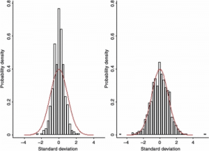
An anaesthesiology researcher, Yoshitaka Fujii, has the new record for number of papers retracted in scientific journals: 172 and counting. The fakery was uncovered by an analysis of the results of all his published randomized trials, showing that they had an unbelievably good agreement between the treatment and control groups, far better than was consistent with random chance.  For example, here’s the graph of differences in average age between treatment and control groups for Fujii’s trials (on the left) and other people’s trials (on the right), with the red curve indicating the minimum possible variation due only to chance.

The problem was pointed out more than ten years ago, in a letter to one of the journals involved, entitled “Reported data on granisetron and postoperative nausea and vomiting by Fujii et al. are incredibly nice!”  Nothing happened.  Perhaps a follow-up letter should have been titled “When we say ‘incredibly nice’, we mean ‘made-up’, and you need to look into it”.

Last year, Toho University, Fujii’s employer, did an investigation that found eight of the trials had not been approved by an ethics committee (because they hadn’t, you know, actually happened). They didn’t comment on whether the results were reliable.

Finally, the journals got together and gave the universities a deadline to come up with evidence that the trials existed, were approved by an ethics committee, and were reported correctly.  Any papers without this evidence would be retracted.

Statistical analysis to reveal fraud is actually fairly uncommon.  It requires lots of data, and lazy or incompetent fraud: if Prof Fujii had made up individual patient data using random number generators and then analysed it, there would have been no evidence of fraud in the results.   It’s more common  to see misconduct revealed by re-use or photoshopping of images, by failure to get ethics committee approvals, or by whistleblowers.  In some cases where the results are potentially very important, the fraud gets revealed by attempts to replicate the work.

June 21, 2012

If it’s not worth doing, it’s not worth doing well?

League tables work well in sports.  The way the competition is defined means that ‘games won’ really is the dominant factor in ordering teams,  it matters who is at the top, and people don’t try to use the table for inappropriate purposes such as deciding which team to support.  For schools and hospitals, not so much.

The main problems with league tables for schools (as proposed in NZ) or hospitals (as implemented in the UK) are, first, that a ranking requires you to choose a way of collapsing multidimensional information into a rank, and second, that there is usually massive uncertainty in the ranking, which is hard to convey.   There doesn’t have to be one school in NZ that is better than all the others, but there does have to be one school at the top of the table.  None of this is new: we have looked at the problems of collapsing multidimensional information before, with rankings of US law schools, and the uncertainty problem with rates of bowel cancer across UK local government areas.

This isn’t to say that school performance data shouldn’t be used.  Reporting back to schools how they are doing, and how it compares to other similar schools, is valuable.  My first professional software development project (for my mother) was writing a program (in BASIC, driving an Epson dot-matrix printer) to automate the reports to hospitals from the Victorian Perinatal Data Collection Unit.  The idea was to give each hospital the statewide box plots of risk factors (teenagers, no ante-natal care), adverse outcomes (deaths, preterm births, malformations), and interventions (induction of labor, caesarean section), with their own data highlighted by a line.   Many of the adverse outcomes were not the hospital’s fault, and many of the interventions could be either positive or negative depending on the circumstances, so collapsing to a single ‘hospital quality’ score would be silly, but it was still useful for hospitals to know how they compare.  In that case the data was sent only to the hospital, but for school data there’s a good argument for making it public.

While it’s easy to see why teachers might be suspicious of the government’s intentions, the rationale given by John Key for exploring some form of official league table is sensible.  It’s definitely better not to have a simple ranking, and it might arguably be better not to have a set of official comparative reports, but the data are available under the Official Information Act.  The media may currently be shocked and appalled at the idea of league tables, but does anyone really believe this would stop a plague of incomplete, badly-analyzed, sensationally-reported exposés of “New Zealand’s Worst Schools!!”?  It would be much better for the Department of Education to produce useful summaries, preferably not including a league-table ranking, as a prophylactic measure.

June 9, 2012

The data speak for themselves

May 14, NZ Herald:  Housing boom cuts mortgagee sales.  The number of mortgagee listings has been falling nationally since the recession, and Auckland is leading the charge.

May 31: Stuff: More people losing the family home.  High numbers of ”mum and dad” homeowners are losing family homes to mortgagee sales, new figures show.

June 1: Stuff: Rise in family home mortgagee sales. Family homes are making up an increasing number of the more than 2200 mortgagee sales in New Zealand, new figures show.

June 9: NZ Herald: Mortgagee sales: Landlords feel pain. Mortgagee sales have hit record numbers, and landlords are the new victims.

The housing market doesn’t change that much from week to week.