Posts filed under Random variation (139)

October 19, 2012

Road toll still down.

The police are urging people to drive carefully this weekend, which is a good idea as always.  They are also reducing their speeding threshold to 4km/h over the limit, saying that this “had made a big difference during previous holiday periods”, and that they want to “avoid a repeat of last year’s carnage, in which seven people were killed on the roads”. The lower speed tolerance was bought in for the Queens Birthday weekend 2010, which was before last year, so at least for Labour day it doesn’t seem to have made much difference.

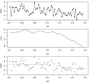
It’s always hard to interpret figures for a single weekend (or even a single month) because of random variation.  Here’s the data for the past six years (from, and)

The top panel shows monthly deaths, with October 2012 as an open circle because the number there is an extrapolation by doubling the deaths for Oct 1-15.  There’s a lot of month-to-month variability, and the trend isn’t that obvious.

The second panel shows cumulative sums of deaths minus the average number for 2007-2009, a chart used in industrial process monitoring. The curve is basically flat until mid-2010, and then starts a steady decline, suggesting that a new, lower, average started in mid-2010 and has been pretty stable since.  The current value of the curve, at -200, means that 200 people are still alive who would have died on the roads if the rates were still at the 2007-2009 levels.

The third panel shows the monthly deaths again, with horizontal lines at the average for 2007-2009 and 2011-12, confirming that there was a decrease to a new, relatively stable level. The decrease doesn’t just happen in months with holiday weekends, so it’s unlikely to just be the tightened speeding tolerance causing it. It would be good to know what is responsible, and there are plenty of theories, but not much evidence.
October 9, 2012

Random variation and US polls

Since 3News has had a story saying that Romney is ahead in the US polls (not up yet, but look here later) I figure it’s worth linking to someone who understands these things, Nate Silver.

In short, yes, a poll by a very respectable group did report Romney as ahead, in a very large swing. But other polls showed much smaller swings. So it’s most likely that part of the result is random variation.  It’s true that Romney’s advantage is larger than the margin of error in this poll, but that does happen: one poll in twenty should be outside the margin of error even if there’s nothing more complicated going on.

Nate Silver’s projection including this poll still gives Romney only a 25% chance of winning, about twice what he had before the debate. Intrade‘s betting gives about 35%, up from just over 20%.

[ update: the Princeton Election Consortium meta-analysis of polls has Obama with a 2% lead, down from 6%, but predicted to rise again]

October 1, 2012

Computer hardware failure statistics

Ed Nightingale, John Douceur, and Vince Orgovan at Microsoft Research have analyzed hardware failure data from a million ordinary consumer PCs, using data from automated crash-reporting systems. (via)

Their main finding is that if something goes wrong with your computer, you should panic immediately, rather than being relieved when it seems to recover. Machines that accumulated at least 5 days full-time use over eight months had a 1/470 chance of a hard disk failure, but those that had one hard disk failure had a 30% chance of a second failure, and those with a second failure had nearly a 60% chance of a third failure.  Do you feel lucky?

It’s obvious that the set of computers that have a failure are basically doomed, but this still leaves open an interesting statistical question.  Does the risk of a second failure increase because the first failure damages the computer, or because the first failure picks out a set of computers that were always a bit dodgy?   I think the researchers missed something here: they tested for whether the times between failures have an exponential distribution (which is the distribution for events that don’t have any memory), and found that it didn’t.  That doesn’t distinguish between the situation where each computer has its own constant risk of failure, and the situation where each machine starts off the same but some of them have risk increasing over time.

For computers, it doesn’t matter very much which of these possibilities is true, but in some other contexts it does.   For example, if young people sent to prison are more likely to reoffend, we want to know whether the prison exposure was partly responsible, or whether these particular people were likely to reoffend anway. Unfortunately, this turns out to be hard.

September 22, 2012

Random vs systematic variation

When looking at variation in any sort of proportion, the first step is to work out how much is random variation and how much is systematic and so can perhaps be interpreted or improved.  This is the same principle that makes the ‘margin of error’ important in opinion polls.

In Stuff’s release of the National Standards data there is a ‘Download the data’ link. They have censored a few measurements for privacy reasons, which makes sense.  They have also left out the sample sizes: how many students is each number based on?  For the overall school standards it would be tedious but possible to put this back in by hand using their ‘School Report’ search function, but not for the comparisons broken down by gender and ethnicity.

As an illustration of why this matters, there are multiple schools where 100% of the Maori students are reading at or above the National Standard, and there don’t seem to be any where 100% of all the students are reading at or above standard.  What conclusion would you draw from this about Maori vs Pakeha education in NZ?

September 18, 2012

The question matters

Luis Apiolaza has an interesting post on suicide statistics in Canterbury, where he examines the Coroner’s comments that suicide rates decreased after the quake.

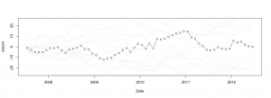
He compares the actual counts of suicides since 2007 to a purely random sequence of counts with the same mean (a Poisson process), and doesn’t see much difference: one of the panels below shows the real data, and the other four show data with no pattern.

Another way to look at the same thing is with cumulative sums, used in industrial process control: the dots are cumulative sums of actual minus average suicides, and the dashed lines in the background are ten simulated versions of the same thing, with no true pattern. Again, the real data doesn’t stand out as different.

These analyses answer the question “Is there evidence of changes in suicide rate in Canterbury some time in the last five years?”, saying “Not really”.  However, if we know when the February earthquake was, and we know that lower suicide rates (and also crime rates) are often seen after natural disasters, we can ask if the Canterbury data are consistent with that expectation. They are, as the Coroner observed, but if you didn’t already have that expectation, the data wouldn’t provide much evidence for it.

The data don’t speak for themselves: you have to ask them questions, and the choice of question matters.


September 9, 2012

Weather forecasting

Nate Silver, baseball statistician and election polling expert, has an article in the New York Times about weather forecasting and how it has improved much more than almost any other area of prediction:

In 1972, the service’s high-temperature forecast missed by an average of six degrees when made three days in advance. Now it’s down to three degrees. More stunning, in 1940, the chance of an American being killed by lightning was about 1 in 400,000. Today it’s 1 in 11 million. This is partly because of changes in living patterns (more of our work is done indoors), but it’s also because better weather forecasts have helped us prepare.

Perhaps the most impressive gains have been in hurricane forecasting. Just 25 years ago, when the National Hurricane Center tried to predict where a hurricane would hit three days in advance of landfall, it missed by an average of 350 miles. … Now the average miss is only about 100 miles.

The reasons are important in the light of today’s Big Data hype: meterologists have benefited from better input data, but more importantly from better models.  Today’s computers can run more accurate approximations to the fluid dynamics equations that really describe the weather. Blind data mining couldn’t have done nearly as well.     (via)

August 30, 2012

Conclusions of difference require evidence of difference

One of the problems in medical research, exacerbated by the new ability to measure millions of genetic variables at once, is that you can always divide people into sensible subgroups.

If your treatment doesn’t work, or your hated junk food isn’t related to cancer, overall, you can see if the relationship is there in men or in women.  Or in younger or older people.  Or in Portugese-speaking bassoonists. The more you chop up the data, the more likely you are to find some group where there’s a difference.  You can then focus on that group in your results.

To combat this tendency, my Seattle colleague Noel Weiss has been promoting the slogan “conclusions of difference require evidence of difference”.  That is, if you want to report that cupcakes cause cancer in men but not in women, you need evidence that the relationship is different in men and in women.  Finding supportive evidence in men but not finding it in women isn’t enough: that’s not evidence of a difference.  Needing evidence of a difference is especially important when you wouldn’t expect a difference.  We expect most things to have basically similar effects in men and women, and where the effects are different there’s usually an obvious reason.

All this is leading up to a story in the Herald, where a group of genetics researchers claim that a well-studied variant in a gene called monoamine oxidase increases happiness in women, but not in men.  We know this is surprising, because the researcher said so — they were expecting a decrease in happiness, and they don’t seem to have been expecting a male:female difference.  The researchers say that the difference could be because of testosterone — and of course it could be, but they don’t present any evidence at all that it is.

Anyway, as you will be expecting by now, I found the paper (the Herald gets points for giving the journal name), and it is possible to do a simple test for differences in `happiness’ effect between men and women. And there isn’t much evidence for a difference. For people who collect p-values: about 0.09 (Bayesian would get a similar conclusion after a lot more work). So, if we didn’t expect a benefit in  women and no difference in men, the data don’t give us much encouragement for believing that.

Testing for differences isn’t the ideal solution — even better would be to fit a model that allows for a smooth variation between constant effect and separate effect — but testing for differences is a good precursor to putting out a press release about differences and trying for headlines all over the world. We can’t expect newspapers to weed this sort of thing out if scientists are encouraging it via press releases.


August 16, 2012

Probabilistic weather forecasts

For the Olympics, the British Meterology Office was producing animated probabilistic forecast maps, showing the estimated probability of various amounts of rain or strengths of wind at a fine grid of locations over Britain.  These are a great improvement over the usual much more vague and holistic predictions, and they were made possible by a new and experimental high-resolution ensemble forecasting system.  (via)

I will quibble slightly about the probabilities in the forecast, though.  The Met Office generates a set of predictions spanning a reasonable range of weather models and input uncertainties, and then says “80% change of rain” if 80% of the predictions have rain at that location.   That is, 80% means an 80% chance that a randomly chosen prediction will say “rain”, it doesn’t necessarily mean that “out of locations and hours with 80% forecast probability, 80% of them will actually get rain”.

It’s possible to improve the calibration of the probabilities by feeding the ensemble of predictions into a statistical model, and researchers at the University of  Washington have been working on this.  Their ProbCast page gives probabilistic rain and temperature forecasts for the state of Washington that are based on a statistical model for the relationship between actual weather and the ensemble of forecasts, and this does give more accurate uncertainty numbers.

August 2, 2012

Is Lotto rigged?

Stuff seems to think so (via a Stat of the Week nomination)

If you plan to celebrate 25 years of Lotto with a ticket for tonight’s Big Wednesday draw, some outlets offer better odds than others.

No, they don’t.  They offer the same odds, roughly zero. Some outlets have sold more winning tickets than others in the past, that’s all.

Many people, even statisticians, enjoy playing Lotto. If you want to buy tickets at places where other people have won in the past, there’s nothing wrong with that and it won’t hurt your chances.   Since many people enjoy playing, it makes some sense for newspapers to write about Lotto from time to time.  But there’s no excuse for leading with a blatantly untrue statement.


July 23, 2012

Road toll stable

From the Herald this morning

More people have died in fewer car smashes since January 1 than at this time last year, prompting a Government reminder about the responsibility drivers hold over others’ lives.

“The message for drivers is clear,” Associate Transport Minister Simon Bridges said yesterday of a spate of multi-fatality crashes that have boosted the road toll to 161.

The number of fatal crashes is 133, compared to 144 last year at this time, and the number of deaths is 161, compared to 155 last year.

How do we calculate how much random variation would be expected in counts such as these?  It’s not sampling error in the sense of opinion polls, since these really are all the crashes in New Zealand.  We need a mathematical model for how much the numbers would vary if nothing much had changed.

The simplest mathematical model for counts is the Poisson process.  If dying in a car crash is independent for any two people in NZ, and the chance is small for any person (but not necessarily the same for different people) then number of deaths over any specified time period will follow a Poisson distribution.    The model cannot be exactly right — multiple fatalities would be much rarer if it were — but it is a good approximation, and any more detailed model would lead to more random variation in the road toll than the Poisson process does.

There’s a simple trick to calculate a 95% confidence interval for a Poisson distribution, analogous to the margin of error in opinion polls.  Take the square root of the count, add and subtract 1 to get upper and lower bounds, and square them: a count of 144  is consistent with underlying averages rates from 121 to 169.   And, as with opinion polls, when you look at differences between two years the range of random variation is about 1.4 times larger.

Last year we had an unusually low road toll, well below what could be attributed to random variation.  It still isn’t clear why, not that anyone’s complaining.  The numbers this year look about as different from last year’s as you would expect purely by chance.  If the message for drivers is clear, it’s only because the basic message is always the same:

yellow road sign: You're in a box on wheels hurtling along several times faster than evolution could have prepared you to go