Posts filed under Random variation (139)

February 2, 2018

Diagnostic accuracy: twitter followers

The New York Times and Stuff both have recent stories about fake Twitter followers. There’s an important difference. The Times focuses on a particular company that they claim sells fake followers; Stuff talks about two apps that claim to be able to detect fakes by looking at their Twitter accounts.

The difference matters. If you bought fake followers from a company such as the one the Times describes, then you (or a ‘rogue employee’) knew about it with pretty much 100% accuracy.  If you’re relying on algorithmic identification, you’d need some idea of the accuracy for it to be any use — and an algorithm that performs fairly well on average for celebrity accounts could still be wrong quite often for ordinary accounts. If you know that 80% of accounts with a given set of properties are fake, and someone has 100,000 followers with those properties, it might well be reasonable to conclude they have 80,000 fake followers.  It’s a lot less safe to conclude that a particular follower, Eve Rybody, say, is a fake.

Stuff says

Twitter Audit analyses the number of tweets, date of the last tweet, and ratio of followers to friends to determine whether a user is real or “fake”.

SocialBakers’ Maie Crumpton says it’s possible for celebrities to have 50 per cent “fake” or empty follower accounts through no fault of their own. SocialBakers’ labels an account fake or empty if it follows fewer than 50 accounts and has no followers.

Twitter Audit thinks I’ve got 50 fake followers. It won’t tell me who they are unless I pay, but I think it’s probably wrong. I have quite a few followers who are inactive or who are read-only tweeters, and some that aren’t real people but are real organisations.

Twitter users can’t guard against followers being bought for them by someone else but Brislen and Rundle agree it is up to tweeters to protect their reputation by actively managing their account and blocking fakes.

I don’t think I’d agree even if you could reliably detect individual fake accounts; I certainly don’t agree if you can’t.
January 8, 2018

Not dropping every year

Stuff has a story on road deaths, where Julie Ann Genter claims the Roads of National Significance are partly responsible for the increase in death rates. Unsurprisingly, Judith Collins disagrees.  The story goes on to say (it’s not clear if this is supposed to be indirect quotation from Judith Collins)

From a purely statistical viewpoint the road toll is lowering – for every 10,000 cars on the road, the number of deaths is dropping every year.

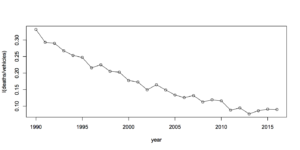
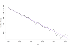
From a purely statistical viewpoint, this doesn’t seem to be true. The Ministry of Transport provides tables that show a rate of fatalities per 10,000 registered vehicles of 0.077 in 2013, 0.086 in 2014,  0.091 in 2015, and  0.090 in 2016. Here’s a graph, first raw

and now with a fitted trend (on a log scale, since the trend is straighter that way)

Now, it’s possible there’s some other way of defining the rate that doesn’t show it going up each year. And there’s a question of random variation as always. But if you scale for vehicles actually on the road, by using total distance travelled, we saw last year that there’s pretty convincing evidence of an increase in the underlying rate, over and above random variation.

The story goes on to say “But Genter is not buying into the statistics.” If she’s planning to make the roads safer, I hope that isn’t true.

November 23, 2017

More complicated than that

Science Daily

Computerized brain-training is now the first intervention of any kind to reduce the risk of dementia among older adults.

Daily Telegraph

Pensioners can reduce their risk of dementia by nearly a third by playing a computer brain training game similar to a driving hazard perception test, a new study suggests.

Ars Technica

Speed of processing training turned out to be the big winner. After ten years, participants in this group—and only this group—had reduced rates of dementia compared to the controls

The research paper is here, and the abstract does indeed say “Speed training resulted in reduced risk of dementia compared to control, but memory and reasoning training did not”

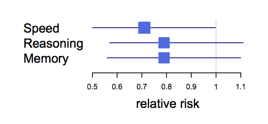
They’re overselling it a bit. First, these are intervals showing the ratios of number of cases with and without the three types of treatment, including the uncertainty

dementia

Summarising this as “speed training works but the other two don’t” is misleading.  There’s pretty marginal evidence that speed training is beneficial and even less evidence that it’s better than the other two.

On top of that, the results are for less than half the originally-enrolled participants, the ‘dementia’ they’re measuring isn’t a standard clinical definition, and this is a study whose 10-year follow-up ended in 2010 and that had a lot of ‘primary outcomes’ it was looking for — which didn’t include the one in this paper.

The study originally expected to see positive results after two years. It didn’t. Again, after five years, the study reported “Cognitive training did not affect rates of incident dementia after 5 years of follow-up.”  Ten-year results reported in 2014, showed relatively modest differences in people’s ability to take care of themselves, as Hilda Bastian commented.

So. This specific type of brain training might actually help. Or one of the other sorts of brain training they tried might help. Or, quite possibly, none of them might help.  On the other hand, these are relatively unlikely to be harmful, and maybe someone will produce an inexpensive app or something.

November 17, 2017

Lotto

Q: Can I improve my chances of winning Lotto by…

A: No.

Q: But….

A: No.

Q: …

A: Just no.

Q: … by buying a ticket?

A: Ok, yes. But not by very much.

Q: You sound like you’ve been asked about Lotto odds a lot.

A: There’s a larger-than-usual jackpot in the NZ Powerball

Q: Enough to make it worth buying a ticket?

A: If you like playing lotto, sure.

Q: No, as an investment.

A: I refer the honourable gentleman to the answer given some moments ago

Q: Huh?

A: No.

Q: But $35 million. And a 1 in 38 million chance of winning. And 80c tickets.  Buying all the tickets would cost less than $30 million. So, positive expected return.

A: If you were the only person playing

Q: And if I’m not?

A: Then you might have to share the prize

Q: How many other people will be playing?

A: Lotto NZ says they expect to sell more than a million tickets

Q: Compared to 38 million possibilities that doesn’t sound much

A: That’s tickets. Not lines.

Q: Ah. How many lines?

A: They don’t say.

Q: Couldn’t the media report that instead of bogus claims about a chemist in Hawkes Bay selling better tickets?

A: Probably not. I don’t think Lotto NZ tells them.

Q: That story says it would take 900 years to earn the money at minimum wage. How long to get it by playing Powerball?

A: At, say, ten lines twice per week?

Q: Sure.

A: 36900 years.

November 4, 2017

Types of weather uncertainty

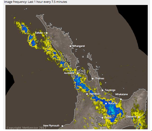
From the MetService rain radar
rain

If the band of rain were moving north-east, small uncertainties in its motion and orientation would mean that you’d know there would be half an hour of rain in Auckland, but not exactly when.

If it were moving south-east (as it is), small uncertainties in the motion and orientation mean that you know it will rain for a long time somewhere, but not exactly where.

One way to communicate the difference between these two predictions would be to show a set of possible realisations of rainfall.  For NW movement, you’d get a set of curves each with a single hump but at different times. For SW movement you’d get a much wider range of curves, where some showed no rain and others showed half a day or all day. I don’t know enough about ensemble forecasting to be sure, but I think this would be feasible

In principle, the common ‘patchy torrential downpours’ Spring rain pattern would show as rain curves each with different short periods of rain. I don’t think the technology is up to that using genuine predictions, but it might be possible to predict that we’re going to get that sort of weather and simulate the ensemble curves.

Current forecast summaries are mostly (except for hurricane paths) about averages: the probability of rain,  the expected amount, the worst-case amount. As technology progresses we will increasingly be able to do better than averages.


October 30, 2017

Past results do not imply future performance


A rugby team that has won a lot of games this year is likely to do fairly well next year: they’re probably a good team.  Someone who has won a lot of money betting on rugby this year is much less likely to keep doing well: there was probably luck involved. Someone who won a lot of money on Lotto this year is almost certain to do worse next year: we can be pretty sure the wins were just luck. How about mutual funds and the stock market?

Morningstar publishes ratings of mutual funds, with one to five stars based on past performance. The Wall Street Journal published an article saying (a) investors believe these are predictive of future performance and (b) they’re wrong.  Morningstar then fought back, saying (a) we tell them it’s based on past performance, not a prediction and (b) it is, too, predictive. And, surprisingly, it is.

Matt Levine (of Bloomberg; annoying free registration) and his readers had an interesting explanation (scroll way down)

Several readers, though, proposed an explanation. Morningstar rates funds based on net-of-fee performance, and takes into account sales loads. And fees are predictive. Funds that were good at picking stocks in the past will, on average, be average at picking stocks in the future; funds that were bad at picking stocks in the past will, on average, be average at picking stocks in the future; that is in the nature of stock picking. But funds with low fees in the past will probably have low fees in the future, and funds with high fees in the past will probably have high fees in the future. And since net performance is made up of (1) stock picking minus (2) fees, you’d expect funds with low fees to have, on average, persistent slightly-better-than-average performance.

That’s supported by one of Morningstar’s own reports.

The expense ratio and the star rating helped investors make better decisions. The star rating and expense ratios were pretty even on the success ratio–the closest thing to a bottom line. By and large, the star ratings from 2005 and 2008 beat expense ratios while expense ratios produced the best success ratios in 2006 and 2007. Overall, expense ratios outdid stars in 23 out of 40 (58%) observations.

A better data analysis for our purposes would look at star ratings for different funds matched on fees, rather than looking at the two separately.  It’s still a neat example of how you need to focus on the right outcome measurement. Mutual fund trading performance may not be usefully predictable, but even if it isn’t, mutual fund returns to the customer are, at least a little bit.


October 13, 2017

Road deaths up

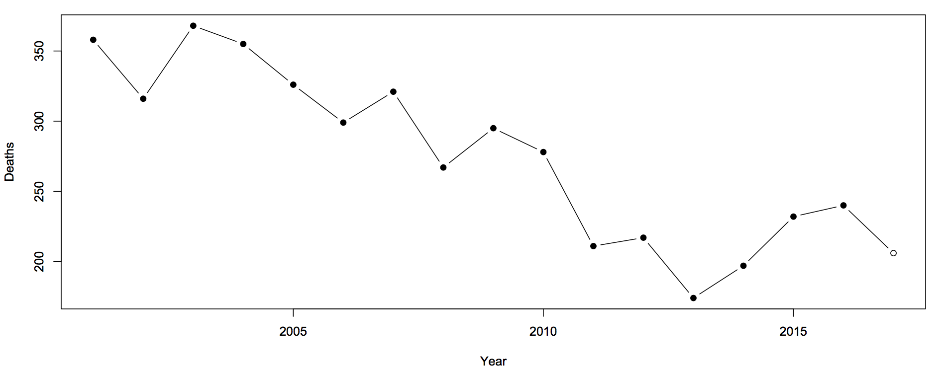
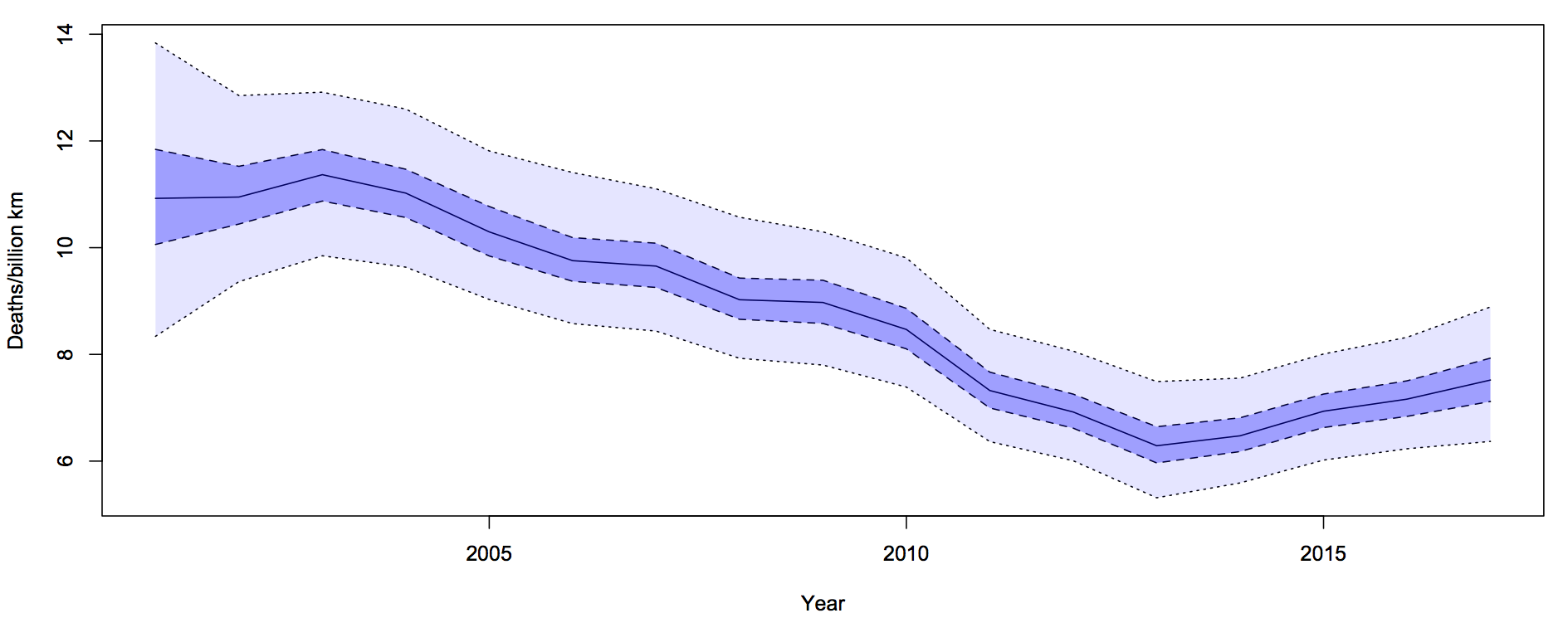
Sam Warburton (the economist, not the rugby player) has been writing about the recent increase in road deaths. Here are the counts (with partial 2017 data)

road-1

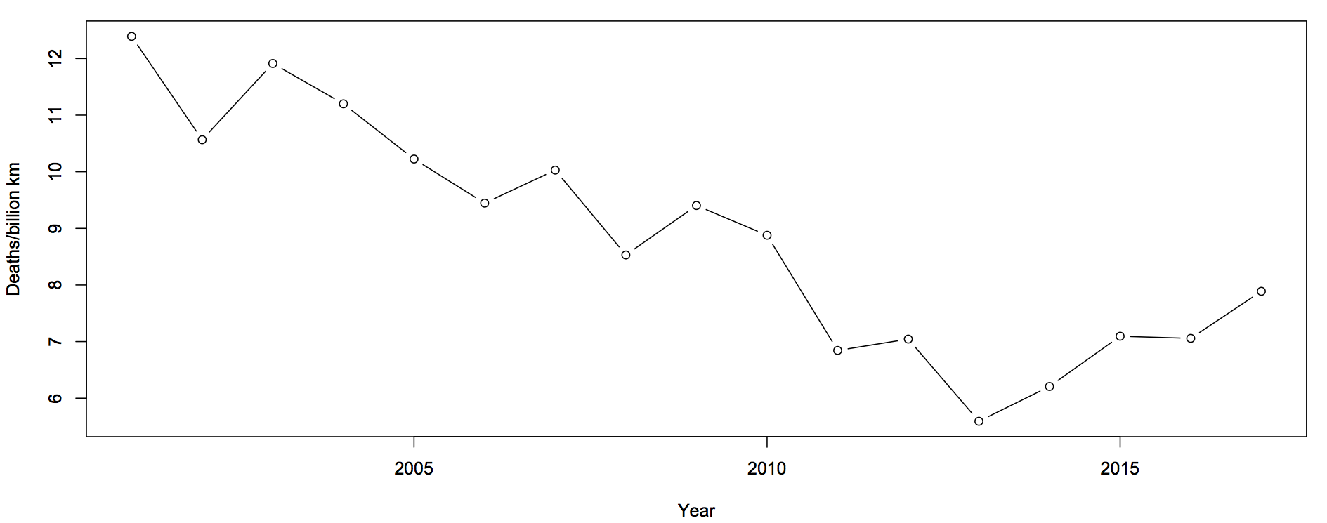
The first question you should ask is whether this is explained by population increases or by driving increases. That is, we want rates — deaths per unit of distance travelled

roads-2

There’s still an increase, but now the 2017 partial data are in line with the increase. The increase cannot be explained simply by more cars being on the roads.

The next question is about uncertainty.  Traditionally, news stories about the road toll were based on one month of data and random variation could explain it all. We still need a model for how much random variation to expect.  What I said before was

The simplest mathematical model for counts is the Poisson process.  If dying in a car crash is independent for any two people in NZ, and the chance is small for any person (but not necessarily the same for different people) then number of deaths over any specified time period will follow a Poisson distribution.    The model cannot be exactly right — multiple fatalities would be much rarer if it were — but it is a good approximation, and any more detailed model would lead to more random variation in the road toll than the Poisson process does.

In that case I was arguing that there wasn’t any real evidence of a change, so using an underestimate of the random variation made my case harder. In this case I’m arguing the change is larger than random variation, so I need to make sure I don’t underestimate random variation.

What I did was fit a Bayesian model with two extra random components.  The first was the trend over time. To avoid making assumptions about the shape of the trend I just assumed that the difference between adjacent years was relatively small and random. The second random component was a difference between the trend value for a year and the ‘true’ rate for that year. On top of all of that, there’s Poisson variation.  Since the size of the two additional random components is estimated from the data, they will capture all the variation.

roads-3

For each year, there is a 50% probability that the underlying rate is in the darker blue interval, and a 95% probability it’s in the light blue interval.  The trend is smoother than the data because the data has both the Poisson variation and the extra year-specific deviation. There’s more uncertainty in 2001 because we didn’t use pre-2001 data to tie it down at all, but that won’t affect the later half of the time period much.

It looks from the graph as though there was a minimum in 2013-14 and an increased rate since then.  One of the nice things about these Bayesian models is that you can easily and meaningfully ask for the probability that each year was the minimum. The probability is 54% for 2013 and 27% for 2014: there really was a minimum around then.

The probability that the rate is higher in 2017 than in 2013 is over 90%. This one isn’t just random variation, and it isn’t population increase.


Update: Peter Ellis, who has more experience with NZ official statistics and with Bayesian state-space time series models, gets qualitatively similar results

September 24, 2017

The polls

So, how did the polls do this time? First, the main result was predicted correctly: either side needs a coalition with NZ First.

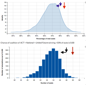
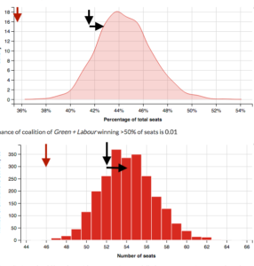
In more detail, here are the results from Peter Ellis’s forecasts from the page that lets you pick coalitions.

Each graph has three arrows. The red arrow shows the 2014 results. The blue/black arrow pointing down shows the current provisional count and the implied number of seats, and the horizontal arrow points to Graeme Edgeler’s estimate of what the special votes will do (not because he claims any higher knowledge, but because his estimates are on a web page and explain how he did it).

First, for National+ACT+UnitedFuture

national

Second, for Labour+Greens

labgrn

The result is well within  the uncertainty range of the predictions for Labour+Greens, and not bad for  National. This isn’t just because NZ politics is easy to predict: the previous election’s results are much further away. In particular, Labour really did gain a lot more votes than could reasonably have been expected a few months ago.


Update: Yes, there’s a lot of uncertainty. And, yes, that does  mean quoting opinion poll results to the nearest 0.1% is silly.

July 30, 2017

What are election polls trying to estimate? And is Stuff different?

Stuff has a new election ‘poll of polls’.

The Stuff poll of polls is an average of the most recent of each of the public political polls in New Zealand. Currently, there are only three: Roy Morgan, Colmar Brunton and Reid Research. 

When these companies release a new poll it replaces their previous one in the average.

The Stuff poll of polls differs from others by giving weight to each poll based on how recent it is.

All polls less than 36 days old get equal weight. Any poll 36-70 days old carries a weight of 0.67, 70-105 days old a weight 0.33 and polls greater than 105 days old carry no weight in the average.

In thinking about whether this is a good idea, we’d need to first think about what the poll is trying to estimate and about the reasons it doesn’t get that target quantity exactly right.

Officially, polls are trying to estimate what would happen “if an election were held tomorrow”, and there’s no interest in prediction for dates further forward in time than that. If that were strictly true, no-one would care about polls, since the results would refer only to the past two weeks when the surveys were done.

A poll taken over a two-week period is potentially relevant because there’s an underlying truth that, most of the time, changes more slowly than this.  It will occasionally change faster — eg, Donald Trump’s support in the US polls seems to have increased after James Comey’s claims about Clinton’s emails in the US, and Labour’s support in the UK polls increased after the election was called — but it will mostly change slower. In my view, that’s the thing people are trying to estimate, and they’re trying to estimate it because it has some medium-term predictive value.

In addition to changes in the underlying truth, there is the idealised sampling variability that pollsters quote as the ‘margin of error’. There’s also larger sampling variability that comes because polling isn’t mathematically perfect. And there are ‘house effects’, where polls from different companies have consistent differences in the medium to long term, and none of them perfectly match voting intentions as expressed at actual elections.

Most of the time, in New Zealand — when we’re not about to have an election — the only recent poll is a Roy Morgan poll, because  Roy Morgan polls more much often than anyone else.  That means the Stuff poll of polls will be dominated by the most recent Roy Morgan poll.  This would be a good idea if you thought that changes in underlying voting intention were large compared to sampling variability and house effects. If you thought sampling variability was larger, you’d want multiple polls from a single company (perhaps downweighted by time).  If you thought house effects were non-negligible, you wouldn’t want to downweight other companies’ older polls as aggressively.

Near an election, there are lots more polls, so the most recent poll from each company is likely to be recent enough to get reasonably high weight. The Stuff poll is then distinctive in that it complete drops all but the most recent poll from each company.

Recency weighting, however, isn’t at all unique to the Stuff poll of polls. For example, the pundit.co.nz poll of polls downweights older polls, but doesn’t drop the weight to zero once another poll comes out. Peter Ellis’s two summaries both downweight older polls in a more complicated and less arbitrary way; the same was true of Peter Green’s poll aggregation when he was doing it.  Curia’s average downweights even more aggressively than Stuff’s, but does not otherwise discard older polls by the same company. RadioNZ averages the only the four most recent available results (regardless of company) — they don’t do any other weighting for recency, but that’s plenty.

However, another thing recent elections have shown us is that uncertainty estimates are important: that’s what Nate Silver and almost no-one else got right in the US. The big limitation of simple, transparent poll of poll aggregators is that they say nothing useful about uncertainty.

April 14, 2017

Cyclone uncertainty

Cyclone Cook ended up a bit east of where it was expected, and so Auckland had very little damage.  That’s obviously a good thing for Auckland, but it would be even better if we’d had no actual cyclone and no forecast cyclone.  Whether the precautions Auckland took were necessary (at the time) or a waste  depends on how much uncertainty there was at the time, which is something we didn’t get a good idea of.

In the southeastern USA, where they get a lot of tropical storms, there’s more need for forecasters to communicate uncertainty and also more opportunity for the public to get to understand what the forecasters mean.  There’s scientific research into getting better forecasts, but also into explaining them better. Here’s a good article at Scientific American

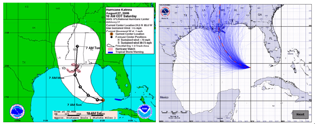
Here’s an example (research page):

hurricane

On the left is the ‘cone’ graphic currently used by the National Hurricane Center. The idea is that the current forecast puts the eye of the hurricane on the black line, but it could reasonably be anywhere in the cone. It’s like the little blue GPS uncertainty circles for maps on your phone — except that it also could give the impression of the storm growing in size.  On the right is a new proposal, where the blue lines show a random sample of possible hurricane tracks taking the uncertainty into account — but not giving any idea of the area of damage around each track.

There’s also uncertainty in the predicted rainfall.  NIWA gave us maps of the current best-guess predictions, but no idea of uncertainty.  The US National Weather Service has a new experimental idea: instead of giving maps of the best-guess amount, give maps of the lower and upper estimates, titled: “Expect at least this much” and “Potential for this much”.

In New Zealand, uncertainty in rainfall amount would be a good place to start, since it’s relevant a lot more often than cyclone tracks.

Update: I’m told that the Met Service do produce cyclone track forecasts with uncertainty, so we need to get better at using them.  It’s still likely more useful to experiment with rainfall uncertainty displays, since we get heavy rain a lot more often than cyclones.