Student-friendly radar charts
The Critic, the student magazine of Otago, has an interesting feature on the council elections, rating the candidates on six issues determined by polling to be important to students. One of the ways they present the candidate ratings is with radar plots
These show the rating for each of the issues on six radial axes, connected to form the white polygon. Candidates who are more ‘student-friendly’ on these issues will end up with larger polygons, and the different shapes show that there are significant tradeoffs between, say, a candidate who is in favour of drinking and (quality) loud music, and one who is sound on environment and transport.
This is a pretty good use of radar plots. Their main limitations are that the ordering of the axes can have a big effect on the visual impression, and that evaluating tradeoffs quantitatively is hard. Neither is a really serious limitation here, and both are problems common to many ways of displaying multivariate data.
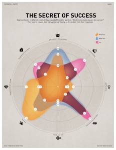
Here’s another radar chart, originally from INFOGRAPHIKA magazine, rescued from its unfair banishment to wtfviz.net.
This one shows how people rated the importance of eight factors in success, split up by their income. It’s interesting to see how much higher connections, initial capital, and cheating were rated as important by the poor, and how the rich thought hard work was the key factor, not being very impressed even by education. It’s clear that each group likes the story that makes them look good; less clear who is more correct. What’s a bit depressing is how small a role anyone thinks is played by luck.


