Posts filed under Polls (132)

October 17, 2012

Do we trust the police?

Cameron Slater (and the Police, and the Police Association) are Outraged about a Horizon poll on public perceptions of the police.  They do have some fair points, although a few deep breaths wouldn’t hurt.

Horizon Research conducted a poll shortly after an article in the Dominion Post.  This, in itself, is one of the claims against the company, but I don’t think this one really holds water — if you’re a public opinion firm wanting coverage, trying to capitalise on well-publicised issues seems fair enough, and it’s not as if we in the blogosphere are on the moral high ground here.

The results of the poll are clearly not relevant to the question of police conduct in the particular incident described in the Dominion Post article, since if the poll has even the slightest pretension to being representative, none of the respondents will know anything about that incident beyond what they might have read in the papers.  Also, since this is a one-off poll, the Dominion Post’s headline “Trust in police hits new low survey shows” cannot possibly be justified.  There is no comparison with a series of similar surveys in the past; respondents were just asked whether their trust in the police had changed over time.

Many of the reported findings of the poll seem reasonable, and in line with other evidence, for example: 73% have the same or more trust in the police than five years ago, and the police are thought to do well on their primary areas of responsibility

  • protecting life: 87.1% well, 10.2% poorly
  • protecting the peace: 84% well, 11.6% poorly
  • road safety: 86% well, 12.3% poorly
  • protecting property: 67.1% think they perform well, 28.7% poorly.

The police, in their press release, apparently as further argument against the poll results,  point out that crime rates are falling.  That’s not really relevant.  Even if the crime rates were falling specifically because of police actions (which is unproved, since there are falls in other countries too), it would only prove that people should think the police are effective in stopping crime, not that they do think the police are fair in investigating complaints.

The controversial claims are about victims of police misconduct:  firstly, that sizable majorities think the investigation procedure needs to be more independent, and secondly, that people who identify themselves as victims are not happy with how their cases were handled.  Again, this doesn’t seem all that strange: I basically trust the police, but I’m still in favour of having investigations done independently just from the ‘lead us not into temptation’ principle.  It’s not news that NZ, by international standards, gives people fairly low levels of compensation for all sorts of things. And it’s hardly surprising that people who think they were mistreated by police aren’t happy with how they were treated by police.

The problem is with how the poll was conducted, and there are at least two pieces of evidence that it wasn’t done well. The first is in the poll results themselves.  The number of New Zealanders who file complaints against the police is very small.  We looked at this back when the issue of complaints against teachers came up.  In a one-year period there were 2052 complaints, half of them minor ‘Category 5’ complaints.  That’s one Category 1-4 complaint per 4500 Kiwis per year (and if some people make multiple complaints, the effective number is even smaller).   In a representative sample of 756 people there shouldn’t have been enough people with experience of police complaints to get useful estimates of anything, let alone to the quoted three decimal places.   Even if we ignored bias and just worried about sampling variation, it would be a serious fault that no margin of error or sample size is quoted for these subgroups.

The second problem is that a Facebook page associated with the incident gave a bounty (chance of winning money and iPad) to people who clicked through to the online poll.   There are now comments on that page saying that not very many people did click through and that they might not have been counted anyway because they wouldn’t have been registered far enough in advance.  That reminds me of this XKCD cartoon. If you have a poll where it’s even conceivable that it could be biased this way, it’s not much consolation to know that the only known attempt to do it was a failure.
October 10, 2012

Nutrition polls

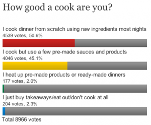
The clicky poll accompanying the story about nutrition in the younger generation now looks like this:

There are slightly dubious surveys, like the Weight Watchers one, and then there are bogus polls strictly for entertainment purposes only.

October 9, 2012

Random variation and US polls

Since 3News has had a story saying that Romney is ahead in the US polls (not up yet, but look here later) I figure it’s worth linking to someone who understands these things, Nate Silver.

In short, yes, a poll by a very respectable group did report Romney as ahead, in a very large swing. But other polls showed much smaller swings. So it’s most likely that part of the result is random variation.  It’s true that Romney’s advantage is larger than the margin of error in this poll, but that does happen: one poll in twenty should be outside the margin of error even if there’s nothing more complicated going on.

Nate Silver’s projection including this poll still gives Romney only a 25% chance of winning, about twice what he had before the debate. Intrade‘s betting gives about 35%, up from just over 20%.

[ update: the Princeton Election Consortium meta-analysis of polls has Obama with a 2% lead, down from 6%, but predicted to rise again]

September 7, 2012

Natural division of labour

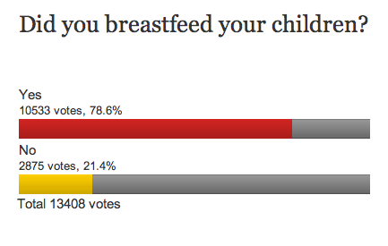
From one of the current clicky polls over on Stuff, some surprising results:

In a representative sample of NZ parents I would have thought the ‘Yes’ figure would have to be at most 50%.

The question is an example of where the passive voice can be an improvement: “Were your children breastfed?” 


August 20, 2012

Nostra maxima culpa

As Alan Keegan points out in his Stat of the Week nomination, the Stats Department Facebook page was sporting a graph whose only redeeming feature is that it doesn’t even pretend to convey information.

To decide what to do with the graph, we are hosting a bogus poll:


August 13, 2012

Cybercrime misrepresentation soars

From a story in Stuff

The amount of money Kiwis lost to online dating scams has doubled in the past year and now makes up almost two-thirds of all reported online fraud losses.

which then goes on to say

NetSafe operates a website, theorb.org.nz, in partnership with the police, the Consumer Affairs Ministry and other government agencies which lets people report frauds by clicking on an “online reporting button”.

So it’s not a doubling of cybercrime, it’s a doubling of cyberreporting. A bogus poll, in other words.

We then read

The charity claimed in June that cyber-crime cost the country “as much as $625 million” in financial losses once the time and expense in sorting issues, such as removing malware, was included.

If we simultaneously believed the $625 million and believed that the ‘two-thirds’ from online dating scams was meaningful, that would be $400 million per year from online dating scams, which is ludicrous.  So at least one of these figures is bogus.

In fact, they both probably are. The story goes on to say

The estimate was extrapolated from international surveys carried out by Symantec, which sells security software.

NetSafe consultant Chris Hails acknowledged Symantec’s figures had been questioned and said there was no single source of reliable figures.

The journalist is to be commended for at least forcing this admission.  The figures from people selling computer security products are notoriously inflated; there’s a good description of attempts to track down the sources of these numbers from a recent ProPublica article.

It’s hard to visualise big numbers, so it may not be obvious how extreme the $625 million number is.  For example, it’s more than the total profit from NZ beef exports ($2 billion gross, about 25% profit (p22)) , and it’s more than ACC spends on medical treatment each year.

August 4, 2012

Pie charts: threat or menace?

Stuff has a story based on a real and useful poll, but summarised with a dreadful graph.  You will have heard statisticians ranting about pie charts and may have wondered whether their medications need to be adjusted.  Here’s why we rant.

Notice that the pie isn’t round; it’s an ellipse.  Presumably we’re supposed to imagine it being tilted away at some angle (in contrast to the table, the headline, and the legend, which are aligned with the page.   Also notice that the wedges have numbers on them — that’s often a sign that the graph can’t be interpreted by itself.  The red wedge looks a lot smaller than the blue wedge.

(more…)

July 26, 2012

Good reporting of a poll

The Herald has a fairly good story about a poll on motorway tolls:  the target population (Auckland City), the sample size, the results, and the sampling method are all described.

The sample wasn’t a random sample, but according to the description, it was still a reasonable sample

Those surveyed were drawn from a research panel recruited by Horizon in accordance with the demographics of Auckland’s adult population at the last Census, weighted to match age, gender, personal income, employment and education levels

The respondents will be a biased sample, but the pollers have made efforts to correct this bias.  That’s what is done in good-quality national surveys even if a random sample is taken, because non-response inevitably makes the sample less representative than it should be.

There are two points that would have been welcome in the story which weren’t there.  Firstly, there is no margin of error.  Using a biased sample and reweighting will typically give a larger margin of error than using a random sample, though not so large as to make a big difference to the conclusions the Herald reports.  Secondly, the respondents were asked for their opinions about different ways of raising 10 billion dollars to pay for major city projects, but it’s not clear whether they were asked about just not doing the projects and saving the 10 billion dollars.

July 20, 2012

Measurement error and rare events

Surveys are not perfect: some people misunderstand the question, some people recall incorrectly, some responses are written down incorrectly by the poller, and some people just lie.   These biases happen in both directions, but their impact is not symmetrical.

Suppose you had a survey that asked “Have you ever been abducted by aliens?”  We can be sure that false ‘Yes’ results will be more common than false ‘No’ results, so the survey will necessarily overestimate the true proportion. If you wrote down the wrong answer for 1% of people, you’d end up with an estimate that was 1% too high.

In principle, the same issue  could be a serious problem in estimating the support for minor parties: about 1% of people voted for ACT at the last election, and 99% didn’t.  Suppose you poll 10000 people and ask them if they voted for ACT, and suppose that 100 of them really were ACT voters. If your opinion poll gets the wrong answer, randomly, for 1% of people, you will get the wrong answer from 1 of the true ACT voters, and 99 of the true non-ACT voters, so you will report 100+99-1=198 ACT voters and 9900+1-99 = 9802 non-ACT voters.  You would overestimate the votes for ACT by a factor of two!  Keith Humphreys, who we have linked to before, postulates that this is why US polls indicating support for a third-party candidate tend to seriously overestimate their support.

I’m skeptical.  Here in NZ, where we really have minor parties, there is no systematic tendency to overestimate the support they receive.  ACT got 1% of the vote, and that was close to what the polls predicted. Similarly, the Maori Party, and the Greens received about the same number of votes in the last election as averages of the polls had predicted.  For NZ First, the election vote was actually higher than in the opinion polls.  Similarly, for the Dutch general election in 2010 there was pretty good agreement between the last polls and the election results.  Even in Australia, where there is effectively a two-party system in the lower house (but with preferential voting), the opinion poll figures for the Greens agreed pretty well with the actual vote

It’s true that measurement error tends to bias towards 50%, and this matters in some surveys, but I would have guessed the US phantom third party support is the result of bias, not error. That is, I suspect people tend to overstate their support for third-party candidates in advance of the election, and that in the actual election they vote strategically for whichever of the major parties they dislike least.   My hypothesis would imply not much bias in countries where minor-party votes matter, and more bias in countries with first-past-the-post voting.  Unfortunately there’s also a pure measurement error hypothesis that’s consistent with the data, which is that people are just more careful about measuring minor-party votes in countries where they matter.

July 17, 2012

Margin of error yet again

In my last post I more-or-less assumed that the design of the opinion polls was handed down on tablets of stone.  Of course, if you really need more accuracy for month-to-month differences, you can get it.   The Household Labour Force Survey gives us the official estimates of unemployment rate.  We need to be able to measure changes in unemployment that are much smaller than a few percentage points, so StatsNZ doesn’t just use independent random samples of 1000 people.

The HLFS sample contains about 15,000 private households and about 30,000 individuals each quarter. We sample households on a statistically representative basis from areas throughout New Zealand, and obtain information for each member of the household. The sample is stratified by geographic region, urban and rural areas, ethnic density, and socio-economic characteristics. 

Households stay in the survey for two years. Each quarter, one-eighth of the households in the sample are rotated out and replaced by a new set of households. Therefore, up to seven-eighths of the same people are surveyed in adjacent quarters. This overlap improves the reliability of quarterly change estimates.

That is, StatsNZ uses a much larger sample, which reduces the sampling error at any single time point, and samples the same households more than once, which reduces the sampling error when estimating changes over time.   The example they give on that web page shows that the margin of error  for annual change in the employment rate is on the order of 1 percentage point.  StatsNZ calculates sampling errors for all the employment numbers they publish, but I can’t find where they publish the sampling errors.

[Update: as has just been pointed out to me, StatsNZ publish the sampling errors at the bottom of each column of the Excel version of their table,  for all the tables that aren’t seasonally adjusted]