Posts filed under Politics (193)

August 30, 2014

Funding vs disease burden: two graphics

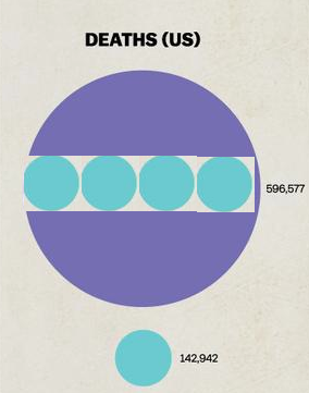
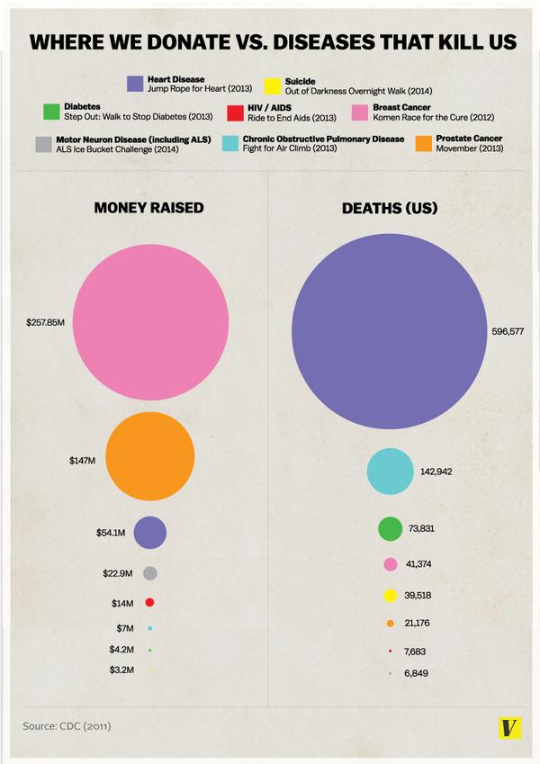
You have probably seen the graphic from vox.comhyU8ohq


There are several things wrong with it. From a graphics point of view it doesn’t make any of the relevant comparisons easy. The diameter of the circle is proportional to the deaths or money, exaggerating the differences. And the donation data are basically wrong — the original story tries to make it clear that these are particular events, not all donations for a disease, but it’s the graph that is quoted.

For example, the graph lists $54 million for heart disease, based on the ‘Jump Rope for Heart’ fundraiser. According to Forbes magazine’s list of top charities, the American Heart Association actually received $511 million in private donations in the year to June 2012, almost ten times as much.  Almost as much again came in grants for heart disease research from the National Institutes of Health.

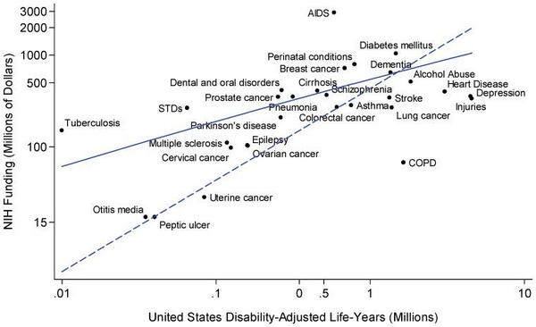
There’s another graph I’ve seen on Twitter, which shows what could have been done to make the comparisons clearer:

BwNxOzdCIAAyIZS


It’s limited, because it only shows government funding, not private charity, but it shows the relationship between funding and the aggregate loss of health and life for a wide range of diseases.

There are a few outliers, and some of them are for interesting reasons. Tuberculosis is not currently a major health problem in the US, but it is in other countries, and there’s a real risk that it could spread to the US.  AIDS is highly funded partly because of successful lobbying, partly because it — like TB — is a foreign-aid issue, and partly because it has been scientifically rewarding and interesting. COPD and lung cancer are going to become much less common in the future, as the victims of the century-long smoking epidemic die off.

Depression and injuries, though?


Update: here’s how distorted the areas are: the purple number is about 4.2 times the blue number

four-to-one

August 29, 2014

Getting good information to government

On the positive side: there’s a conference of science advisers and people who know about the field here in Auckland at the moment. There’s a blog, and there will soon be videos of the presentations.

On the negative side: Statistics Canada continues to provide an example of how a world-class official statistics agency can go downhill with budget cuts and government neglect.  The latest story is the report on how the Labour Force Survey (which is how unemployment is estimated) was off by 42000 in July. There’s a shorter writeup in Maclean’s magazine, and their archive of stories on StatsCan is depressing reading.

August 19, 2014

“More maps that won’t change your mind about racism in America”

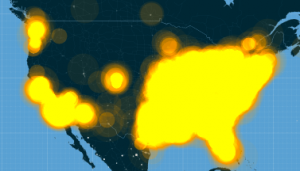
From floatingsheep.org

sheep

Ultimately, despite the centrality of social media to the protests and our ability to come together and reflect on the social problems at the root of Michael Brown’s shooting, these maps, and the kind of data used to create them, can’t tell us much about the deep-seated issues that have led to the killing of yet another unarmed young black man in our country. And they almost certainly won’t change anyone’s mind about racism in America. They can, instead, help us to better understand how these events have been reflected on social media, and how even purportedly global news stories are always connected to particular places in specific ways.

August 8, 2014

History of NZ Parliament visualisation

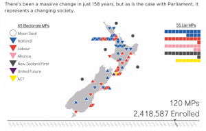
One frame of a video showing NZ party representation in Parliament over time,

nzparties

made by Stella Blake-Kelly for TheWireless. Watch (and read) the whole thing.

August 7, 2014

Non-bogus non-random polling

As you know, one of the public services StatsChat provides is whingeing about bogus polls in the media, at least when they are used to anchor stories rather than just being decorative widgets on the webpage. This attitude doesn’t (or doesn’t necessarily) apply to polls that make no effort to collect a non-random sample but do make serious efforts to reduce bias by modelling the data. Personally, I think it would be better to apply these modelling techniques on top of standard sampling approaches, but that might not be feasible. You can’t do everything.

I’ve been prompted to write this by seeing Andrew Gelman and David Rothschild’s reasonable and measured response (and also Andrew’s later reasonable and less measured response) to a statement from the American Association for Public Opinion Research.  The AAPOR said

This week, the New York Times and CBS News published a story using, in part, information from a non-probability, opt-in survey sparking concern among many in the polling community. In general, these methods have little grounding in theory and the results can vary widely based on the particular method used. While little information about the methodology accompanied the story, a high level overview of the methodology was posted subsequently on the polling vendor’s website. Unfortunately, due perhaps in part to the novelty of the approach used, many of the details required to honestly assess the methodology remain undisclosed.

As the responses make clear, the accusation about transparency of methods is unfounded. The accusation about theoretical grounding is the pot calling the kettle black.  Standard survey sampling theory is one of my areas of research. I’m currently writing the second edition of a textbook on it. I know about its grounding in theory.

The classical theory applies to most of my applied sampling work, which tends to involve sampling specimen tubes from freezers. The theoretical grounding does not apply when there is massive non-response, as in all political polling. It is an empirical observation based on election results that carefully-done quota samples and reweighted probability samples of telephones give pretty good estimates of public opinion. There is no mathematical guarantee.

Since classical approaches to opinion polling work despite massive non-response, it’s reasonable to expect that modelling-based approaches to non-probability data will also work, and reasonable to hope that they might even work better (given sufficient data and careful modelling). Whether they do work better is an empirical question, but these model-based approaches aren’t a flashy new fad. Rod Little, who pioneered the methods AAPOR is objecting to, did so nearly twenty years before his stint as Chief Scientist at the US Census Bureau, an institution not known for its obsession with the latest fashions.

In some settings modelling may not be feasible because of a lack of population data. In a few settings non-response is not a problem. Neither of those applies in US political polling. It’s disturbing when the president of one of the largest opinion-polling organisations argues that model-based approaches should not be referenced in the media, and that’s even before considering some of the disparaging language being used.

“Don’t try this at home” might have been a reasonable warning to pollers without access to someone like Andrew Gelman. “Don’t try this in the New York Times” wasn’t.

August 4, 2014

Predicting blood alcohol concentration is tricky

Rasmus Bååth, who is doing a PhD in Cognitive Science, in Sweden, has written a web app that predicts blood alcohol concentrations using reasonably sophisticated equations from the forensic science literature.

The web page gives a picture of the whole BAC curve over time, but requires a lot of detailed inputs. Some of these are things you could know accurately: your height and weight, exactly when you had each drink and what it was. Some of them you have a reasonable idea about: is your stomach empty or full, and therefore is alcohol absorption fast or slow. You also need to specify an alcohol elimination rate, which he says averages 0.018%/hour but could be half or twice that, and you have no real clue.

If you play around with the interactive controls, you can see why the advice given along with the new legal limits is so approximate (as Campbell Live is demonstrating tonight).  Rasmus has all sorts of disclaimers about how you shouldn’t rely on the app, so he’d probably be happier if you don’t do any more than that with it.

July 13, 2014

Age/period/cohort voting

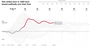
From the New York Times, an interactive graph showing how political leanings at different ages have changed over time

vote

Yes, voting preferences for kids are problematic. Read the story (and this link) to find out how they inferred them. There’s more at Andrew Gelman’s blog.

July 2, 2014

What’s the actual margin of error?

The official maximum margin of error for an election poll with a simple random sample of 1000 people is 3.099%. Real life is more complicated.

In reality, not everyone is willing to talk to the nice researchers, so they either have to keep going until they get a representative-looking number of people in each group they are interested in, or take what they can get and reweight the data — if young people are under-represented, give each one more weight. Also, they can only get a simple random sample of telephones, so there are more complications in handling varying household sizes. And even once they have 1000 people, some of them will say “Dunno” or “The Conservatives? That’s the one with that nice Mr Key, isn’t it?”

After all this has shaken out it’s amazing the polls do as well as they do, and it would be unrealistic to hope that the pure mathematical elegance of the maximum margin of error held up exactly.  Survey statisticians use the term “design effect” to describe how inefficient a sampling method is compared to ideal simple random sampling. If you have a design effect of 2, your sample of 1000 people is as good as an ideal simple random sample of 500 people.

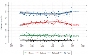
We’d like to know the design effect for individual election polls, but it’s hard. There isn’t any mathematical formula for design effects under quota sampling, and while there is a mathematical estimate for design effects after reweighting it isn’t actually all that accurate.  What we can do, thanks to Peter Green’s averaging code, is estimate the average design effect across multiple polls, by seeing how much the poll results really vary around the smooth trend. [Update: this is Wikipedia’s graph, but I used Peter’s code]

NZ_opinion_polls_2011-2014-majorparties

I did this for National because it’s easiest, and because their margin of error should be close to the maximum margin of error (since their vote is fairly close to 50%). The standard deviation of the residuals from the smooth trend curve is 2.1%, compared to 1.6% for a simple random sample of 1000 people. That would be a design effect of (2.1/1.6)2, or 1.8.  Based on the Fairfax/Ipsos numbers, about half of that could be due to dropping the undecided voters.

In principle, I could have overestimated the design effect this way because sharp changes in party preference would look like unusually large random errors. That’s not a big issue here: if you re-estimate using a standard deviation estimator that’s resistant to big errors (the median absolute deviation) you get a slightly larger design effect estimate.  There may be sharp changes, but there aren’t all that many of them, so they don’t have a big impact.

If the perfect mathematical maximum-margin-of-error is about 3.1%, the added real-world variability turns that into about 4.2%, which isn’t that bad. This doesn’t take bias into account — if something strange is happening with undecided voters, the impact could be a lot bigger than sampling error.


June 23, 2014

Undecided?

My attention was drawn on Twitter to this post at The Political Scientist arguing that the election poll reporting is misleading because they don’t report the results for the relatively popular “Undecided” party.  The post is making a good point, but there are two things I want to comment on. Actually, three things. The zeroth thing is that the post contains the numbers, but only as screenshots, not as anything useful.

The first point is that the post uses correlation coefficients to do everything, and these really aren’t fit for purpose. The value of correlation coefficients is that they summarise the (linear part of the) relationship between two variables in a way that doesn’t involve the units of measurement or the direction of effect (if any). Those are bugs, not features, in this analysis. The question is how the other party preferences have changed with changes in the ‘Undecided’ preference — how many extra respondents picked Labour, say, for each extra respondent who gave a preference. That sort of question is answered  (to a straight-line approximation) by regression coefficients, not correlation coefficients.

When I do a set of linear regressions, I estimate that changes in the Undecided vote over the past couple of years have split approximately  70:20:3.5:6.5 between Labour:National:Greens:NZFirst.  That confirms the general conclusion in the post: most of the change in Undecided seems to have come from  Labour. You can do the regressions the other way around and ask where (net) voters leaving Labour have gone, and find that they overwhelmingly seem to have gone to Undecided.

What can we conclude from this? The conclusion is pretty limited because of the small number of polls (9) and the fact that we don’t actually have data on switching for any individuals. You could fit the data just as well by saying that Labour voters have switched to National and National voters have switched to Undecided by the same amount — this produces the same counts, but has different political implications. Since the trends have basically been a straight line over this period it’s fairly easy to get alternative explanations — if there had been more polls and more up-and-down variation the alternative explanations would be more strained.

The other limitation in conclusions is illustrated by the conclusion of the post

There’s a very clear story in these two correlations: Put simply, as the decided vote goes up so does the reported percentage vote for the Labour Party.

Conversely, as the decided vote goes up, the reported percentage vote for the National party tends to go down.

The closer the election draws the more likely it is that people will make a decision.

But then there’s one more step – getting people to put that decision into action and actually vote.

We simply don’t have data on what happens when the decided vote goes up — it has been going down over this period — so that can’t be the story. Even if we did have data on the decided vote going up, and even if we stipulated that people are more likely to come to a decision near the election, we still wouldn’t have a clear story. If it’s true that people tend to come to a decision near the election, this means the reason for changes in the undecided vote will be different near an election than far from an election. If the reasons for the changes are different, we can’t have much faith that the relationships between the changes will stay the same.

The data provide weak evidence that Labour has lost support to ‘Undecided’ rather than to National over the past couple of years, which should be encouraging to them. In the current form, the data don’t really provide any evidence for extrapolation to the election.


[here’s the re-typed count of preferences data, rounded to the nearest integer]
June 17, 2014

Margins of error

From the Herald

The results for the Mana Party, Internet Party and Internet-Mana Party totalled 1.4 per cent in the survey – a modest start for the newly launched party which was the centre of attention in the lead-up to the polling period.

That’s probably 9 respondents. A 95% interval around the support for Internet–Mana goes from 0.6% to 2.4%, so we can’t really tell much about the expected number of seats.

Also notable

Although the deal was criticised by many commentators and rival political parties, 39 per cent of those polled said the Internet-Mana arrangement was a legitimate use of MMP while 43 per cent said it was an unprincipled rort.

I wonder what other options respondents were given besides “unprincipled rort” and “legitimate use of MMP”.