Posts filed under Politics (193)

January 6, 2015

Foreign drivers, again

The Herald has a poll saying 61% of New Zealanders want to make large subsets of foreign drivers sit written and practical tests before they can drive here (33.9%: people from right-hand drive countries; 27.4% everyone but Australians). It’s hard to tell how much of this is just the push effect of being asked the questions and how much is real opinion.

The rationale is that foreign drivers are dangerous:

Overseas drivers were found at fault in 75 per cent of 538 injury crashes in which they were involved. But although failure to adjust to local conditions was blamed for seven fatal crashes, that was the suspected cause of just 26 per cent of the injury crashes.

This could do with some comparisons.  75% of 538 is 403, which is about 4.5% of all injury crashes that year.  We get about 2.7 million visitors per year, with a mean stay of 20 days (PDF), so on average the population is about 3.3% short-term visitors.

Or, we can look at the ‘factors involved’ for all the injury crashes. I get 15367  drivers of motorised vehicles involved in injury crashes, and 9192 of them have a contributing factor that is driver fault (causes 1xx to 4xx in the Crash Analysis System). This doesn’t include things like brake failures.  So, drivers on average are at fault in about 60% of the injury crashes they are involved in.

Based on this, it looks as though foreign drivers are somewhat more dangerous, but that restricting them is very unlikely to prevent more than, say, 1-2% of crashes. If you consider all the ways we might reduce injury crashes by 1-2%, and think about the side-effects of each one, I don’t think this is going to be near the top of the list.

December 13, 2014

Barchart of the week

Venezuelan-election-chart-e1418319765834

Via SkepChick, this chart from Venezolana de Televisión (Venezuelan national TV) during the 2013 elections almost makes Fox News look good.

December 10, 2014

Not net tax

A recurring bad statistic 

But Finance Minister Bill English told Morning Report that was is not the answer, and half of all New Zealand households pay no net tax at all.

In some ways this is an improvement over one of the other version of the statistics, where it’s all households with income under $110,000 who collectively paid no net tax. It’s still misleading.  It seems to be modelled on the similar figure for the US, but the NZ version is less accurate. On the other hand, the NZ version is less pernicious — unlike Mitt Romney, Bill English isn’t saying the 50% are lazy and irresponsible.

In the US figure, ‘net tax’ meant ‘net federal income tax’, ie, federal income tax minus the subset of benefits that are delivered through the tax system.  In New Zealand, the figure appears to mean national income tax minus benefits delivered through the tax system (eg Working For Families tax credits) and also minus cash benefits delivered by other means.  In both cases, though, the big problem is the taxes that aren’t included.  In New Zealand, that’s GST.

The median household income in New Zealand is about $68,000. If we assume Mr English has done his sums correctly, this is where the ‘net tax’ starts (though the original version of the claim was 43% rather than ‘half’, which would push the cutpoint down to $50,000).  Suppose the household is paying 30% of income on housing (higher than the national average), which is GST-exempt, and that they’re saving 3%, eg, through Kiwisaver (also higher than the national average). By assumption, they get back what they pay in income tax, so they spend the rest. GST on what they spend is $6834: their tax rate net of transfers is about 10%. To get a negative “net tax” you need to include some things that aren’t taxes and leave out some things that are taxes.

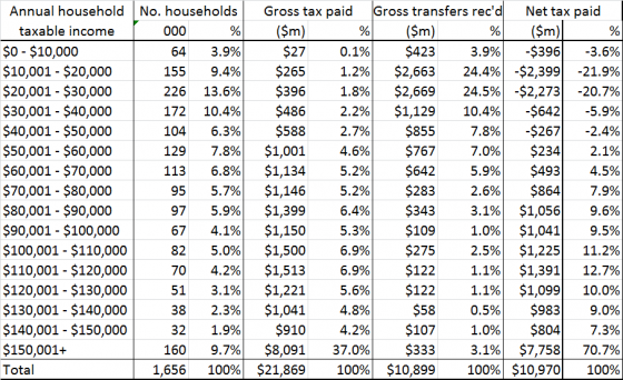
If you use this table from 2011, which David Farrar at Kiwiblog attributed to English’s office, it looks like many people in the $30k-$40k band will also pay tax net of transfers

nettaxpaid-560x342

If everyone in that band was at the midpoint, and they had no tax deductions (so that the $35k taxable income is all the non-transfer income they have), the total taxable income plus gross transfers for that band is about $7150 million, and 15% of 60% of that is $643 million, so they’d have to use 40% of their money in GST-exempt ways to pay no tax net of transfers.  Presumably the switch from positive to negative tax net of transfers is somewhere in this band. So, somewhere between 27% and 37% of New Zealand households pay less in tax than they receive in transfers.

Of course, cash benefits aren’t the only thing you get from the government, and more detailed modelling of where taxes are actually paid and the value of education and health benefits estimates that the lower 60% of households (adjusted for household size) get more in direct benefits and social services than they pay in direct and indirect taxes — but a lot of that is ‘getting what you pay for’, not redistribution.

Most importantly of all, there isn’t an obvious target value for the proportion of households who pay no tax net of transfers. There’s nothing obviously special about the claimed 50% or the actual 30ish%. The question is whether increasing taxes and transfers to reduce inequality would be good or bad overall, and this statistic really isn’t relevant.


Previously for this set of statistics

December 8, 2014

Political opinion: winning the right battles

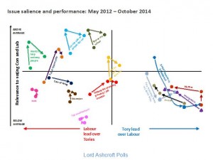
From Lord Ashcroft (UK, Conservative) via Alex Harroway (UK, decidedly not Conservative), an examination of trends in UK opinion on a bunch of issues, graphed by whether they favour Labour or the Conservatives, and how important they are to respondents. It’s an important combination of information, and a good way to display it (or it would be if it weren’t a low-quality JPEG)

Ashcroft-Chart


Ashcroft says

The higher up the issue, the more important it is; the further to the right, the bigger the Conservative lead on that issue. The Tories, then, need as many of these things as possible to be in the top right quadrant.

Two things are immediately apparent. One is that the golden quadrant is pretty sparsely populated. There is currently only one measure – being a party who will do what they say (in yellow, near the centre) – on which the Conservatives are ahead of Labour and which is of above average importance in people’s choice of party.

and Alex expands

When you campaign, you’re trying to do two things: convince, and mobilise. You need to win the argument, but you also need to make people think it was worth having the argument. The Tories are paying for the success of pouring abuse on Miliband with the people turned away by the undignified bully yelling. This goes, quite clearly, for the personalisation strategy in general.

November 5, 2014

US election graphics

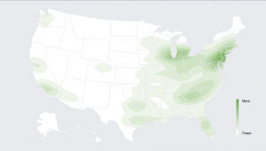
Facebook has a live map of who has mentioned on Facebook that they had voted (via Jason Sundram)

facebook-voted

USA Today showed a video including a Twitter live map

twitter-elections

These both have the usual problem with maps of how many people do something: there are more people in some places than others. As usual, XKCD puts it well:

xkcd-elections

Useful statistics is about comparisons, and this comparison basically shows that more people live in New York than in New Underwood.

As usual, the New York Times has informative graphics, including a live set of projections for the interesting seats.


November 3, 2014

It’s warmer out there

Following a discussion on Twitter this morning, I thought I’d write again about increasing global temperatures, and also about the types of probability statements.

The Berkeley Earth Surface Temperature project is the most straightforward source for conclusions about warming in the recent past. The project was founded by Richard Muller, a physicist who was concerned about the treatment of the raw temperature measurements in some climate projections. At one point, there was a valid concern that the increasing average temperatures could be some sort of statistical artefact based on city growth (‘urban heat island’) or on the different spatial distribution and accuracy of recent and older monitors. This turned out not to be the case. Temperatures are increasing, systematically.  The Berkeley Earth estimate agrees very well with the NASA, NOAA, and Hadley/CRU estimates for recent decades

best

The grey band around the curve is also important. This is the random error. There basically isn’t any.  To be precise, for recent years, the difference between current and average temperatures is 20 to 40 times the uncertainty — compare this to the 5σ used in particle physics.

What there is uncertainty about is the future (where prediction is hard), and the causal processes involved. That’s not to say it’s a complete free-for-all. The broad global trends fit very well to a simple model based on CO2 concentration plus the cooling effects of major volcanic eruptions, but the detail is hard to predict.

Berkeley Earth has a page comparing reconstructions of  temperatures with actual data for many climate models.  The models in the last major IPCC assessment report show a fairly wide band of prediction uncertainty — implying that future temperatures are more uncertain than current temperatures. The lines still all go up, but by varying amounts.

best-gcm


The same page has a detailed comparison of the regional accuracy of the models used in the new IPCC report. The overall trend is clear, but none of the models is uniformly accurate. That’s where the uncertainty comes from in the IPCC statements.

The earth has warmed, and as the oceans catch up there will be sea levels rises. That’s current data, without any forecasting.  There’s basically no uncertainty there.

It’s extremely likely that the warming will continue, and very likely that it is predominantly due to human-driven emissions of greenhouses gases.

We don’t know accurately how much warming there will be, or exactly how it will be distributed.  That’s not an argument against acting. The short-term and medium-term harm of climate changes increases faster than linearly with the temperature (4 degrees is much worse than 2 degrees, not twice as bad), which means the expected benefit of doing something to fix it is greater than if we had the same average prediction with zero uncertainty.

October 7, 2014

Enumerating hard-to-reach populations

I’ve written before about how it’s hard to get accurate estimates of the size of small subpopulations, even with large, well-designed surveys.

Via the Herald

Mr Key said that was an emerging issue for New Zealand. “If I was to spell out to New Zealanders the exact number of people looking to leave and be foreign fighters, it would be larger, I think, than New Zealanders would expect that number to be.”

If the government really knows the ‘exact number’, there must have been a lot more domestic surveillance than we’ve been told about.

New Zealanders probably don’t have any very well formed expectations for that number, since we have basically no information to go on. My guess would be along the lines of “Not very many, but people are strange,  so probably some.” I’d be surprised if it were less than 10 or more than 1000.


October 6, 2014

NZ voting cartograms

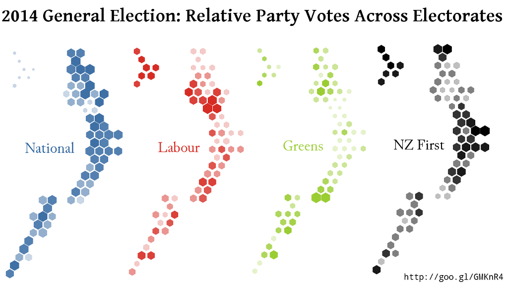
One of the problems with electoral maps is the ‘one cow, one vote’ effect: rural electorates are physically bigger, and so take up more of the map. When you combine that with the winner-take-all impact of simple colour schemes, it can look as though National won basically everything instead of just missing out on a majority.

Using a design by Chris McDowall that I linked earlier this year, David Friggens has mapped out the party votes across the country with equal area given to each electorate.  These maps show where the votes for each major party came from

big4


He also has maps for the minor parties, some of which have very localised support.

September 22, 2014

So, we had an election

Turnout of enrolled voters was up 3 percentage points over 2011, but enrollment was down, so as a fraction of the eligible population, turnout was only up half a percentage point.

From the Herald’s interactive, the remarkably boring trends through the count

There are a few electorates that are, arguably, still uncertain, but by 9pm the main real uncertainty at the nationwide level was whether Hone Harawira would win Te Tai Tokerau, and that wasn’t going to affect who was in government.  By 10pm it was pretty clear Harawira was out (though he hadn’t conceded) and that Internet Mana had been, in his opponent’s memorable phrase, “all steam and no hangi.”

Jonathan Marshall (@jmarshallnz) has posted swings in each electorate, for the party vote and electorate vote. He also has an interactive Sainte-Laguë seat allocation calculator and has published the data (complete apart from special votes) in a convenient form for y’all to play with.

David Heffernan (@kiwipollguy) collected a bunch of poll, poll average, and pundit predictions, and writes about them here. The basic summary is that they weren’t very good, though there weren’t any totally loony ones, as there were for the last US Presidential election. Our pundits seem to be moderately well calibrated to reality, but there’s a lot of uncertainty in the system and the improvement from averaging seems pretty small.  The only systematic bias is that the Greens did a bit worse than expected.

Based on his criterion, which is squared prediction error scaled basically by party vote, two single polls — 3 News/Reid at the high end and Herald Digipoll at the low end — spanned almost the entire range of prediction error.

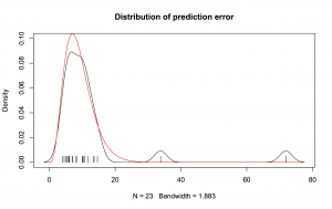
The variation between predictions isn’t actually much bigger than you’d expect by chance. The prediction errors have the mean you’d expect from a random sample of about 400 people, and apart from two outliers they have the right spread as well. On the graph, the red curve is a chi-squared distribution with 9 degrees of freedom, and the black curve is the distribution of the 23 estimates. The outliers are Wikipedia and the last 3 News/Reid Research poll.

elections-dist

About half the predictions were qualitatively wrong: they had National needing New Zealand First or the Conservatives for a majority. The Conservatives were clearly treated unfairly by the MMP threshold. If someone is going to be, I’m glad it’s them, but a party with more votes than the Māori Party, Internet Mana, ACT, United Future, and Legalise Cannabis put together should have a chance to prove their unsuitability in Parliament.


September 18, 2014

Interactive election results map

The Herald has an interactive election-results map, which will show results for each polling place as they come in, together with demographic information about each electorate.  At the moment it’s showing the 2011 election data, and the displays are still being refined — but the Herald has started promoting it, so I figure it’s safe for me to link as well.

Mashblock is also developing an election site. At the moment they have enrolment data by age. Half the people under 35 in Auckland Central seem to be unenrolled,which is a bit scary. Presumably some of them are students enrolled at home, and some haven’t been in NZ long enough to enrol, but still.

Some non-citizens probably don’t know that they are eligible — I almost missed out last time. So, if you know someone who is a permanent resident and has lived in New Zealand for a year, you might just ask if they know about the eligibility rules. Tomorrow is the last day.