Posts filed under Politics (193)

February 28, 2016

Forecasts and betting

The StatsChat rugby predictions are pretty good, but not different enough from general educated opinion that you could make serious money betting with them.

By contrast, there’s a professor of political science who has an election forecasting model with a 97+% chance that Trump will be president if he is the Republican nominee.

If you were in the UK or NZ, and you actually believed this predicted probability, you could go to PaddyPower.com and bet at 9/4 on Trump winning  and at 3/1 on Rubio being the nominee. If you bet $3x on Trump and hedge with $1x on Rubio, you’ll almost certainly get your money back if Trump isn’t the nominee, and the prediction says you’ll have a 97% chance of more than doubling your money if he is.

Since I’m not betting like that, you can deduce I think the 97% chance is wildly inflated.

February 11, 2016

Anti-smacking law

Family First has published an analysis that they say shows the anti-smacking law has been ineffective and harmful.  I think the arguments that it has worsened child abuse are completely unconvincing, but as far as I can tell there isn’t any good evidence that is has helped.  Part of the problem is that the main data we have are reports of (suspected) abuse, and changes in the proportion of cases reported are likely to be larger than changes in the underlying problem.

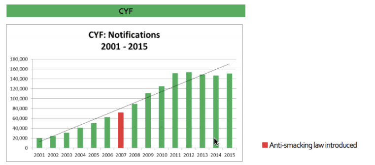
We can look at  two graphs from the full report. The first is notifications to Child, Youth and Family

ff-1

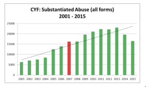
The second is ‘substantiated abuse’ based on these notifications

ff-2

For the first graph, the report says “There is no evidence that this can be attributed simply to increased reporting or public awareness.” For the second, it says “Is this welcome decrease because of an improving trend, or has CYF reached ‘saturation point’ i.e. they simply can’t cope with the increased level of notifications and the amount of work these notifications entail?”

Notifications have increased almost eight-fold since 2001. I find it hard to believe that this is completely real: that child abuse was rare before the turn of the century and became common in such a straight-line trend. Surely such a rapid breakdown in society would be affected to some extent by the unemployment  of the Global Financial Crisis? Surely it would leak across into better-measured types of violent crime? Is it no longer true that a lot of abusing parents were abused themselves?

Unfortunately, it works both ways. The report is quite right to say that we can’t trust the decrease in notifications;  without supporting evidence it’s not possible to disentangle real changes in child abuse from changes in reporting.

Child homicide rates are also mentioned in the report. These have remained constant, apart from the sort of year to year variation you’d expect from numbers so small. To some extent that argues against a huge societal increase in child abuse, but it also shows the law hasn’t had an impact on the most severe cases.

Family First should be commended on the inclusion of long-range trend data in the report. Graphs like the ones I’ve copied here are the right way to present these data honestly, to allow discussion. It’s a pity that the infographics on the report site don’t follow the same pattern, but infographics tend to be like that.

The law could easily have had quite a worthwhile effect on the number and severity of cases child abuse, or not. Conceivably, it could even have made things worse. We can’t tell from this sort of data.

Even if the law hasn’t “worked” in that sense, some of the supporters would see no reason to change their minds — in a form of argument that should be familiar to Family  First, they would say that some things are just wrong and the law should say so.  On the other hand, people who supported the law because they expected a big reduction in child abuse might want to think about how we could find out whether this reduction has occurred, and what to do if it hasn’t.

November 16, 2015

Measuring gender

So, since we’re having a Transgender Week of Awareness at the moment, it seems like a good time to look at how statisticians ask people about gender, and why it’s harder than it looks.

By ‘harder than it looks’ I don’t just mean that it isn’t a binary question; we’re past that stage, I hope.  Also, this isn’t about biological sex — in genetics I do sometimes care how many X chromosomes someone has, but most questionnaires don’t need to know. It’s harder than it looks because there isn’t just one question.

The basic Male/Female binary question can be extended in (at least) two directions.  The first is to add categories to represent other ways people identify their gender beyond just male/female, which can be fluid over time, or can have more than two categories. Here a write-in option is useful since you almost certainly don’t know all the distinctions people care about across different cultures. In a specialised questionnaire you might even want to separate out questions about fluid/constant identity from non-binary/diversity, but for routine use that might be more than you need.

A second direction is to ask about transgender status, which is relevant for discrimination and (or thus) for some physical and mental health risks.  (Here you might want also want to find out about people who, say, identify as female but present as male.) We have very little idea how many people are transgender — it makes data on sexual orientation look really precise — and that’s a problem for service provision and in many other areas.

Life would get simpler for survey collectors if you combined these into a single question, or if you had a Male/Female/It’s Complicated question with follow-up questions for the third group. On the other hand, it’s pretty clear why trans people don’t like that approach. These really are different questions. For people whose answer to the first question is something like “it depends” or a culturally specific third option, the combination may not be too bad. The problem comes when answer to the second type of question might be “Trans (and yes I sometimes get comments behind my back at work but most people are fine)”, but the answer to the first “Female (and just as female as people with ovaries and a birth certificate, ok)”.

Earlier this year Stats New Zealand ran a discussion and  had a go at a better gender question, and it is definitely better than the old one, especially when it allows for multiple answers and for a write-in answer. They also have a ‘synonym list’ to help people work with free-text answers, although that’s going to be limited if all it does is map back to binary or three-way groups. What they didn’t do was to ask for different types of information separately. [edit: ie, they won’t let you unambiguously say ‘female’ in an identity question then ‘trans’ in a different question]

It’s true that for a lot of purposes you don’t need all this information. But then, for a lot of purposes you don’t actually need to know anything about gender.

(via Writehanded and Jennifer Katherine Shields)

November 13, 2015

Flag text analysis

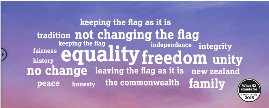
The group in charge of the flag candidate selection put out a summary of public responses in the form of a word cloud. Today in Insights at the Herald there’s a more accurate word cloud using phrases as well as single words and not throwing out all the negative responses

wordcloud

There’s also some more sophisticated text analysis of the responses, showing what phrases and groups of ideas were common, and an accompanying story by Matt Nippert

Suzanne Stephenson, head of communications for the flag panel, rejected any suggestion of spin and said the wordcloud was never claimed as “statistically significant”.

“I think people misunderstood it as a polling exercise.”

“Statistically significant” is irrelevant misuse of technical jargon. The only use for a word cloud is to show which words are more common. If that wasn’t what the panel wanted to do, they shouldn’t have done it.


November 9, 2015

To each according to his needs

There’s a fairly overblown story in the Guardian about religion and altruism

“Overall, our findings … contradict the commonsense and popular assumption that children from religious households are more altruistic and kind towards others,” said the authors of The Negative Association Between Religiousness and Children’s Altruism Across the World, published this week in Current Biology.

“More generally, they call into question whether religion is vital for moral development, supporting the idea that secularisation of moral discourse will not reduce human kindness – in fact, it will do just the opposite.”

The research found that kindergarten (update: and primary school) children from religious families scored lower on an altruism test (a version of the Dictator game).  Given ten stickers, non-religious children would give about one more away on average than religious children.


While it’s obviously true that this sort of simple moral behaviour doesn’t require religion, the cause-and-effect conclusion the story is trying to draw is stronger than the data. I’m pretty confident the people quoted approvingly wouldn’t have been as convinced by the same sort of research if it had found the opposite result.

The research does provide convincing evidence on another point, though: three-dimensional graphics are a Bad Idea.

religion


October 26, 2015

Wealth inequality: not so simple

There’s a new edition of the Credit Suisse report on global wealth. It thinks New Zealand is the second richest nation in the world, and that the USA has 10% of the world’s poorest people.

Here’s a picture of some of those world’s poorest people.

Keck-graduation-2015_0092

These are graduates from the Keck School of Medicine, at the University of Southern California, who owe an average of over US$200,000 in student loans.  By the Credit Suisse definition of wealth inequality they have less wealth than people living in poorly-maintained state housing in south Auckland. They have less wealth than immigrant agricultural workers in southern California. They have less wealth than subsistence farmers in Chad.

The computations are correct in a sense, but useless for two reasons. The first is that they don’t count the value of any non-salable assets (like a degree in medicine from USC, or permanent residency in the US).  The second is more subtle.  Wealth inequality is a concern over and above income inequality mostly because it’s bad for governance: small groups of people get too much power.  Assets minus debts isn’t a good indication of this power, because the cost and effectiveness of lobbying, influence, and bribery varies so much from country to country.


October 19, 2015

Flag referendum stats

UMR have done a survey of preferences on the new flag candidates that can be used to predict the preferential-voting result.  According to their data, while Red Peak has improved a long way from basically no support in August, it has only improved enough to be a clear third to the two Lockwood ferns, which are basically tied for the lead both on first preferences and on full STV count.  On the other hand, none of the new candidates is currently anywhere near beating the current version.

The error in a poll like this is probably larger than in an election poll, because there’s no relevant past data to work with. Also, for the second round of the referendum, it’s possible that cutting the proposals down to a single alternative will affect opinion. And, who knows, maybe Red Peak will keep gaining popularity.

September 28, 2015

Seeing the margin of error

A detail from Andrew Chen’s visualisation of all the election polls in NZ:

polls

His full graph is somewhat interactive: you can zoom in on times, select parties, etc. What I like about this format is how clear it makes the poll-to-poll variability.  The poll result for, say, National isn’t a line, it’s a cloud of uncertainty.

The cloud of uncertainty gets narrower for minor parties (as detailed in my cheatsheet), but for the major parties you can see it span an entire 10-percentage-point grid cell or more.

September 10, 2015

Do preferential voting and similar flags interact badly?

(because I was asked about Keri Henare’s post)

Short answer: No.

As you know, we have four candidate flags. Two of them, the Lockwood ferns, have the same design with some colour differences. Is this a problem, and is it particularly a problem with Single Transferable Vote (STV) voting?

In the referendum, we will be asked to rank the four flags. The first preferences will be counted. If one flag has a majority, it will win. If not, the flag with fewest first preferences will be eliminated, and its votes allocated to their second-choice flags. And so on. Graeme Edgeler’s Q&A on the method covers the most common confusions. In particular, STV has the nice property that (unless you have really detailed information about everyone else’s voting plans) your best strategy is to rank the flags according to your true preferences.

That’s not today’s issue. Today’s issue is about the interaction between STV and having two very similar candidates.  For simplicity, let’s consider the extreme case where everyone ranks the two Lockwood ferns together (whether 1 and 2, 2 and 3, or 3 and 4). Also for simplicity, I’ll assume there is a clear preference ranking — that is, given any set of flags there is one that would be preferred over each of the others in two-way votes.  That’s to avoid various interesting pathologies of voting systems that aren’t relevant to the discussion. Finally, if we’re asking if the current situation is bad, we need to remember that the question is always “Compared to what?”

One comparison is to using just one of the Lockwood flags. If we assume either that there’s one of them that’s clearly more popular, or that no-one really cares about the difference, then this gives the same result as using both the Lockwood flags.

Given that the legislation calls for four flags this isn’t really a viable alternative. Instead, we could replace one of the Lockwood flags with, say, Red Peak.  Red Peak would then win if a majority preferred it over the remaining Lockwood flag and over each of the other two candidates.  That’s the same result that we’d get adding a fifth flag, except that adding a fifth flag takes a law change and so isn’t feasible.

Or, we could ask how the current situation compares to another voting system. With first-past-the-post, having two very similar candidates is a really terrible idea — they tend to split the vote. With approval voting (tick yes/no for each flag) it’s like STV; there isn’t much impact of adding or subtracting a very similar candidate.

If it were really  true that everyone was pretty much indifferent between the Lockwood flags or that one of them was obviously more popular, it would have been better to just take one of them and have a different fourth flag. That’s not an STV bug; that’s an STV feature; it’s relatively robust to vote-splitting.

It isn’t literally true that people don’t distinguish between the Lockwood flags. Some people definitely want to have black on the flag and others definitely don’t.  Whether it would be better to have one Lockwood flag and Red Peak depends on whether there are more Red Peak supporters than people who feel strongly about the difference between the two ferns.  We’d need data.

What this argument does suggest is that if one of the flags were to be replaced on the ballot, trying to guess which one was least popular need not be the right strategy.
September 9, 2015

Assessing popular opinion

One of the important roles played by good-quality opinion polls before an election is getting people’s expectations right.  It’s easy to believe that the opinions you hear everyday are representative, but for a lot of people they won’t be.  For example, here are the percentages for the National Party for each polling place in Auckland Central in the 2014 election. The curves show the margin of error around the overall vote for the electorate, which in this case wasn’t far from the overall for the whole country.

kael

For lots of people in Auckland Central, their neighbours vote differently than the electorate as a whole.  You could do this for the whole country, especially if the data were in a more convenient form, and it would be more dramatic.

Pauline Kael, the famous New York movie critic, mentioned this issue in a talk to the Modern Languages Association

“I live in a rather special world. I only know one person who voted for Nixon. Where they are I don’t know. They’re outside my ken. But sometimes when I’m in a theater I can feel them.”

She’s usually misquoted in a way that reverses her meaning, but still illustrates the point.

It’s hard to get hold of popular opinion just from what you happen to come across in ordinary life, but there are some useful strategies. For example, on the flag question

  • How many people do you personally know in real life who had expressed a  preference for one of the Lockwood fern flags and now prefer Red Peak?
  • How many people do you follow on Twitter (or friend on Facebook, or whatever on WhatsApp) who had expressed a  preference for one of the Lockwood fern flags and now prefer Red Peak?

For me, the answer to both of these is “No-one”: the Red Peak enthusiasts that I know aren’t Lockwood converts. I know of some people who have changed their preferences that way — I heard because of my last StatsChat post — but I have no idea what the relevant denominator is.

The petition is currently just under 34,000 votes, having slowed down in the past day or so. I don’t see how Red Peak could have close to a million supporters.  More importantly, anyone who knows that it does must have important evidence they aren’t sharing. If the groundswell is genuinely this strong, it should be possible to come up with a few thousand dollars to get at least a cheap panel survey and demonstrate the level of support.

I don’t want to go too far in being negative. Enthusiasm for this option definitely goes beyond disaffected left-wing twitterati — it’s not just Red pique — but changing the final four at this point really should require some reason to believe the new flag could win. I don’t see it.

Opinion is still evolving, and maybe this time we’ll keep the Australia-lite flag and the country will support something I like next time.