Posts filed under Politics (193)

September 4, 2017

Before and after

We’re in the interesting situation this election where it looks like political preferences are actually changing quite rapidly (though some of this could be changes in non-response that don’t show up in actual voting).

On Thursday, One News released a poll by Colmar Brunton that found Labour ahead of National by 43% to 41% for the first time in years.  Yesterday, NewsHub released a Reid Research poll with Labour back behind National 39% to 43%.

“Released” is important here. The Colmar Brunton poll was taken over August 26-30. The Reid Research poll was taken over August 22-30. That is, despite being released  later, the Reid Research poll was (on average) taken earlier. Comments (and even analysis) of polls often ignore the interview time and focus on the release date, but here we can see why the code of conduct for pollers requires the interview period to be described.

A difference of 4 percentage points in Labour’s support is quite large for two polls of this size (though not out of the question just from sampling error). If the polls were really discrete events four days apart, it would be plausible to argue they showed Labour’s support had stopped increasing — that the Ardern effect had reached its limit. If the two polls were taken over exactly the same period, the most plausible conclusion would be that the true support was in between and that we knew nothing more about Labour’s trajectory. With the Sunday poll actually taken slightly earlier, the difference is still likely to mostly be noise, but to the (very limited) extent that it says anything about trajectory, the story is positive for Labour.

August 26, 2017

Successive approximations to understanding MMP

The MMP voting system and its implications are relatively complicated. I’m going to try to give simple approximations and then corrections to them. If you want more definitive details, here’s the Electoral Commission and the Electoral Act.

Two votes: You have an electorate vote, which only affects who your local MP is, and doesn’t affect the composition of Parliament. You also have a party vote that affects the composition of Parliament, but not who your local MP is. The number of seats a party gets in Parliament is proportional to the number of party votes it gets.

This isn’t true, but it’s actually a pretty good working approximation for most of us.

There are two obvious flaws. First, if your local MP belongs to a party that doesn’t get enough votes to have any seats in Parliament, they still get to be an MP. Peter Dunne in Ōhariu was an example of this in the 2014 election. Second, when working out the number of seats a party is entitled to in Parliament, parties with less than 5% of the vote are excluded unless they won some electorate.  In the 2014 election, the Conservative Party got 3.97% of the vote, but no seats.

The Māori Party was an example of both exceptions: they did get enough votes in proportional terms for two seats, but not enough to make the 5% cutoff, but they didn’t have to because Te Ururoa Flavell won the Waiāriki electorate seat for them.

Proportionality: There are 120 seats, so a party needs 1/120th, or about 0.83%, of the vote for each one.

That’s not quite true because of the 5% threshold, both because some parties miss out and because the relevant percentages are of the votes remaining after parties have been excluded by the threshold.

It’s also not true because of rounding.  We elect whole MPs, not fractional ones, so we need a rounding rule. Roughly speaking, half -seats round up. More accurately, suppose there is some number N of votes available per seat (which will be worked out later). If you have at least 0.5×N votes you get one seat, 1.5×N gets you two seats, 13.5×N gets you fourteen seats.  So what’s N? It’s roughly 1/121th (0.83%) of the votes; it’s exactly whatever number you need to allocate exactly as many seats as you have available. (The Electoral Commission actually uses a procedure that’s identical in effect to this one and easier to compute, but (I think) harder to explain).

In 2014, the Māori Party got 1.32% of the vote, which is a bit more than 1.5×0.83%, and were entitled to two seats. ACT got less than 0.83% but more than 0.5×0.83% and were entitled to one seat.

Finally, if a party gets more seats from electorate candidates than it is due by proportionality those seats are extra, above the 120-seat ideal size of Parliament — except that seats won by a party or individual not contesting the party vote do come out of the 120-seat total.  So, in 2014, ACT got enough party votes to be due one of the 120 seats, but United Future didn’t. United Future did contest the party vote so Peter Dunne’s seat did not come out of the 120-seat total — he was an ‘overhang’ 121st MP. I’m guessing the reason overhangs by parties contesting the party vote are extra is that you don’t know how many there will be until you’ve done the calculation, so you’d have to go back to the start and recalculate if you counted them in the 120 (which might change the number of over-allocated seats and force another recalculation and so on).

Māori Roll: People of Māori descent can choose, every five years, to be on a Māori electoral roll rather than the general roll. If enough of them do, Māori electorates are created with the same number of people as the general electorates. There are currently seven Māori electorates, representing just over half of the people of Māori descent.  As with any electorate, you don’t have to be enrolled there to stand there; anyone eligible to be an MP can stand. 

The main way this is oversimplified is because of the people of Māori descent who aren’t on either roll, because they’re too young or just not enrolled yet. You can’t tell whether they would be on the general roll or the Māori roll, so there are procedures for StatsNZ to split the non-enrolled Māori-descent population up to calculate electorate populations.
August 22, 2017

Deciding how to vote

There’s a bunch of web pages/apps out there that supposedly help you to decide who to vote for.

On the Fence: This one asks you to move a slider to ‘balance’ competing principles, then works out which party you agree with.

There are some obvious problems. First, the scale isn’t clearly calibrated.  If you’re at 50:50 on government vs private-sector roles in providing affordable housing, does that mean you think 50% of it should be state houses, or that it should all be state-owned but built by private sector construction companies, or something vague and woolly?

Second, as lots of people have pointed out, there’s some false dichotomies there, like the privacy:security tradeoff.

Perhaps more important, when there is a genuine tradeoff, it’s a genuine tradeoff. You typically can’t decide it by abstract principle without reference to the facts.

Vote Compass:  This one takes advantage of the empirical observation that people’s voting preferences compress fairly well into two dimensions.  The questions are much more clearly calibrated: eg, the affordable-housing one is “The government should build affordable housing for Kiwis to buy” with a ‘Strongly agree” to “Strongly disagree” scale.

Most usefully, there’s a tool for you to explore how your position differs from that of the parties on each of the questions, and to reweight the results depending on which issues you care about.  Annoyingly, there’s a category “Moral Issues” that includes marijuana legalisation but not the questions about refugees or climate-change or affordable housing

Policy: The Spinoff has a tool that seems philosophically different from the others. It has much more emphasis on comparing actual party policies and less on trying to find out what your ideal party would be. As a result, it’s less useful if you want to be told what you think, but might be more useful if you want to look at specific policies. Whether you do, I suppose, depends on how much you believe the policies — especially from the minor parties, where you’d need to know how the policies rank in their actual negotiating position for coalition or confidence & supply.

July 30, 2017

What are election polls trying to estimate? And is Stuff different?

Stuff has a new election ‘poll of polls’.

The Stuff poll of polls is an average of the most recent of each of the public political polls in New Zealand. Currently, there are only three: Roy Morgan, Colmar Brunton and Reid Research. 

When these companies release a new poll it replaces their previous one in the average.

The Stuff poll of polls differs from others by giving weight to each poll based on how recent it is.

All polls less than 36 days old get equal weight. Any poll 36-70 days old carries a weight of 0.67, 70-105 days old a weight 0.33 and polls greater than 105 days old carry no weight in the average.

In thinking about whether this is a good idea, we’d need to first think about what the poll is trying to estimate and about the reasons it doesn’t get that target quantity exactly right.

Officially, polls are trying to estimate what would happen “if an election were held tomorrow”, and there’s no interest in prediction for dates further forward in time than that. If that were strictly true, no-one would care about polls, since the results would refer only to the past two weeks when the surveys were done.

A poll taken over a two-week period is potentially relevant because there’s an underlying truth that, most of the time, changes more slowly than this.  It will occasionally change faster — eg, Donald Trump’s support in the US polls seems to have increased after James Comey’s claims about Clinton’s emails in the US, and Labour’s support in the UK polls increased after the election was called — but it will mostly change slower. In my view, that’s the thing people are trying to estimate, and they’re trying to estimate it because it has some medium-term predictive value.

In addition to changes in the underlying truth, there is the idealised sampling variability that pollsters quote as the ‘margin of error’. There’s also larger sampling variability that comes because polling isn’t mathematically perfect. And there are ‘house effects’, where polls from different companies have consistent differences in the medium to long term, and none of them perfectly match voting intentions as expressed at actual elections.

Most of the time, in New Zealand — when we’re not about to have an election — the only recent poll is a Roy Morgan poll, because  Roy Morgan polls more much often than anyone else.  That means the Stuff poll of polls will be dominated by the most recent Roy Morgan poll.  This would be a good idea if you thought that changes in underlying voting intention were large compared to sampling variability and house effects. If you thought sampling variability was larger, you’d want multiple polls from a single company (perhaps downweighted by time).  If you thought house effects were non-negligible, you wouldn’t want to downweight other companies’ older polls as aggressively.

Near an election, there are lots more polls, so the most recent poll from each company is likely to be recent enough to get reasonably high weight. The Stuff poll is then distinctive in that it complete drops all but the most recent poll from each company.

Recency weighting, however, isn’t at all unique to the Stuff poll of polls. For example, the pundit.co.nz poll of polls downweights older polls, but doesn’t drop the weight to zero once another poll comes out. Peter Ellis’s two summaries both downweight older polls in a more complicated and less arbitrary way; the same was true of Peter Green’s poll aggregation when he was doing it.  Curia’s average downweights even more aggressively than Stuff’s, but does not otherwise discard older polls by the same company. RadioNZ averages the only the four most recent available results (regardless of company) — they don’t do any other weighting for recency, but that’s plenty.

However, another thing recent elections have shown us is that uncertainty estimates are important: that’s what Nate Silver and almost no-one else got right in the US. The big limitation of simple, transparent poll of poll aggregators is that they say nothing useful about uncertainty.

May 14, 2017

There’s nothing like a good joke

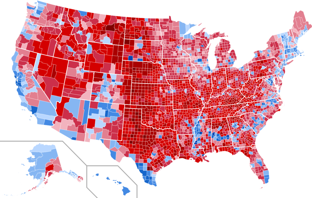
You’ve probably seen the 2016 US election results plotted by county, as in this via Brilliant Maps
county

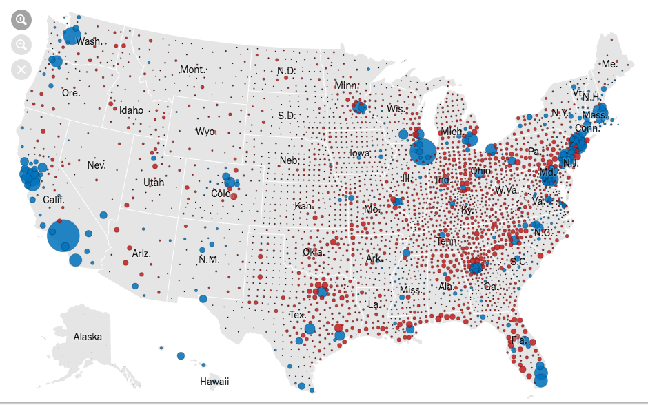
It’s not ideal, because large, relatively empty counties take up a lot of space but represent relatively few people.  It’s still informative: you can see, for example, that urban voters tended to support Clinton even in Texas.  There are also interesting blue patches in rural areas that you might need an atlas to understand.

For most purposes, it’s better to try to show the votes, such as this from the New York Times, where the circle area is proportional to the lead in votes
nyt

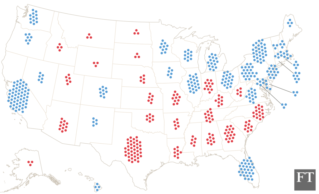
You might want something that shows the Electoral College votes, since those are what actually determines the results, like this by Tom Pearson for the Financial Times
ec-dot

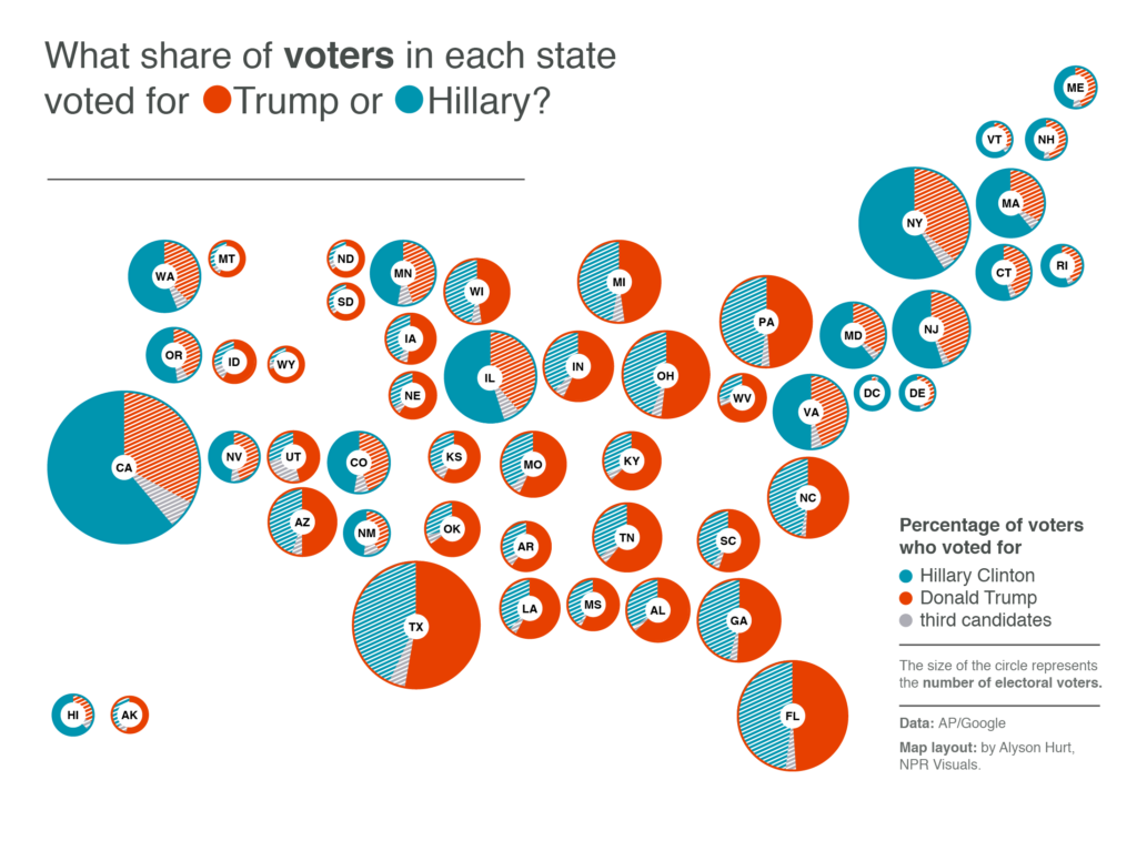
Or, you might like pie charts, such as this one from Lisa Charlotte Rost

rost-pie

These all try to improve on the simple county map by showing votes — people — rather than land. The NYT one is more complex than the straightforward map; the other two are simpler but still informative.


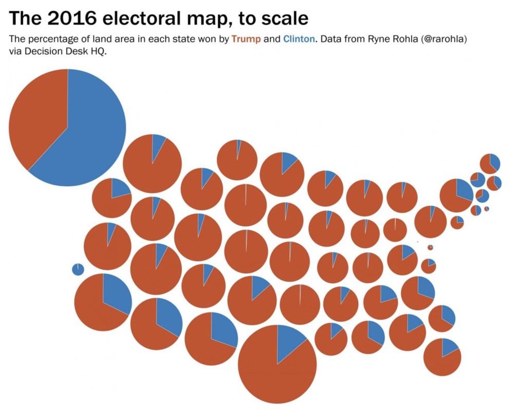
Or, you could simplify the county map in another way. You could remove all the spatial information from within states — collecting the ‘blue’ land into one wedge and the ‘red’ land into another — and not add anything. You might do this as a joke, to comment on the President’s use of the simple county map
pie

The problem with the Internet, though, is that people might take it seriously.  It’s not completely clear whether Chris Cillizza was just trolling, but a lot of people sure seem to take his reposting of it seriously.

May 4, 2017

Summarising a trend

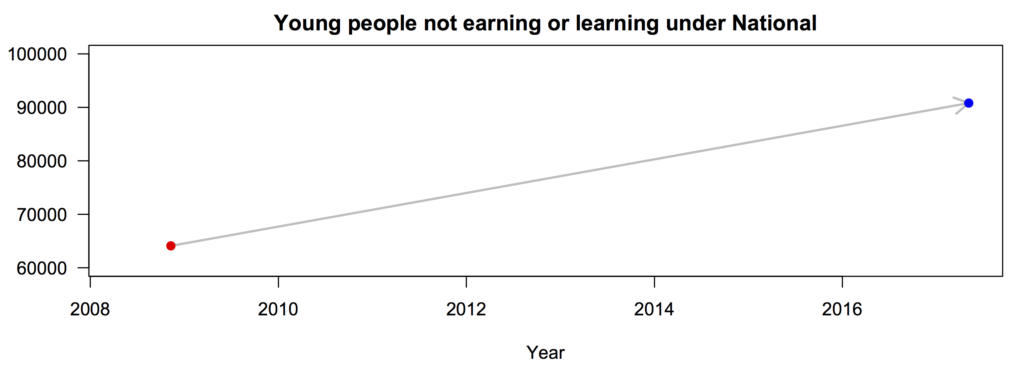
Keith Ng drew my attention on Twitter to an ad from Labour saying “Under National, the number of young people not earning or learning has increased by 41%”.

When you see this sort of claim, you should usually expect two things: first, that the claim will be true in the sense that there will be two numbers that differ by 41%; second, that it will not be the most informative summary of the data in question.

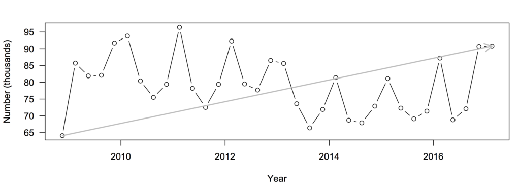
If you look on Infoshare, in the Household Labour Force Survey, you can find data on NEET (not in education, employment, or training).  The number was 64100 in the fourth quarter of 2008, when Labour lost the election.  It’s now (Q1, 2017) 90800, which is, indeed, 41% higher.  Let’s represent the ad by a graph:

neet1


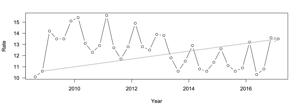
We can fill in the data points in between:
neet2
Now, the straight line doesn’t look as convincing.

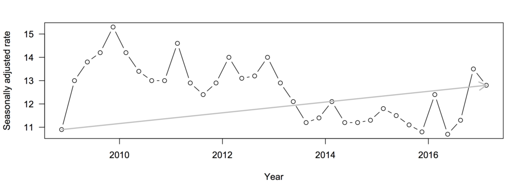
Also, why are we looking at the number, when population has changed over this time period. We really should care about the rate (percentage)
neet3
Measuring in terms of rates the increase is smaller — 27%.  More importantly, though, the rate was even higher at the end of the first quarter of National’s administration than it is now.

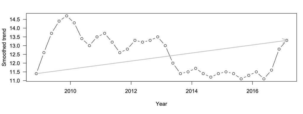
The next thing to notice is the spikes every four quarters or so: NEET is higher in the summer and lower in the winter because of the school  year.  You might wonder if StatsNZ had produced a seasonally adjusted version, and whether it was also conveniently on Infoshare…
need4
The increase is now 17%

But for long-term comparisons of policy, you’d probably want a smoothed version that incorporates more than one quarter of data. It turns out that StatsNZ have done this, too, and it’s on Infoshare.
neet5
The increase is, again 17%. Taking out the seasonal variation, short-term variation, and sampling noise makes the underlying pattern clearer.  NEET increased dramatically in 2009, decreased, and has recently spiked. The early spike may well have been the recession, which can’t reasonably be blamed on any NZ party.  The recent increase is worrying, but thinking of it as trend over 9 years isn’t all that helpful.

May 3, 2017

A century of immigration

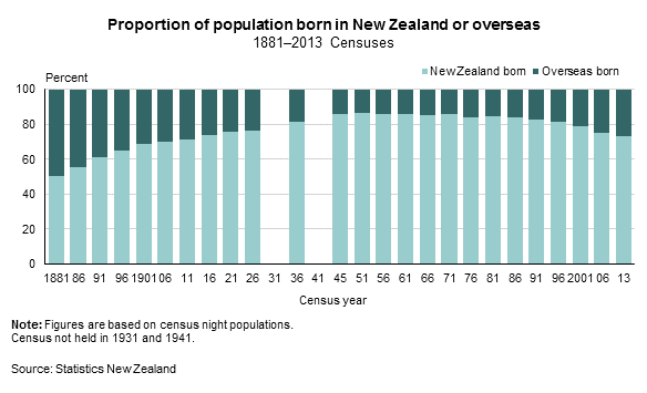
Given the discussions of immigration in the past weeks, I decided to look for some historical data.  Stats NZ has a report “A Century of Censuses”, with a page on ‘proportion of population born overseas.” Here’s the graph

nz-oseas-born

The proportion of immigrants has never been very low, but it fell from about 1 in 2 in the late 19th century to about 1 in 6 in the middle of the 2oth century, and has risen to about 1 in 4 now. The increase has been going on for the entire lifetime of any NZ member of Parliament; the oldest was born roughly at Peak Kiwi in the mid-1940s.

Seeing that immigrants have been a large minority of New Zealand for over a century doesn’t necessarily imply anything about modern immigration policy — Hume’s Guillotine, “no ought deducible from is,” cuts that off.  But I still think some people would find it surprising.


April 26, 2017

Simplifying to make a picture

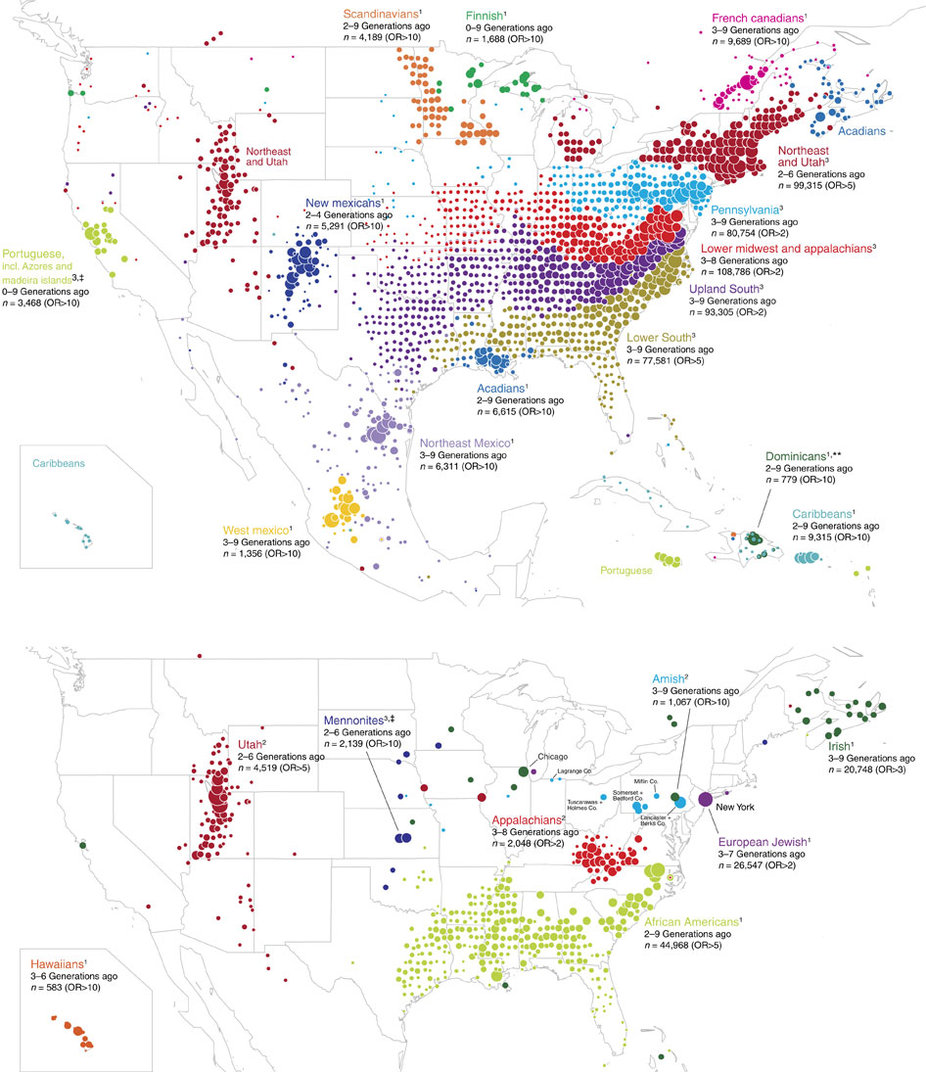
1. Ancestry.com has maps of the ancestry structure of North America, based on people who sent DNA samples in for their genotype service (click to embiggen)ncomms14238-f3

To make these maps, they looked for pairs of people whose DNA showed they were distant relatives, then simplified the resulting network into relatively stable clusters. They then drew the clusters on a map and coloured them according to what part of the world those people’s distant ancestors probably came from.  In theory, this should give something like a map of immigration into the US (and to a lesser extent, of remaining Native populations).  The map is a massive oversimplification, but that’s more or less the point: it simplifies the data to highlight particular patterns (and, necessarily, to hide others).  There’s a research paper, too.


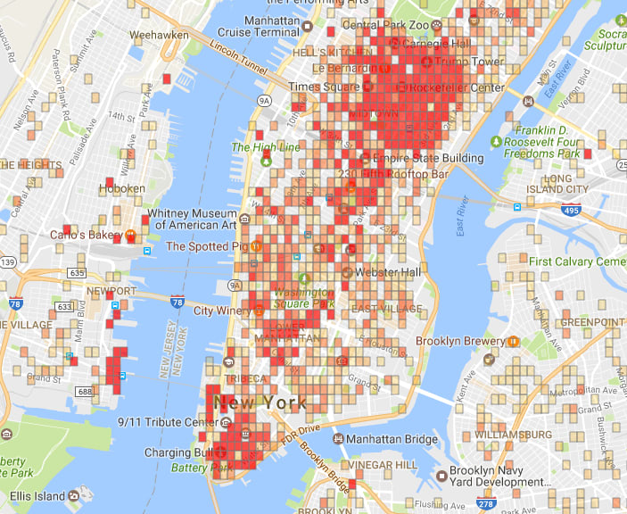
2. In a satire on predictive policing, The New Inquiry has an app showing high-risk neighbourhoods for financial crime. There’s also a story at Buzzfeed.

sub-buzz-24605-1493145131-7

The app uses data from the US Financial Regulatory Authority (FINRA), and models the risk of financial crime using the usual sort of neighbourhood characteristics (eg number of liquor licenses, number of investment advisers).


3. The Sydney Morning Herald had a social/political quiz “What Kind of Aussie Are You?”.

1486745652102

They also have a discussion of how they designed the 7 groups.  Again, the groups aren’t entirely real, but are a set of stories told about complicated, multi-dimensional data.


The challenge in any display of this type is to remove enough information that the stories are visible, but not so much that they aren’t true– and not everyone will agree on whether you’ve succeeded.

April 25, 2017

Electioneering and statistics

In New Zealand, the Government Statistician reports to the Minister of Statistics, currently Mark Mitchell.  For about a decade, the UK has had a different system, where the National Statistician reports to the UK Statistics Authority, which is responsible directly to Parliament. The system is intended to make official statistics more clearly independent of the government of the day.

An additional role of the UK Statistics Authority is as a sort of statistics ombudsman when official statistics are misused.  There’s a new letter from the Chair to the UK political parties

The UK Statistics Authority has the statutory objective to promote and safeguard the production and publication of official statistics that serve the public good.

My predecessors Sir Michael Scholar and Sir Andrew Dilnot have in the past been obliged to write publicly about the misuse of official statistics in other pre-election periods and during the EU referendum campaign. Misuse at any time damages the integrity of statistics, causes confusion and undermines trust.

I write now to ask for your support and leadership to ensure that official statistics are used throughout this General Election period and beyond, in the public interest and in accordance with the principles of the Code of Practice for Official Statistics. In particular, the statistical sources should be clear and accessible to all; any caveats or limitations in the statistics should be respected; and campaigns should not pick out single numbers that differ from the picture painted by the statistics as a whole.

I am sending identical letters to the leaders of the main political parties, with a copy to Sir Jeremy Heywood, Cabinet Secretary.

We don’t have anyone whose job it is to write that sort of letter here, but it would be nice if the political parties (and their partisans) still followed this advice.

March 9, 2017

Causation, correlation, and gaps

It’s often hard to establish whether a correlation between two variables is cause and effect, or whether it’s due to other factors.  One technique that’s helpful for structuring one’s thinking about the problem is a causal graph: bubbles for variables, and arrows for effects.

I’ve written about the correlation between chocolate consumption and number of Nobel prizes for countries.  The ‘chocolate leads to Nobel Prizes’ hypothesis would be drawn like this:

chocolate

One of several more-reasonable alternatives is that variations in wealth explain the correlation, which looks like

chocolate1

As another example, there’s a negative correlation between the number of pirates operating in the world’s oceans and atmospheric CO2 concentration.  It could be that pirates directly reduce atmospheric CO2 concentration:

pirates

but it’s perhaps more likely that both technology and wealth have changed over time, leading to greater CO2 emissions and also to nations with the ability and motivation to suppress piracy:

pirates1

The pictures are oversimplified, but they still show enough of the key relationships to help with reasoning.  In particular, in these alternative explanations, there are arrows pointing into both the putative cause and the effect. There are arrows from the same origin into both ‘chocolate’ and ‘Nobel Prizes’; there are arrows from the same origins into both ‘pirates’ and ‘CO2‘.  Confounding — the confusion of relationships that leads to causes not matching correlations — requires arrows into both variables (or selection based on arrows out of both variables).

So, when we see a causal hypothesis like this one:

paygap

and ask if there’s “really” a gender pay gap, the answer “No” requires finding a variable with arrows into both gender and pay.  Which in your case you have not got. The pay gap really is caused by gender.

There are still interesting and important questions to be asked about mechanisms. For example, consider this graph

paygap1

We’d like to know how much of the pay gap is direct underpayment, how much goes through the mechanism of women doing more childcare, and how much goes through the mechanism of occupations with more women being  paid less.  Information about mechanisms helps us think about how to reduce the gap, and what the other costs of reducing it might be.  The studies I’ve seen suggest that all three of these mechanisms do contribute, so even if you think only the direct effects matter there’s still a problem.

You can also think of all sorts of things and stuff I’ve left out of that graph, and you could put some of them back in

paygap2

But you’re still going to end up with a graph where there are only arrows out of gender.  Women earn less, on average, and this is causation, not mere correlation.