Posts filed under Politics (194)

August 4, 2012

Pie charts: threat or menace?

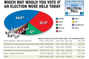
Stuff has a story based on a real and useful poll, but summarised with a dreadful graph.  You will have heard statisticians ranting about pie charts and may have wondered whether their medications need to be adjusted.  Here’s why we rant.

Notice that the pie isn’t round; it’s an ellipse.  Presumably we’re supposed to imagine it being tilted away at some angle (in contrast to the table, the headline, and the legend, which are aligned with the page.   Also notice that the wedges have numbers on them — that’s often a sign that the graph can’t be interpreted by itself.  The red wedge looks a lot smaller than the blue wedge.

(more…)

July 20, 2012

Measurement error and rare events

Surveys are not perfect: some people misunderstand the question, some people recall incorrectly, some responses are written down incorrectly by the poller, and some people just lie.   These biases happen in both directions, but their impact is not symmetrical.

Suppose you had a survey that asked “Have you ever been abducted by aliens?”  We can be sure that false ‘Yes’ results will be more common than false ‘No’ results, so the survey will necessarily overestimate the true proportion. If you wrote down the wrong answer for 1% of people, you’d end up with an estimate that was 1% too high.

In principle, the same issue  could be a serious problem in estimating the support for minor parties: about 1% of people voted for ACT at the last election, and 99% didn’t.  Suppose you poll 10000 people and ask them if they voted for ACT, and suppose that 100 of them really were ACT voters. If your opinion poll gets the wrong answer, randomly, for 1% of people, you will get the wrong answer from 1 of the true ACT voters, and 99 of the true non-ACT voters, so you will report 100+99-1=198 ACT voters and 9900+1-99 = 9802 non-ACT voters.  You would overestimate the votes for ACT by a factor of two!  Keith Humphreys, who we have linked to before, postulates that this is why US polls indicating support for a third-party candidate tend to seriously overestimate their support.

I’m skeptical.  Here in NZ, where we really have minor parties, there is no systematic tendency to overestimate the support they receive.  ACT got 1% of the vote, and that was close to what the polls predicted. Similarly, the Maori Party, and the Greens received about the same number of votes in the last election as averages of the polls had predicted.  For NZ First, the election vote was actually higher than in the opinion polls.  Similarly, for the Dutch general election in 2010 there was pretty good agreement between the last polls and the election results.  Even in Australia, where there is effectively a two-party system in the lower house (but with preferential voting), the opinion poll figures for the Greens agreed pretty well with the actual vote

It’s true that measurement error tends to bias towards 50%, and this matters in some surveys, but I would have guessed the US phantom third party support is the result of bias, not error. That is, I suspect people tend to overstate their support for third-party candidates in advance of the election, and that in the actual election they vote strategically for whichever of the major parties they dislike least.   My hypothesis would imply not much bias in countries where minor-party votes matter, and more bias in countries with first-past-the-post voting.  Unfortunately there’s also a pure measurement error hypothesis that’s consistent with the data, which is that people are just more careful about measuring minor-party votes in countries where they matter.

July 16, 2012

When a dog bites a man, that’s not news

A question on my recent post about political opinion polls asks

– at what point does the trend become relevant?

– and how do you calculate the margin of error between two polls?

Those are good questions, and the reply was getting long enough that I decided to promote it to a post of its own. The issue is that proportions will fluctuate up and down slightly from poll to poll even if nothing is changing, and we want to distinguish this from real changes in voter attitudes — otherwise there will be a different finding every month and it will look as if public opinion is bouncing around all over the place.  I don’t think you want to base a headline on a difference that’s much below the margin of error, though reporting the differences is fine if you don’t think people can find the press release on their own.

The (maximum) margin of error, which reputable polls usually quote, gives an estimate of uncertainty that’s designed to be fairly conservative. If the poll is well-designed and well-conducted, the difference between the poll estimate and the truth will be less than the maximum margin of error 95% of the time for true proportions near one-half, and more often than 95% for smaller proportions.  The difference will be less than half the margin of error about two-thirds of the time, so being less conservative doesn’t let you shrink the margin very much.   In this case the difference was well under half the margin of error.  In fact, if there were no changes in public opinion you would still see month-to-month differences this big about half the time.

For trends based on just two polls, the margin of error is larger than for a single poll, because it could happen by chance that one poll was a bit too low and the other was a bit too high: the difference between the two polls can easily be larger than the difference between either poll and the truth.

The best way to overcome the random fluctuations to pick up small trends is to do some sort of averaging of polls, either over time, or over competing polling organisations.  In the US, the website fivethirtyeight.com combines all the published polls to get estimates and probabilities of winning the election, and they do very well in short-term predictions.  Here’s a plot for Australian (2007) elections, by Simon Jackman, of  Stanford, where you can see individual poll results (with large fluctuations) around the average curve (which has much smaller uncertainties).  KiwiPollGuy  has apparently done something similar for NZ elections (though I’d be happier if their identity or their methodology was public).

So, how are these numbers computed?  If the poll was a uniform random sample of N people, and the true proportion was P, the margin of error would be 2 * square root(P*(1-P)/N).  The problem then is that we don’t know P — that’s why we’re doing the poll. The maximum margin of error takes P=0.5, which gives the largest margin of error, and one that’s pretty reasonable for a range of P from, say, 15% to 85%. The formula then simplifies to 1/square root of N.   If N is 1000, that’s 3.16%, for N=948 as in the previous post, it is 3.24%.

Why is it  2 * square root(P*(1-P)/N)?  Well, that takes more maths than I’m willing to type in this format so I’m just going to mutter “Bernoulli” at you and refer you to Wikipedia.

For trends based on two polls, as opposed to single polls, it turns out that the squared uncertainties add, so the square of the margin of error for the difference is twice the square of the margin of error for a single poll.  Converting back to actual percentages, that means the margin of error for a difference based on two polls is 1.4 times large than for a single poll.

In reality, the margins of error computed this way are an underestimate, because of non-response and other imperfections in the sampling, but they don’t do too badly.
July 3, 2012

Minimum pricing for alcohol

John Key is quoted in the Herald as not understanding minimum unit pricing

Mr Key believed that if a minimum price were set, it would change the quality of alcohol that people drank, but not the amount.

“What typically happens is people move down the quality curve and still get access to alcohol.”

The point of minimum unit pricing, as opposed to increased excise rates, is precisely to stop this.  The idea is that there is a minimum retail price for a quantity of alcohol: the proposal here was $1.50 per standard drink, in the law recently passed in Scotland it is 50p, and in the Canadian province of Saskatchewan it is $2.25.  If the price of your currently-preferred adult beverage is raised by the law, everything ‘down the quality curve’ will also have its price raised to exactly the same level.

There are reasons why it might not work: the price elasticity of demand might be low or there might be too much black-market supply. Reasonable people could also believe the benefits aren’t worth the impact on moderate drinkers: eg, at $1.50 per 12g of alcohol most red wines (at 14% alcohol) would have to cost at least $13.50 per bottle.  But, if anything, it would move people up the quality curve, not down.  That’s why it’s different from just raising excise rates.

You can read an analysis of the impact of the Saskatchewan policy, presented to the Scottish Parliament by a Canadian researcher: it seems to have reduced the quantity of alcohol drunk and also led people to drink lower-alcohol beverages.


Finding out if policies work

The UK Cabinet Office (with the help of Ben Goldacre and David Torgerson) has come out in favour of finding out whether new policies actually work:

Test, Learn, Adapt‘ is a paper which the Behavioural Insights Team is publishing in collaboration with Ben Goldacre, author of Bad Science, and David Torgerson, Director of the University of York Trials Unit. The paper argues that Randomised Controlled Trials (RCTs), which are now widely used in medicine, international development, and internet-based businesses, should be used much more extensively in public policy.

As we have pointed out before, lots of people come up with potentially good ideas for dietary interventions, crime prevention, reductions in drug use, and improved education, to name just a few targets.     The experience from medical research is that plausible, theoretically-sound, carefully thought-out treatment ideas mostly don’t work.  In other fields we don’t know because we haven’t looked.

June 21, 2012

If it’s not worth doing, it’s not worth doing well?

League tables work well in sports.  The way the competition is defined means that ‘games won’ really is the dominant factor in ordering teams,  it matters who is at the top, and people don’t try to use the table for inappropriate purposes such as deciding which team to support.  For schools and hospitals, not so much.

The main problems with league tables for schools (as proposed in NZ) or hospitals (as implemented in the UK) are, first, that a ranking requires you to choose a way of collapsing multidimensional information into a rank, and second, that there is usually massive uncertainty in the ranking, which is hard to convey.   There doesn’t have to be one school in NZ that is better than all the others, but there does have to be one school at the top of the table.  None of this is new: we have looked at the problems of collapsing multidimensional information before, with rankings of US law schools, and the uncertainty problem with rates of bowel cancer across UK local government areas.

This isn’t to say that school performance data shouldn’t be used.  Reporting back to schools how they are doing, and how it compares to other similar schools, is valuable.  My first professional software development project (for my mother) was writing a program (in BASIC, driving an Epson dot-matrix printer) to automate the reports to hospitals from the Victorian Perinatal Data Collection Unit.  The idea was to give each hospital the statewide box plots of risk factors (teenagers, no ante-natal care), adverse outcomes (deaths, preterm births, malformations), and interventions (induction of labor, caesarean section), with their own data highlighted by a line.   Many of the adverse outcomes were not the hospital’s fault, and many of the interventions could be either positive or negative depending on the circumstances, so collapsing to a single ‘hospital quality’ score would be silly, but it was still useful for hospitals to know how they compare.  In that case the data was sent only to the hospital, but for school data there’s a good argument for making it public.

While it’s easy to see why teachers might be suspicious of the government’s intentions, the rationale given by John Key for exploring some form of official league table is sensible.  It’s definitely better not to have a simple ranking, and it might arguably be better not to have a set of official comparative reports, but the data are available under the Official Information Act.  The media may currently be shocked and appalled at the idea of league tables, but does anyone really believe this would stop a plague of incomplete, badly-analyzed, sensationally-reported exposés of “New Zealand’s Worst Schools!!”?  It would be much better for the Department of Education to produce useful summaries, preferably not including a league-table ranking, as a prophylactic measure.

June 7, 2012

Qualitative vs quantitative

The Herald claims “NZ says no to larger schoolrooms”  based on a street survey of “more than 70” people, of whom 81% were opposed to the changes.   The current clicky poll has 74% of about 8000 responses supporting the much weaker claim ‘Less one-on-one time can’t be good for kids’,  a statement that even John Key would probably not contest. We aren’t told what the actual questions were in the street survey, or how much the respondents knew about what the actual proposed changes were.

There are two ways you can get useful data by interviewing people.  In quantitative research, where you take a proper probability sample and ask questions with simple answers unambiguously related to what you are trying to find out.  The law of large numbers then ensures that your sample results are not too different from the population results.   The Colmar Brunton polls are an example of this. In qualitative research, you are trying to find out the full range of responses and understand people’s thinking: you get smaller numbers of people and ask much more open-ended questions.  Marketing focus groups are an example of this approach.

Just as the clicky website polls are a degraded version of quantitative survey research, the street poll is a degraded form of qualitative survey research.  A good qualitative survey would try to find out how people feel about the tradeoffs in education funding, about where they would rather make cuts, and how views differed between groups of people — do people without children give similar explanations to  those with children, for example.

In this case, however, public opinion is probably clear enough that any measurement will give a similar result, at least as long as you’re not interested in working out what policies would be better.

June 5, 2012

Why European Union is hard (part II)

One of the difficulties with surveys on sensitive questions is that people may respond just out of emotional affiliation or based on slogans, rather than actually reflecting carefully on their beliefs.   That’s the positive interpretation of opinion poll results collected in February by a Greek public opinion firm, who appear to be respectable apart from their horrible taste in graphs (via, and)

Among the questions was a section where respondents were asked whether they Strongly Disagree, Disagree, Agree, or Strongly Agree with statements (presumably in Greek and translated in the report)

  • Greece should claim by any means from Germany war reparations/indemnities
  • Greece should claim by any means from Germany the payment of ‘war loans’ granted to the German Occupation Forces during the period 1941-1944
  • Germany, with its current policy, attempts to dominate Europe through its financial power
  • They have right all those who argue that Germany’s current policy aims at the establishment of a Fourth Reich.

It’s surprising that someone would ask these questions, but it’s even more surprising that the proportion agreeing was 91%, 87%, 81%, and 77% respectively, and mostly in the ‘Strongly Agree’ category.

May 29, 2012

Getting it right, again

The Herald had a  clicky poll on the proposed R-plate restricted-driving legislation, and has reported the results in an unobjectionable paragraph at the end of a good story getting input from experts.  I’m not sure that the poll actually adds to the story, but at least it doesn’t subtract from it.

May 28, 2012

Getting it right

You can report a self-selected sample responsibly: the Otago Daily Times shows how. Their lead:

Ninety percent of people who have made submissions on the Queenstown Lakes District Council representation review want to keep an Arrowtown ward and councillor.