Posts filed under Politics (194)

September 19, 2013

Briefly

  • An interactive graphic showing variation as well as trends in unemployment in the US. From eager eyes
  • Some people just can’t do simple mathematical computations, but  for those that can, they can easily be distracted by political bias. Grist describes a nice experiment by psychologist Dan Kahan and colleagues
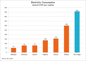
  • Your refrigerator uses more power than many people in AfricaElectricity-consumption-Todd-Moss
August 31, 2013

West Island elections

Australia, as you may have noticed, is having an election. Some statistical analysis links


August 21, 2013

Measuring what you care about

From the Twitters

There followed a lively discussion, with comparisons to election results in various unpleasant places.

As I’ve suggested before, the really damning aspect of the 99.9% bus punctuality stats is that they might actually be honest. That is, `punctuality’ has been defined in a way that it does not reflect passenger experience and is of almost no interest to passengers. A bus is ‘punctual’ if it starts its route (which I assume means the driver starts up the ticket system) no more than 5 minutes late. What happens later doesn’t matter, as long as the bus does eventually reach its destination.

The real-time prediction system (although it may not be great at predicting the future) knows where the buses have been, so it would be feasible to set up a punctuality summary that actually measured punctuality — perhaps the proportion of major timepoints where the bus was no more than 5 minutes late or 1 minute early in departing.

I mention this point again because I’m teaching Design of Clinical Trials at the moment, and one of the big issues is ‘surrogate outcomes’. That is, people running studies are often tempted to measure something convenient rather than what patients care about: diabetes trials may measure blood sugar rather than heart attacks and kidney failure; heart disease trials may measure blood pressure rather than heart attacks or strokes; cancer trials may measure tumour size rather than survival or symptoms.  This matters, because there are important examples where a treatment improves a surrogate outcome, but makes the real outcomes worse.

There is no way that the Auckland bus punctuality statistics are accurate measurements of something that matters to passengers. It’s not a matter of life and death as it is in clinical trials, but it’s still a waste of time and money.  And since the Auckland bus system is actually pretty good, it makes Auckland Transport and the Council look unnecessarily stupid.
August 18, 2013

Correlation, genetics, and causation

There’s an interesting piece on cannabis risks at Project Syndicate. One of the things they look at is the correlation between frequent cannabis use and psychosis.  Many people are, quite rightly, unimpressed with the sort of correlation, since it isn’t hard to come up with explanations for psychosis causing cannabis use or for other factors causing both.

However, there is also some genetic data.  The added risk of psychosis seems to be confined to people with two copies of a particular genetic variant in a gene called AKT1. This is harder to explain as confounding (assuming the genetics has been done right), and is one of the things genetics is useful for. This isn’t just a one-off finding; it was found in one study and replicated in another.

On the other hand, the gene AKT1 doesn’t seem to be very active in brain cells, making it more likely that the finding is just a coincidence.  This is one of the things bioinformatics is good for.

In times like these it’s good to remember Ben Goldacre’s slogan “I think you’ll find it’s a bit more complicated than that.”

August 11, 2013

Advances in non-representative sampling

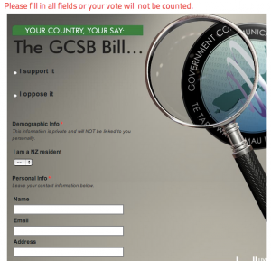
My attention has been drawn (by Joseph Simpson, on Twitter) to the Campbell Live online poll on the GCBSB vote.  These polls are fairly bogus anyway, being collected from self-selected viewers or readers, but in this case there’s an added twist.

In red at the top “Please fill in all fields or your vote will not be counted.”  The fields include name, email, and address.  Wouldn’t you expect that people unhappy with the prospect of increased (legal) surveillance of New Zealanders might be less willing to give all their personal details with their vote?

vote
To be fair, the form says that the personal information is private and won’t be linked to you personally.  If we assume don’t mean this, but actually mean that the personal information won’t be linked to the votes, and that TV3 is able to ensure this, there’s no problem.

July 31, 2013

It depends on how you look at it

Collapsing lots of variables into a single ‘goodness’ score always involves choices about how to weight different information; there isn’t a well-defined and objective answer to questions like “what’s the best rugby team in the world?” or “what’s the best university in the world?”.  And if you put together a ranking of rugby teams and ended up with Samoa at the top and the All Blacks well down the list, you might want to reconsider your scoring system.

On the other hand, it’s not a good look if you make a big deal of holding failing schools accountable and then reorder your scoring system to move a school from “C” to “A”. Especially when it’s a charter school founded by a major donor to the governing political party.

Emails obtained by The Associated Press show Bennett and his staff scrambled last fall to ensure influential donor Christel DeHaan’s school received an “A,” despite poor test scores in algebra that initially earned it a “C.”

“They need to understand that anything less than an A for Christel House compromises all of our accountability work,” Bennett wrote in a Sept. 12 email to then-chief of staff Heather Neal, who is now Gov. Mike Pence’s chief lobbyist.


July 26, 2013

Interesting maps

Two selections from radicalcartography (via Noah Illinsky on Twitter)

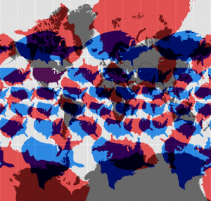
The Mercator projection (and other projections) with copies of the US superimposed for reference

wandering_merc


(the Mercator projection has the unique property, vital for pre-modern navigation, that compass bearings are straight lines.  It shouldn’t be used where this property isn’t needed).


And social survey data on how people greet friends in France

frenchkisses


(as the cartographer notes, the data come from a bogus poll and may be somewhat unreliable)


July 23, 2013

Legal high bans and crime

From Scoop, in a press release on the legal-highs bill by Manurewa Local Board member Toa Greening

Ireland led the way by prohibiting all non-prescribed psychoactive substances back in 2010. This resulted in an immediate reduction in related psychoactive substance health issues and crime.

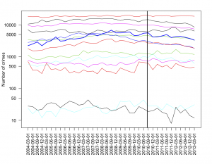
Irish data on recorded crimes is available throught the Ireland Official Statistics portal, Statcentral.ie.  This graph shows quarterly data since 2004 for the main crime categories (the heavy blue line is drug offenses, and the vertical line is when the ban came into force)

irish-crime


I don’t see any dramatic effects of the ban on any category of crime.

July 18, 2013

Why don’t people know stuff?

There’s been a lot of discussion on the internet and in the UK media about  the Royal Statistical Society’s poll on widespread misbeliefs in the UK, which we covered about a week ago.

One useful response is from Alex Harrowell at The Yorkshire Ranter

The deficit model of ignorance defines ignorance to be a deficiency disease, in which individuals lack facts and are therefore prone to believing nonsense. Ignorant individuals know fewer facts than non-ignorant individuals. This is true as far as it goes. The problem arises when you try to determine causes or prescribe treatment. The deficit model leads to the conclusion that you should, somehow, give them fact pills. Once supplemented with facts, they’ll be OK.

The problem, though, is that this doesn’t actually work, and raises the question as to why they got like that.

July 16, 2013

Benefits numbers context

According to Stuff, Paula Bennett says the number on benefits is down by 10,000 since last year . Whether this is good or bad depends on where they ended up instead (as the story points out) but it is what the Government was attempting.

What the story doesn’t point out is that by MSD numbers there were drops of 10,000 or more in the number on benefits in the years ending June 2004, 2005, 2006, 2007 (and over 7000 in the year ending 2012, and over 8000 in the year ending 2003). And that’s as early as the data file goes.

Numbers on benefits have been going down for a long time, with an interruption for the recession, when they (obviously) went up a lot. Some of what we’re seeing now is just economic recovery, some is new rules, some is long-term changes in society. It’s hard to split the credit or blame, but it’s useful to know that a fall of 10,000 in a year isn’t  unusual.