Posts filed under Politics (194)

January 2, 2014

Toll, poll, and tolerance.

The Herald has a story that  has something for everyone.  On the front page of the website it’s labelled “Support for lower speed limit“, but when you click through it’s actually about the tighter tolerance (4km/h, rather than 10km/h) for infringement notices being used on the existing speed limits.

The story is about a real poll, which found about 2/3 support for the summer trial of tighter speed limits. Unfortunately, the poll seems to have had really badly designed questions. Either that, or the reporting is jumping to unsupportable conclusions:

The poll showed that two-thirds of respondents felt that the policy was fair because it was about safety. Just 29 per cent said that it was unfair and was about raising revenue.

That is, apparently the alternatives given for respondents combined both whether they approved of the policy and what they thought the reason was.  That’s a bad idea for two reasons. Firstly, it confuses the respondents, when it’s hard enough getting good information to begin with. Secondly, it pushes them towards an answer.   The story is decorated with a bogus clicky poll, which has a better set of questions, but, of course, largely meaningless results.

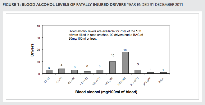
The story also quotes the Police Minister attributing a 25% lower death toll during  the Queen’s Birthday weekends to the tighter tolerance

“That means there is an average of 30 people alive today who can celebrate Christmas who might not otherwise have been,” Mrs Tolley said.

We’ve looked at this claim before. It doesn’t hold up. Firstly, there has been a consistently lower road toll, not just at holiday weekends.  And secondly, the Ministry of Transport says that driving too fast for the conditions is a only even one of the contributing factors in 29% of fatal crashes, so getting a 25% reduction in deaths just from tightening the tolerance seems beyond belief.  To be fair, the Minister only said the policy “contributed” to the reduction, so even one death prevented would technically count, but that’s not the impression being given.

What’s a bit depressing is that none of the media discussion I’ve seen of the summer campaign has asked what tolerance is actually needed, based on accuracy of speedometers and police speed measurements. And while stories mention that the summer campaign is a trial run to be continued if it is successful, no-one seems to have asked what the evaluation criteria will be and whether they make sense.

(suggested by Nick Iversen)

December 30, 2013

Diversification

There’s a story on NPR news about college advertising brochures.

Pippert and his researchers looked at more than 10,000 images from college brochures, comparing the racial breakdown of students in the pictures to the colleges’ actual demographics. They found that, overall, the whiter the school, the more diversity depicted in the brochures, especially for certain groups.

When you look at the research paper it turns out that’s not quite right. The main data table (Table 3) is

diversity

What it shows is that the proportion of African-American students in photos in the brochure is actually pretty much constant, regardless of the proportion at the university. It’s the exaggeration that increases for whiter campuses.  It would have been nice to see this in a graph (and also perhaps see White+Asian pooled), but sociology doesn’t routinely do graphs (Kieran Healy has a paper trying to get them to)

Interestingly, the 15% or so proportion of African-American students in photos is above the proportion in the population as a whole (12.4%), but is very close to the proportion in the 16-19 age band, which includes the target audience for these brochures. That may well be just a coincidence, since there’s enough geographical variation that basically no-one is exposed to what the US population proportion looks like.

December 3, 2013

Silliness on both sides in the Waikato fluoride stoush

The anti-fluoride Fluoride Action Network has accused the Waikato Times of reversing the results of an online poll that asked whether people supported the council’s move to defer re-fluoridating the city’s water supply until a High Court legal challenge  is decided.

What the Waikato Times did or didn’t do is immaterial. Folks, the paper ran a self-selecting online poll, which makes its results utterly meaningless.

The best poll we have on this is October’s non-binding referendum. It showed that nearly 70% of Hamilton voters favoured water fluoridation.

November 29, 2013

Roundup retraction

I’ve written before about the Seralini research that involved feeding glyphosate and GM corn to rats. Now, Retraction Watch is reporting that the paper will be retracted.

This is a slightly unusual retraction: typically either the scientist has a horrible realisation that something went wrong (maybe their filters were affecting composition of their media) or the journal has a horrible realisation that something went wrong (maybe the images were Photoshopped or the patients didn’t actually exist).

The Seralini paper, though, is being retracted for being kinda pointless. The editors emphasise that they are not suggesting fraud, and write

A more in-depth look at the raw data revealed that no definitive conclusions can be reached with this small sample size regarding the role of either NK603 or glyphosate in regards to overall mortality or tumor incidence. Given the known high incidence of tumors in the Sprague-Dawley rat, normal variability cannot be excluded as the cause of the higher mortality and incidence observed in the treated groups.

Ultimately, the results presented (while not incorrect) are inconclusive, and therefore do not reach the threshold of publication for Food and Chemical Toxicology. 

They’re certainly right about that, but this is hardly a new finding. I’m not really happy about retraction of papers when it isn’t based on new information that wasn’t easily available at the time of review. Too many pointless and likely wrong papers are published, but this one is being retracted for being pointless, likely wrong, and controversial.


[Update: mass enthusiasm for the retraction is summarised by Peter Griffin]

November 5, 2013

Can we bring out the real numbers now?

So, the decision has been made and the blood alcohol limit will be lowered.  Perhaps now we can start using realistic numbers for the impact.  The story in the Herald today shows the problem, although it’s actually much better than anything I’ve seen in the mainstream media previously:

The changes come after a two-year review of the impact of lowering the legal blood alcohol limit by 30mg suggested 3.4 lives would be saved a year and 64 injury-causing crashes avoided.

It would also save $200 million in social costs over 10 years.

“Alcohol impairment is a major cause of road accidents in New Zealand, with an average of 61 fatalities, 244 serious injuries, and 761 minor injuries every year caused by at-fault drivers who have been drinking,” said Transport Minister Gerry Brownlee.

“The social cost of these injuries and fatalities is $446 million – a huge sum in a country of our size.”

In the first paragraph the estimated benefit based on actual research is quoted. That’s a big step forward. The second paragraph is just wrong: the social costs aren’t in addition to the lives saved and injuries prevented; that’s where the social cost numbers come from. And it’s multiplied by ten years.

In the third and fourth paragraphs Mr Brownlee is quoted as justifying the change by quoting total costs of drink driving. The social cost number in the fourth paragraph is 22 times larger than the actual estimated benefit. You’d think that sort of discrepancy would draw some journalistic comment.

And later in the story we are told about a victim of a drunk driver. A driver whose blood alcohol concentration was 190mg/100ml, more than twice the existing legal limit, and who was duly convicted and sent to prison under the old laws. Not the sort of person whose behaviour is likely to be affected by this change.

November 4, 2013

Majorities in public and in politics

From Andrew Gelman, who is passing along research by some Columbia political scientists, the estimated support, by state, for the Employment Nondiscrimination Act, a gay rights bill that the US Senate will be voting on this Monday.

nondiscr


US Senators are elected by, and theoretically represent, their  state as a whole. The bill has majority support in every state, well over 60% in most states. It’s not clear whether it will pass.

Part of the problem is multilevel democracy: to be a Senator, you have to be selected as a candidate as well as winning the election. And the people who vote at the preselection stage (primary elections, in the US) average more extreme than those who vote in the election.  The more levels of selection you need, the worse the problem gets: Tim Gowers (prompted by the US government shutdown) does the mathematician thing and derives the extreme case. And the problem is exacerbated by the fact that politicians aren’t as knowledgeable about the views of their electorates as they think are.

October 13, 2013

Think of a number and multiply by 80000

Bernard Hickey in the Herald

Imagine the public outrage if it were discovered that more than 80,000 New Zealanders were receiving wages, salaries and investment incomes of more than $6 billion a year, but were also receiving a benefit from the Government.

and

Income figures this week from Statistics NZ show more than 80,000 New Zealanders over the age of 65 receive wages, salaries and investment returns of more than $6.5 billion a year while claiming NZ Super.

It certainly helps to summon the outrage if you uses totals rather than averages. I  think there could be a reasonable case for means-testing NZ Super, but these numbers are not a contribution to informed public debate.

I’m not even sure where he got the data: he says “income figures this week from Statistics NZ”, and the only plausible source on the Stats NZ release calendar seems to be the NZ Income Survey, released on October 4. But in the NZ Income Survey data, table 8 says there are only 53,900 people aged 65+ with income above $1150/wk, which works out to just under $60000/year (including their NZ Super, of course).  His figures could still be right — perhaps the very wealthy people at the top drag the total up —  but they can only be right in the same sense as Bill English‘s “people earning under $110000 collectively pay no net income tax”.

Imagine the public outrage if it were discovered that nearly 54000 retired New Zealanders were earning over $45000/yr  from investments and salaries and still collecting NZ Super as well. Go on, imagine it.

September 27, 2013

Nuclear warming?

From the Guardian, some time ago

Jeremy Clarkson had a point – and that’s not something you hear me say every day (indeed, any day) – when in a recent Sun column he challenged the scientists […] who had described a slab of ice that had broken away from Antarctica as “the size of Luxembourg”.

“I’m sorry but Luxembourg is meaningless,” said Clarkson, pointing out that the standard units of measurement in the UK are double-decker London buses, football pitches and Wales. He could have added the Isle of Wight, Olympic-sized swimming pools and Wembley stadiums to the list.

These journalist units of measurements are useful only to the extent that they are more familiar and easily understood than the actual numbers.

From The Conversation, more recently, David Holmes begins

The planet is building up heat at the equivalent of four Hiroshima bombs worth of energy every second. And 90% of that heat is going into the oceans.

This image comes originally from John Cook, who writes

bomb

So I suggest a sticky way to communicate global warming is to express it in units of Hiroshima bombs worth of heat. This ticks all the sticky boxes:

  • It’s simple – nothing communicates a lot of heat like an A-bomb.
  • It’s unexpected – whenever I explain this to audiences, their eyes turn into saucers. Almost noone realises just how much heat our climate system is accumulating.
  • It’s concrete – nobody has trouble conceptualising an A-bomb. Well, much of the younger generation don’t know about Hiroshima – when I test-drived this metaphor on my teenage daughter, she asked “what’s Hiroshima?”. But it’s easily recommunicated as an atomic bomb.
  • It tells a story – the idea that second after second, day after day, the greenhouse effect continues to blaze away and our planet continues to build up heat.
  • The only downside of this metaphor is it is emotional – the Hiroshima bomb does come with a lot of baggage. However, this metaphor isn’t used because it’s scary – it’s simply about communicating the sheer amount of heat that our climate is accumulating. I’ve yet to encounter a stickier way of communicating the scale of the planet’s energy imbalance.

I think he’s wrong about the  downside.  The real downside is that the image of Hiroshima has nothing to do with heat production.  The Hiroshima bomb was important because it killed lots of people, many of them civilians, ended the war, and ushered in the age of nuclear weapons where a small number of military or political leaders had the ability to destroy industrial civilisation and kill the majority of our species (which nearly happened, 30 years ago today).

If we set off four Hiroshima-scale bombs per second, global warming would become a relatively unimportant side issue — and in fact, nuclear weapons are much more widely associated with nuclear winter.

You could also invoke public health concerns and describe the heat accumulation as equivalent to everyone in the world smoking seven cigarettes per second (1185 cal/cig: data). That would be wrong in the same ways.

How many deaths would be prevented by lowering the blood alcohol limit to 0.08%?

Well, obviously, none. The limit is already 0.08%.

However, there are still deaths caused by people who drive over the limit.  From crash data for drivers only, in 2011, there were a lot more crashes where the driver was above 0.08% than between 0.05% and 0.08%, and a larger fraction of these will have been caused by alcohol rather than just being coincident with alcohol.

bac


Just as lowering the limit 0.08% prevented some, but not all, crashes where the drivers were above 0.08%, lowering the limit to 0.05% would prevent some, but not all, crashes where the driver is above 0.05%.

The Herald says

Alcohol Healthwatch director Rebecca Williams said the statistics clearly showed 20 people would still be alive if the Government had responded to calls for a lower alcohol limit.

which seems completely indefensible.

I don’t have any personal stake in the 0.08% limit — I don’t have a car and can afford taxis. And I’m not denying the real dangers of drink driving: according to estimates from NZ data the risk at 0.08% is about three times that at 0.05%.  But it’s dishonest to assume that all deaths where the driver was over 0.05% would be eliminated by the change, and to pretend there are no costs from the change.  We should be arguing this using the best available estimates of the benefits and costs.

And if you think the costs are irrelevant because there’s no limit on the value of a life, what about all the other ways to save lives? There are plenty of competing options, even if you think it’s only New Zealand lives that are valuable.


September 24, 2013

Student-friendly radar charts

The Critic, the student magazine of Otago, has an interesting feature on the council elections, rating the candidates on six issues determined by polling to be important to students. One of the ways they present the candidate ratings is with radar plots

radar-critic


These show the rating for each of the issues on six radial axes, connected to form the white polygon.  Candidates who are more ‘student-friendly’ on these issues will end up with larger polygons, and the different shapes show that there are significant tradeoffs between, say, a candidate who is in favour of drinking and (quality) loud music, and one who is sound on environment and transport.

This is a pretty good use of radar plots. Their main limitations are that the ordering of the axes can have a big effect on the visual impression, and that evaluating tradeoffs quantitatively is hard. Neither is a really serious limitation here, and both are problems common to many ways of displaying multivariate data.

Here’s another radar chart, originally from INFOGRAPHIKA magazine, rescued from its unfair banishment to wtfviz.net.

radio-success


This one shows how people rated the importance of eight factors in success, split up by their income.  It’s interesting to see how much higher  connections, initial capital, and cheating were rated as important by the poor, and how the rich thought hard work was the key factor, not being very impressed even by education.   It’s clear that each group likes the story that makes them look good; less clear who is more correct.  What’s a bit depressing is how small a role anyone thinks is played by luck.