Posts filed under Politics (194)

May 2, 2014

Animal testing

Labour want to prevent animal testing of legal highs. That’s a reasonable position. They are quoted by the Herald as saying “there is no ethical basis for testing legal highs on animals”. That’s a completely unreasonable position: testing on animals prevents harm to humans, and the fact you don’t agree with something doesn’t mean it lacks an ethical basis.

More important is their proposed legislation on this issue, with the key clause

Notwithstanding anything in the Psychoactive Substances Act 2013, no animal shall be used in research or testing for the purpose of gaining approval for any psychoactive substance as defined in section 9 of the Psychoactive Substances Act 2013.”

Assuming that the testing is done overseas, which seems to be National’s expectation, this legislation wouldn’t prevent animal use in testing.  The time when a drug dealer would want to use animals in testing is for initial toxicity: does the new drug cause liver or kidney damage, or have obvious long-term neurological effects that might reduce your customer base unduly.  The animal data wouldn’t be sufficient on their own, because there’s some variation between species, especially in side-effects mediated by the immune system (don’t Google “Stevens-Johnson syndrome” while you’re eating). But animal data would be relevant, and many plausible candidates for therapeutic medications fail early in development because of this sort of toxicity.

Whether animals were used for toxicity testing or not, it would still be necessary to test in humans to find the appropriate dose and the psychoactive effects in people. Depending on the regulations, it might well also be necessary to test moderate overdoses in humans — especially as it appears most of the adverse effects of the synthetic cannabis products are in people taking quite high doses.  That’s the sort of data that might be required in an application for approval of a psychoactive substance.

Labour’s proposal would mean that the animal test data could not be used for gaining approval, and would also mean that the regulations could not require animal data.  But I can’t see much reason it would discourage someone from using animals in initial toxicity testing, which is the only place animal testing would really be relevant.
April 24, 2014

Drinking age change

There’s a story in the Herald about the impact of changes in the drinking age. It’s a refreshing change since it’s a sensible analysis of reasonable data to address an interesting question; but I still want to disagree with some of the interpretation.

As those of you who have lived in NZ for longer will remember, the drinking age was lowered from 20 to 18 on December 1, 1999. One of the public-health questions this raises is the effect on driving.  You’d expect an increase in crashes in 18-20 year olds, but it’s not obvious what would happen in older drivers. You could imagine a range of possibilities:

  • People are more at risk when they’re learning to manage drinking in the context of needing to drive, but there’s no real difference between doing this at 18 or at 20
  • At eighteen, a significant minority of people still have the street smarts of a lemming and so the problem will be worse than at twenty
  • At eighteen, fewer people are driving, so the problem will be less bad
  • At eighteen, fewer people are driving so there’s more pressure on those with cars to drive, so the problem will be worse
  • At eighteen, drivers are less experienced and are relying more on their reflexes, so the problem will be worse.

Data would be helpful, and the research (PDF,$; update: now embedded in the story) is about the relative frequency of serious crashes involving alcohol at various ages for 1994-1999, 2000-2004, 2006-2010, ie, before the change, immediately after the change, and when things had settled down a bit. The analysis uses the ratio of crashes involving alcohol to other crashes, to try to adjust for other changes over the period.  That’s sensible but not perfect: changing the drinking age could end up changing the average number of passengers per car and affecting the risk that way, for example.

The research found that 18-20 year olds were at 11% lower risk than 20-24 year olds when 20 was the drinking age, and 21% higher risk when 18 was the drinking age (with large margins of uncertainty). That seems to fit the first explanation: there’s a training period when you’re less safe, but it doesn’t make a lot of difference when it happens — the 20% increase for two years matches the 11% increase for four years quite closely. We certainly can’t rule out the problem being worse at 18 than at 20, but there doesn’t seem to be a strong signal that way.

The other thing to note is that the research also looked at fatal crashes separately and there was no real sign of the same pattern being present. That could easily just be because of the sparser data, but it seems worth pointing out given that all three of the young people named in the story were in fatal crashes.

March 31, 2014

Election poll averaging

The DimPost posted a new poll average and trend, which gives an opportunity to talk about some of the issues in interpretation (you should also listen to Sunday’s Mediawatch episode)

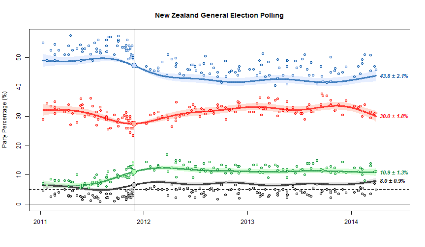
The basic chart looks like this

nzpolls20140330bc1

The scatter of points around the trend line shows the sampling uncertainty.  The fact that the blue dots are above the line and the black dots are below the line is important, and is one of the limitations of NZ polls.  At the last election, NZ First did better, and National did worse, than in the polling just before the election. The trend estimates basically assume that this discrepancy will keep going in the future.  The alternative, since we’ve basically got just one election to work with, is to assume it was just a one-off fluke and tells us nothing.

We can’t distinguish these options empirically just from the poll results, but we can think about various possible explanations, some of which could be disproved by additional evidence.  One possibility is that there was a spike in NZ First popularity at the expense of National right at the election, because of Winston Peters’s reaction to the teapot affair.  Another possibility is that landline telephone polls systematically undersample NZ First voters. Another is that people are less likely to tell the truth about being NZ First voters (perhaps because of media bias against Winston or something).  In the US there are so many elections and so many polls that it’s possible to estimate differences between elections and polls, separately for different polling companies, and see how fast they change over time. It’s harder here. (update: Danyl Mclauchlan points me to this useful post by Gavin White)

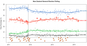
You can see some things about different polling companies. For example, in the graph below, the large red circles are the Herald-Digipoll results. These seem a bit more variable than the others (they do have a slightly smaller sample size) but they don’t seem biased relative to the other polls.  If you click on the image you’ll get the interactive version. This is the trend without bias correction, so the points scatter symmetrically around the trend lines but the trend misses the election result for National and NZ First.

poll-digipoll

March 25, 2014

Political polling code

The Research Association New Zealand  has put out a new code of practice for political polling (PDF) and a guide to the key elements of the code (PDF)

The code includes principles for performing a survey, reporting the results, and publishing the results, eg:

Conduct: If the political questions are part of a longer omnibus poll, they should be asked early on.

Reporting: The report must disclose if the questions were part of an omnibus survey.

Publishing: The story should disclose if the questions were part of an omnibus survey.

There is also some mostly good advice for journalists

  1. If possible, get a copy of the full poll  report and do not rely on a media release.
  2. The story should include the name of the company which conducted the poll, and the client the poll was done for, and the dates it was done.
  3.  The story should include, or make available, the sample size, sampling method, population sampled, if the sample is weighted, the maximum margin of error and the level of undecided voters.
  4. If you think any questions may have impacted the answers to the principal voting behaviour question, mention this in the story.
  5. Avoid reporting breakdown results from very small samples as they are unreliable.
  6. Try to focus on statistically significant changes, which may not just be from the last poll, but over a number of polls.
  7. Avoid the phrase “This party is below the margin of error” as results for low polling parties have a smaller margin of error than for higher polling parties.
  8.  It can be useful to report on what the electoral results of a poll would be, in terms of likely parliamentary blocs, as the highest polling party will not necessarily be the Government.
  9. In your online story, include a link to the full poll results provided by the polling company, or state when and where the report and methodology will be made available.
  10. Only use the term “poll” for scientific polls done in accordance with market research industry approved guidelines, and use “survey” for self-selecting surveys such as text or website surveys.

Some statisticians will disagree with the phrasing of point 6 in terms of statistical significance, but would probably agree with the basic principle of not ‘chasing the noise’

I’m not entirely happy with point 10, since outside politics and market research, “survey” is the usual word for scientific polls, eg, the New Zealand Income Survey, the Household Economic Survey, the General Social Survey, the National Health and Nutrition Examination Survey, the British Household Panel Survey, etc, etc.

As StatsChat readers know, I like the term “bogus poll” for the useless website clicky surveys. Serious Media Organisations who think this phrase is too frivolous could solve the problem by not wasting space on stories about bogus polls.

March 22, 2014

Facts and values

In a rant against `data journalism’ in general and fivethirtyeight.com in particular, Leon Wieseltier writes in the New Republic

Many of the issues that we debate are not issues of fact but issues of value. There is no numerical answer to the question of whether men should be allowed to marry men, and the question of whether the government should help the weak, and the question of whether we should intervene against genocide. And so the intimidation by quantification practiced by Silver and the other data mullahs must be resisted. Up with the facts! Down with the cult of facts! 

There are questions of values that are separate from questions of fact, even if the philosopher Hume went too far in declaring “no ‘ought’ deducible from ‘is'”.   There may even be things we should or should not do regardless of the consequences. Mostly, though, our decisions should depend on the consequences.

We should help the weak. That’s a value held by most of us and not subject to factual disproof.  How we should do it is more complicated.  How much money should be spent? How much should we make people do to prove they need help? Is it better to give people money or vouchers for specific goods and services? Is it better to make more good jobs available or to give more help to those who can’t get them?  How much does participating in small social and political community groups or supporting independent radical writers and thinkers help versus putting the same effort into paying lobbyists or donating to political parties or individual candidates? Is it important to restrict wealth and power of small elites, and what costs are worth paying to do so? How much discretion should be given to police and the judiciary to go lightly on the weak, and how much should they  be given strict rules to stop them going lightly on the strong? Is a minimum wage increase better than a low-income subsidy? Are the weak better off if we have a tax system that’s not very progressive in theory but it hard for the rich and powerful to evade?

As soon as you want to do something, rather than just have good intentions about it, the consequences of your actions matter, and you have a moral responsibility to find out what those consequences are likely to be.

March 20, 2014

Beyond the margin of error

From Twitter, this morning (the graphs aren’t in the online story)

Now, the Herald-Digipoll is supposed to be a real survey, with samples that are more or less representative after weighting. There isn’t a margin of error reported, but the standard maximum margin of error would be  a little over 6%.

There are two aspects of the data that make it not look representative. Thr first is that only 31.3%, or 37% of those claiming to have voted, said they voted for Len Brown last time. He got 47.8% of the vote. That discrepancy is a bit larger than you’d expect just from bad luck; it’s the sort of thing you’d expect to see about 1 or 2 times in 1000 by chance.

More impressively, 85% of respondents claimed to have voted. Only 36% of those eligible in Auckland actually voted. The standard polling margin of error is ‘two sigma’, twice the standard deviation.  We’ve seen the physicists talk about ‘5 sigma’ or ‘7 sigma’ discrepancies as strong evidence for new phenomena, and the operations management people talk about ‘six sigma’ with the goal of essentially ruling out defects due to unmanaged variability.  When the population value is 36% and the observed value is 85%, that’s a 16 sigma discrepancy.

The text of the story says ‘Auckland voters’, not ‘Aucklanders’, so I checked to make sure it wasn’t just that 12.4% of the people voted in the election but didn’t vote for mayor. That explanation doesn’t seem to work either: only 2.5% of mayoral ballots were blank or informal. It doesn’t work if you assume the sample was people who voted in the last national election.  Digipoll are a respectable polling company, which is why I find it hard to believe there isn’t a simple explanation, but if so it isn’t in the Herald story. I’m a bit handicapped by the fact that the University of Texas internet system bizarrely decides to block the Digipoll website.

So, how could the poll be so badly wrong? It’s unlikely to just be due to bad sampling — you could do better with a random poll of half a dozen people. There’s got to be a fairly significant contribution from people whose recall of the 2013 election is not entirely accurate, or to put it more bluntly, some of the respondents were telling porkies.  Unfortunately, that makes it hard to tell if results for any of the other questions bear even the slightest relationship to the truth.


March 4, 2014

Civil Rights Principles for the Era of Big Data

From a mostly left-wing (ie, NZ middle-of-the-road) group of US civil-rights organisations, but at least some of it will also appeal to libertarians. If you think this sort of thing is interesting/important a good place to find more is mathbabe.org.

Technological progress should bring greater safety, economic opportunity, and convenience to everyone. And the collection of new types of data is essential for documenting persistent inequality and discrimination. At the same time, as new technologies allow companies and government to gain greater insight into our lives, it is vitally important that these technologies be designed and used in ways that respect the values of equal opportunity and equal justice. We aim to:

  1. Stop High-Tech Profiling. New surveillance tools and data gathering techniques that can assemble detailed information about any person or group create a heightened risk of profiling and discrimination. Clear limitations and robust audit mechanisms are necessary to make sure that if these tools are used it is in a responsible and equitable way.
  2. Ensure Fairness in Automated Decisions. Computerized decisionmaking in areas such as employment, health, education, and lending must be judged by its impact on real people, must operate fairly for all communities, and in particular must protect the interests of those that are disadvantaged or that have historically been the subject of discrimination. Systems that are blind to the preexisting disparities faced by such communities can easily reach decisions that reinforce existing inequities. Independent review and other remedies may be necessary to assure that a system works fairly.
  3. Preserve Constitutional Principles. Search warrants and other independent oversight of law enforcement are particularly important for communities of color and for religious and ethnic minorities, who often face disproportionate scrutiny. Government databases must not be allowed to undermine core legal protections, including those of privacy and freedom of association.
  4. Enhance Individual Control of Personal Information. Personal information that is known to a corporation — such as the moment-to-moment record of a person’s movements or communications — can easily be used by companies and the government against vulnerable populations, including women, the formerly incarcerated, immigrants, religious minorities, the LGBT community, and young people. Individuals should have meaningful, flexible control over how a corporation gathers data from them, and how it uses and shares that data. Non-public information should not be disclosed to the government without judicial process.
  5. Protect People from Inaccurate Data. Government and corporate databases must allow everyone — including the urban and rural poor, people with disabilities, seniors, and people who lack access to the Internet — to appropriately ensure the accuracy of personal information that is used to make important decisions about them. This requires disclosure of the underlying data, and the right to correct it when inaccurate.

As an example, consider this Chicago crime risk profiling system. Is it worrying? If so, why; if not, why not?

February 25, 2014

Minimum wage trends

I’m not going to get into the question of whether the NZ minimum wage should be higher; inequality and poverty are problems in NZ, but whether a minimum wage increase would help more than, say,  tax and benefit changes is not my area of expertise.  However, the question of how much the minimum wage has gone up is a statistical issue, and also appears to be controversial.

From April 2008 to April 2013, the minimum wage increased 14.6%. Inflation (2008Q1 to 2013Q1) was 11%. So, the minimum wage increased faster than inflation, and the proposed change will keep it increasing faster than inflation.

From whole-year 2008 to whole-year 2013, per-capita GDP increased 9.7%.  Mean weekly income increased 21%. Median weekly income increased 18.8%. Average household consumption expenditure increased 7.8%.

Increasing the 2008 minimum wage by 18.8%, following median incomes, would give $14.26, so the proposed minimum wage is at least close to keeping up with median income, as well as keeping ahead of economic growth. An increase to $14.50 would have basically kept up with mean income as well.

An important concern in using CPI is that housing might be a larger component of expenditure for people on minimum wage. However, since 2008 the CPI component for housing has increased more slowly than total CPI, so at least on a national basis and for this specific time frame that doesn’t change the conclusion.

[Sources: GDP at StatsNZ for GDP, household consumption expenditure. NZ Income Survey at StatsNZ for mean and median income. RBNZ for inflation]

As a final footnote: the story also mentions the Prime Minister’s salary. There really isn’t an objective way to compare changes in this to changes in the minimum wage. The PM’s salary has increased by a smaller percentage than the minimum wage since 2008, but the absolute increase is more than ten times that of a full-time minimum wage job.

February 2, 2014

Manipulating unemployment

There are two basic sets of numbers related to unemployment: the number of people receiving unemployment benefit, which is easy to measure because the government knows who they are and makes them check in regularly; and the actual number of unemployed people, which is harder to measure and not perfectly well-defined.

Essentially everyone in the world uses the same definition of the unemployment rate: number of people looking for jobs divided by number of people who have jobs or are looking.  This isn’t ideal — it excludes people who’ve given up looking for jobs because there aren’t any — but it’s standard (and endorsed by, eg, the International Labour Organisation).  These numbers are estimated in two ways: by a survey of people (in New Zealand, the Household Labour Force Survey) and by data from businesses (LEED, and the Quarterly Employment Survey, in New Zealand)

In countries such as NZ, with well-run, independent national statistics agencies, the unemployment rate is hard to manipulate because the official statisticians won’t let you. The number on benefits is hard to manipulate because it’s easily measured.  So both numbers are trustworthy measurements of what they measure.  Sometimes, deliberately or accidentally, people confuse the two and say that unemployment has gone down when in fact it’s only the number on benefits that has gone down. If anyone sees examples of deliberate or reckless confusion of numbers on benefits and numbers unemployed, I’d welcome a note either to me or as a Stat-of-the-Week nomination, since it’s an important issue and an easy target for a post.

The current government is not, actually, particularly culpable in confusing these numbers; they prefer to take unjustified credit for the economic improvements following the global recession. For example, Paula Bennett has tended to talk about her ministry’s success in reducing the number of people on benefits (whether it’s true or  not, and whether it’s good or not).

So, I was surprised to see a column by Matt McCarten in the Herald accusing the Government of manipulating the unemployment statistics. He doesn’t mean that Stats New Zealand’s unemployment rate estimates have been manipulated — if he had evidence of that, it would be (minor) international news, not a local opinion column. He doesn’t mean that the published numbers on people receiving unemployment benefits are wrong, either. In fact, none of his accusations are really about manipulating the statistics. Mr McCarten is actually accusing the government of trying to push people off unemployment benefits. Since that’s one of the things Paula Bennett has publicly claimed credit for, it can hardly be viewed as a secret.

Personally, I’m in agreement with him on his actual point, but not on how it’s presented. Firstly, if the problem is the harassment of unemployed people to stop them claiming unemployment benefits, you should say that, not talk about manipulating statistics. And secondly, if there really is widespread public misunderstanding when politicians talk about the state of the economy, it’s hard to see who could be more to blame than the Herald.

January 7, 2014

NZ electoral visualisations

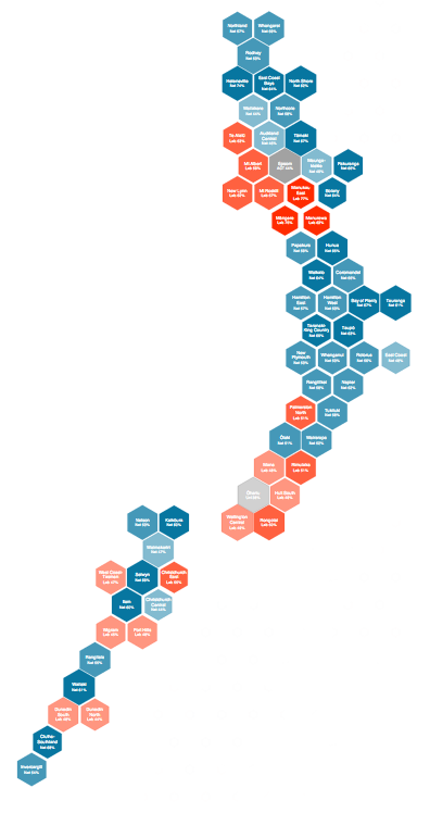
The first post at the new Hindsight blog is on Chris McDowall’s hexagonal maps of NZ political geography.

hexmap


He also has some slides describing the construction of another visualisation, relating party vote to deprivation index.