Posts filed under Law (39)

October 18, 2016

The lack of change is the real story

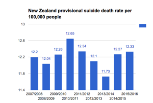
The Chief Coroner has released provisional suicide statistics for the year to June 2016.  As I wrote last year, the rate of suicide in New Zealand is basically not changing.  The Herald’s story, by Martin Johnston, quotes the Chief Coroner on this point

“Judge Marshall interpreted the suicide death rate as having remained consistent and said it showed New Zealand still had a long way to go in turning around the unacceptably high toll of suicide.”

The headline and graphs don’t make this clear

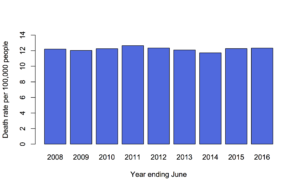
Here’s the graph from the Herald

suicide-herald

If you want a bar graph, it should go down to zero, and it would then show how little is changing

suicide-2

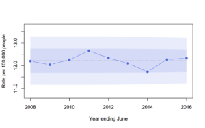
I’d prefer a line graph showing expected variation if there wasn’t any underlying change: the shading is one and two standard deviations around the average of the nine years’ rates

suicide-3

As Judge Marshall says, the suicide death rate has remained consistent. That’s our problem.  Focusing on the year to year variation misses the key point.

March 7, 2016

Crime reports in NZ

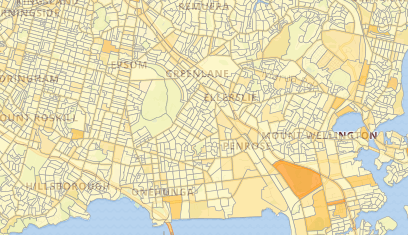
The Herald Insights section has a multi-day exploration of police burglary reports, starting with a map at the Census meshblock level.

burglary

When you have counts of things on a map there’s always an issue of denominators and areas.  There’s the “one cow, one vote” phenomenon where rural areas dominate the map, and also the question of whether to show the raw count, the fraction of the population, or something else.  Burglaries are especially tricky in this context, because the crime location need not be a household, and the perpetrator need not live nearby, so the meshblock population really isn’t the right denominator.  The Herald hasn’t standardised, which I think is a reasonable default.

It’s also an opportunity to link again to Graeme Edgeler’s discussions of  why ‘burglary’ is a wider category than most people realise.

August 31, 2015

Gender gap

As I’ve noted in the past, one of the big components of the remaining gender pay gap is lower pay for jobs that attract more women. I thought this was an issue where direct action would be infeasible. Maybe not.

Two New Zealand groups are now trying to target this, as described by Kirsty Johnson and Nicholas Jones in the Herald. When trying legal action, midwives and education support workers have the advantage that their wages are set by the government.

Having set wages for a large group gives the case someone to target, and it also weakens the counterargument based on individual differences. I don’t know whether this sort of claim is likely to succeed under NZ law, or what the impact would be if it did. I don’t even known whether success is desirable. But it’s an interesting approach to a real problem.

December 9, 2014

Health benefits and natural products

The Natural Health and Supplementary Products Bill is back from the Health Committee. From the Principles section of the Bill:

(c) that natural health and supplementary products should be accompanied by information that—

   (i)is accurate; and

   (ii)tells consumers about any risks, side-effects, or benefits of using the product:

(d)that health benefit claims made for natural health and supplementary products should be supported by scientific or traditional evidence.

There’s an unfortunate tension between (c)(i) and (d), especially since (for the purposes of the Bill) the bar for ‘traditional evidence’ is set very low: evidence of traditional use is enough.

Now, traditional use obviously does convey some evidence as to safety and effectiveness. If you wanted a herbal toothache remedy, you’d be better off looking in Ngā Tipu Whakaoranga and noting traditional Māori use of kawakawa, rather than deciding to chew ongaonga.

For some traditional herbal medicines there is even good scientific evidence of a health benefit. Foxglove, opium poppy, pyrethrum, and willowbark are all traditional herbal products that really are effective. Extracts from two of them are on the WHO essential medicines list, as are synthetic adaptions of the other two. On the other hand, these are the rare exceptions — these are the  ones where a vendor wouldn’t have to rely only on traditional evidence.

It’s hard to say how much belief in a herbal medicine is warranted by traditional use, and different people would have different views. It would have been much better to allow the fact of traditional use to be advertised itself, rather than allowing it to substitute for evidence of benefit.  Some people will find “traditional Māori use” a good reason to buy a product, others might be more persuaded by “based on Ayurvedic principles”.  We can leave that evaluation up to the consumer, and reserve claims of ‘health benefit’ for when we really have evidence of health benefit.

This isn’t treating science as privileged, but it is treating science as distinguished. There are some questions you really can answer by empirical study and repeatable experiment (as the Bill puts it), and one of them is whether a specific treatment does or does not have (on average) a specific health benefit in a specific group of people.


November 6, 2014

State lines

Two very geographical graphics:

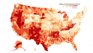
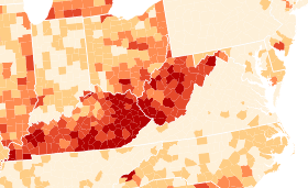
From the New York Times (via Alberto Cairo), a map of percentage increases in number of people with health insurance in the US.

insured-map

This is a good example of something that needs to be a map, to demonstrate two facts about the impact of Obamacare. First, state policies matter. That’s most dramatic in this region from the right-hand side, about halfway up:

insured-highlight

Kentucky and West Virginia implemented an expansion in Medicaid, the low-income insurance program, and had a big increase in number of people insured. Neighbouring counties in Tennessee and Virginia, which did not implement the Medicaid expansion, had much smaller increases.  The beige rectangle at the top left is Massachusetts, which already had a universal health care law and so didn’t change much. (Ahem. Geography and orientation apparently not my strong points. Massachusetts didn’t change, but that’s Pennsylvania, which only just started Medicaid expansion)

Second, there was a lot of room for improvement in some places — most dramatically, south Texas. The proportion of people with health insurance increased by 10-15 percentage points, but it’s still below 40%.


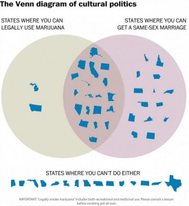
As a contrast, the Washington Post gives us this,

venn

which is, hands-down, the least readable marriage equality map I’ve ever seen.


October 7, 2014

Marriage equality maps

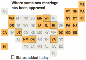
The US Supreme Court declined to review seven same-sex marriage decisions today. The StatsChat-relevant aspect is the flurry of maps this prompted:

I think the New York Times (via Twitter) is my favorite version: the square statebins use geography just as an index to make states easier to find, and (in contrast to the last statebins I linked to) they’ve moved Alaska to the right place

BzS1Q2zIQAAxW3Q


(more…)

September 18, 2014

Interactive election results map

The Herald has an interactive election-results map, which will show results for each polling place as they come in, together with demographic information about each electorate.  At the moment it’s showing the 2011 election data, and the displays are still being refined — but the Herald has started promoting it, so I figure it’s safe for me to link as well.

Mashblock is also developing an election site. At the moment they have enrolment data by age. Half the people under 35 in Auckland Central seem to be unenrolled,which is a bit scary. Presumably some of them are students enrolled at home, and some haven’t been in NZ long enough to enrol, but still.

Some non-citizens probably don’t know that they are eligible — I almost missed out last time. So, if you know someone who is a permanent resident and has lived in New Zealand for a year, you might just ask if they know about the eligibility rules. Tomorrow is the last day.

August 18, 2014

Health/nutrition claims: baby and bathwater

Australia and New Zealand are introducing new food labelling legislation that will reduce the scope for bogus health and nutrition claims (the only bogus claims allowed will be the ones that slipped into the official code).  This is a Good Thing, as I have said in the past.

The legislation also says you can’t make health claims about booze. This is probably a Good Thing, although I don’t see why calorie/carbohydrate claims shouldn’t be allowed.  However, there’s a serious bug in the standards: one of the claims that’s specifically disallowed for alcoholic beverages is “gluten-free.”

It’s true that “gluten-free” has become a trendy bogus nutrition claim, but it’s also vital health information for some people, particularly those with coeliac disease. In that context, “gluten-free” is more like an allergen warning (“May contain nuts”) than a nutrition warning.  In fact, if you look at the section on “Mandatory Warning and Advisory Statements and Declarations”, Clause 4 includes

Cereals containing gluten and their products, namely, wheat, rye, barley, oats and spelt and their hybridised strains other than where these substances are present in beer and spirits standardised in Standards 2.7.2 and 2.7.5 respectively

along with peanuts, soybeans, eggs, milk, etc.  That is, declaring the presence of gluten is mandatory except in beer, where it is the only one of the Clause 4 mandatory warnings that becomes forbidden.  Banning gluten-free labelling on beer is deliberate and planned, it didn’t just fall between the cracks.

Since this is a trans-Tasman law, it’s going to be a pain to revise.  There seems to be one possible loophole. In the Nutrition/Health claims standards, there is provision for endorsements by independent endorsing bodies. These are exempted from most of the health/nutrition regulations: as the Explanatory Text says:

Endorsements are exempt from the other requirements of the Standard (except clause 7), to allow for endorsement programs which use the criteria set by the endorsing body.

It appears (though I may have missed something, and I’m not a lawyer) that Coeliac New Zealand could still endorse gluten-free beers, even though the brewers couldn’t make the same claims themselves.

[Further update: MPI contacted Keruru Brewery and say they are now working on a solution for gluten-free beer.]

[update: I heard about this on Twitter, but the blog post that kicked off Twitter is here]
May 22, 2014

Big Data social context

From Cathy O’Neil: Ignore data, focus on power (and, well, most of the stuff on her blog)

From danah boyd and Kate Crawford: Critical Questions for Big Data

Will large-scale search data help us create better tools, services, and public goods? Or will it usher in a new wave of privacy incursions and invasive marketing? Will data ana- lytics help us understand online communities and political movements? Or will it be used to track protesters and suppress speech? Will it transform how we study human communication and culture, or narrow the palette of research options and alter what ‘research’ means?  


May 21, 2014

When not to map

Maps are good because they take advantage of all the previous maps we’ve seen to provide background familiarity.  On the other hand, they use up both the available spatial dimensions before you’ve actually got any data, so you need to encode the information some other way. Colour is the obvious choice, but colour is much more limited than people appreciate.

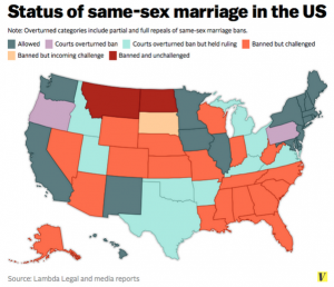
Kieran Healy tweetedIt’s not like there’s a simple, tradeoff-free solution, but this is not a good map.”

BoH2_TfIMAACQIl


And he’s right; it isn’t. There are too many categories, and some of them are ordered but not all of them, so colour isn’t enough. Even if you’re going to try, these aren’t the right colours: for example, orange should be between yellow and red.  About the most you could do clearly with a single map is the three-way split: Yes, same-sex couples can just roll up to the registry;  No, not this week; or It’s Complicated.

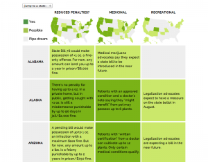
Jacob Harris pointed to an article at Source, describing the design of graphics for a story about marijuana legalisation. It does much better


raja_final_product_1


They link to the classic piece “When maps shouldn’t be maps” by Matthew Ericson, which I’ve linked before. They also have a whole collection of articles on better maps, though it’s fairly programming-oriented.