Posts filed under Just look it up (283)

August 14, 2014

Breast cancer risk and exercise

Stuff has a story from the LA Times about exercise and breast cancer risk.  There’s a new research paper based on a large French population study, where women who ended up having a breast cancer diagnosis were less likely to have exercised regularly for the past five year period.  This is just observational correlation, and although it’s a big study, with 2000 breast cancer cases in over 50000 women, the evidence is not all that strong (the uncertainty range around the 10% risk reduction given in the paper goes from an 18% reduction down to a 1% reduction).  Given that,  I’m a bit unhappy with the strength of the language in the story:

For women past childbearing age, a new study finds that a modest amount of exercise — four hours a week of walking or more intensive physical activity such as cycling for just two hours a week — drives down breast cancer risk by roughly 10 per cent.

There’s a more dramatically wrong numerical issue towards the end of the story, though:

The medications tamoxifen and raloxifene can also drive down the risk of breast cancer in those at higher than average risk. They come with side effects such as an increased risk of deep-vein thrombosis or pulmonary embolism, and their powers of risk reduction are actually pretty modest: If 1000 women took either tamoxifen or raloxifene for five years, eight breast cancers would be prevented.

By comparison, regular physical activity is powerful.

Using relative risk reduction for the (potential) benefits of exercise and absolute risk reduction for the benefits of the drugs is misleading. Using the breast cancer risk assessment tool from the National Cancer Institute, the five-year breast cancer risk for a typical 60 year old is perhaps 2%. That agrees with the study’s 2000 cases in 52000 women followed for at least nine years.  If 1000 women with that level of risk took up regular exercise for five years, and if the benefits were real,  two breast cancers would be prevented.

Exercise is much less powerful than the drugs, but it’s cheap, doesn’t require a doctor’s prescription, and the side-effects on other diseases are beneficial, not harmful.

August 6, 2014

Income statistics

The Herald has a story headlined “Where to work if it’s money you’re after,” giving estimated median incomes across a range of job areas.  Sadly, if you read to the end, two of the sources are summaries of advertised salaries for advertised jobs on Seek and TradeMe.  That is, they are neither actual incomes, nor for the country as a whole.

Rather than just whinge about unrepresentative data, I looked at StatsNZ. They divide things up differently, so there was only one job group in the story that exactly matched one on NZ.Stat. People working in construction have a median weekly income of $840 and mean weekly income of $956 according to the NZ Income Survey. If most people in construction worked all year, without periods of unemployment, this would come to a median annual income of  $43,680 or a mean of $49,712.

The Herald thinks the median annual income in construction is $60,000-$78,000.


July 28, 2014

Misleading maps

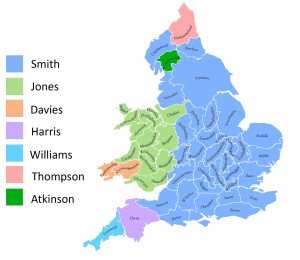
This map, from Reddit, shows the most common name in each county of England and Wales in 1881, based on the 1881 census.

jones

Matthew Yglesias at Vox.com  says what’s remarkable is how nearly perfectly the Smith/Jones divide lines up with the political boundary between England and Wales”.  I think it’s remarkable that he think’s it’s remarkable — I think of ‘Jones’ as the stereotypical Welsh name — but obviously associations are different in the US.  It is worth pointing out that the line-up isn’t as good as you might think if you weren’t careful: three of the light-green counties are actually in England, not in Wales. 

Yglesias also says that the names seem to show pretty distinctively what part of the British Isles your male line hails from.” That’s an example of how maps are systematically misleading — the conclusion may be true, but the map doesn’t support it as strongly as it seems to.  The map shows the most common name in each county, and most of the counties where Jones is the most common name are Welsh. However, that doesn’t mean most people called Jones were in Wales. In fact, based on search counts from UKCensusOnline.com, Lancashire had more Joneses than any Welsh county, and London had more than all but two Welsh counties. Overall, only 51% of Joneses were in Wales, going up to 60% if you include the three English counties coloured light green on the map.

In this particular case, many non-Welsh Joneses probably did have Welsh ancestors who had left Wales well before 1881, but not all of them — according to Wikipedia, the name came from Norman French and the first recorded use was in England.

July 1, 2014

Does it make sense?

From the Herald (via @BKDrinkwater on Twitter)

Wages have only gone up $34.53 annually against house prices, which are up by $38,000.

These are the findings of the Home Affordability Report quarterly survey released by Massey University this morning.

At face value, that first sentence doesn’t make any sense, and also looks untrue. Wages have gone up quite a lot more than $34.53 annually. It is, however, almost a quote from the report, which the Herald embeds in their online story

 There was no real surprise in this result because the average annual wage increase of $34.53 was not enough to offset a $38,000 increase in the national median house price and an increase in the average mortgage interest rate from 5.57% to 5.64%. 

If you look for income information online, the first thing you find is the NZ Income Survey, which reported a $38 increase in median weekly salary and wage income for those receiving any. That’s a year old and not the right measure, but it suggests the $34.53 is probably an increase in some measure of average weekly income. Directly comparing that to the increase in the cost of house would be silly.

Fortunately, the Massey report doesn’t do that. If you look at the report, on the last page it says

Housing affordability for housing in New Zealand can be assessed by comparing the average weekly earnings with the median dwelling price and the mortgage interest rate

That is, they do some calculation with weekly earnings and expected mortgage payments. It’s remarkably hard to find exactly what calculation, but if you go to their website, and go back to 2006 when the report was sponsored by AMP, there is a more specific description.

If I’ve understood it correctly, the index is annual interest payment for an 80% mortgage  on the median house price at the average interest rate, divided by the average weekly wage.  That is, it’s the number of person-weeks of average wage income it would take to pay the mortgage interest for a year.  An index of 30 in Auckland means that the mortgage interest for the first year on 80% mortgage on the median house would take 30 weeks of average wage income to pay. A household with two people earning the average Auckland wage would spend 15/52 or nearly 30% of their income on mortgage interest to buy the median Auckland house.

Two final notes: first the “There was no real surprise” claim in the report is pretty meaningless. Once you know the inputs there should never be any real surprise in a simple ratio. Second, the Herald’s second paragraph

These are the findings of the Home Affordability Report quarterly survey released by Massey University this morning.

is just not true. Those are the inputs to the report, from, respectively, Stats New Zealand and REINZ. The findings are the changes in the affordability indices.

June 26, 2014

Slightly too Open Data

  1. The Atlantic published some visualisations of taxi rides in New York
  2. Chris Whong asked for the data under Freedom-of-Information laws, and got it. Of course, the taxi and driver ids were anonymized
  3. Vijay Pandurangan noticed that the driver id and taxi id were really, really weakly anonymised.
  4. You can find out a lot once you know the taxi id.


The NY Taxi & Limousine Commission had run the ids through a cryptographic hash function, MD5. Hash functions are designed so that if you don’t know anything about the input you can’t reconstruct it from the output, but if you know the input exactly, you can verify easily that it gives the same output.  The problem comes when you know a lot about the input, but not everything.  In this case, there are only about two million possible id numbers, and you can just try them all. Once you have the ids, you can look up.

Even if the taxi authorities had done the anonymisation correctly — replacing each id with a random number — it would inevitably have been possible to extract some of the ids with a bit of work.  That’s not the same as being able to extract all of them with a few hours’ computer time.

June 11, 2014

But did he ever return?

An excellent visualisation of very detailed data from the Boston subway system:

Boston’s Massachusetts Bay Transit Authority (MBTA) operates the 4th busiest subway system in the U.S. after New York, Washington, and Chicago. If you live in or around the city you have probably ridden on it. The MBTA recently began publishing substantial amount of subway data through its public APIs. They provide the full schedule in General Transit Feed Specification (GTFS) format which powers Google’s transit directions. They also publish realtime train locations for the Red, Orange, and Blue lines (but not Green or Silver lines). The following visualizations use data captured from these feeds for the entire month of February, 2014. Also, working with the MBTA, we were able to acquire per-minute entry and exit counts at each station measured at the turnstiles used for payment.

[No, he never returned]

June 8, 2014

Foreign drivers

From the ChCh Press

Foreign drivers cause more fatal and injury crashes in the South Island than the national average – and the West Coast is the worst spot.

They don’t actually mean “more,” they mean “a higher proportion of”.

New Zealand Transport Agency (NZTA) safety directions chief adviser Lisa Rossiter said its crash statistics for the past 10 years showed foreign drivers were involved in about 6 per cent of all fatal or injury crashes in New Zealand, and were at fault in about 2 per cent.

On average, short-term visitors make up roughly 2.5% of people in New Zealand (2.78 million visitors in the year to April 2014, median visit of 9 days, so I’m guessing mean visit about two weeks). About another 2% of people in New Zealand are international students, who are at least sometimes counted as foreign drivers.

So, the risk seems to be a bit higher for foreign drivers, but probably not twice as high. Some of the excess can probably be explained by age: international students, backpackers, and drunk Australians in Queenstown are younger than the population average.

It’s different in parts of the South Island

The tourist hot spots of Otago and the West Coast fared worst.

A foreign driver was identified as a factor in 13 per cent of fatal crashes on the coast, and 5 per cent of fatal crashes in Otago from 2004 to 2013.

A lot of this must be because tourists are over-represented in tourist hot spots: that’s what ‘tourist hot-spot’ means. The proportion of short-term visitors is about 2.5% nationwide, but it’s probably rather lower that than in Gisborne and rather higher on the West Coast.

It’s also worth noting that “identified as a factor” is fairly weak. If you go to the Ministry of Transport reports and add up the percentage of times different factors were involved in a crash, you get a lot more than 100% (for the 2010 report I get 225% for fatal crashes and 185% for injury crashes)

For crashes involving a tourist driver and more than one car, the foreign driver was fully or partly responsible two out of three times.

This at least gets rid of the denominator problem, but the “partly” responsible is still a problem. We aren’t told what proportion of the time the local driver was fully or partly responsible — based on the information given, that could also be two out of three times.

It’s quite likely that foreign drivers are at higher risk, especially those from countries that drive on the right, but the problem is not a big fraction of the NZ road toll. It’s worth considering things that can sensibly be done to reduce it — which doesn’t include withdrawing from the U.N. Convention on Road Traffic — but if you’re trying to stop road deaths it may be more effective to concentrate on interventions that don’t just affect foreign drivers.  Clearer signage, guard rails and median barriers, separated bike lanes, improved public transport… there are many things that might knock a percentage point off road deaths more easily than targetting foreign drivers.

June 5, 2014

NZ interactive graphic examples


  • From The Wireless, a story with maps of voter turnout and registration rates for younger people (RadioNZ might not be where you expect interactive graphics, but there it is). If I were being picky, I would say the popup labels are too big relative to the size of the map window.
May 23, 2014

Is Roy Morgan weird?

There seems to be a view that the Roy Morgan political opinion poll is more variable than the others, even to the extent that newspapers are willing to say so, eg, Stuff on May 7

The National Party has taken a big hit in the latest Roy Morgan poll, shedding 6 points to 42.5 per cent in the volatile survey.

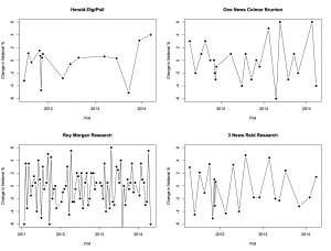
I was asked about this on Twitter this morning, so I went to get Peter Green’s data and aggregation model to see what it showed. In fact, there’s not much difference between the major polling companies in the variability of their estimates. Here, for example, are poll-to-poll changes in the support for National in successive polls for four companies

fourpollers


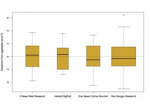
And here are their departures from the aggregated smooth trend

boxpollers


There really is not much to see here. So why do people feel that Roy Morgan comes out with strange results more often? Probably because Roy Morgan comes out with results more often.

For example, the proportion of poll-to-poll changes over 3 percentage points is 0.22 for One News/Colmar Brunton, 0.18 for Roy Morgan, and 0.23 for 3 News/Reid Research, all about the same, but the number of changes over 3 percentage points in this time frame is 5 for One News/Colmar Brunton, 14 for Roy Morgan, and 5 for 3 News/Reid Research.

There are more strange results from Roy Morgan than for the others, but it’s mostly for the same reason that there are more burglaries in Auckland than in the other New Zealand cities.

Distrust the center

Automated location information can be very useful, but if the ‘location’ is an area and the automated result is a single point, it’s easy to get misled.