Posts filed under Just look it up (284)

February 18, 2015

Petrol prices

From time to time I like to remind people about the national petrol price monitoring program. For example, when there’s a call for a review of fuel prices.

The Ministry of Business, Innovation & Employment (Economic Development Information) carries out weekly monitoring of “importer margins” for regular petrol and automotive diesel.  The weekly oil prices monitoring report is reissued each week with the previous week’s data.

The importer margin is the amount available to retailers to cover domestic transportation, distribution and retailing costs, and profit margins.

The purpose of this monitoring is to promote transparency in retail petrol and diesel pricing and is a key recommendation from the New Zealand Petrol Review

The importer margin for petrol over the past three years looks like this:

petrol-margin

The wiggly blue line is the week-by-week estimated margin; the shaded area is centered around the red trend line and covers 50% of the data. The margin had been going up; the calls for a review came just after it plummeted.

At the same site, but updated only quarterly, is an international comparison of the cost of fuel broken down into tax and everything else.

petrol-international

January 29, 2015

Absolute risk/benefit calculators

An interesting interactive calculator for heart disease/stroke risk, from the University of Nottingham. It lets you put in basic, unchangeable factors (age,race,sex), modifiable factors (smoking, diabetes, blood pressure, cholesterol), and then one of a set of interventions

Here’s the risk for an imaginary unhealthy 50-year old taking blood pressure medications

bp

The faces at the right indicate 10-year risk: without the unhealthy risk factors, if you had 100 people like this, one would have a heart attack, stroke, or heart disease death over ten years, with the risk factors and treatment four  would have an event (the pink and red faces).  The treatment would prevent five events in 100 people, represented by the five green faces.

There’s a long list of possible treatments in the middle of the page, with the distinctive feature that most of them don’t appear to reduce risk, from the best evidence available. For example, you might ask what this guy’s risk would be if he took vitamin and fish oil supplements. Based on the best available evidence, it would look like this:

vitamin


The main limitation of the app is that it can’t handle more than one treatment at a time: you can’t look at blood pressure meds and vitamins, just at one or the other.

(via @vincristine)

January 20, 2015

Is it misleading to say a majority of US public school kids live in poverty?

Yes.

Well, no.

Ok, yes, maybe.

This was the Washington Post headline: “Majority of U.S. public school students are in poverty“. It hasn’t made the NZ media, but some of you probably read about the rest of the world occasionally and might have seen it.

The original source, a report from the Southern Education Foundation, is careful not to use the word “poverty”.  They say 51% of public school students are low-income, defined as receiving free or subsidised school meals.  There’s a standard US government definition of poverty, used in defining eligibility for social programs, and by that definition 51% of public school students come from households with income less than 1.85 times the threshold for poverty.  The report also says what proportion get free school meals, for which the threshold is 1.35 times the poverty line, and it’s 44%.

They don’t give the proportion under the official poverty line. If the exact figure mattered for this post I could probably work it out from the American Community Survey, but since only about 10% of US kids are in private schools after kindergarten and before college, it’s going to be in the same ballpark as the proportion for all children — 22%.   It’s hard to see it being more than 30%.

On the other hand, the US has an unusual official definition of poverty.  In most Western countries, the poverty line is a set fraction (often 60%) of the median household income (adjusted somehow for household size). The US uses the price of a fixed set of foodstuffs and an estimate of what fraction of income goes on food, defined in 1963-4 and then updated using the CPI (actually, that’s what the Census Bureau uses, the rest of the government uses a simplified version of the same thing).  If you defined poverty by 60% of median household income, you’d come pretty close to the subsidized-meals threshold.  That is, defining poverty the way most other Western countries do, the headline is close to being correct.

On the other other hand, the Washington Post is a  US newspaper.  If you’re writing for the Post and you think it’s unreasonable to define ‘poverty’ to exclude a US family of three with an income (including cash benefits) of $20,000, I have some sympathy for your position. I still think you need to say your definition is different from the official one and wasn’t used by your source.

December 27, 2014

The Lesser Spotted Hutt Man Drought

From the Christmas Eve edition of the Upper Hutt Leader, which you can read online:

Ladies, be warned — Upper Hutt is in  the grip of a man drought

Here’s the graph to prove it (via Richard Law, on Twitter)

 upperhuttleader


As the graph clearly indicates, women outnumber men hugely in the 25-35 age range, and (of course) at the oldest ages. The problem is, the y-axis starts at 45%. For lines or points that’s fine, but for bar charts it isn’t — because the bars connect the points to the x-axis.

This is Stats New Zealand’s version of the graph, in standard ‘population pyramid’ form. It’s much less dramatic.

dbimages

We could try a barchart with axis at zero

huttzero

It’s still much less dramatic — and you can see why the paper chopped the ages off at 75, since using the full range available in the data wouldn’t have fit on their axes.  The y-axis wasn’t just trimmed to fit the data; it was trimmed beyond the data.

You could make a case that ‘zero’ in this example is actual 50%: we (well, not we, but journalists who have to fill space) care about the deficiency or surplus of members of the appropriate sex.

hutt50

Or, you could look at deficiency or surplus of individuals, rather than percentages

huttdiff

Using individuals makes the younger age groups look more important, which helps the story, but on the other hand shows that the scale of this natural disaster isn’t all that devastating.

That’s basically what the expert quoted in the story says. Prof Garth Fletcher, from VUW, says

“People in Upper Hutt or Lower Hutt, they go to parties, they go to bars, they go to places in the wider Wellington area.”

It was only when you started having a gap between men and women of more than 5 or 10 percent that there would be real world implications, he said.


[Update: My data and graphs are for Upper Hutt (city). That’s about 2/3 of the Rimutaka electorate, which is where the paper’s data are for]

December 22, 2014

How unrepresentative bogus polls can be

From @davejac on Twitter, clipped from Stuff

stuff-home


Since this is on the Census, we have good population data. If you include family-trust properties as ‘own’, which seems to be the intent, just over a quarter own mortgage-free, just under a third own but are paying a mortgage, and about a third are paying rent. The rest are more complicated.

The poll under-represents renters and over-represents owners, and it quite dramatically under-represents “Other”.

[update: those figures are for households, but the broad pattern of differences would be similar for people — there are more single-person households renting, but also large ones]

December 12, 2014

Diversity maps

From Aaron Schiff, household income diversity at the census area level, for Auckland

AKL-income-diversity-better

The diversity measure is based on how well the distribution of income groups in the census area unit matches the distribution across the entire Auckland region, so in a sense it’s more a representativeness measure —  an area unit with only very high and very low incomes would have low diversity in this sense (but there aren’t really any). The red areas are low diversity and include the wealthy suburbs on the Waitemātā harbour and the Gulf, and the poor suburbs of south Auckland. This is an example of something that can’t be a dot map: diversity is intrinsically a property of an area, not an individual


From Luis Apiolaza, ethnic diversity in schools across the country

luis-school-diversity


This screenshot shows an area in south Auckland, and it illustrates that ‘diversity’ really means ‘diversity’, it’s not just a code word for non-white. The low-diversity schools (white circles) in the lower half of the shot include Westmount School (99% Pākehā), but also Te Kura Māori o Ngā Tapuwae (99% Māori), and St Mary MacKillop Catholic School (90% Pasifika).  The high-diversity schools in the top half of the shot don’t have a majority of students from any ethnic group.

December 10, 2014

Not net tax

A recurring bad statistic 

But Finance Minister Bill English told Morning Report that was is not the answer, and half of all New Zealand households pay no net tax at all.

In some ways this is an improvement over one of the other version of the statistics, where it’s all households with income under $110,000 who collectively paid no net tax. It’s still misleading.  It seems to be modelled on the similar figure for the US, but the NZ version is less accurate. On the other hand, the NZ version is less pernicious — unlike Mitt Romney, Bill English isn’t saying the 50% are lazy and irresponsible.

In the US figure, ‘net tax’ meant ‘net federal income tax’, ie, federal income tax minus the subset of benefits that are delivered through the tax system.  In New Zealand, the figure appears to mean national income tax minus benefits delivered through the tax system (eg Working For Families tax credits) and also minus cash benefits delivered by other means.  In both cases, though, the big problem is the taxes that aren’t included.  In New Zealand, that’s GST.

The median household income in New Zealand is about $68,000. If we assume Mr English has done his sums correctly, this is where the ‘net tax’ starts (though the original version of the claim was 43% rather than ‘half’, which would push the cutpoint down to $50,000).  Suppose the household is paying 30% of income on housing (higher than the national average), which is GST-exempt, and that they’re saving 3%, eg, through Kiwisaver (also higher than the national average). By assumption, they get back what they pay in income tax, so they spend the rest. GST on what they spend is $6834: their tax rate net of transfers is about 10%. To get a negative “net tax” you need to include some things that aren’t taxes and leave out some things that are taxes.

If you use this table from 2011, which David Farrar at Kiwiblog attributed to English’s office, it looks like many people in the $30k-$40k band will also pay tax net of transfers

nettaxpaid-560x342

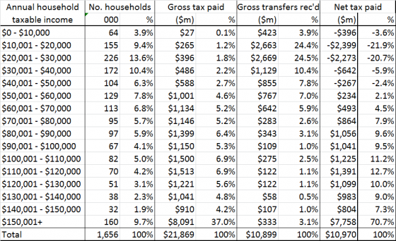
If everyone in that band was at the midpoint, and they had no tax deductions (so that the $35k taxable income is all the non-transfer income they have), the total taxable income plus gross transfers for that band is about $7150 million, and 15% of 60% of that is $643 million, so they’d have to use 40% of their money in GST-exempt ways to pay no tax net of transfers.  Presumably the switch from positive to negative tax net of transfers is somewhere in this band. So, somewhere between 27% and 37% of New Zealand households pay less in tax than they receive in transfers.

Of course, cash benefits aren’t the only thing you get from the government, and more detailed modelling of where taxes are actually paid and the value of education and health benefits estimates that the lower 60% of households (adjusted for household size) get more in direct benefits and social services than they pay in direct and indirect taxes — but a lot of that is ‘getting what you pay for’, not redistribution.

Most importantly of all, there isn’t an obvious target value for the proportion of households who pay no tax net of transfers. There’s nothing obviously special about the claimed 50% or the actual 30ish%. The question is whether increasing taxes and transfers to reduce inequality would be good or bad overall, and this statistic really isn’t relevant.


Previously for this set of statistics

December 1, 2014

National income map

From the Herald’s data blog again, an interactive map of household incomes across the country, by Chris McDowall.

This is a dot map, with one dot for each household. The locations aren’t exact, since that sort of information isn’t publicly available; they are placed randomly within the Census meshblock (which presumably explains the household in the middle of the old Mangere Bridge in the example below).

income-map

Dot maps handle varying population density much better than shaded maps: if you zoom out, you can see that typical household income is not even a thing in most of the geographical area of NZ, but if you zoom in on a city, like Auckland, or a small town, like Raetihi or Ohakune, you can see the patterns of income.

You can’t do everything with dots, though.  Firstly, they only work where there really is a location for each number. If you wanted to map air pollution or land value, the reality is spread out, not localised.

More interesting, though, is the comparison with this map from StatsNZ over household income over time in Auckland

census-income

A single household income is localised at a single point, but a change between two censuses isn’t.  If you used different dot locations for the four census times, some of the visual change would just be noise from the dot locations, but if you used the same dot locations you’d be implying that those specific households had those specific income changes.


November 9, 2014

The world’s most profitable crop?

pot

This chart is from a beautiful infographic about cash crops.  I don’t believe the cannabis revenue number. That’s partly because I read Keith Humphreys and Mark Kleiman on the subject.

Keith Humphreys takes apart a claim of $120 billion for the total value of the US marijuana market, showing that it can’t be anything near that much.

Current pot smokers report that they use marijuana an average of 60 days a year. Using our current example, 40 ounces/60 days of use means that the average user would have to go through 2/3 of an ounce of marijuana on each day that they used marijuana. That’s .67 X 50 or 33.5 joints per day of use. And there’s a terrific bridge for sale in Brooklyn too.

Even then, the purported $120 billion was the price to the consumer.  That’s not what was used for the legal crops, and it makes a big difference.

Suppose we agree use consumer price rather than farmer revenue because the data are slightly more reliable. I don’t really believe a number above about $12 billion for the US.  The US has about 1/5 of the world GDP. If the US spent $12 billion/year on cannabis, the rest of the world would need to spend almost $300 billion, or more than six times as much as a fraction of their income.  A lot of the world would need to spend more on pot than on basic carbohydrates.

It’s not inconceivable that the number is right — maybe cannabis is really big in, say, Brazil or India and I just don’t know about it — but it’s surprising enough that I’d want a lot more detail to justify it.

August 29, 2014

Getting good information to government

On the positive side: there’s a conference of science advisers and people who know about the field here in Auckland at the moment. There’s a blog, and there will soon be videos of the presentations.

On the negative side: Statistics Canada continues to provide an example of how a world-class official statistics agency can go downhill with budget cuts and government neglect.  The latest story is the report on how the Labour Force Survey (which is how unemployment is estimated) was off by 42000 in July. There’s a shorter writeup in Maclean’s magazine, and their archive of stories on StatsCan is depressing reading.