Posts filed under Just look it up (283)

May 4, 2015

US racial disparity: how do we compare?

There’s a depressing chart at Fusion, originally from the Economist, that shows international comparisons for infant mortality, homicide, life expectancy, and imprisonment, with White America and Black America broken out as if they were separate countries.

Originally, I was just going to link to the chart, but I thought I should look at how Māori/Pākehā  disparities compare. European-ancestry New Zealanders and Māori make up roughly the same proportions of the NZ population as self-identified White and Black do in the US. The comparison is depressing, but also interesting: showing how ratios and differences give you different results.

First, infant mortality.  Felix Salmon writes

A look at infant mortality, a key indicator of development, is just as grim. Iceland has 1.6 deaths per 1,000 births; South Korea has 3.2. “White America” is pretty bad — by developed-country standards — with 5.1 deaths per 1,000 births. But “Black America,” again, is much, much worse: at 11.2 deaths per 1,000 births, it’s worse than Romania or China.

According to the Ministry of Health,  Māori infant mortality was 7.7/1000 in 2011 compared to 3.7/1000 for non-Māori, non-Pacific. According to StatsNZ, the rate for Māori was lower in 2012 (the numbers don’t quite match: different definitions or provisional data).  So, the Māori/Pakeha ratio is similar to the Black/White ratio in the US, but the difference is quite a bit smaller here.

Incarceration rates show a similar pattern. In the US, the rate is 2207/100k for Blacks and 380/100k for Whites.  In New Zealand, the rates are (about) 700/100k for Māori and 100/100k for European-ancestry. The NZ figures include people on remand; I don’t know if the US figures do. The ratio is a bit lower in New Zealand, but the difference is dramatically lower.

Homicide rates are harder to compare, because New Zealand only started collecting ethnicity of victims last year, and because NZ.Stat will only show you one month of data at a time. However, it looks as though the ratio is a lot less than the nearly 9 in the US. More importantly, the overall rate is much lower here: our rate is 0.9 per 100k, the overall US rate is 4.5 per 100k.

If the Māori/Pākehā disparities are slightly less serious than US Black/White disparities as ratios but much less serious as differences, which comparison is the right one? To some extent this depends on the question: risk ratios may be more relevant as indicators of structural problems, but risk differences are what actually matter to individuals.
May 1, 2015

Have your say on the 2018 census


StatsNZ has a discussion forum on the 2018 Census

census

They say

The discussion on Loomio will be open from 30 Apr to 10 Jun 2015.

Your discussions will be considered as an input to final decision making.

Your best opportunity to influence census content is to make a submission. Statistics NZ will use this 2018 Census content determination framework to make final decisions on content. The formal submission period will be open from 18 May until 30 Jun 2015 via www.stats.govt.nz.

So, if you have views on what should be asked and how it should be asked, join in the discussion and/or make a submission


April 30, 2015

Half the median

From the Herald, under the headline “First-home buyers nab new home subsidies”

The AMP 360 First Home Buyer Affordability Report, published yesterday, shows housing remains “affordable” in all regions except Auckland and Queenstown.

The index tracked the lower-quartile (halfway between zero and the median) selling prices of houses and the median after-tax income of typical first-home buyers (a working couple both aged 25 to 29).

The lower quartile is not “halfway between zero and the median”. The lower quartile is the price that 25% of sales are below and 75% are above.

What’s more, the interpretation is obviously wrong. If you take the first Google link, at interest.co.nz, there’s a table by region, and it lists the lower quartile price for Auckland metro as $587000 and Auckland City as $681000. The Herald reports the median price often enough that they must know it isn’t over a million dollars.

While I’m complaining: the data table at interest.co.nz is in a state of sin. It’s not actually a data table; it’s a picture of a data table, a GIF image.

March 20, 2015

Ideas that didn’t pan out

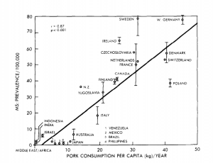
One way medical statisticians are trained into skepticism over their careers is seeing all the exciting ideas from excited scientists and clinicians that don’t turn out to work. Looking at old hypotheses is a good way to start. This graph is from a 1986 paper in the journal Medical Hypotheses, and the authors are suggesting pork consumption is important in multiple sclerosis, because there’s a strong correlation between rates of multiple sclerosis and pork consumption across countries:

pork

This wasn’t a completely silly idea, but it was never anything but suggestive, for two main reasons. First, it’s just a correlation. Second, it’s not even a correlation at the level of individual people — the graph is just as strong support for the idea that having neighbours who eat pork causes multiple sclerosis. Still, dietary correlations across countries have been useful in research.

If you wanted to push this idea today, as a Twitter account claiming to be from a US medical practice did, you’d want to look carefully at the graph rather than just repeating the correlation. There are some countries missing, and other countries that might have changed over the past three decades.

In particular, the graph does not have data for Korea, Taiwan, or China. These have high per-capita pork consumption, and very low rates of multiple sclerosis — and that’s even more true of Hong Kong, and specifically of Chinese people in Hong Kong.  In the other direction, the hypothesis would imply very low levels of multiple sclerosis among US and European Jews. I don’t have data there, but in people born in Israel the rate of multiple sclerosis is moderate among those of Ashkenazi heritage and low in others, which would also mess up the correlations.

You might also notice that the journal is (or was) a little non-standard, or as it said  “intended as a forum for unconventional ideas without the traditional filter of scientific peer review”.

Most of this information doesn’t even need a university’s access to scientific journals — it’s just out on the web.  It’s a nice example of how an interesting and apparently strong correlation can break down completely with a bit more data.

March 17, 2015

Bonus problems

If you hadn’t seen this graph yet, you probably would have soon.

bonuses CAQYEF4UYAA5PqA

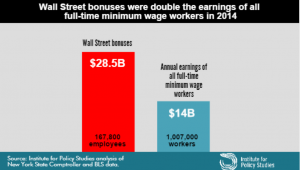
The claim “Wall Street bonus were double the earnings of all full-time minimum wage workers in 2014” was made by the Institute for Policy Studies (which is where I got the graph) and fact-checked by the Upshot blog at the New York Times, so you’d expect it to be true, or at least true-ish. It probably isn’t, because the claim being checked was missing an important word and is using an unfortunate definition of another word. One of the first hints of a problem is the number of minimum wage workers: about a million, or about 2/3 of one percent of the labour force.  Given the usual narrative about the US and minimum-wage jobs, you’d expect this fraction to be higher.

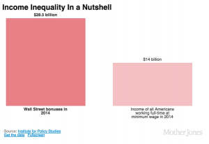
The missing word is “federal”. The Bureau of Labor Statistics reports data on people paid at or below the federal minimum wage of $7.25/hour, but 29 states have higher minimum wages so their minimum-wage workers aren’t counted in this analysis. In most of these states the minimum is still under $8/hr. As a result, the proportion of hourly workers earning no more than federal minimum wage ranges from 1.2% in Oregon to 7.2% in Tennessee (PDF).  The full report — and even the report infographic — say “federal minimum wage”, but the graph above doesn’t, and neither does the graph from Mother Jones magazine (it even omits the numbers of people)

On top of those getting state minimum wage we’re still short quite a lot of people, because “full-time” is defined by 35 or more hours per week at your principal job.  If you have multiple part-time jobs, even if you work 60 or 80 hours a week, you are counted as part-time and not included in the graph.

Matt Levine writes:

There are about 167,800 people getting the bonuses, and about 1.03 million getting full-time minimum wage, which means that ballpark Wall Street bonuses are 12 times minimum wage. If the average bonus is half of total comp, a ratio I just made up, then that means that “Wall Street” pays, on average, 24 times minimum wage, or like $174 an hour, pre-tax. This is obviously not very scientific but that number seems plausible.

That’s slightly less scientific than the graph, but as he says, is plausible. In fact, it’s not as bad as I would have guessed.

What’s particularly upsetting is that you don’t need to exaggerate or use sloppy figures on this topic. It’s not even that controversial. Lots of people, even technocratic pro-growth economists, will tell you the US minimum wage is too low.  Lots of people will argue that Wall St extracts more money from the economy than it provides in actual value, with much better arguments than this.

By now you might think to check carefully that the original bar chart is at least drawn correctly.  It’s not. The blue bar is more than half the height of the red bar, not less than half.

March 9, 2015

Not all there

One of the most common problems with data is that it’s not there. Families don’t answer their phones, over-worked nurses miss some forms, and even tireless electronic recorders have power failures.

There’s a large field of statistical research devoted to ways of fixing the missing-data problem. None of them work — that’s not my cynical opinion, that’s a mathematical theorem — but many of them are more likely to make things better than worse.  The best ways to handle data you don’t have depends on what sort of data and why you don’t have it, but even the best ways can confuse people who aren’t paying attention.

Just ignoring the missing data problem and treating the data you have as all the data is effectively assuming the missing data look just like the observed data. This is often very implausible. For example, in a weight-loss study it is much more likely that people who aren’t losing weight will drop out. If you just analyse data from people who stay in the study and follow all your instructions, unless this is nearly everyone, they will probably have lost weight (on average) even if your treatment is just staring at a container of felt-tip pens.

That’s why it is often sensible to treat missing observations as if they were bad. The Ministry of Health drinking water standards do this.  For example, they say that only 96.7% of New Zealand received water complying with the bacteriological standards. That sounds serious. Of the 3.3% failures, however, more than half (2.0%) were just failures to monitor thoroughly enough, and only 0.1% had E. coli transgression that were not followed up by immediate corrective action.

From a regulatory point of view, lumping these together makes sense. The Ministry doesn’t want to create incentives for data to ‘accidentally’ go missing whenever there’s a problem. From a public health point of view, though, you can get badly confused if you just look at the headline compliance figure and don’t read down to page 18.

The Ministry takes a similarly conservative approach to the other standards, and the detailed explanations are more reassuring than the headline compliance figures. There are a small number of water supplies with worrying levels of arsenic — enough to increase lifetime cancer risk by a tenth of a percentage point or so — but in general the biggest problem is inadequate fluoride concentrations in drinking water for nearly half of Kiwi kids.


March 5, 2015

Showing us the money

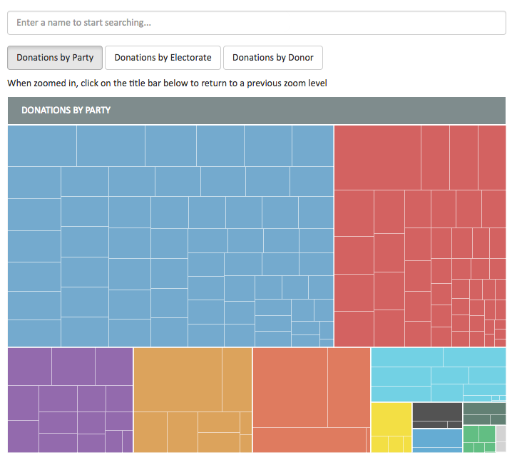
The Herald is running a project to crowdsource data entry and annotation for NZ political donations and expenses: it’s something that’s hard to automate and where local knowledge is useful. Today, they have an interactive graph for 2014 election donations and have made the data available

money

February 25, 2015

Wiki New Zealand site revamped

We’ve written before about Wiki New Zealand, which aims to ‘democractise data’. WNZ has revamped its website to make things clearer and cleaner, and you can browse here.

As I’m a postgraduate scarfie this year, the table on domestic students in tertiary education interested me – it shows that women (grey) are enrolled in greater numbers than men at every single level. Click the graph to embiggen.

Founder Lillian Grace talks about the genesis of Wiki New Zealand here, and for those who love the techy  side, here’s a video about the backend.


png


February 21, 2015

Another interesting thing about petrol prices

or What I Did At Open Data Day.

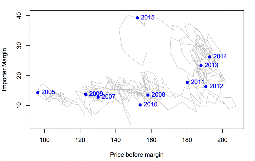
The government monitoring data on petrol prices go back to 2004, and while they show their data as time series, there are other ways to look at it.

petroltrend

The horizontal axis is the estimated cost of imported petrol plus all the taxes and levies. The vertical axis is the rest of the petrol price: it covers the cost hauling the stuff around the country, the cost of running petrol stations, and profit for both petrol stations and companies.

There’s an obvious change in 2012. From 2005 to 2012, the importer margin varied around 15c/litre, more or less independent of the costs. From 2012, the importer margin started rising, without any big changes in costs.

Very recently, things changed again: the price of crude oil fell, with the importer margin staying roughly constant and the savings being passed on to consumers. Then the New Zealand dollar fell, and the importer margin has fallen — either the increased costs from the lower dollar are being absorbed by the vendors, or they have been hedged somehow.


February 18, 2015

Petrol prices

From time to time I like to remind people about the national petrol price monitoring program. For example, when there’s a call for a review of fuel prices.

The Ministry of Business, Innovation & Employment (Economic Development Information) carries out weekly monitoring of “importer margins” for regular petrol and automotive diesel.  The weekly oil prices monitoring report is reissued each week with the previous week’s data.

The importer margin is the amount available to retailers to cover domestic transportation, distribution and retailing costs, and profit margins.

The purpose of this monitoring is to promote transparency in retail petrol and diesel pricing and is a key recommendation from the New Zealand Petrol Review

The importer margin for petrol over the past three years looks like this:

petrol-margin

The wiggly blue line is the week-by-week estimated margin; the shaded area is centered around the red trend line and covers 50% of the data. The margin had been going up; the calls for a review came just after it plummeted.

At the same site, but updated only quarterly, is an international comparison of the cost of fuel broken down into tax and everything else.

petrol-international