Posts filed under Just look it up (284)

April 27, 2013

Facebook data analysis and visualisation

From the Stephen Wolfram blog, lots of analysis of Facebook friend data with well-designed graphs.  For example, this graph shows how the mean age of your `friends’ is related to your age.

median-age-friends-vs-age2


Those under 40 have Facebook friends of about the same age, but after than the age distribution levels off and becomes much more variable.

April 26, 2013

Life expectancy doesn’t mean that

Tony Cooper has nominated a Bloomberg statistic (being reprinted in NZ) on life expectancy for Stat of the Week.

The `Sunset Index‘ purports to be the average number of years of life after you stop working, with figures ranging from 23.44 for Singapore to 1.49 for Nigeria. New Zealand is somewhere in the middle, with an index of 15.98.  It really isn’t credible that Nigerians who leave the workforce at age 50 die an average of 18 months later, so what have they done wrong?

Bloomberg have calculated life expectancy at birth, and subtracted the retirement age, but if you reach retirement, you’ve already avoided dying for a long time.  The life expectancy at retirement could be quite different from life expectancy at birth.  Since this difference is likely to vary between countries, the `Sunset Index’ won’t even be correct in relative terms.

So, how bad does it get?  If you look at life expectancy data for Nigeria you see that, indeed, life expectancy at birth is about 50 years, but that life expectancy at age 50 is 70.7 years for men and 72.6 for women. The true `Sunset Index’ value would be about 21, and Bloomberg are off by a couple of decades.

The error is less severe in other countries: infant and child mortality has a big impact on life expectancy at birth,  and in Nigeria about one child in seven dies before age 5. Here are a few corrected values for the Sunset Index

  • Singapore: 25
  • Nigeria: 21
  • Iran: 21
  • New Zealand: 20
  • USA: 16.5
  • Bangladesh: 13

The US is near the bottom of the corrected index because it combines a late retirement age (by Bloomberg’s definition — full Social Security eligibility) with only moderately good life expectancy.

April 19, 2013

Are Adam and Steve waiting out there?

Graeme Edgeler says on Twitter

I know many gay couples will want to marry quickly, but there *must* be a couple named Adam & Steve and we should totally let them go first.

Should we expect an Adam and Stephen couple? This is an opportunity to use public data and simple probability to get a rough estimate.

StatsNZ reported just over 5000 cohabiting male couples in 2006. That’s an underestimate of male couples, but probably an overestimate of those planning to marry soon.

I remembered seeing Project Steve, from the National Center for Science Education.  They collect signatures supporting the teaching of evolution from scientists named Stephen (after Stephen J. Gould) — they are currently up to 1268 — and make the point that under 1% of US males are named Stephen.

It turns out that they get this information from the US Census.  The most recent data is 1990 (and, of course, is US) so it’s not ideal, but it will give us a rough idea.  Stephen comes in at 0.54%, and when you add in Stephan, Esteban, Stefano, it still is no more than 0.6%.  Adam is 0.259%.

Under random assignment, then, there would be less than a 1 in 10 chance that there’s a couple called Adam and Steve living together in NZ, and even then they might well not be planning to get married.


[Update: Brendon correctly points out that I missed ‘Steven’, which is actually the most common variant. Apart from demonstrating that I’m an idiot, this doesn’t change the basic message.]

April 17, 2013

Visualising New York income inequality

From the New Yorker, a set of graphs showing how median household income varies along each subway line, based on the census tract containing each station.

Here’s the graph if you take the A-train:

atrain

(via @brettkeller)


Open data on the West Island

If you want to get Australian census summary data, you can download it from the Australian Bureau of Statistics, or buy a DVD for A$250.

An article in iTNews explains why someone might pay rather than downloading

“You have to click to download each pack individually, and they’ve set the site up deliberately to make it difficult to use a browser plugin to download everything that is contained on the released DVD image,” Bowland told iTNews.

That’s not hyperbole: Grahame Bowland quotes JavaScript code comments that actually say they are trying to make automatic downloading difficult.

Or, the data release is now available using bittorrent, thanks to Bowland, who bought the DVD (this is perfectly legit: the data are Creative Commons licenced).

(via @keith_ng)

April 10, 2013

Health claims not berry well supported

I don’t usually bother with general nutrition stories that don’t contain any direct reference to research, but the Herald story about berries was irresistible. There are lots of biologically active compounds in berries, and many of them have been shown to have interesting properties in test-tubes or mice. As you know by now,  this sort of interesting biochemistry is important because it occasionally translates to genuine health benefits, so you should be asking what the human clinical research shows.

If you go to the Cochrane Library (which is free to everyone in New Zealand), and look for clinical research in humans involving blueberries or cranberries you don’t find much. The only topic with enough information to draw any sort of conclusion is on cranberry juice to prevent urinary tract infections. Which it basically doesn’t. The plain-language summary says

Cranberries (usually as cranberry juice) have been used to prevent urinary tract infections (UTIs). Cranberries contain a substance that can prevent bacteria from sticking on the walls of the bladder. This may help prevent bladder and other UTIs. This review identified 24 studies (4473 participants) comparing cranberry products with control or alternative treatments. There was a small trend towards fewer UTIs in people taking cranberry product compared to placebo or no treatment but this was not a significant finding. Many people in the studies stopped drinking the juice, suggesting it may not be a acceptable intervention. Cranberry juice does not appear to have a significant benefit in preventing UTIs and may be unacceptable to consume in the long term. 

As with many fruits and vegetables, eating more of them instead of other stuff is both enjoyable and probably healthy. As with pretty much any food, there might be some specific additional benefits (or harms), but if so we don’t yet have much evidence for them.

Another NZ blog

JustSpeak is

a non-partisan network of young people speaking to, and speaking up for a new generation of thinkers who want change in our criminal justice system.

I’m linking because they have a good visualisation of the recently-released police crime statistics, comparing the proportion of apprehensions leading to prosecution among Maori and Pakeha youth. The back-to-back bar charts take advantage of the brain’s ability to detect lack of symmetry.

youfcrime

I probably would have left out the homicide category, which has too few to compare, and it would be interesting to see if small gaps between the categories help.

The real problem is in interpretation.  It’s hard to say what you’d expect just from economic differences and differences in where people live, without any differences in how they are treated by police. A higher proportion of prosecutions could mean the police are using their discretion to prosecute more Maori youth, but a lower proportion of prosecutions could just as easily have been interpreted as harassment of innocent Maori youth.


April 8, 2013

Explore your budget

Keith Ng’s annual NZ Budget visualization seems to be up. Go play.

You might also like last years’ one.  And possibly even the 2011 radioactive space donut.

April 3, 2013

Infographic of the day.

Our only Prime Minister has tweeted an infographic of the new crime figures

key


In his defense, I will first concede that Mr Key is not regarded as an unbiased source of information, so he doesn’t have the same responsibilities that journalists do.

Still.

One of the basic and classical problems with representing numbers by pictures (apart from the choice of picture) is scaling.  The crime rate was 16% lower in 2012 than in 2008. The blue bottle is 16% smaller in every dimension than the red bottle.  If you just look at the size of the picture, the area of the blue bottle is nearly 30% smaller than the red bottle. If you take the visual metaphor seriously, these bottles have volume, and the volume of the blue bottle would be 40% smaller.

One of the other basic and classical problems discussed in books on misleading statistical graphics is picking two points out of a time series. Using data from Stats New Zealand, we can plot 17 years.

keygraph


Crime has been decreasing for a long time, at roughly the same rate.  Mr Key’s graph corresponds to the red line.

Crime news vs crime data

If you actually look at the data, neither the Herald nor Stuff comes off well in today’s crime figure reports.  Stuff has the headline “Crime drop due to ‘tag and release'”, and it’s not until the third paragraph that they admit the ‘tag and release’ impact is on court workloads and has nothing to do with  number of crimes reported.  The Herald says

Crime is at its lowest level in 24 years but the percentage of offences that police solve is also dropping – less than half of all cases.

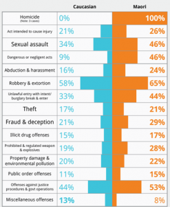
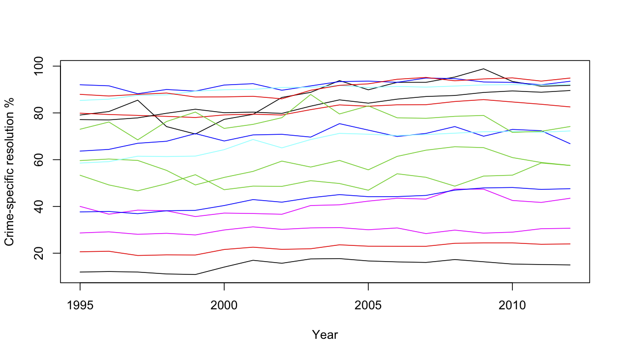
This is at least technically true, but the drop they are talking about is less than one percentage point, when the resolution rate differs between types of crime by about 90 percentage points. Even a small change in the relative numbers of different offenses would make a one percentage difference in overall resolution rate meaningless.  Here, using data from Stats New Zealand are the resolution rates for 16 categories of crime over the past 18 years.

crime-specific

I haven’t tried to label them all, but at the top are homicides, acts intended to cause injury, illegal drug offenses, and offenses against justice procedures and government operations.  The reasons vary:  the resolution rate for violent crimes is high because police put a lot of effort into solving them;  the rate is high for drug offenses because they aren’t usually reported except when the police discover them.  At the low end are burglary and unlawful entry, where the vast majority of cases are never resolved.  If anyone is trying to sell you a policy based on a small change in the average of these, without accounting for variation in proportions, you should keep a firm grip on your wallet.

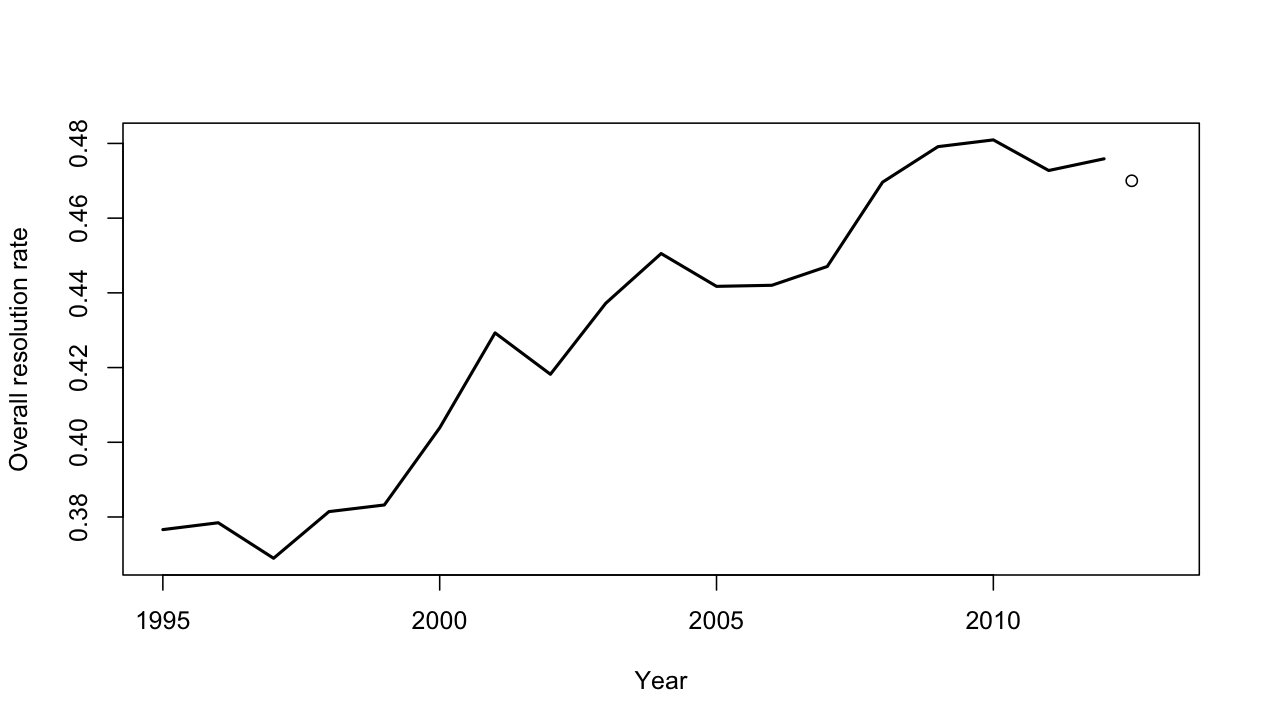
Against that background, what does the trend in resolution rate look like?

overall


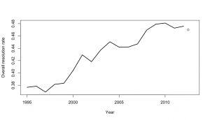
The lines show the past 18 fiscal years, the dot shows todays data for the 2012 calendar year.  It’s possible that the resolution rate is flattening out at its peak of 48%, or even decreasing slowly over the past few years, but it’s hardly convincing evidence of a trend.


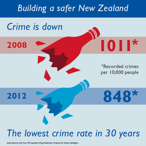
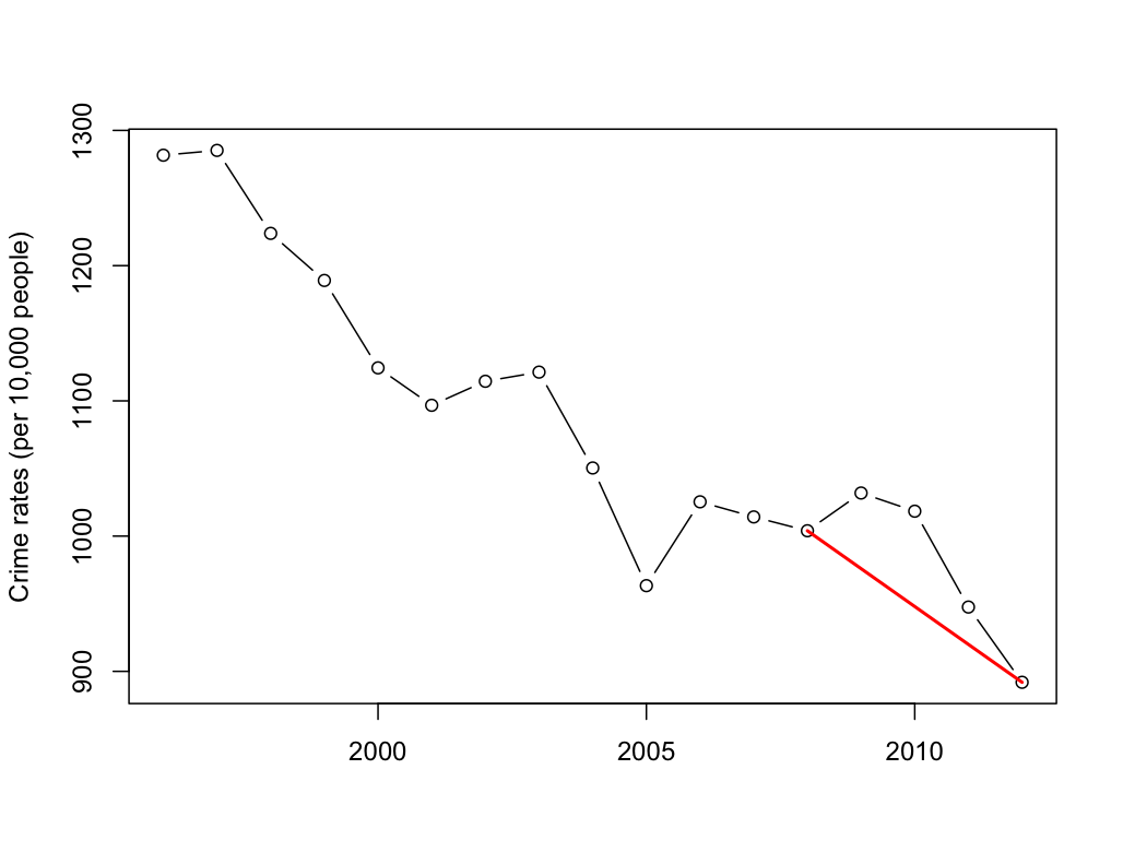
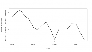
The change in recorded crimes over time is also a fairly noisy trend, but generally downwards even before we account for population growth

recorded


It’s also worth pointing out that preventing crime is important, but catching criminals is beneficial primarily as a means of preventing crime.  A low crime rate with few crimes resolved is far preferable to a high crime rate with most crimes resolved.   The easiest way for the police to increase the resolution rate would be to put more effort into catching drug users, but it would be hard to regard that as the most socially useful way to spend their time and taxpayers money.