Posts filed under Just look it up (284)

October 25, 2013

A third of young Americans have been arrested

Via Keith Humphreys, being arrested is a very common experience for young people in America: using the National Longitudinal Survey of Youth, Richard Braeme and colleagues found

By age 18, the in-sample cumulative arrest prevalence rate lies between 15.9% and 26.8%; at age 23, it lies between 25.3% and 41.4%. These bounds make no assumptions at all about missing cases. If we assume that the missing cases are at least as likely to have been arrested as the observed cases, the in-sample age-23 prevalence rate must lie between 30.2% and 41.4%. The greatest growth in the cumulative prevalence of arrest occurs during late adolescence and the period of early or emerging adulthood

October 24, 2013

Burning issue

I’m in Sydney at the moment, so this is topical, as well as being an illustration of maps, infographics, and internet fact-checking.

From Paul Rosenzweig on Twitter, allegedly a map of the bushfires shown on NBC News in the US

attributed to NBC News

People in Australia think this map is hilarious/outrageous depending on personality — the current emergency was just in New South Wales.  That was my reaction too. But the NBC News blog gets this right, which is a bit confusing

However, @Aus_ScienceWeek, the people who run National Science Week, point out that the map looks rather like the appropriate subsection of NASA’s satellite-based fire map from mid-September

firemap.2013251-2013260.2048x1024


so it might well be correct in the sense that there actually fires in those places, though still wrong as a description of the emergency.


October 14, 2013

Briefly

October 13, 2013

Think of a number and multiply by 80000

Bernard Hickey in the Herald

Imagine the public outrage if it were discovered that more than 80,000 New Zealanders were receiving wages, salaries and investment incomes of more than $6 billion a year, but were also receiving a benefit from the Government.

and

Income figures this week from Statistics NZ show more than 80,000 New Zealanders over the age of 65 receive wages, salaries and investment returns of more than $6.5 billion a year while claiming NZ Super.

It certainly helps to summon the outrage if you uses totals rather than averages. I  think there could be a reasonable case for means-testing NZ Super, but these numbers are not a contribution to informed public debate.

I’m not even sure where he got the data: he says “income figures this week from Statistics NZ”, and the only plausible source on the Stats NZ release calendar seems to be the NZ Income Survey, released on October 4. But in the NZ Income Survey data, table 8 says there are only 53,900 people aged 65+ with income above $1150/wk, which works out to just under $60000/year (including their NZ Super, of course).  His figures could still be right — perhaps the very wealthy people at the top drag the total up —  but they can only be right in the same sense as Bill English‘s “people earning under $110000 collectively pay no net income tax”.

Imagine the public outrage if it were discovered that nearly 54000 retired New Zealanders were earning over $45000/yr  from investments and salaries and still collecting NZ Super as well. Go on, imagine it.

October 5, 2013

I refer the Honorable Member to the answer given some moments ago

There’s an interesting story in Stuff today about an increased risk of death in people who drink lots of coffee. One of the interesting things about it is that the Herald has the same story about two weeks ago. And when I say “the same story”, I mean almost word for word the same AAP story.  I wasn’t convinced then (neither was Andrew Gelman), and it hasn’t gotten any more convincing.

The other interesting thing about the story is that the research paper was published in Mayo Clinic Proceedings. “What’s interesting about Mayo Clinic Proceedings?”, you ask, having never heard of it.  That’s my point. There are some scientific journals whose press releases you’d expect the media to monitor, and you’d expect to see stories about research papers with popular appeal. Mayo Clinic Proceedings is not really one of those journals, and it isn’t clear how this research came to the attention of AAP.

October 1, 2013

Making up numbers

Bob Jones, in the Herald

But although the offenders are male, 99.999 per cent of men are not rapists and feel just as outraged as women do about it.

He’s obviously just pulled that number out of his head (or somewhere else round and inappropriate), since it would imply only about 20 male rapists in New Zealand. About 20 times that number were convicted and sent to prison just last year for sexual assault or aggravated sexual assault.

A lot of men have a hard time believing that rape is as common as it is — either because they can’t imagine doing it, or because they do it and don’t think it’s rape. But there are good-quality high response-rate surveys showing that lots of women have been raped, and if only a tiny minority of men are rapists, they have to be very busy.

Bob Jones is off by at least three, and quite likely more than four orders of magnitude. That must be close to a record.

(update)

September 27, 2013

Nuclear warming?

From the Guardian, some time ago

Jeremy Clarkson had a point – and that’s not something you hear me say every day (indeed, any day) – when in a recent Sun column he challenged the scientists […] who had described a slab of ice that had broken away from Antarctica as “the size of Luxembourg”.

“I’m sorry but Luxembourg is meaningless,” said Clarkson, pointing out that the standard units of measurement in the UK are double-decker London buses, football pitches and Wales. He could have added the Isle of Wight, Olympic-sized swimming pools and Wembley stadiums to the list.

These journalist units of measurements are useful only to the extent that they are more familiar and easily understood than the actual numbers.

From The Conversation, more recently, David Holmes begins

The planet is building up heat at the equivalent of four Hiroshima bombs worth of energy every second. And 90% of that heat is going into the oceans.

This image comes originally from John Cook, who writes

bomb

So I suggest a sticky way to communicate global warming is to express it in units of Hiroshima bombs worth of heat. This ticks all the sticky boxes:

  • It’s simple – nothing communicates a lot of heat like an A-bomb.
  • It’s unexpected – whenever I explain this to audiences, their eyes turn into saucers. Almost noone realises just how much heat our climate system is accumulating.
  • It’s concrete – nobody has trouble conceptualising an A-bomb. Well, much of the younger generation don’t know about Hiroshima – when I test-drived this metaphor on my teenage daughter, she asked “what’s Hiroshima?”. But it’s easily recommunicated as an atomic bomb.
  • It tells a story – the idea that second after second, day after day, the greenhouse effect continues to blaze away and our planet continues to build up heat.
  • The only downside of this metaphor is it is emotional – the Hiroshima bomb does come with a lot of baggage. However, this metaphor isn’t used because it’s scary – it’s simply about communicating the sheer amount of heat that our climate is accumulating. I’ve yet to encounter a stickier way of communicating the scale of the planet’s energy imbalance.

I think he’s wrong about the  downside.  The real downside is that the image of Hiroshima has nothing to do with heat production.  The Hiroshima bomb was important because it killed lots of people, many of them civilians, ended the war, and ushered in the age of nuclear weapons where a small number of military or political leaders had the ability to destroy industrial civilisation and kill the majority of our species (which nearly happened, 30 years ago today).

If we set off four Hiroshima-scale bombs per second, global warming would become a relatively unimportant side issue — and in fact, nuclear weapons are much more widely associated with nuclear winter.

You could also invoke public health concerns and describe the heat accumulation as equivalent to everyone in the world smoking seven cigarettes per second (1185 cal/cig: data). That would be wrong in the same ways.

September 19, 2013

Petitions and polls

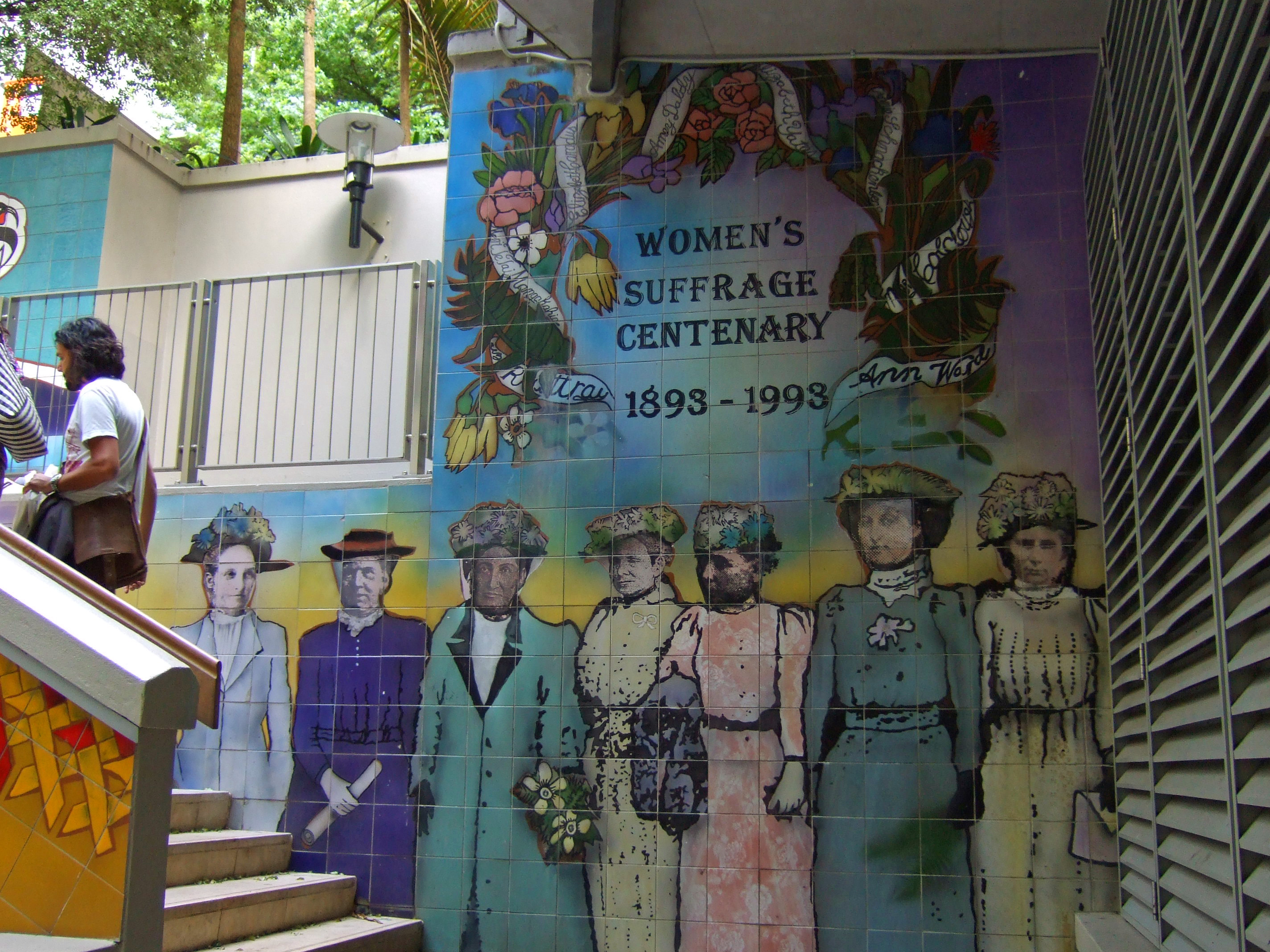
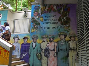
Today is the 120th anniversary of women’s suffrage in New Zealand, with commemorations in a range of places, including the Centenary fountain in Khartoum Place, Auckland

Khartoum_Place2


The petition for women’s suffrage, signed by about 24000 women, was submitted to Parliament in July 1893

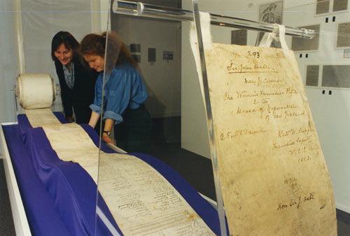
and the names of the petitioners have been digitised and made available at New Zealand History Online.

I haven’t been able to work out exactly what the adult female population of NZ was at the time, but the digital yearbook says that there were 305287 non-Maori females, that 30.94% were married and 4.11% widowed, and that there were 67000 never-married females 15 and older.  Depending on how many of the never-married 15+ were 21 or older, this gives perhaps 150000, so about 16% of the non-Maori adult female population signed the petition. That compares to modern petitions with about 2.4% of voting-age people opposing marriage equality and about 10% for the anti-asset-sales petition (though these are targeting the entire NZ voting population, not just women).

Presumably, rather more than 16% of women were in favour of getting the right to vote, but it’s always difficult to track people down and get them all to sign.  In 1893 there wasn’t an alternative: sampling hadn’t been invented, and would likely have been impractical  — certainly, calling random phone numbers wouldn’t have got you very far.

Today, we have much more accurate ways of estimating the proportion of people who support some government action. Petitions, like demonstrations, are mostly useful for signalling to the government that some issue they weren’t  aware of is actually important.  For example, the petition against animal testing for legal highs would have been effective to the extent that the government wasn’t aware people cared about the issue. For anyone who was aware this was a political issue, a well-conducted opinion poll would be more informative and should be both less expensive and more effective than a petition.

Referendum petitions, as in New Zealand and some parts of the US, are an example of this principle: if an issue can get the support of 10% of the NZ voting population, it’s probably important enough to be worth serious consideration and debate.  The threshold is weaker in many places. For example, in California a petition need only get 5% of the number of people who voted in the last election for state governor, which currently comes to under 2% of the adult population.

September 17, 2013

What you’re not paying for medicines

From Pharmac’s annual report for 2012 (via @sudhvir), a graph comparing actual government expenditure on subsidised drugs (red) with what would be projected under pre-Pharmac subsidy policies (blue)

BUVq0j2CEAAlYtj


This table from the report shows some of how this was done. It shows the twenty drugs on which the most money was spent

top20


Many of these are new (any drug whose name ends in ‘b’ is likely to be new), but they are mostly drugs that are genuinely better, at least for a subset of patients, than the alternatives.  The top of the list, atorvastatin, lowers cholesterol more effectively than the cheaper simvastatin. It’s the best selling drug of all time, but in New Zealand is used only in a relatively small set of  people whose cholesterol doesn’t go down enough on simvastatin. Adalimumab was a breakthrough in serious rheumatoid arthritis, and trastuzumab is the revolutionary breast cancer treatment sold as Herceptin.

Further down the list, candesartan is a blood pressure drug that can be used in people who have side-effects with some other blood pressure drugs. In Australia, candesartan and its relatives are used very widely; here they are used only when other drugs are insufficient or not tolerated.

Pharmac isn’t perfect, and I think it’s underfunded, but it does a very good job of getting most of the benefit of modern pharmaceutical medicine at a very low price.

September 13, 2013

Briefly

From this morning’s Twitter feed

  • An animated GIF (click on it to wake it up) showing how to improve a barchart by removing junk. [from Darkhorse Analytics: Data looks better naked]

data-ink


  • Data journalism: how the data sausage gets made.  Jacob Harris describes how he collected and summarised data on meat recalls in the US
  • The Royal Statistical Society has repeated the simple maths test they gave politicians last year, this time for senior professionals and managers. Less than half of them could give the probability of getting two heads from tossing two coins.
  • However, the same Royal Statistical Society news item ends “The figures have been weighted and are representative of all GB adults (aged 18+)”. This seems to me to fall in the “not even wrong” category. The target group aren’t remotely representative of all British adults, and I’d be surprised if it was even possible to reweight them to the national age distribution.
  • Cathy O’Neill (mathbabe.org) asks why rankings of eg, cars or universities don’t allow the user to change priorities for different attributes (as the OECD Better Life Index does, for example)