Posts filed under Just look it up (284)

November 16, 2013

What people die of

The Institute for Health Metrics, at my previous university  in Seattle, has a new tool for visualising the causes of death and disability across the world with interactive graphics.

This pair of maps is for cancer in women.

cancer


The lower map is just cancer deaths per 100,000 women.  That’s the easiest sort of number to obtain, but the problem with it is obvious: the orange and red countries are mostly just the places where the female population is older than average.

The upper map is age-standardised deaths per 100,000 women. That is, you take the rate in your country for women of a particular age, say 72 years old , and multiply by the proportion of 72-year olds in the UN’s standard reference population. When you do this for each year of age and add up the results, you get an estimate of what the cancer rate differences really are like, averaged over ages.

The map looks completely different after standardising by age. In particular, there’s a lot less variation between countries. The lowest rate is in Saudi Arabia, which is wealthy enough to afford good medical care but still has low rates of many cancer risk factors in women. The highest rate is Papua New Guinea, which has very high rates of cervical cancer (affecting younger women than many cancers).

Fun with percentages

This week there was a quarterly report estimating smartphone market share for different operating systems, which turned out to be  packed with trapdoors for the unwary reporter.  The NZ media largely avoided  the problems (mostly by sensibly ignoring the report) but many international tech sites leaped in with both feet.

The basic information is in this table:

iphone


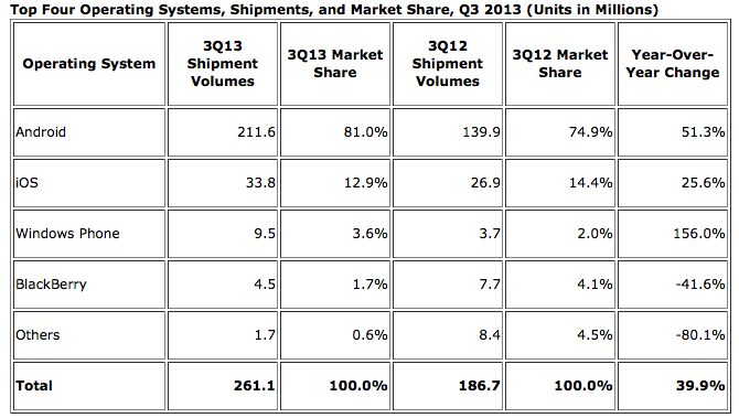
There are some important nerdy details in interpreting the numbers, such as the difference between “shipments” and “sales,” but we can ignore those for now. The main problem came in picking which numbers to report. The popular ones were the 81.0% market share for Android, the 1.5% fall in market share for Apple’s iOS, and the 156% increase in shipments for the Windows Phone.

The big rise in Windows phones is due (as the report points out) to the fact that there were basically no Windows phones being sold last year, and that’s now increased to some Windows phones being sold — not only is Windows still well behind iOS and Android, but its increase in actual phones shipped was smaller than the increase for either iOS or Android.  That’s all clear just from the numbers in the report.

Android has obviously been really successful, but 80% market share doesn’t mean quite as much as it sounds: this is just one quarter of phone shipments, and nowhere near 80% of the smartphones already out there are Android — the installed base is still much larger for iOS. If you’re writing the next Candy Crush or Angry Birds, what you care about most is the number of potential customers on each operating system. On the other hand, if you’re interested in current cash flow, so that one quarter’s shipments are relevant, you care about revenue or profit, which are lower per phone for Android (which is why I now have an Android phone).

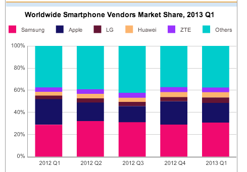
And, finally, if you’re a tech writer, as Kit Eaton points out, you should know enough about the industry to realise that Apple made a much-anticipated announcement of two new iPhone models at the end of September.  Given a choice, many people (and not just psychotic Apple fanboys) would want to wait until the new phones appeared, either to buy one or to get discounted obsolete model. You’d expect iOS sales to be lower  in the preceding quarter. This isn’t just hypothetical: the chart from the April IDC press release (we’re not digging very deep here) shows the contraction and expansion in Apple market share around the release of the previous model, the iPhone 5, last September.

phones


On the  other hand, at least the fact that last year also had a new iPhone release means that ignoring the context sort of cancels itself out.

(via @juhasaarinen)

November 13, 2013

Two open-data links

Actually existing open data in Australia (via @juhasaarinen):

The number of datasets available on the Government’s open data website has slimmed by more than half after the agency discovered one third of the datasets were junk….

“We unfortunately found that a third of the “datasets” were just links to webpages or files that either didn’t exist anymore, or redirected somewhere not useful to genuine seekers of data,” Sheridan said.

Do-it-yourself open data in NZ : Graeme Edgeler on the Official Information Act

Some time last year [note: 2010], I realised that you could find stuff out by asking the Government. It used to be I’d have had a discussion with someone, or read a news story or made a blog comment and thought to myself “I wonder if they …” or “how many …” and I wouldn’t try to find out. And then once – for some reason – likely the personal satisfaction of knowing I was right about something – I flicked off an email to a government department asking them for some small piece of information.


November 12, 2013

Screaming above our weight

Via @BenAtkinsonPhD: a map of heavy metal bands per capita

metal


We’re ahead of the US, though behind the Scandinavian countries, as usual.

(for foreigners: NZ political cliche)

November 8, 2013

Spending on foreign aid

It’s been a while since the last StatsChat bogus poll, so here’s a new one. Answer it before you read on

(more…)

November 6, 2013

Data journalism resources

The website datadrivenjournalism.net says

The website is part of an European Journalism Centre initiative dedicated to accelerating the diffusion and improving the quality of data journalism around the world. We also run the online course Doing Journalism with Data as well as the School of Data Journalism, and are behind the acclaimed Data Journalism Handbook. 

A couple of interesting links in particular

October 31, 2013

Scary lack of context

A number that should be in all stories about accidents on special days of the year: 4500.  That’s roughly how many new claims ACC gets per day: divide the 1.7 million per year by 365.

The Herald passes on the ACC’s figures of 31 Halloween-related injuries and 840 attributed to Guy Fawkes. First you have to divide by five, since these are aggregate totals over five years. Then divide by the average number of claims per day to find that Guy Fawkes Day is responsible for about 4% of a typical day’s injuries, and Halloween racks up about 0.1% of a day.

It wouldn’t be surprising if Halloween actually prevented more injuries than it causes — participating children will be doing something safe under adult supervision, rather than teasing innocent pets, fighting with siblings, getting underfoot in the kitchen, or participating in team sports.

October 27, 2013

Fast-food outlets and obesity

Everyone knows that areas with more fast-food stores have more overweight people, and it certainly makes sense that fast food is bad for you. Like almost everything else, though, it gets more complicated when you start looking carefully.

Firstly, earlier this year Eric Crampton wrote in NBR about some research by an economics PhD student, Rachel Webb, who was trying to take advantage of this well-known relationship to unpick some aspects of correlation vs causation in the relationship between mother’s weight and infant’s birthweight. She found that, actually, areas in New Zealand with more fast-food outlets didn’t have more obesity to any useful and consistent extent.

Secondly, there’s new research on diet and fast food using data from the big NHANES surveys in the USA.  It confirms, as you might expect, that people who eat more fast food also eat less healthily at other times.


What you do know that ain’t so

In 2006, statistics celebrity Hans Rosling asked students at the Karolinska Insitute about international child mortality. In each of the following pairs of countries (presented in alphabetical order within pairs), which one has higher child mortality?

  • Sri Lanka or Turkey?
  • Poland or South Korea?
  • Malaysia or Russia?
  • Pakistan or Vietnam?
  • South Africa or Thailand

None of these are close — they differ by at least a factor of two — but the students did significantly worse than chance, averaging less than two correct answers out of five.

Gapminder.org has a new ‘Ignorance Project’ aiming to find out what important facts about global health and welfare are widely misunderstood.  They don’t just have a naive ‘information deficiency’ view of this ignorance:

When we encounter ignorance, we want to find a cure. Sometimes the facts just have to be delivered. But in many cases, the facts are little known as they don’t fit with other misunderstandings, they are counterintuitive, such as the most of the outdated concepts about the world population. In these cases we need to invent a new simple way to explain it. Those new explanations are the essence of Gapminder’s new free teaching material that make it fun and easy to teach and to learn a fact-based worldview.

It may not work, but it’s worth a try

(more…)

One in ten?

From Stuff, under the headline ‘One in 10 Kiwis now alcoholic

One in 10 New Zealanders could now be considered “alcoholic” according to new diagnostic criteria – but the majority of those with a drinking problem are unlikely to recognise it because the issue is so common.

The new estimate of 400,000 “alcoholics” in New Zealand – around 10 per cent of our 4.4 million population – was tallied up by Professor Doug Sellman from the National Addiction Centre at the University of Otago.

It is significantly higher than the Ministry of Health’s 2006 estimate which says 3 to 6 per cent of the population has an alcohol issue.

Sellman’s figures are based on the new diagnostic criteria for “alcohol use disorder” recently published in the fifth edition of the Diagnostic and Statistical Manual (DSM) of the American Psychiatric Association.

From the president of the American Society for Addiction Medicine, in a review of DSM-V

DSM-5 has “Alcohol Use Disorder,” which comes in mild, moderate and severe flavors, suggesting the inadequate pyramid approach. There are 11 possible symptoms of the “use disorder,” of which two are necessary to achieve a mild specifier, four for moderate and six for severe. “Alcohol use disorder is defined by a cluster of behavioral and physical symptoms,” the authors of DSM-5 state. I have no problem with that except that some may confuse “alcohol use disorder” with addictive disease or with alcoholism

Some may, indeed.