Posts filed under Just look it up (284)

April 9, 2014

Busable Wellington

In response to a reader request, here are the same bus service maps as for Auckland. Again, click for big PDF files so you can zoom in.  I think these include non-bus transit, but I’m not completely sure.

Hours per day with at least six transit trips within 500m

wellybus6png


Hours per day with at least 12 transit trips within 500m

wellybus12png


In the Wellington region it seems that people who have any bus service have a useful amount.

The region as a whole has a smaller proportion of people with good public transport than Auckland region (7% in the top category, 60% in the bottom), but if we restrict to Wellington City there are 17% in the top category, 26% in the next, and only 30% in the lowest.


[Update: Here’s a version with a 1km distance instead of 500m]


April 8, 2014

Busable Auckland

Bus commuter services can be very useful in reducing traffic and parking congestion in the city center, but reducing the average number of cars per household requires buses that are available all the time. I used the Auckland Transport bus schedule data and the new StatsNZ meshblock data and boundary files

Here’s a map of Auckland showing how many hours per day (on average) there are at least six bus trips per hour stopping within 500m of each meshblock (actually, within 500m of the ‘label point’ for the meshblock).

On a single road, six trips per hour is one trip in each direction every twenty minutes. The dark purple area has this level of service at least 16 hours a day on average. (Click for the honking great PDF version.)

bus6png

For twelve trips per hour (eg, one every twenty minutes on two different routes) the area shrinks a lot

bus12png

The reason for using meshblocks in the map is that we can merge the bus files with the census files. For example, for Auckland as a whole, 50% of the population is in the grey busless emptiness, 17% in the 8-16 hour tolerable zone, and 12% in the pretty reasonable 16+ hour zone.   People of Maori descent are more likely to be unbused (60%) and less likely to be well bused (8%), as are people over 65 (60% in the lowest category, 9% in the highest).

Recent (<10 years) migrants like transit: 18% of us are in the good bus category and only 40% in the busless category.

April 2, 2014

Census meshblock files: all the datas

Statistics New Zealand has just released the meshblock-level data from last year’s Census, together with matching information for the previous two censuses (reworked to use the new meshblock boundaries).

Mashblock shows one thing that can be built with this sort of data, there are many others.

Get your meshblock files here

March 30, 2014

Inflation adjustment before breakfast

I saw this story in the Herald and didn’t read it in detail, just thought it was an interesting calculation to do

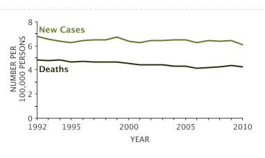
The Financial Times reported last week that the average global price of eight breakfast staples had risen almost 25 per cent this year.

The increases mainly affected coffee, orange juice, wheat, sugar, milk, butter, cocoa and pork.

We decided to create a Kiwi version of the Financial Times story and Statistics NZ food price figures reveal New Zealand families are not exempt from the trend.

David Farrar did read the story, and so was rather less impressed, as he also mentioned on Twitter.  The problem is that the calculation was done wrong.

If you served tomatoes, mushrooms, bacon, toast, eggs, tinned spaghetti and cereal, with coffee, tea and orange juice this weekend, it would have cost you 6.9 per cent more than the same meal in 2008, and almost 3 per cent more than in 2012. Breakfast food prices have risen more quickly than other prices.

Over the past five years, the compound average annual rate of inflation was 2.1 per cent.

If the average annual rate was 2.1%, which sounds about right, the total increase over five years would be 2.1% five times, which turns out to be 11%. Since 6.9% is less than 11%, breakfast food prices have risen less quickly than other prices. Quite a bit less. The story has it completely backward.

If you’re reading especially carefully, you might also notice that it’s more than five years from “this weekend” back to 2008 — for example, a comparison of end of March 2008 to this weekend would be a six year period.

This is the sort of thing that a subeditor should spot. It’s also the sort of thing the RBNZ inflation calculator is useful for — you put in a number and two years and it does the calculations.  If you use the calculator, you find that “this weekend” is apparently December 2013, and the 2008 comparison is December 2008, rather than March 2008 to March 2013. You’d also see that the sub-index for food had increased less than the total CPI, which would presumably make you more suspicious about the story.

There’s also some discussion of individual item prices. This doesn’t have the awful 5:1 error ratio of the main argument, but it still demonstrates where a bit of thinking could have helped

Mild Arabica coffee was trading on the commodity markets for US$1.76 ($2.03) a pound (453g) in February, up from US$1.35 in January. Mild Arabica coffee was trading on the commodity markets for US$1.76 ($2.03) a pound (453g) in February, up from US$1.35 in January.

If you go to the Countdown website you find that their Signature range coffee beans cost NZ$6 for 200g, or roughly US$12 per pound. Obviously most of the cost is not the wholesale commodity price. That’s presumably even more true for instant coffee (the authentic version of the beverage in a ‘traditional cooked breakfast’)

The components of the CPI that have increased fastest aren’t all that surprising if you read the Herald regularly. For example, the cost of home ownership was up 27% over that five-year period, insurance was up 26%, education, and cigarettes and tobacco were up 67%.

If some things go up faster than average, others must go up slower or even decrease. Household appliances and furniture are down a bit. Telecommunications equipment, computing equipment,  and telecommunications services have gotten much cheaper. You can hardly give away a 2008 phone or computer (though if you’re trying to, Te Whare Marama refuge will put it, and more recent kit, to good use)

March 29, 2014

WiFi context

Age-adjusted brain cancer diagnoses and deaths in the US over time (SEER)

brain


The IEEE 802.11a standard was published in 1999 and was first called WiFi in 2000.  WiFi exposure has increased dramatically since then. You can see what the trend in brain cancer has been.

The International Agency for Cancer Research (IARC) lists WiFi as a ‘possible’ human carcinogen. That doesn’t mean they think it’s actually causing cancer. That means there’s enough uncertainty that they can’t rule out the possibility that it would cause cancer at some dose.

A cancer ‘hazard’ is an agent that is capable of causing cancer under some circumstances, while a cancer ‘risk’ is an estimate of the carcinogenic effects expected from exposure to a cancer hazard. The Monographs are an exercise in evaluating cancer hazards, despite the historical presence of the word ‘risks’ in the title. The distinction between hazard and risk is important, and the Monographs identify cancer hazards even when risks are very low at current exposure levels, because new uses or unforeseen exposures could engender risks that are significantly higher.

It’s quite hard to rule this sort of thing out, which is why out of the 970 agents IARC has classified, only one has been labelled “probably not carcinogenic to humans”. That one wasn’t radiofrequency electromagnetic fields, but if you read the summary of the monograph (PDF) you find it’s cellphones held to the ear that are the possible risk they were concerned about.

This information may be helpful context if you read the Dominion Post.


Where do people come from?

An analysis of global migration flows,  published in Science, via Quartzvid_global_migration_datasheet_web-gimp3


The first thing that Kiwis will note is the graph says no-one migrates to New Zealand. That’s even though the proportion of foreign-born residents in New Zealand is almost twice that in the USA and more than twice that in the UK.

As usual, the issue is denominators: the graphic shows the largest migration flows, and in New Zealand the flow of migrants to Australia is about equal to all the inflows put together. None of the other flows of migrants are large enough to show up.

March 14, 2014

The wind and the rain

Cyclone Lusi, from the earth wind animation

lusi


And coloured by total precipitable water (orange: dry, light blue: very wet)

lusi-water

Keep safe.


March 1, 2014

It’s cold out there, in some places

Next week I’m visiting Iowa State University, one of the places where the discipline of statistics was invented. It’s going to be cold — the overnight minimum on Sunday is forecast at -25C — because another of the big winter storms is passing through.

The storms this year have been worse than usual. Minneapolis (where they know from cold) is already up to its sixth-highest number of days with the maximum below 0F (-18C, the temperature in your freezer). The Great Lakes have 88% ice cover, more than they have had for twenty years.

Looking at data from NOAA, this winter has been cold overall in the US, very slightly below the average for the past century or so.

us

However, that’s just the US. For the northern hemisphere as a whole, it’s been an unusually warm winter, well above historical temperatures

hemisphere


This has been your periodic reminder that weather news, for good reasons, gives you a very selective view of global temperature.


February 26, 2014

Caricatures in music space

There’s a map going around Twitter, being described as the most popular band in each US state


It’s a bit surprising that every state has a different favourite band, so I looked at the site listed on the map as the source.  In fact, the listed bands are not the most popular ones in any of the states. They are something more interesting.

Paul Lamere used Spotify (and perhaps other social music-streaming services) to get music listening preferences for 200000 people. He then looked at which artist in the top 100 for a state had the worst ranking over the US as a whole. He forced the result to be different for every state by bumping the less-populous state to its next choice when there was a tie. So, as the title on the map actually says, these are the most distinctive bands for a state, not the most popular.  They are caricatures, not photographs.

Since he had data based on postal code (ZIP code), it’s a pity he grouped these all the way up to the state level.  It would have been interesting to see urban vs suburban vs rural differences, and the major geographical trends across states such as Texas.

Alcohol arithmetic not needed

From Stuff the Herald

Rising economic confidence and “aggressive” marketing techniques are the driving factors behind an 8.9 million litre rise in alcohol availability last year, says one concerned health organisation.

That sounds like a lot, but the population is also increasing. So how does the alcohol per capita change? That might take some slight effort to work out, except that Statistics New Zealand puts it in the list of Key Facts for this data release and in the media release

The volume of pure alcohol available per person aged 15 years and over was unchanged, at 9.2 litres. This equates to an average of 2.0 standard drinks per person per day.

So, probably not due entirely to rising economic confidence and aggressive marketing techniques.