Posts filed under Just look it up (284)

February 18, 2025

Surprises in data

When you get access to some data, a first step is to see if you understand it: do the variables measure what you expect, are there surprising values, and so on.  Often, you will be surprised by some of the results. Almost always this is because the data mean something a bit different from what you expected. Sometimes there are errors. Occasionally there is outright fraud.

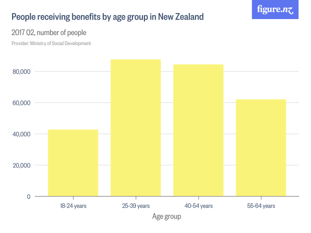
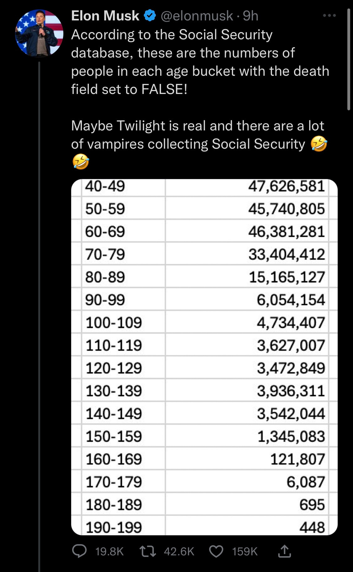
Elon Musk and DOG-E have been looking at US Social Security data. They created a table of Social Security-eligible people not recorded as dead and noticed that (a) some of them were surprisingly old, and (b) the total added up to more than the US population.

That’s a good first step, as I said. The next step is to think about possible explanations (as Dan Davies says: “if you don’t make predictions, you won’t know when to be surprised”). The first two I thought of were people leaving the US after working long enough to be eligible for Social Security (like, for example, me) and missing death records for old people (the vital statistics records weren’t as good in the 19th century as they are now).

After that, the proper procedure is to ask someone or look for some documentation, rather than just to go with your first guess.  It’s quite likely that someone else has already observed the existence of records with unreasonable ages and looked for an explanation.

In this case, one would find (eg, by following economist Justin Wolfers) a 2023 report “Numberholders Age 100 or Older Who Did Not Have Death Information on the Numident” (PDF), a report by the Office of the Inspector General, which said that the very elderly ‘vampires collecting Social Security’ were neither vampires nor collecting Social Security, but were real people whose deaths hadn’t been recorded.   This was presumably a follow-up to a 2015 story where identity fraud was involved — but again, the government wasn’t losing money, because it wasn’t paying money out to dead people.

The excess population at younger years isn’t explained by this report, but again, the next step is to see what is already known by the people who spend their whole careers working with the data, rather than to decide  the explanation is the first thing that comes to mind.

March 28, 2018

Cycling for work or play

Auckland Transport publish data from cycle counters on various bike paths. They’re most interested in trends over time (increasing) and perhaps in seasonal variation (more in summer).

Here’s a look at weekday vs weekend counts using data from the start of 2016 to now (click to embiggen).

There are some paths that are clearly used primarily by commuters, with more than twice the average traffic on a weekday vs weekend. There are also some that are mostly used at the weekend, such as Matakana, Upper Harbour, and Mangere Bridge.  And some, like the Lightpath, that get used all the time.

Note: while it’s great that Auckland Transport publishes these data, the data would be easier to reuse if the names they used for each counter were consistent over time (eg: “Tamaki Dr” vs “Tamaki Drive”, or “Nelson Street Lightpath Counter Cyclists” vs “Nelson Street Lightpath Cyclists”)


March 26, 2018

The data speak for themselves?

This graph was on Twitter this morning. There’s nothing wrong with the graph: good data, clear presentation, but it does provide a nice illustration of the difficulties in official statistics — you have to decide what categories to use, and it makes a difference.

The second leading cause, motor vehicles, is straightforward enough.  The first, firearms, is more complicated. A majority of the firearm deaths are suicides, and it’s controversial whether firearm access increases the suicide rate or just affects the method.  Poisoning is also complicated: you might well want to treat both suicide and accidental recreational-drug overdose separately. And so on.

Sometimes you want to break down the data by intent, sometimes by physical cause, sometimes by medical type of injury or damage. You can’t define the ‘correct’ answer in the absence of a question.

February 17, 2018

Read me first?

There’s a viral story that viral stories are shared by people who don’t actually read them. I saw it again today in a tweet from Newseum Insititute

If you search for the study it doesn’t take long to start suspecting that the majority of news sources sharing this study didn’t read it first.  One that at least links is from the Independent, in June 2016.

The research paper is here. The money quote looks like this, from section 3.3

First, 59% of the shared URLs are never clicked or, as we call them, silent.

We can expand this quotation slightly

First, 59% of the shared URLs are never clicked or, as we call them, silent. Note that we merged URLs pointing to the same article, so out of 10 articles mentioned on Twitter, 6 typically on niche topics are never clicked

That’s starting to sound a bit different. And more complicated.

What the researchers did was to look at bit.ly URLs to news stories from five major sources, and see if they had ever been clicked. They divided the links into two groups: primary URLs tweeted by the media source itself (eg @NYTimes), and secondary URLs tweeted by anyone else. The primary URLs were always clicked at least once — you’d expect that just for checking purposes.  The secondary URLs, as you’d expect, averaged fewer clicks per tweet; 59% were not clicked at all.

That’s being interpreted as if it were 59% of retweets didn’t involve any clicks. But it isn’t. It’s quite likely that most of these links were never retweeted.  And there’s nothing in the data about whether the person who first tweeted the link read the story: there certainly isn’t any suggestion that person didn’t read the story.

So, if I read some annoying story about near-Earth asteroids on the Herald and if tweeted a bit.ly URL, there’s a chance no-one would click on it. And, looking at my Twitter analytics, I can see that does sometimes happen. When it happens, people usually don’t retweet the link either, and it definitely doesn’t go viral.

If I retweeted the official @NZHerald link about the story, then it would almost certainly have been clicked by someone. The research would say nothing whatsoever about the chance that I (or any of the other retweeters) had read it.


February 13, 2018

Opinions about immigrants

Ipsos MORI do a nice set of surveys about public misperceptions: ask a sample of people for their estimate of a number and compare it to the actual value.

The newest set includes a question about the proportion of the prison population than are immigrants. Here’s (a redrawing of) their graph, with NZ in all black.

People think more than a quarter of NZ prisoners are immigrants; it’s actually less than 2%. I actually prefer this as a ratio

The ratio would be better on a logarithmic scale, but I don’t feel like doing that today since it doesn’t affect the main point of this pointpost.

A couple of years ago, though, the question was about what proportion of the overall population were immigrants. That time people also overestimated a lot.  We can ask how much of the overestimation for the prison question can be explained by people just thinking there are more immigrants than there really are.

Here’s the ratio of the estimated proportion of immigrants among the prison population and the total population

The bar for New Zealand is to the left; New Zealand recognises that immigrants are less likely to be in prison than people born here. Well, the surveys taken two years apart are consistent with us recognising that, at least.

That’s just a ratio of two estimates. We can also compare to the reality. If we divide this ratio by the true ratio we find out how much more likely people think an individual immigrant is to end up in prison compared to how likely they really are.

It seems strange that NZ is suddenly at the top. What’s going on?

New Zealand has a lot of immigrants, and we only overestimate the actual number by about a half (we said 37%; it was 25% in 2017). But we overestimate the proportion among prisoners by a lot. That is, we get this year’s survey question badly wrong, but without even the excuse of being seriously deluded about how many immigrants there are.

January 8, 2018

Long tail of baby names

The Dept of Internal Affairs has released the most common baby names of 2017 (NZ is, I think, the first country each year to do this), and Radio NZ has a story.  A lot of names popular last year were also popular in the past; a few (eg Arlo) are changing fast.

If you look at the sixty-odd years of data available, there’s a dramatic trend. In 1954, ‘John’ was the top boy’s name, with 1389 uses. In 2017 the top was ‘Oliver’, but with only 314 uses — not enough to make 1954’s top twenty. According to the government, there were nearly 13,000 different names given last year, so the mean number of babies per name is under 5; the most popular names are still much more popular than average. But less so than in the past.

Here’s the trend in the number of babies given the top name

and the top ten names

and the top hundred names

That decrease is despite an increase in the total population: here’s the top 10 names as a percentage of all babies (assuming 53% of babies are boys)

and the top 100 names

The proportion with any of the top 100 names has been going down consistently, and also becoming less different between boys and girls.


November 19, 2017

Hyperbole or innumeracy?

From the Herald (and also from NewstalkZB, apparently originally at South Africa’s The Citizen)

He is also said to own a custom-built Mercedes Benz s600L that is able to withstand AK-47 bullets, landmines and grenades. It also features a CD and DVD player, internet access and anti-bugging devices. The Citizen reported that Mugabe – who is a trained teacher – also owns a Rolls-Royce Phantom IV: a colonial-era British luxury car so exclusive, only 18 were ever manufactured. The vintage black car is estimated to be worth more than Zimbabwe’s entire GDP. (emphasis added)

Several people on Twitter, starting with Richard Easther, had the same reaction: that this doesn’t look remotely plausible.  It’s like the claims that Labour’s water levies would make cabbages cost $18 and a bottle of wine $75 — extraordinary claims demand, if not extraordinary evidence, at least some evidence.

So, how is it that you’d decide this number was implausible? Well, in one direction, you might try to guess the GDP of Zimbwawe.  If Zimbabwe had a smaller population than NZ you’d probably know it was a small country, so we can say there’s at least 5 million people.  So, if the per-capita GDP was only $1, it would still add up to $5 million, and that’s a very expensive car.  Since you’d expect the population to be more than 5 million and the per-capita GDP to be a lot more than $1, the figure is looking implausible.

In the other direction, you might look up the current GDP of Zimbabwe — $16 billion — or the lowest it’s been in recent years — $4.4 billion in 2008 — and note that you could by several wide-body jets for that much.

That’s enough to know something is strange. If you wanted more detail you could search for prices of Rolls-Royce Phantom IVs or of the most expensive cars ever sold, and find that, yes, there’s three or four orders of magnitude missing.

Or, you could look at the first line of the story

Zimbabwe embattled president Robert Mugabe is reportedly worth more than $1 billion despite his country being one of the poorest in the world.

Or the last line

Rolls Royce Phantoms cost a minimum of just under $698,000, but custom-built versions are sold for as much as $1.74 million. Media in South Africa reported the combined cost of the cars was about $6.98 million.

and again, there’s no way the claim about the car vs the GDP could be true — a used one couldn’t be worth thousands of times more than a new one.

So, where could it have come from?  My guess is that the claim was originally hyperbole: that someone did say “his car’s worth more than the Zimbabwe GDP” but they didn’t mean it literally. Over repetitions, the rhetorical figure turned into an “estimate”, and was quoted without any real thought.

What’s harder to understand is someone thinking a CD and DVD player is the height of motoring luxury.

October 10, 2017

Graphic of the week

From the world’s third-largest news agency:

afp

  1. The Nationalist Party?
  2. National got 56 seats, not 58 — the graph seems to have the National results from the provisional count but the Labour and Green results from the final count
  3. NZ First doesn’t use yellow
  4. ACT, on the other hand, does.
  5. But ACT is relatively unlikely to enter a left-wing coalition with Labour and the Greens
August 11, 2017

Different sorts of graphs

This bar chart from Figure.NZ was in Stuff today, with the lead

Working-age people receiving benefits are mostly in the prime of our working life – the ages of 25 to 54.

19205831

The numbers are correct, but the extent to which the graph fits the story is a bit misleading.  The main reason the two bars in the middle are higher is that they are 15-year age groups, when the first bar is a 7-year group and the last is a ten-year group.

Another way to show the data is to scale the bar widths proportional to the number of years and then scale the height so that the bar area matches the count of people. The bar height is now counts of people per year of age

benefits

This is harder to read for people who aren’t used to it, but arguably more informative. It suggests the 25-54 year groups may be the largest just because the groups are wider.

We really need population size data, since the number of people in NZ also varies by age group.  Showing the percentage receiving benefits in each age group gives a different picture again

benpop

It looks as though

  • “working age” people 25-39 and 40-54 make up a larger fraction of those receiving benefits than people 18-24 or 55-64
  • a person receiving benefits is more likely to be, say, 20 or 60 than 35 or 45.
  • the proportion of people receiving benefits increases with age

These can all be true; they’re subtly different questions. Part of the job of a statistician is to help you think about which one you wanted to ask.

August 1, 2017

Holiday travel trends

The Herald has a story and video graphic, and a nice interactive graphic on international travel by Kiwis since 1979.  The story is basically good (and even quotes a price corrected for inflation).

Here’s one frame of the video graphic
escape

First, a lot of the world isn’t coloured. There are New Zealanders who have visited say, Germany or Turkey or Egypt, even though these countries never make it into the 1-24,999 colour category. It looks as if the video picks a set of 16 countries and follows just those forward in time: we’re not told how these were picked.

Second, there’s the usual map problem of big things looking big (exacerbated by the Mercator projection). In 1999, more people went to Fiji than the US; more to Samoa than France. A map isn’t good at making these differences visually obvious, though the animation helps. And, tangentially, if you’re going to use almost a third of the map real estate on the region north of 60°, you should notice that Alaska is part of the USA.

The other, more important, issue that’s common to the whole presentation (and which I understand is being updated at the moment) is what the country data actually mean. It seems that it really is holiday data, excluding both business and visiting friends/relatives (comparing the video to this from Figure.NZ), but it’s by “country of main destination”.  If you go to more than one country, only one is counted.  That’s why the interactive shows zero Kiwis travelling to the Vatican City, and it may help explain numbers like 300 for Belgium.

Official statistics usually measure something fairly precise, but it’s not always the thing that you want them to measure.