Posts filed under Graphics (394)

April 24, 2015

Graph of the week

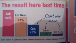
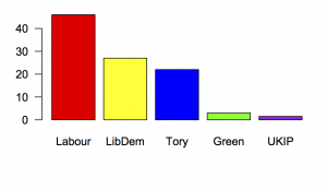
Via @ian_sample on Twitter, a UK election ad

libdem

The basic approach has been traditional with the Liberal Party since before they merged with the Social Democratic Party; the accuracy has been, let’s say, variable. In this example, the 19-point difference between Labour and Liberal Democrats is shown as larger smaller than the 5-point difference between Liberal Democrats and Conservatives.

Here’s what those numbers really look like:
dulwich


April 14, 2015

Cumulative totals go up

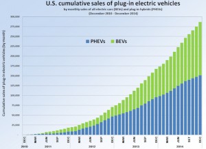
From ThinkProgress  (graph from Wikipedia) “U.S. plug-in electric vehicle cumulative sales have soared in the past few years, thanks in part to rapidly falling battery prices” and “A major reason for the rapid jump in EV sales is the rapid drop in the cost of their key component -– batteries.”

US_PEV_Sales_2010_2014

From a cumulative graph it’s hard to tell whether the cumulative sales have soared due to rapidly falling battery prices or just due to the fact that cumulative sales have to increase, but the past few years look pretty much like straight lines to me.

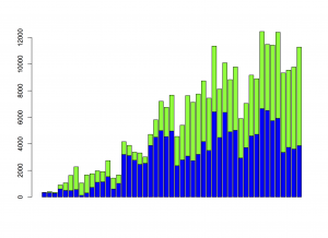
Here’s the noncumulative monthly sales, with the same colour-coding: there hasn’t been a big increase in the rate of sales during 2013 or 2014, so it’s not clear there’s much for falling battery prices to explain. Beyond the graph, for the first three months of 2015 there have been slightly few sales than in the first three months of 2014.

noncumulative

Cumulative sales of a new technology with sizeable network effects are important: it matters how many plug-in vehicles are out there. A cumulative graph is still a bad way to see patterns.


April 9, 2015

Graph of the week

license

Number of learner license tests taken in New Zealand, according to One News.

We’ll follow up to see if the future prediction part of the graph turns out to be correct.

April 7, 2015

Evils of Axis

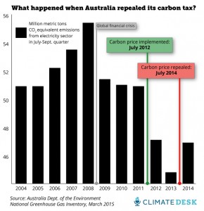
First, from Mother Jones magazine, via Twitter

oz-carbon-emissions4

The impact of the carbon tax looks impressive, but this is a bar chart — it starts at zero and they’ve only shown the top fifth of it.

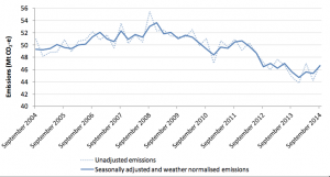
They do link to the data, the quarterly Greenhouse Gas Inventory update.  In that report, Figure 8 is

ozcarbon-line

The dotted line is the same data as the bar chart, except that the dotted line has data for every quarter and the bar chart has data only for the July-September quarter each year. And  the line chart has a wider range on the vertical axis — it doesn’t go down to zero, but it isn’t a bar chart, so it doesn’t have to. The other point about the line chart is that there’s a solid line there as well. The solid line is adjusted for seasonal variation and weather. If you wanted to know about real changes in how Australians are using energy, that’s the line you’d use.


Second, a beautiful map of CO2 emissions from fossil fuel combustion, from the Washington Post via Flowing Data

co2map

The ‘vertical’ scale here is a colour scale; what’s misleading is that it’s a logarithmic scale. The map makes it look as if a large fraction of CO2 emission comes from transporting stuff through empty areas, but the pale beige indicates emissions thousands of times lower than in the urban/suburban areas. Red ink isn’t anywhere close to being proportional to CO2.

March 30, 2015

Aspect ratios and not starting at zero

The vertical axis on a bar chart must start at zero. The very rare exceptions are ones that prove the rule: where ‘zero’ isn’t zero. Otherwise, the axis starts at zero or it isn’t a bar chart. The whole point of bar charts is that the length of the bar is proportional to the data value.

Line charts and scatterplots are different.  They don’t need to be tied down to zero, and the axis scales can be chosen to make the information as clear as possible. With great power comes great responsibility, as we can see from the following pair of line graphs of oil drilling in the US.

littlerigs

bigrigs

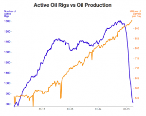
It’s pretty obvious that these come from people with different communications agendas. Or, it would be, except they are from the same story at Bloomberg.

Neither graph has an ideal aspect ratio. The flat one is too flat: you can’t see the wobbles over time in number of rigs. The tall one is too tall: the number of rigs has halved, but it looks as though it has crashed much more than that.

Bill Cleveland has a useful default rule for scaling line graphs: the median slope of the line segments should be about 45 degrees. The orange line on the tall graph isn’t far off that, but the blue line is steeper.  The 45-degree rule would give a graph like this:

flatrigs

In fact, there is plenty of room to start the blue axis at zero, but that’s not always the right choice.

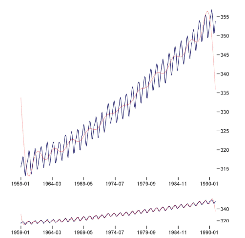
Here, in a sadly-appropriate pairing, is the Keeling Curve, the graph of atmospheric CO2 concentrations at Mauna Loa observatory, in a visualisation paper from Berkeley.

co2

There’s no sense at all in having the vertical axis start at zero. Zero is just not a relevant value of atmospheric CO2. What’s more interesting, though, is how the two scalings show different information. The upper graph is scaled so the year-to-year changes have slope centred at 45 degrees. This makes it easier to see that the CO2 increase is accelerating. The lower graph is scaled so the month to month changes have slope centred at 45 degrees, making it easier to see the shape of the seasonal pattern.

Different vertical scaling can be used just to mislead the reader, but it can also be used to make data more readable and to communicate more effectively.

March 23, 2015

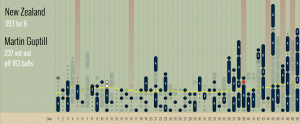
Cricket visualisations

Lascarides-Guptill

Population genetic history mapped

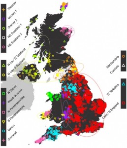
Most stories about population genetic ancestry tend to be based on pure male-line or pure female-line ancestry, which can be unrepresentative.  That’s especially true when you’re looking at invasions — invaders probably leave more Y-chromosomes behind than the rest of the genome.  There’s a new UK study that used data on the whole genome from a few thousand British people, chosen because all four of their grandparents lived close together.  The idea is that this will measure population structure at the start of the twentieth century, before people started moving around so much.

Here’s the map of ancestry clusters. As the story in the Guardian explains, one thing it shows that the Romans and Normans weren’t big contributors to population ancestry, despite their impact on culture.

0b02a9ee-3110-4323-8654-ee559ee03cc0-875x1020

March 18, 2015

Awful graphs about interesting data


Today in “awful graphs about interesting data” we have this effort that I saw on Twitter, from a paper in one of the Nature Reviews journals.

nrd4570-f2

As with some other recent social media examples, the first problem is that the caption isn’t part of the image and so doesn’t get tweeted. The numbers are the average number of drug candidates at each stage of research to end up with one actual drug at the end. The percentage at the bottom is the reciprocal of the number at the top, multiplied by 60%.

A lot of news coverage of research is at the ‘preclinical’ stage, or is even earlier, at the stage of identifying a promising place to look.  Most of these never get anywhere. Sometimes you see coverage of a successful new cancer drug candidate in Phase I — first human studies. Most of these never get anywhere.  There’s also a lot of variation in how successful the ‘successes’ are: the new drugs for Hepatitis C (the first column) are a cure for many people; the new Alzheimer’s drugs just give a modest improvement in symptoms.  It looks as those drugs from MRSA (antibiotic-resistant Staph. aureus) are easier, but that’s because there aren’t many really novel preclinical candidates.

It’s an interesting table of numbers, but as a graph it’s pretty dreadful. The 3-d effect is purely decorative — it has nothing to do with the represntation of the numbers. Effectively, it’s a bar chart, except that the bars are aligned at the centre and have differently-shaped weird decorative bits at the ends, so they are harder to read.

At the top of the chart,  the width of the pale blue region where it crosses the dashed line is the actual data value. Towards the bottom of the chart even that fails, because the visual metaphor of a deformed funnel requires the ‘Launch’ bar to be noticeably narrower than the ‘Registration’ bar. If they’d gone with the more usual metaphor of a pipeline, the graph could have been less inaccurate.

In the end, it’s yet another illustration of two graphical principles. The first: no 3-d graphics. The second: if you have to write all the numbers on the graph, it’s a sign the graph isn’t doing its job.

March 17, 2015

Bonus problems

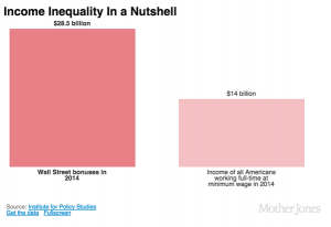
If you hadn’t seen this graph yet, you probably would have soon.
bonuses CAQYEF4UYAA5PqA

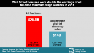
The claim “Wall Street bonus were double the earnings of all full-time minimum wage workers in 2014” was made by the Institute for Policy Studies (which is where I got the graph) and fact-checked by the Upshot blog at the New York Times, so you’d expect it to be true, or at least true-ish. It probably isn’t, because the claim being checked was missing an important word and is using an unfortunate definition of another word. One of the first hints of a problem is the number of minimum wage workers: about a million, or about 2/3 of one percent of the labour force.  Given the usual narrative about the US and minimum-wage jobs, you’d expect this fraction to be higher.

The missing word is “federal”. The Bureau of Labor Statistics reports data on people paid at or below the federal minimum wage of $7.25/hour, but 29 states have higher minimum wages so their minimum-wage workers aren’t counted in this analysis. In most of these states the minimum is still under $8/hr. As a result, the proportion of hourly workers earning no more than federal minimum wage ranges from 1.2% in Oregon to 7.2% in Tennessee (PDF).  The full report — and even the report infographic — say “federal minimum wage”, but the graph above doesn’t, and neither does the graph from Mother Jones magazine (it even omits the numbers of people)

On top of those getting state minimum wage we’re still short quite a lot of people, because “full-time” is defined by 35 or more hours per week at your principal job.  If you have multiple part-time jobs, even if you work 60 or 80 hours a week, you are counted as part-time and not included in the graph.

Matt Levine writes:

There are about 167,800 people getting the bonuses, and about 1.03 million getting full-time minimum wage, which means that ballpark Wall Street bonuses are 12 times minimum wage. If the average bonus is half of total comp, a ratio I just made up, then that means that “Wall Street” pays, on average, 24 times minimum wage, or like $174 an hour, pre-tax. This is obviously not very scientific but that number seems plausible.

That’s slightly less scientific than the graph, but as he says, is plausible. In fact, it’s not as bad as I would have guessed.

What’s particularly upsetting is that you don’t need to exaggerate or use sloppy figures on this topic. It’s not even that controversial. Lots of people, even technocratic pro-growth economists, will tell you the US minimum wage is too low.  Lots of people will argue that Wall St extracts more money from the economy than it provides in actual value, with much better arguments than this.

By now you might think to check carefully that the original bar chart is at least drawn correctly.  It’s not. The blue bar is more than half the height of the red bar, not less than half.
March 16, 2015

Maps, colours, and locations

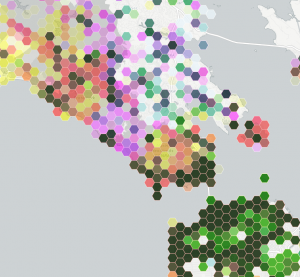
This is part of a social media map, of photographs taken in public places in the San Francisco Bay Area

bayarea

The colours are trying to indicate three social media sites: Instagram is yellow, Flickr is magenta, Twitter is cyan.

Encoding three variables with colour this way doesn’t allow you to easily read off differences, but you can see clusters and then think about how to decode them into data. The dark green areas are saturated with photos.  Light green urban areas have Instagram and Twitter, but not much Flickr.  Pink and orange areas lack Twitter — mostly these track cellphone coverage and population density, but not entirely.  The pink area in the center of the map is spectacular landscape without many people; the orange blob on the right is the popular Angel Island park.

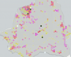
Zooming in on Angel Island shows something interesting: there are a few blobs with high density across all three social media systems. The two at the top are easily explained: the visitor centre and the only place on the island that sells food. The very dense blob in the middle of the island, and the slightly less dense one below it are a bit strange. They don’t seem to correspond to any plausible features.

angelisland

My guess is that these are a phenomenon we’ve seen before, of locations being mapped to the center of some region if they can’t be specified precisely.

Automated data tends to be messy, and making serious use of it means finding out the ways it lies to you. Wayne Dobson doesn’t have your cellphone, and there isn’t a uniquely Twitter-worthy bush in the middle of Angel Island.