Posts filed under Graphics (394)

July 20, 2015

Pie chart of the day

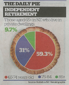
From the Herald (squashed-trees version, via @economissive)

CKUXF6iUsAAWPr-

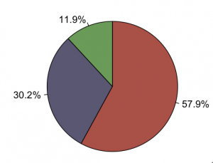
For comparison, a pie of those aged 65+ in NZ regardless of where they live, based on national population estimates:

CKUbriWVAAAWbpT

Almost all the information in the pie is about population size; almost none is about where people live.

A pie chart isn’t a wonderful way to display any data, but it’s especially bad as a way to show relationships between variables. In this case, if you divide by the size of the population group, you find that the proportion in private dwellings is almost identical for 65-74 and 75-84, but about 20% lower for 85+.  That’s the real story in the data.

July 9, 2015

Interesting graph of the day

From Matt Levine at Bloomberg

nyse

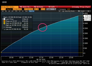
This is a graph of cumulative US stock trades today. The pink circle is centred at 11:32am, when the New York Stock Exchange had technical problems and shut down. Notice how nothing happens: the computers adapt very quickly to having a slightly smaller range of places to trade. As Levine puts it:

“For the most part the system is muddling along, relatively normally,” says a guy, and presumably if you asked a computer it would be even more chill.

June 25, 2015

Poetry about statistics

On Twitter, Evelyn Lamb pointed me to the poem “A contribution to Statistics”, by Wisława Szymborska (who won the 1996 Nobel Prize for Literature). It begins

Out of every hundred people

those who always know better:
— fifty-two,

doubting every step
   — nearly all the rest,

glad to lend a hand
if it doesn’t take too long:
— as high as forty-nine,

Read all of it here

The same blog, “Poetry with Mathematics”, has some other statistically themed poems:

The last was written in honour of Florence Nightingale, who was the first female member of the Royal Statistical Society, and also an honorary member of the American Statistical Association.

June 7, 2015

What does 80% accurate mean?

From Stuff (from the Telegraph)

And the scientists claim they do not even need to carry out a physical examination to predict the risk accurately. Instead, people are questioned about their walking speed, financial situation, previous illnesses, marital status and whether they have had previous illnesses.

Participants can calculate their five-year mortality risk as well as their “Ubble age” – the age at which the average mortality risk in the population is most similar to the estimated risk. Ubble stands for “UK Longevity Explorer” and researchers say the test is 80 per cent accurate.

There are two obvious questions based on this quote: what does it mean for the test to be 80 per cent accurate, and how does “Ubble” stand for “UK Longevity Explorer”? The second question is easier: the data underlying the predictions are from the UK Biobank, so presumably “Ubble” comes from “UK Biobank Longevity Explorer.”

An obvious first guess at the accuracy question would be that the test is 80% right in predicting whether or not you will survive 5 years. That doesn’t fly. First, the test gives a percentage, not a yes/no answer. Second, you can do a lot better than 80% in predicting whether someone will survive 5 years or not just by guessing “yes” for everyone.

The 80% figure doesn’t refer to accuracy in predicting death, it refers to discrimination: the ability to get higher predicted risks for people at higher actual risk. Specifically, it claims that if you pick pairs of  UK residents aged 40-70, one of whom dies in the next five years and the other doesn’t, the one who dies will have a higher predicted risk in 80% of pairs.

So, how does it manage this level of accuracy, and why do simple questions like self-rated health, self-reported walking speed, and car ownership show up instead of weight or cholesterol or blood pressure? Part of the answer is that Ubble is looking only at five-year risk, and only in people under 70. If you’re under 70 and going to die within five years, you’re probably sick already. Asking you about your health or your walking speed turns out to be a good way of finding if you’re sick.

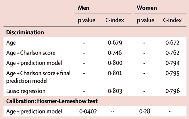
This table from the research paper behind the Ubble shows how well different sorts of information predict.
si2

Age on its own gets you 67% accuracy, and age plus asking about diagnosed serious health conditions (the Charlson score) gets you to 75%.  The prediction model does a bit better, presumably it’s better at picking up a chance of undiagnosed disease.  The usual things doctors nag you about, apart from smoking, aren’t in there because they usually take longer than five years to kill you.

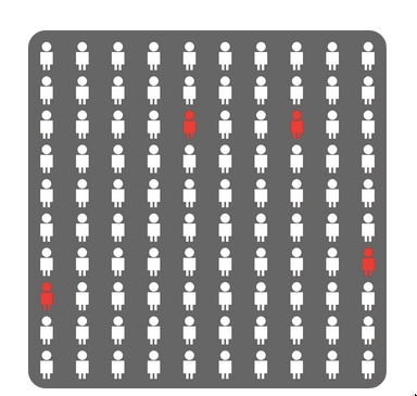
As an illustration of the importance of age and basic health in the prediction, if you put in data for a 60-year old man living with a partner/wife/husband, who smokes but is healthy apart from high blood pressure, the predicted percentage for dying is 4.1%.

The result comes with this well-designed graphic using counts out of 100 rather than fractions, and illustrating the randomness inherent in the prediction by scattering the four little red people across the panel.
ubble

Back to newspaper issues: the Herald also ran a Telegraph story (a rather worse one), but followed it up with a good repost from The Conversation by two of the researchers. None of these stories mentioned that the predictions will be less accurate for New Zealand users. That’s partly because the predictive model is calibrated to life expectancy, general health positivity/negativity, walking speeds, car ownership, and diagnostic patterns in Brits. It’s also because there are three questions on UK government disability support, which in our case we have not got.
 

June 2, 2015

Improving pie-charts

We’ve seen animations of this sort from Darkhorse Analytics before, but this one is special. It shows how to remove unnecessary components from a pie chart to produce something genuinely useful, though, sadly, the procedure doesn’t work for all pie charts.

Click on the picture to start the animation

devourThePie3

(via @JennyBryan)

June 1, 2015

Graph of the week

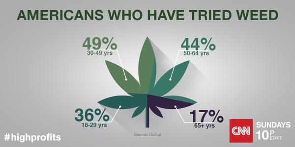
Yes, it’s only Monday, but this one will be hard to beat (from CNN on Twitter, via @albertocairo)

CGX6SisW8AA_QOQ

The off-square dividing make this look as if it’s trying to be a pie chart, but it isn’t. Not only are these not percentages of the same thing and so make no sense as a pie, the colour sections aren’t even scaled in proportion to the numbers (whether you look at angle or area).

May 31, 2015

Of droughts and flooding rains

Australia’s climate is weird, even in the relatively habitable bits such as Melbourne, so it makes for interesting graphs. This is going to be another post about aspect ratios and alignment in graphs and how to use them for things other than lying with statistics. (more…)

May 22, 2015

Budget viz

Aaron Schiff has collected visualisations of the overall NZ 2015 budget

A useful one that no-one’s done yet would be something showing how the $25 benefit increase works out with other benefits being considered as income — either in terms of the distribution of net benefit increases or in terms of effective marginal tax rate.

May 20, 2015

Weather uncertainty

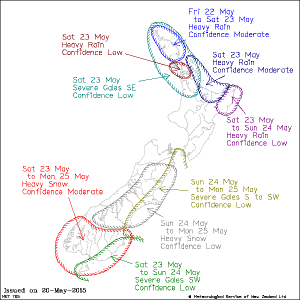
From the MetService warnings page

7567-14d6e9ea400-14d78eb5c00-14d6f31d538.0

The ‘confidence’ levels are given numerically on the webpage as 1 in 5 for ‘Low’, 2 in 5 for ‘Moderate’ and 3 in 5 for ‘High’. I don’t know how well calibrated these are, but it’s a sensible way of indicating uncertainty.  I think the hand-drawn look of the map also helps emphasise the imprecision of forecasts.

(via Cate Macinnis-Ng on Twitter)

May 5, 2015

Civil unions down: not just same-sex

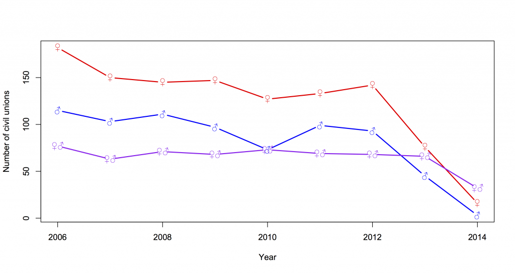
The StatsNZ press release on marriages, civil unions, and divorces to December 2014 points out the dramatic fall in same-sex civil unions with 2014 being the first full year of marriage equality. Interestingly, if you look at the detailed data, opposite-sex civil unions have also fallen by about 50%, from a low but previously stable level.

union